Powertoys: [Settings] Use and appearance of NumberBoxes
Summary of the new feature/enhancement
I think the current design of most - or nearly all - of the numberboxes (in the Settings) is pretty bad. Most of them are waaaaaaaay too wide. Also, most of the time the input values have an lower and upper limit, but none of them have any info indicating what their limit is. If any.
In order of appearance:
FancyZones > "Zone highlight opacity (%)" --> Better use a slider, since this setting has a logical and also fixed minimum and maximum: 0 - 100.
Power Rename > "Maximum numbers of items to show in recently used list for autocomplete dropdown" --> Label is too long. NumberBox is way too wide. See _picture_ below. Currently there's no indication of min/max (turns out to be 0 - 20 here). A Slider or a DropDown Menu (with or without ability for user input?) would be better here. I mention DropDown, because that's what is used in Windows Settings @ "number of contacts shown" on the Taskbar, next the Contacts button. Also it visually resembles with the dropdown that is the subject.

PowerToys Run > "number of results" --> Same idea as previous. But what is the current or realistic upper limit though? Right now, nine digit numers are no problem?
Shortcut Guide > "Press duration before showing (ms)" --> Currently it does not seem to have an upper limit? A value like 91050 (ms) is accepted, which makes no sense at all. I would say a slider (values 0 - 2000) will do fine here.
 Jay-o-Way
All 10 comments
I agree.
We need to think about a UI model where there's a textfield next to the slider that shows the actual value. Currently sliders only show the value when using the slider. There's an earlier issue that mentions this #3234
 niels9001
on 25 May 2020
niels9001
on 25 May 2020
NumberBoxes are great where you need a precise number - but Sliders are better if there are hard limits, and the value is more perceptive than accurate.
Opacity as a slider is good.
Dimensions are probably better as a Numberbox. _(With or without min and max limits)_
 mdtauk
on 25 May 2020
mdtauk
on 25 May 2020
Pardon me, I've stumbled by this (via #3375 ) and do not know anything of the widget set in use.... I had a moment to share some thoughts on the matter for your consideration.
better if... the value is more perceptive than accurate.
This presumes inaccurate perception. For example, this:
Shortcut Guide ...I would say a slider (values 0 - 2000) will do fine here.
Would absolutely do my head in. Wherever possible, I tune my press-and-hold timings to specific values, so a slider would be very cumbersome, and depending on the limits being greater than the pixel count, impossible to use. Likewise, I use the super key for all manner of functions and rarely refer to the shortcut guide, so I'd prefer a longer timeout such as 3s. Someone who hunt-and-pecks for a key combo might want it even longer.
I do see your point, but hopefully you can see that it doesn't apply to everybody. This is to say, I see the problems, but I also see problems with the suggested solutions.
Opacity as a slider is good.
Accurate values for opacity are important; consider the effect of multiple transparent layers.
Hard limits can be applied to numberboxes. Scrolling works in numberboxes. Sliders are notoriously annoying when accuracy is the goal - particularly on inaccurate input devices such as touchscreens. However, I see where they can be useful for those who do not require accuracy, or do require a visual representation of a fixed scale, or for people with poorly implemented touchscreens that do not allow scrolling.
If the width of the label defines the width of the box, that's a fault with the widget. Changing the widget type would only be a workaround, and one that introduces other equally undesirable UX.
In fact, the more I think about all of this, the more it seems that this is a widget UX problem being approached as an app UX problem. I agree with your observations that the UX leaves some room for improvement, but the solutions provided do, too.
Assuming that your suggestions are based on limitations of the widgets, perhaps this should be taken upstream. If not, and the widgets are capable of providing the desired UX for the varying use cases, then perhaps other implementations of the existing widgets could be considered (eg moving arrows, textboxes next to sliders, etc), rather than changing widgets and running into new UX problems.
Edit: Just a thought: I have several apps where a slider is shown, but double-clicking the slider opens a textbox where precise values can be entered. Perhaps this is worthy of consideration.
 xcasxcursex
on 25 May 2020
xcasxcursex
on 25 May 2020
Well, thanks for the reply. We all have our own experiences and opinions, and you seem to have plenty of both 👍
The value of 2000 that I mentioned was just an example. I agree that the max should be higher. Not in the five or six digit range though. I guess some kind of input box is okay for this specific setting.
Someone who hunt-and-pecks for a key combo might want it even longer.
You are right when you mean that some people (especially elder) are much slower, and need more time. My own mother is a huge example. On the other hand, the Guide is created to help people. So if somebody is thinking about a combination or looking for the actual key, the Guide is there to help and I can imagine it to be welcome too. Also: the Guide does not block other keys.
If the width of the label defines the width of the box, that's a fault with the widget.
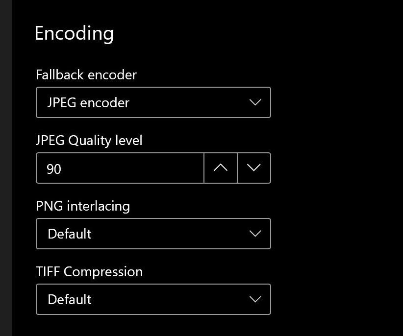
Apparently, you seem to be right again. Changing the window width shows this. Having that said, on the page "Image Re-sizer", at Encoding, we have a few input controls (including one NumberBox, if I'm not mistaken) that are all equally wide. I'm not familiar with all the coding possibilities regarding the size of these controls, but it would be hard to believe that the size of the input controls can not be manually set.
Just a thought: [...] double-clicking the slider opens a textbox where precise values can be entered. Perhaps this is worthy of consideration.
That doesn't sound like a bad idea, for those who want more precision.
People are already requesting a Label next to a Slider to display the current value, while using it. (Windows general settings doesn't have this either, by the way) Maybe the static/label idea can be changed into the inputbox? Then we have them both at the same time. Or is that overkill?
Jay-o-Way
on 26 May 2020
10/10 post, I'll shutup and continue watching from the sidelines, I think you're already on my wavelength here. Shoutout to our parents and their hunt-and-peck keycombos ;)
(and thanks for pointing out that the guide doesn't block the combos anyway)
BTW, in another post, I mentioned this
it would be hard to believe that the size of the input controls can not be manually set.
And apparently that is true so it's gone upstream to the WinUI guys.
xcasxcursex
on 26 May 2020
Lol, thanks for the compliment, haha.
I guess it just boils down to adding a few numbers in the code to give the controls a (fixed) width, adding a ceiling here and there, changing one or two of them into a Slider (I still think opacity would be a good one) and we're fine.
Jay-o-Way
on 26 May 2020
Thanks for all the input.
I think in general, we should be very practical in terms of the decision if it's Slider vs. Numberbox. Numberboxes are great for exact values and when there's not really an upper limit defined. Sliders work well for values that are not too big (e.g. opacity).
I'd propose the following:
Zone highlight opacity (FancyZones)
Slider | 0 - 100 %
JPEG Quality Level (Image Resizer)
Slider | 0 - 100
Maximum number of items (PowerRename)
NumberBox | 1 - *
Maximum number of results (PT Run)
NumberBox | 1 - *
Press duration (Shortcut Guide)
NumberBox | 0 - * ms
Opacity of background (Shortcut Guide)
Slider | 0 - 100 %
This means not too much logic to be rewritten (with ComboBoxes we need to start converting stuff which is a bit of an overstretch IMO). Agree with this @jay-o-way @xcasxcursex @mdtauk?
Values next to slider
As tracked in #3234 we need to make sure that we define a way to show the value (and unit) next to the slider, so it's easy to check without moving the slider around.
Long NumberBoxes / other UI elements
Some of our titles are pretty long, which results in NumberBoxes that are stretched out. This looks pretty bad, and we should put in a standard. I created an issue for that: #3733
niels9001
on 26 May 2020
Sounds good to me. I'll leave the implementations to the developers now. Think the situation is clear enough. Still think steps and ceilings are needed in some of the settings (like at the milliseconds) but I've mentioned that already. 🤐
Edit: if the numberbox actually ends up with limits, would it be nice to mention this in the label? Analog to mentioning the units (like "ms" or "%")
Jay-o-Way
on 26 May 2020
Fixed in 0.19.0, please visit https://github.com/microsoft/PowerToys/releases/ for the latest release
 crutkas
on 30 Jun 2020
crutkas
on 30 Jun 2020
@niels9001 In 0.19.2 and up the "JPEG quality" is a numberbox. Was this one omitted or did somebody vote against the slider?
Jay-o-Way
on 23 Jul 2020
Related issues
 Kazamario
·
3Comments
Kazamario
·
3Comments
 SWinxy
·
3Comments
SWinxy
·
3Comments
 enricogior
·
3Comments
enricogior
·
3Comments
 Garconis
·
3Comments
Garconis
·
3Comments
 seritools
·
3Comments
seritools
·
3Comments