Powertoys: [FZ Editor] GridResizer is not centrally aligned
Steps to reproduce
Use the FancyZones grid editor.
Expected behavior
The GridResizer thumbs should be horizontally and vertically aligned with the zone.
Actual behavior
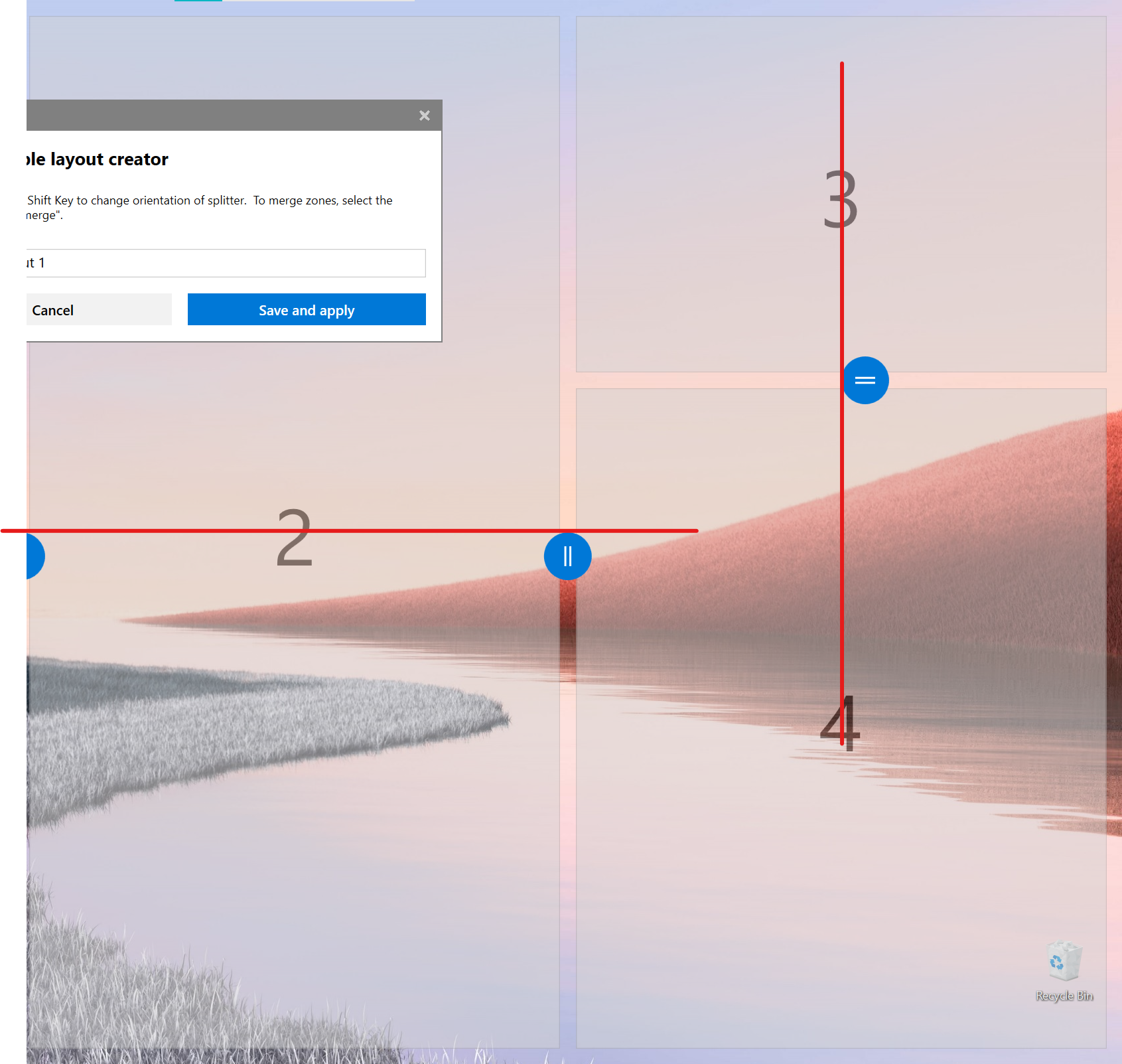
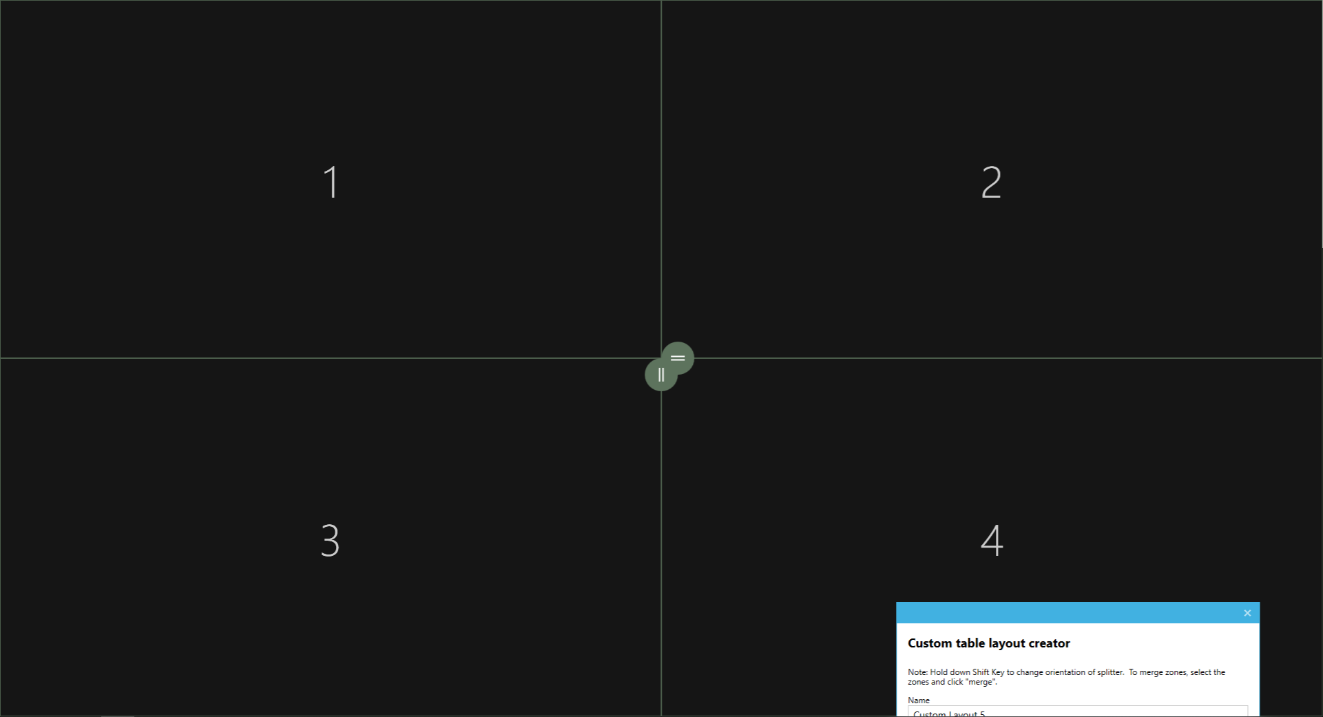
The GridResizers are added, but should have a negative Left (horizontal) or Top (vertical) margin so they are in the center of the zone. This results in a bad visual representation where the zone label and GridResizer are not aligned.
Screenshots
 niels9001
All 9 comments
Feel like this is is an easy fix
 crutkas
on 7 Apr 2020
crutkas
on 7 Apr 2020
There is a reason for the current behavior, the fix should take in consideration cases like the 4 zones grid:
 enricogior
on 9 Apr 2020
enricogior
on 9 Apr 2020
Is it possible to detect when we overlap then do the shift?
crutkas
on 10 Apr 2020
https://github.com/microsoft/PowerToys/issues/2278 maybe this will help a lot on this.
 Aokromes
on 22 Apr 2020
Aokromes
on 22 Apr 2020
I would like to take a look at this, this would be my first issue
 chenac64
on 2 Jun 2020
chenac64
on 2 Jun 2020
I would also like to contribute. chenac64 and I would be working together on this. We will try to get this completed by 6/13/20.
 ColdTune
on 2 Jun 2020
ColdTune
on 2 Jun 2020
Per @enricogior, i don't know if the current layout will be the best route here due to the overlap issue he outlined.
https://github.com/microsoft/PowerToys/issues/1032#issuecomment-626041614 shows a possible new direction for the editor which would solve the issue by just removing the thumbnails entirely and treating the entire edge like the edge on a window.
crutkas
on 2 Jun 2020
Understood, thank you. We will look for another issue to work on.
ColdTune
on 2 Jun 2020
One possible solution for the current UI, would be to reshape the gridresizer into a wide rectangle shape as in https://github.com/microsoft/PowerToys/issues/1032#issuecomment-626041614
In that case, even if two gridresizers overlap, they would still be usable.
Since we don't know when we will redesign the editor, this fix would still be welcomed and also a good opportunity to experiment with the existing code.
enricogior
on 3 Jun 2020
Related issues
 SWinxy
·
3Comments
SWinxy
·
3Comments
 Marrib
·
3Comments
Marrib
·
3Comments
 saahmedm
·
3Comments
saahmedm
·
3Comments
 anish-94
·
3Comments
anish-94
·
3Comments
 xfirf
·
3Comments
xfirf
·
3Comments