Powerlevel10k: Question mark before each line

This is on Arch Linux with Konsole, oh-my-zsh-git and zsh-theme-powerlevel10k-git or steps in README.
In gnome-terminal a desktop is shown before each line (hostname desktop1) - is this correct? Anyway to disable this?
Thanks.
 francoism90
All 17 comments
It tries to show the Arch Linux icon but your font cannot render it. I'll need a bit more info to figure out the reason.
If you run p10k configure, does this icon render in the wizard? It's on the screen close to the very end when you are asked whether you want few or many icons.
How do you answer the yes/no questions in the first several screens of the wizard? These are the questions in the form "Does this look like a XXX?"
What font are you using and how did you install it?
P.S.
You can disable that icon by commenting out os_icon in ~/.p10k.zsh. It's around here: https://github.com/romkatv/powerlevel10k/blob/93230ae6ec92add5f86bf6131c970a3c04f232cd/config/p10k-lean.zsh#L28.
I would really appreciate if you can answer the questions above anyway. This way I can fix this issue for everyone.
 romkatv
on 8 Aug 2019
romkatv
on 8 Aug 2019
@romkatv Some icons render correctly, only this is one in the wizard doesn't work and I respond with n :
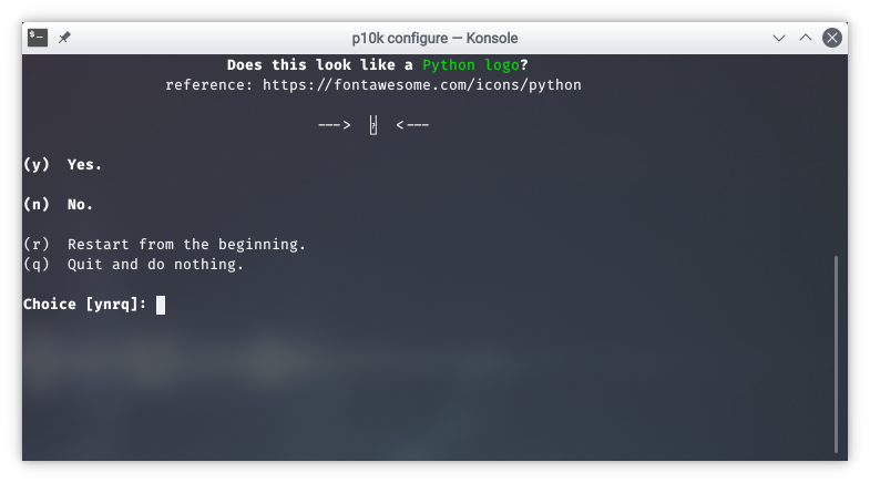
Konsole font: otf-fira-code 1.207-1
Other possible related fonts:
awesome-terminal-fonts 1.1.0-2
powerline-fonts 2.7-3
terminus-font 4.48-1
Fonts have been installed from the repo's/AUR.
Thanks for looking into the issue.
francoism90
on 8 Aug 2019
Just to clarify, you answered the first 3 questions with y, y, n?
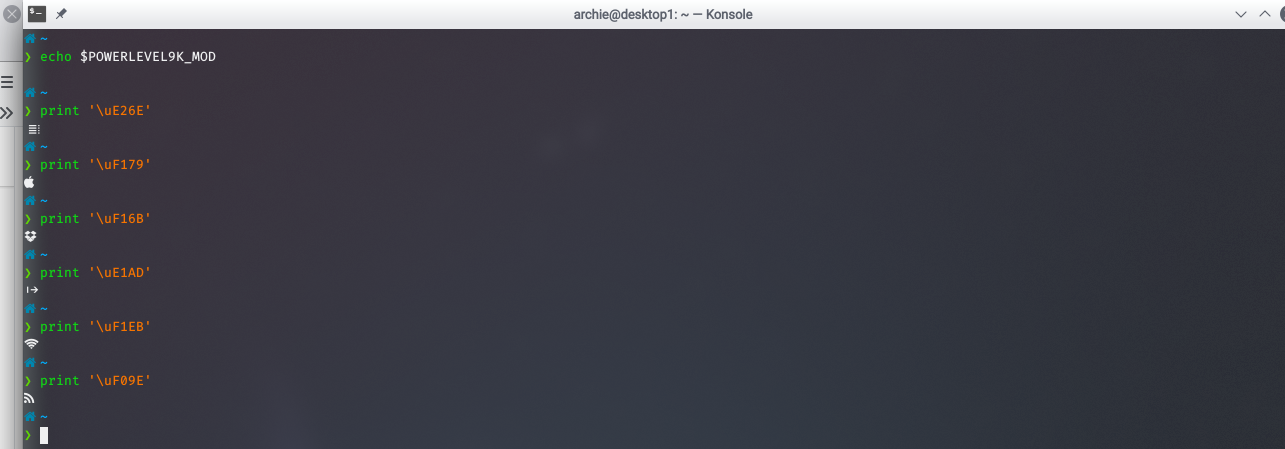
What's the output of echo $POWERLEVEL9K_MODE?
Which of the following render correctly?
print '\uE26E'-- Apple.print '\uF179'-- Apple.print '\uF16B'-- Dropbox.print '\uE1AD'-- Wireless.print '\uF1EB'-- Wireless.print '\uF09E'-- Wireless.
If you run
p10k configure, does this icon render in the wizard? It's on the screen close to the very end when you are asked whether you want few or many icons.
Would appreciate if you can answer this.
romkatv
on 8 Aug 2019
Just to clarify, you answered the first 3 questions with y, y, n?
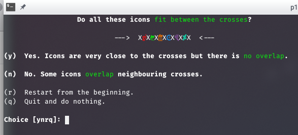
Yes, same order, including another n because the icons are overlapping.
Output:
francoism90
on 8 Aug 2019
Thanks, that was useful.
If you run
p10k configure, does this icon render in the wizard? It's on the screen close to the very end when you are asked whether you want few or many icons.
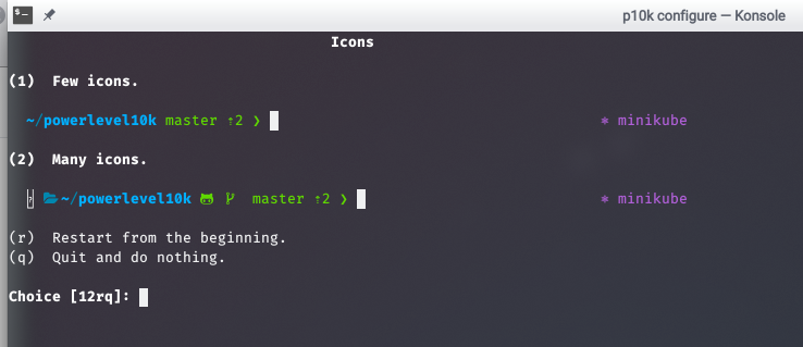
It would help if you could answer this question. Basically, when you get to this screen:
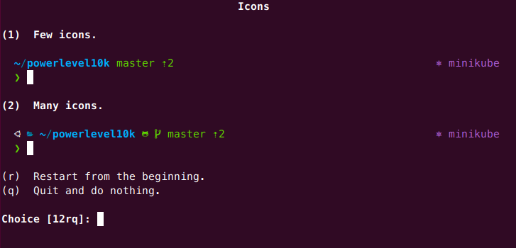
I believe you are choosing (2) here. Does the icon on the left side of the prompt render or is it a question mark? On my screenshot it shows Ubuntu logo (I'm using Ubuntu).
romkatv
on 8 Aug 2019
I believe you are choosing (2) here.
True
Output and I indeed would like to use (2):
francoism90
on 8 Aug 2019
Thanks for your help in debugging this.
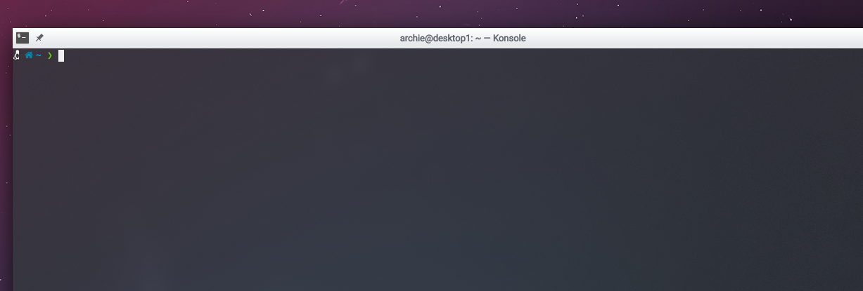
I've committed a fix. Please update powerlevel10k and run p10k configure. You are now supposed to see a Linux logo where you previously saw that broken question mark. Let me know whether it works.
romkatv
on 8 Aug 2019
@romkatv Thanks for pushing a fix. The icon does overlap thought:
When running the wizard the python logo isn't rendered correctly - should I simple ignore that one? :)
Also would be it be possible to show an Arch icon instead of a generic Linux one?
francoism90
on 8 Aug 2019
The icon does overlap thought.
Your screenshot doesn't show any overlap -- there is plenty of space between linux logo and home icon. Linux logo is truncated because Konsole is buggy. It's the only terminal with this particular bug. I've committed a workaround that should help. Please update and run p10k configure again.
When running the wizard the python logo isn't rendered correctly - should I simple ignore that one?
Make sure to answer n when you are presented with an icon that doesn't render. The wizard will switch that icon for another. Type VIRTUAL_ENV=foo/bar to see the replacement Python icon in your prompt.
Also would be it be possible to show an Arch icon instead of a generic Linux one?
Sure. Just use a good font. You'll also get more styling options.
romkatv
on 8 Aug 2019
Thanks for the fixes and details. :)
Is it correct that the linked font doesn't include the symbols? Any other terminal you recommend on KDE?
francoism90
on 8 Aug 2019
Is it correct that the linked font doesn't include the symbols?
Could you clarify? You've installed that font and some symbols don't render? Or something else?
Any other terminal you recommend on KDE?
If you switch to a monospace font (e.g., the recommended one), your prompt will look fine in Konsole.
romkatv
on 8 Aug 2019
Could you clarify? You've installed that font and some symbols don't render? Or something else?
I would like more symbols and if I understand correctly using the correct (symbol) font includes this icon?
Any other terminal you recommend on KDE?
Thanks, will try another monospace font.
francoism90
on 8 Aug 2019
I would like more symbols and if I understand correctly using the correct (symbol) font includes this icon?
The recommended font has all symbols, including the Arch logo.
Thanks, will try another monospace font.
Your Fira isn't monospace, hence massive icons and truncated glyphs. The recommended font is monospace.
romkatv
on 8 Aug 2019
The recommended font has all symbols, including the Arch logo.
To clarify, that font is self-contained. Once you configure your terminal to use MesloLGS NF, all symbols will come from MesloLGS NF, including regular letters, numbers and fancy icons. You don't need to have any other fonts on your system for your prompt to look good.
romkatv
on 8 Aug 2019
Would it be possible to distribute these fonts (optional) with this theme? It would make it easier to integrate it into the current AUR package and allow global install.
Maybe adding the details to the README (includes symbols, etc.) would be helpful, I wasn't aware of this.. but maybe it's only me. :)
francoism90
on 8 Aug 2019
It's possible, but I don't want to increase the size of this repo by 5MB. Plus, unlike zsh files that have to be installed on all machines that you access, you only need to install fonts on your dev machines. Most people have just one or two dev machines.
Maybe adding the details to the README (includes symbols, etc.) would be helpful, I wasn't aware of this.. but maybe it's only me. :)
To be honest, I still don't understand the question about symbols.
Here's what the readme says:
Powerlevel10k doesn't require custom fonts but can take advantage of them if they are available. The full choice of style options is available only when using Nerd Fonts.
And then on the next line, in bold:
Recommended: Meslo Nerd Font patched for Powerlevel10k
The first item in the FAQ:
Q: Why my icons and/or powerline symbols look bad?
Q: It's likely your font's fault. Install the recommended font and runp10k configure.
What should be changed to make it clear that the recommended font is recommended?
romkatv
on 8 Aug 2019
@rawkode Sorry for the noise, I must learn how to read. :)
PS. After installing the nerd font and running p10k configure it works perfectly. Thanks again!
francoism90
on 8 Aug 2019
Related issues
 ImKifu
·
3Comments
ImKifu
·
3Comments
 fedemengo
·
7Comments
fedemengo
·
7Comments
 bwoodruff
·
6Comments
bwoodruff
·
6Comments
 zemuldo
·
4Comments
zemuldo
·
4Comments
 stevenguh
·
6Comments
stevenguh
·
6Comments