Polls: Start with "?" state instead of "x"
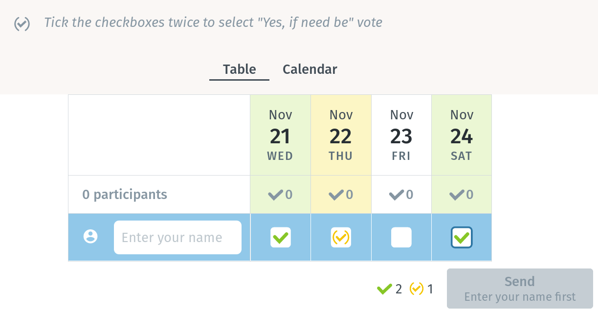
Currently when you go to a poll, it looks like this:
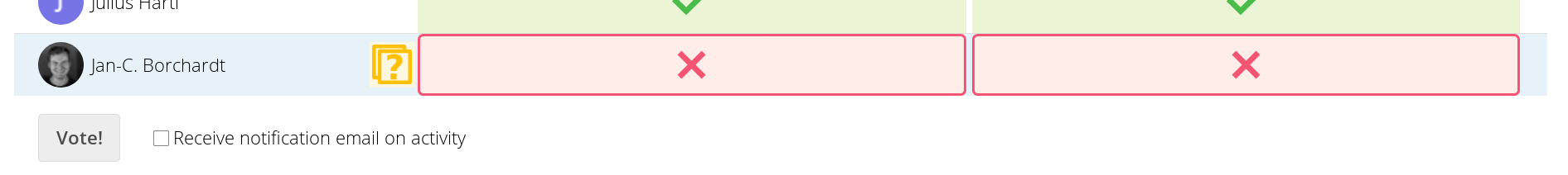
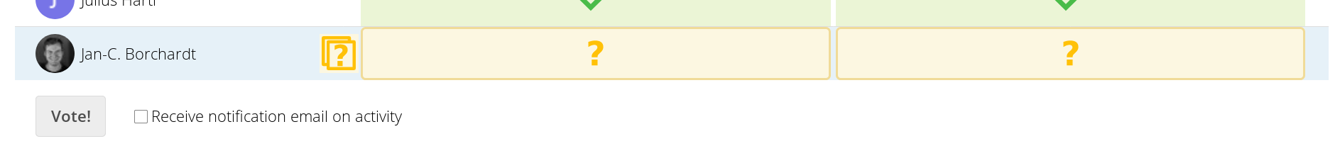
That’s strange because it seems like the app already submited a decision for you. Instead we should start with the "Undecided / if need be state", since it also is a call to action with the "?" icon.
 jancborchardt
All 28 comments
That’s strange because it seems like the app already submited a decision for you.
Difficult discussion, which we already had. Some say start with maybe, some say (including me), force clear answers and say no to every option, the voter does not state his clear optinion.
 dartcafe
on 15 Nov 2018
dartcafe
on 15 Nov 2018
i'm also a fan of clear answers (and don't like the maybe-option at all), but as long as it is an possible option it should definitely be used as initial state to call for an action or if the participant hasn't changed it's state (whether intentional or by accident) to correctly indicate that.
also for polls with a lot of options, which have to be clarified one by one (e.g. date-polls) it is also useful for the participant to easily see which of the options he hasn't already processed.
 DJCrashdummy
on 18 Nov 2018
DJCrashdummy
on 18 Nov 2018
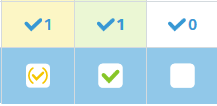
So, Doodle basically also defaults to the "No" state, but they display it way less aggressively. It’s not a red X, it’s just an empty box:
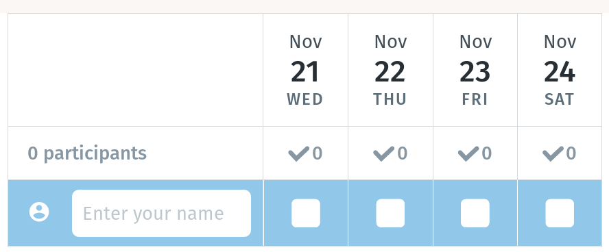
As for the "maybe / if need be" option, that is not enabled by default and can be set during creation:
And then the possible options look like this: Yes, Maybe / if need be, No, Yes:
Only when submitting the poll it changes the background to red, but without the icon:

We should do it like that to not confuse people who are used to Doodle – which is the majority of people we want to win over. ;)
jancborchardt
on 18 Nov 2018
i also thought about the possibility (while creation of a poll) to enable/disable a strict "yes/no"-policy...
thinking about the whole possibilities:
- the yes (green) and no (red) is out of question...
- but the initial state should be a neutral question mark with a neutral colour (perhaps a colour to catch the participants attention)
--> probably if a state wasn't touched also post it like that. or remember the participant that a/some decision(s) has to be made. - or force him to make all decisions, if the creator has chosen this. - and then a maybe/"if need be" may also be reasonable: a check mark in brackets seems good to me (also with a neutral colour or perhaps a very light green or greenish colour, since it is rather yes than no)
...because a question mark is not really an answer, not even in a poll!
the biggest question for me in this case (except the strict yes/no-policy) is, if should it be possible to get back to the initial state once touched.
DJCrashdummy
on 19 Nov 2018
Coming up with our own logic would be much too confusing. We should simply adapt what Doodle is doing for now as they are clearly the most used solution in this field.
jancborchardt
on 19 Nov 2018
So you vote vor:
- default is "no",
- display "No" without a red cross
- display "maybe" as a checkmark in brackets?
dartcafe
on 20 Nov 2018
Yep! But when you submit it, the red cross should be displayed to make it obvious for others. (Just like on Doodle.)
jancborchardt
on 20 Nov 2018
With respect, but this makes no sense for me.
A poll with disabled "maybe" option is created with an intention to get a concrete result. So it is valid to force the user to chek in or out for each possible option. And if someone does not opt in for an option, he says no.
The "maybe" option is a backdor for "I decide later on this option" or "maybe this fits to me" or "this is an option which fits, but I prefer the other option(s)" or what else.
Leaving options with a "did not vote" state, creates a fourth state which leads to more confusion IMHO.
And BTW: Doodle also displays a red background without icon on a no vote. The behavior is the same. If you don`t vote for an option, doodle assumes a "no".
results in
I like your proposal for the design changes, but I would leave it to max. three states for an option.
dartcafe
on 20 Nov 2018
I would also prefer a checkmark in brackets over a "?" icon. I asked my users, mostly doodle users, an they told me the "?" is a "i dont know", "have to check and maybe" whilst a checkmark in brackets is a "its not prefered but when i'm forced to i'll make it possible", which is the answer i prefer over a "?". If they have to decide they should set a "X" for an "i dont know". They can adjust it later (Also see.)
 g6094199
on 21 Nov 2018
g6094199
on 21 Nov 2018
@dartcafe I’m not suggesting adding a 4th state. :) For starting out, I’m just saying "let’s do it like Doodle" so we have a nice baseline. And actually, the default of Doodle is having a poll with only yes and no, _not_ "maybe". :)
jancborchardt
on 21 Nov 2018
no. to be claer on that, i dont want an 4th state either! just replacing the misleading unclear (for germans or doodle users or old guys ;-) ) state.
g6094199
on 21 Nov 2018
I’m not suggesting adding a 4th state. :)
I was hoping that, but really sure you didn't intend to that. ;-) I will make a proposal after the release. I want to get it out!
@v1r0x Ready for release? I will fix the NC15 compatibilty and then I thinks it's done.
dartcafe
on 25 Nov 2018
But when you submit it, the red cross should be displayed to make it obvious for others
@jancborchardt Arghhh. I got you wrong.
I asked my users, mostly doodle users, an they told me the "?" is a "i dont know", "have to check and maybe" whilst a checkmark in brackets is a "its not prefered but when i'm forced to i'll make it possible", which is the answer i prefer over a "?".
@g6094199 Thanks for the inside.
dartcafe
on 25 Nov 2018
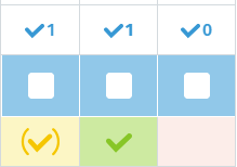
How about this variant?
Any idea for a good toggle button?
dartcafe
on 1 Dec 2018
@dartcafe nice! :)
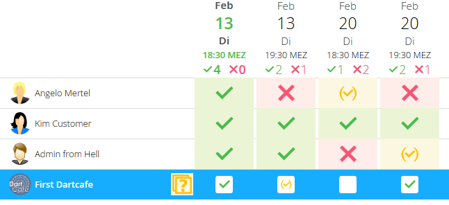
- The blue row highlight is a bit much maybe? Too many colors and everything calls for attenton. We can just remove it since it should be at the beginning of the list anyway #305. (I know Doodle does it, but there it works better somehow.)
- I didn’t really get the use of the "toggle" button. It’s very present but does not seem very useful. Doodle doesn’t have it for example – could you explain the use-case for it? :)
jancborchardt
on 2 Dec 2018
* I didn’t really get the use of the "toggle" button. It’s very present but does not seem very useful. Doodle doesn’t have it for example – could you explain the use-case for it? :)
Hehe. It is a requested feature, which should toggle all options to the next unique state.
* The blue row highlight is a bit much maybe? Too many colors and everything calls for attenton. We can just remove it since it should be at the beginning of the list anyway #305. (I know Doodle does it, but there it works better somehow.)
Yes, the color ist from the NC default colors, but too - ehem - blue (?) for my taste. I will make another proposal next week.
dartcafe
on 3 Dec 2018
Hehe. It is a requested feature, which should toggle all options to the next unique state.
Do you have a link to the design discussion? :slightly_smiling_face: People request features all the time, it doesn’t mean that they have to be very present in the interface. "If everything is important, nothing is." :wink:
Yes, the color ist from the NC default colors, but too - ehem - blue (?) for my taste. I will make another proposal next week.
Cool! What would be enough is to show the current user at the top and make their name font-weight: bold. No background color needed.
jancborchardt
on 3 Dec 2018
Do you have a link to the design discussion?
I don't remember a real request of this, but in some discussions, it seems to be requested. As far as I know, this function was there from the beginning.
What would be enough is to show the current user at the top and make their name
font-weight: bold. No background color needed.
I'll give it a try. But I would prefer the checkbox style for the switches. So it states clear, that an action is requested there comparing to the other rows or a closed poll, when no more action is possible.
dartcafe
on 3 Dec 2018
I don't remember a real request of this, but in some discussions, it seems to be requested. As far as I know, this function was there from the beginning.
Ok, that doesn’t sound like it’s needed. Let’s remove it.
I'll give it a try. But I would prefer the checkbox style for the switches. So it states clear, that an action is requested there comparing to the other rows or a closed poll, when no more action is possible.
I love the checkbox style, was not saying anything against that. :) Only the blue background of the row we can do without, and instead highlight who is you by bolding the name.
jancborchardt
on 4 Dec 2018
[...] and instead highlight who is you by bolding the name.
and what about public shared polls...?
IMHO some kind of highlight resp. call for action (in contrast to an already ended poll) is quite good.
DJCrashdummy
on 4 Dec 2018
Ok, that doesn’t sound like it’s needed. Let’s remove it.
I'm definitely team toggle :wink: I really miss this feature for larger polls in dudle/doodle/... If there are more than 5 options, then it's great to have such option. Also, I wouldn't remove existing (and working) features.
 v1r0x
on 4 Dec 2018
v1r0x
on 4 Dec 2018
@v1r0x what do you exactly use it for? When you realize that you filled out the poll in reverse? (Just kidding, but I'm really puzzled :)
and what about public shared polls...?
@DJCrashdummy we still know who the local person is though (through some kind of browser storage).
jancborchardt
on 4 Dec 2018
@jancborchardt If there's a poll with 10 different dates (e.g. a movie night) and all dates are fine for you (or all not). Without the toggle button you have to click on each date to select the same answer for each date. And it happens from time to time, that you click on an already answered date and have to toggle through all options again.
It might not be a "that happens to me in every poll" use-case, but (at least for me) it is a use-case. And even if it only happens once a month, I hate doodle/dudle for not having that button :wink:
v1r0x
on 4 Dec 2018
@v1r0x thanks for the explanation! That sounds like we should have a 3-dot menu there instead (less distracting and works on touch interfaces too) and then the "Toggle all dates" option will be in there. It could also have an entry for "Remove your answer" (or different words) so you can remove yourself from the poll again if you want.
See the docs for the popover menu at https://docs.nextcloud.com/server/15/developer_manual/design/popovermenu.html
jancborchardt
on 4 Dec 2018
@jancborchardt sounds good! :+1:
v1r0x
on 4 Dec 2018
@v1r0x I am one of the toggle button users as well :) Not regularly but I am happy it is there on polls with many options where I know that I can or cannot join at all dates. This is better than doodle.
@jancborchardt I really like your 3-dot menu solution
 bpcurse
on 4 Dec 2018
bpcurse
on 4 Dec 2018
That sounds like we should have a 3-dot menu
nice intention. Would be a good enhancement for the vue implementation.
dartcafe
on 4 Dec 2018
[...] Only the blue background of the row we can do without, and instead highlight who is you by bolding the name.
and what about public shared polls...?
IMHO some kind of highlight resp. call for action (in contrast to an already ended poll) is quite good.@DJCrashdummy we still know who the local person is though (through some kind of browser storage).
@jancborchardt my statement was about clearly highlighting/"catching the attention" from external users, who never used/seen nextcloud (perhaps nor doodle) and also have no (known) username.
DJCrashdummy
on 5 Dec 2018
Related issues
 Jana702
·
4Comments
dartcafe
·
3Comments
Jana702
·
4Comments
dartcafe
·
3Comments
 CoreyBurger
·
3Comments
CoreyBurger
·
3Comments
 wiertz
·
5Comments
wiertz
·
5Comments
 jacotec
·
3Comments
jacotec
·
3Comments
Most helpful comment
@v1r0x thanks for the explanation! That sounds like we should have a 3-dot menu there instead (less distracting and works on touch interfaces too) and then the "Toggle all dates" option will be in there. It could also have an entry for "Remove your answer" (or different words) so you can remove yourself from the poll again if you want.
See the docs for the popover menu at https://docs.nextcloud.com/server/15/developer_manual/design/popovermenu.html