Is your feature request related to a problem? Please describe.
If I add a lot of dates it's really confusing to recognize which date and time are the opportunities. Also the time is really small written.
Describe the goal you'd like to achieve
I would be great when they have a clear structure.
Describe alternatives you've considered
Maybe like doodle, they used a table for it.
Describe possible solutions
I wouldn't use the hierarchys and don't centered the text because it's too much input and confusing.
Additional context
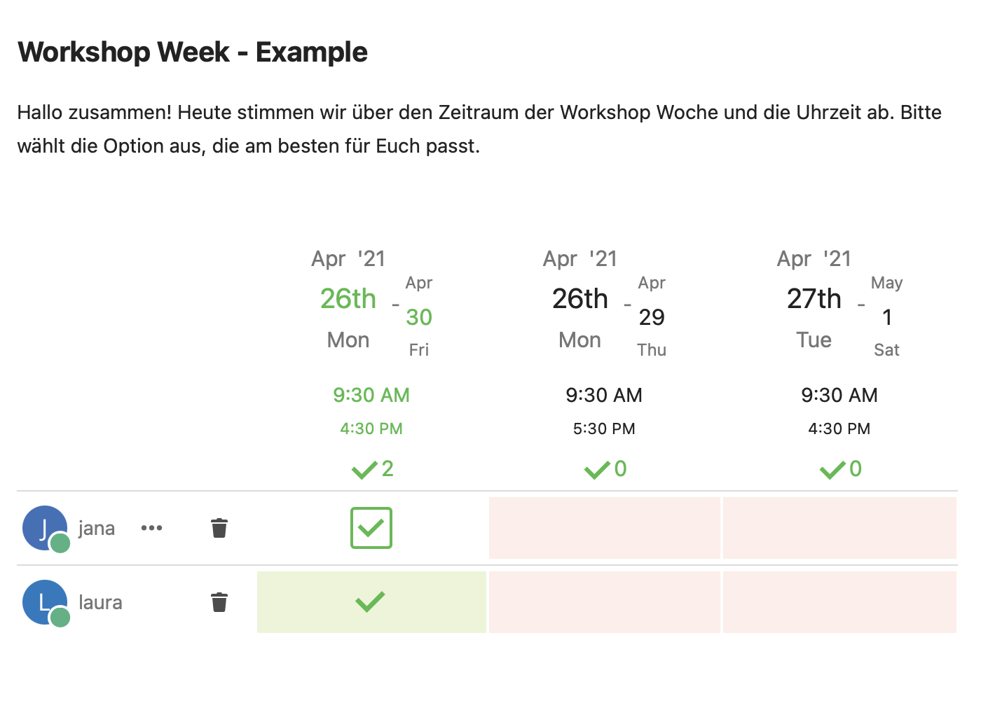
This screenshot shows what I mean.
 Jana702
All 4 comments
Hey @laura040801 Thanks for your issue. I have several questions and need your help to understand your aspects and find ways for improvement.
If I add a lot of dates it's really confusing to recognize which date and time are the opportunities.
Could you describe, what or why this is confusing?
I would be great when they have a clear structure.
What in your optinion is a clearer structure? I mean, what you describe is from a personal view. From my view the current structure is rather clear, but if there is room for optimization, I am happy to get some proposition.
Maybe like doodle, they used a table for it.
Compared to doodle, I would say it is rather similair.
I wouldn't use the hierarchys and don't centered the text because it's too much input and confusing.
Could you explain further, what you would change and how?
 dartcafe
on 28 Apr 2021
dartcafe
on 28 Apr 2021
Hey @dartcafe Thank you for your answer!
The arrangement of the period is confusing due to the offset of the typography. As you can see in the screenshot on top, „April 30th“ is smaller than „April 26th“ and also offset like a staircase. That gives you the feeling that they do not belong together. Underneath the date, the time is written smaller and „4:30 PM“ is smaller than „9:30 AM“. Overall, the impression of an inverted pyramid is created. If you have further options, it is more difficult to see which options are available.
In the following table we will show you @laura040801 and my ideas for a new design.
Design suggestions | Description
-|-
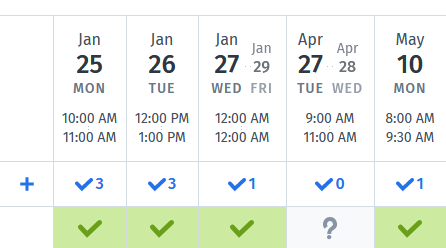
 | If you arrange the header in a uniform size (as you can see in the screenshot), the result would be a nicer shape. However, this variant also has weaknesses, so we tried a new structure.
-|-
 | This varies depending on the information in the table. To provide a better overview, there are three options.
-|-
 | Here you can see a mockup of the desktop screen before and after. (Maybe you should click on them to see it bigger)
-|-
 | The mobile version is also important. In the current version you can only see a fraction of the table, which makes the selection more difficult (first screen). We also applied the new options for the desktop to the mobile version.
-|-
 | The more options there are, a scroll function should be a must-have. There are two ways to visualize this. The first would be a "fade out/in" effect. It helps to recognize that there are more opportunities.
-|-
 | The second option is a "scroll bar". It also helps to recognize the other options. Given the design of Nextcloud, in our opinion this fits better because it has a clearer appearance.
-|-
 | Here you can see a mockup of the mobile version before and after.
What do you think about our suggestions?
Greetings Laura & Jana
Jana702
on 29 Apr 2021
Congratulations. Cool Mockups! 👍 I like the structure and the design, especially the mobile layout. I would say much better than doodle. And now I understand your points in the starting post. 😉
Could we stress this a little bit with the options below? Especially the date, which spans over the end of the month.
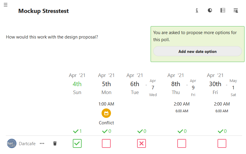
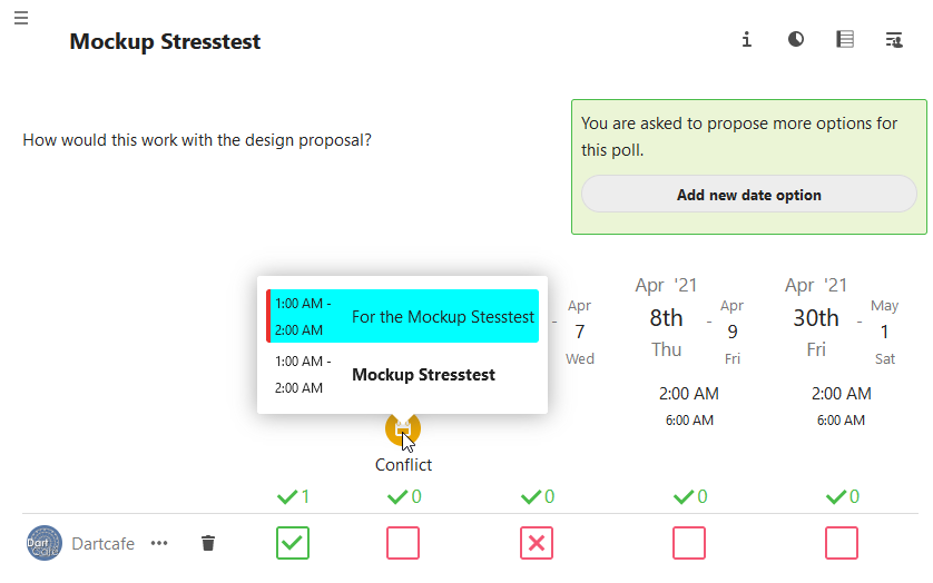
And: How would you solve the display of the warning element, which signals a conflict with an existing calendar event?
Another point is the menu behind the three dots near the username. Any ideas of improvement for this.
@jancborchardt What is your impression? Want to hear something from a pro. 🧼
BTW: Would it be possible to use the current master of polls for the instance?
AND: How long can we rely on the presence of Jana, Laura and JT? Until the end of 2021 is enough. 🤣
dartcafe
on 29 Apr 2021
Moved UX propoasal to #1602
dartcafe
on 8 May 2021
Related issues
dartcafe
·
4Comments
 wompydomp
·
6Comments
wompydomp
·
6Comments
 BurtGummer
·
3Comments
BurtGummer
·
3Comments
 Dubidubiduu
·
5Comments
Dubidubiduu
·
5Comments
 hanzei
·
6Comments
hanzei
·
6Comments
Most helpful comment
Hey @dartcafe Thank you for your answer!
The arrangement of the period is confusing due to the offset of the typography. As you can see in the screenshot on top, „April 30th“ is smaller than „April 26th“ and also offset like a staircase. That gives you the feeling that they do not belong together. Underneath the date, the time is written smaller and „4:30 PM“ is smaller than „9:30 AM“. Overall, the impression of an inverted pyramid is created. If you have further options, it is more difficult to see which options are available.
In the following table we will show you @laura040801 and my ideas for a new design.
Design suggestions | Description
 | If you arrange the header in a uniform size (as you can see in the screenshot), the result would be a nicer shape. However, this variant also has weaknesses, so we tried a new structure.
 | This varies depending on the information in the table. To provide a better overview, there are three options.
 | Here you can see a mockup of the desktop screen before and after. (Maybe you should click on them to see it bigger)
 | The mobile version is also important. In the current version you can only see a fraction of the table, which makes the selection more difficult (first screen). We also applied the new options for the desktop to the mobile version.
 | The more options there are, a scroll function should be a must-have. There are two ways to visualize this. The first would be a "fade out/in" effect. It helps to recognize that there are more opportunities.
 | The second option is a "scroll bar". It also helps to recognize the other options. Given the design of Nextcloud, in our opinion this fits better because it has a clearer appearance.
 | Here you can see a mockup of the mobile version before and after.
-|-
-|-
-|-
-|-
-|-
-|-
-|-
What do you think about our suggestions?
Greetings Laura & Jana