Polaris-react: Replacing Page component in embedded apps
Issue summary
Page component is used for wrapping other components and actions in a page. Its usage is being deprecated inside of embedded apps, moving the actions props to the Titlebar component.
The suggestion made in this thread was to use the Layout component instead of the Page with the deprecation rationale. However, when switching its usage for the Layout component, the results aren't the same.
Is there other component that we should use instead of the Page? Should we continue to work with Page component even though the title prop is required?
Expected behavior
Switching Layout component for Page component for outer wrapping in pages doesn't give the same layouts.
Actual behavior
Steps to reproduce the problem
You could check the behavior in this codesandbox by replacing Layout by Page
Specifications
- Are you using the React components? (Y/N): Yes
- Polaris version number: 3.15.0
- Browser: Chrome 75.0.3770.142
- Operating System: mac Mojave 10.14.3
 adriana45silva
All 12 comments
👋 Thanks for opening your first issue. A contributor should give feedback soon. If you haven’t already, please check out the contributing guidelines. You can also join #polaris on the Shopify Partners Slack.
![probot-shopify[bot] picture](https://avatars2.githubusercontent.com/in/10530?v=4&s=40) probot-shopify[bot]
on 31 Jul 2019
probot-shopify[bot]
on 31 Jul 2019
Hi @adriana45silva, Thanks for creating this issue. My next few days are booked up, and Monday is a holiday in Canada, but I could look at this issue next Tuesday. Does that work for you?
 markiiikram
on 31 Jul 2019
markiiikram
on 31 Jul 2019
My understanding of that deprecation is that it only refers to using certain props on the Page such as breadcrumbs to render in the embedded app breadcrumb. A TitleBar should be used in conjunction with a Page in an embedded app. I hope that's the case, the Page component looks very good in an embedded app and I've been using it on, well, every page.
I feel that breadcrumbs and actions in the title bar (outside of the app iframe) can be missed by the user, so it's good to use a mix. For example, I always put the same breadcrumb in the TitleBar and Page, and then, depending on the page, will put the actions in either the TitleBar or the Page, or a mix.
Side note: Even though Page and Titlebar take an array of breadcrumbs, only one breadcrumb is ever rendered. Bug?
 jeffblake
on 31 Jul 2019
jeffblake
on 31 Jul 2019
@markiiikram @jeffblake Hey there folks! 👋Yes, I'm still using the Page component in all my pages and moving all the actions (breadcrumbs, primaryActions, so on) into the TitleBar component, but I just wanted to understand if we'll be able to continue using it (or what should we replace the component for in embedded apps). The only caveat, though, is that the title prop is required on Page component, so it seems weird to pass an empty string there as a value
(<Page title="">... </Page>) since I can't pass the same values there (or everything will be rendered twice and "break" the layout). Maybe making title optional could be a feature to be added later on... 🤔
adriana45silva
on 1 Aug 2019
Hey @adriana45silva, totally, that's what I'd like to look into and if possible work with the App Bridge team to solution.
markiiikram
on 1 Aug 2019
Hi @markiiikram 👋 checking in to see if there's been progress on this. I'm using Page to set titles but also to organize my layout. Moving the title-setting part to TitleBar makes a lot of sense, but I think we still need a component that would visually do what Page is doing right now (most notably it adds max-width and padding).
 janklimo
on 2 Sep 2019
janklimo
on 2 Sep 2019
Hey @janklimo, Apologies for the delay. @iainmcampbell from App Bridge is going to take a look. Thanks Iain!
markiiikram
on 3 Sep 2019
I’ve done some investigation, and I’m comfortable recommending <Page title=""> as the recommended migration path.
Here’s the legacy method, using Polaris with deprecated embedded app functionality:
import { AppProvider, Page } from "@shopify/polaris";

render(
  <AppProvider apiKey="apikey" shopOrigin="myshop.myshopify.com">
    <Page
      title="My App"
      breadcrumbs={[{ content: "Breadcrumb" }]}
      primaryAction={primaryAction}
      secondaryActions={secondaryActions}
      actionGroups={actionGroups}
    >
      {content}
    </Page>
  </AppProvider>
);
which renders:
<div class="Polaris-Page">
  <div class="Polaris-Page__Content">
    {...content}
  </div>
</div>
Using <Page title=""> and moving all props previously passed to Page to <TitleBar> from App Bridge React:
import { AppProvider, Page } from "@shopify/polaris";
import {
  Provider as AppBridgeProvider,
  TitleBar
} from "@shopify/app-bridge-react";

render(
  <AppProvider>
    <AppBridgeProvider
      config={{ apiKey: "apikey", shopOrigin: "myshop.myshopify.com" }}
    >
      <Page title="">
        <TitleBar
          title="My App"
          breadcrumbs={[{ content: "Breadcrumb" }]}
          primaryAction={primaryAction}
          secondaryActions={secondaryActions}
          actionGroups={actionGroups}
        />
        {content}
      </Page>
    </AppBridgeProvider>
  </AppProvider>
);
Passing an empty string to <Page> does feel a bit wrong, but in this situation the Page component actually does exactly what we want it to. There’s logic in <Page> to ensure we only render the header if header content exists, so we render exactly the same markup as the legacy method:
<div class="Polaris-Page">
  <div class="Polaris-Page__Content">
    {...content}
  </div>
</div>
I’ll update the TitleBar help page with this recommended migration path.
Note: in my testing, <Page></Page> with no title attribute actually didn’t throw any warnings or errors in my editor (vscode) or during compilation. This is odd, as title is not an optional prop, so I’m attributing it to a config error on my part.
 iainmcampbell
on 5 Sep 2019
iainmcampbell
on 5 Sep 2019
Update: the <Page> component’s title prop will be optional in the next release of Polaris (https://github.com/Shopify/polaris-react/pull/2082).
The recommended migration path will look like so:
import { AppProvider, Page } from "@shopify/polaris";
import {
  Provider as AppBridgeProvider,
  TitleBar
} from "@shopify/app-bridge-react";

render(
  <AppProvider>
    <AppBridgeProvider
      config={{ apiKey: "apikey", shopOrigin: "myshop.myshopify.com" }}
    >
      <Page>
        <TitleBar
          title="My App"
          breadcrumbs={[{ content: "Breadcrumb" }]}
          primaryAction={primaryAction}
          secondaryActions={secondaryActions}
          actionGroups={actionGroups}
        />
        {content}
      </Page>
    </AppBridgeProvider>
  </AppProvider>
);
@janklimo @jeffblake @adriana45silva does this ⬆️ address the issue for you?
iainmcampbell
on 9 Sep 2019
@iainmcampbell that works well. One solid benefit I see from decoupling Page and TitleBar is that now you can have just one Page per, well, page. To give a simplified example:
const Dashboard: FunctionComponent<Props> = () => {
  const [currentTab, setCurrentTab] = useState<number>(0);

  const renderActiveTab = () => {
    switch (currentTab) {
      case 0:
        return <Galleries />;
      case 1:
        return <Settings />;
      case 2:
        return <Help />;
    }
  };

  return (
    <>
      <Page title="">
        <Tabs tabs={tabs} selected={currentTab} onSelect={setCurrentTab} />
      </Page>
      {renderActiveTab()}
    </>
  );
};
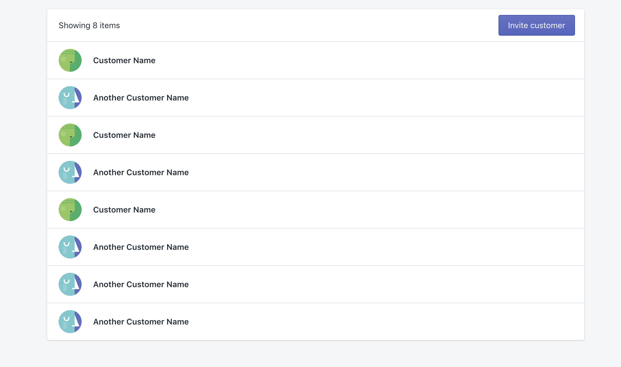
Which looks like this:
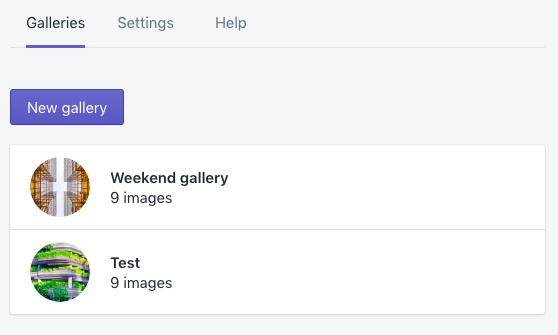
Here I use the first Page component to add styles to the tabs section. I have to set title to empty and render active tab outside of this component because all of them specify title.
With this change I can see this cleans it up nicely: everything wrapped in Page, every tab declaring a TitleBar.
janklimo
on 10 Sep 2019
Making the Page title prop optional was shipped in 4.2.0 and a docs update will ship shortly.
iainmcampbell
on 13 Sep 2019
Related issues
 andrewpye
·
3Comments
andrewpye
·
3Comments
 HYPD
·
3Comments
HYPD
·
3Comments
 alex-page
·
3Comments
alex-page
·
3Comments
 vilav
·
3Comments
vilav
·
3Comments
 danrosenthal
·
3Comments
danrosenthal
·
3Comments