Polaris-react: Poor contrast ratio for selected/active items in OptionList and ActionList
Issue summary
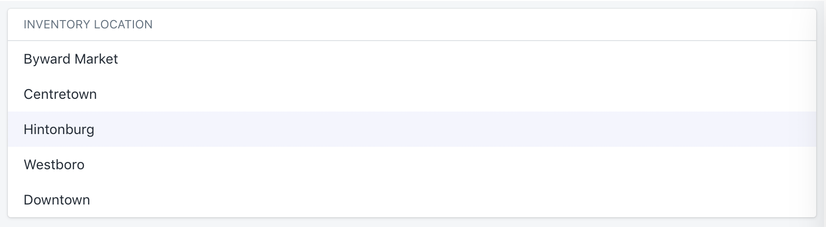
The contrast ratio for highlighting selected/active items in OptionList and ActionList feels poor. There is no visual differentiation between hovered items and selected items.
Expected behavior
Our color usage guidelines indicate that the color Indigo should be used to signify active/highlighted states:
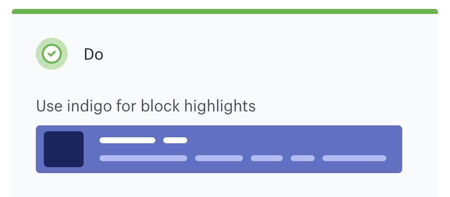
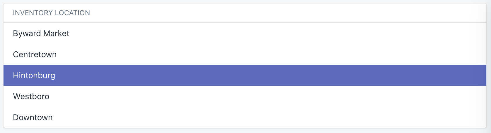
Based on those guidelines, this is what I would expect selected/active items to look like:
Actual behavior
 clauderic
All 2 comments
+1!
Currently working with this pattern and the contrast of a selected item feels too subtle, especially when mixed with an action list; it is super important for merchants to understand the difference between _actions_ (row and column actions) and _options_ (vertical alignment).
 annemarieleger
on 3 Sep 2019
annemarieleger
on 3 Sep 2019
+1 - we are using the action list item active state to show which item is selected in a Popover, and it a little unclear which item is selected with the current contrast ratio.
 andrewmcgov
on 29 Oct 2019
andrewmcgov
on 29 Oct 2019
Related issues
 HYPD
·
3Comments
HYPD
·
3Comments
 andrewpye
·
3Comments
andrewpye
·
3Comments
 mbaumbach
·
3Comments
mbaumbach
·
3Comments
 alex-page
·
3Comments
alex-page
·
3Comments
 nemoeric
·
3Comments
nemoeric
·
3Comments
Most helpful comment
+1!
Currently working with this pattern and the contrast of a selected item feels too subtle, especially when mixed with an action list; it is super important for merchants to understand the difference between _actions_ (row and column actions) and _options_ (vertical alignment).