Polaris-react: [Color system] system proposal
Brand - #5C6AC4
The color semantically tied to the brand in the system will be indigo. It will also feature variants for lightness at two stops, variants for darkness at two stops, and a text variant with accessible levels of contrast. It needs to also support transparency, so it will feature opacity variants based on the base beginning at .05, then .1, and extending up to .9.
Components
|Action list|Tabs|Navigation|Resource List|Option List|Icon darkest|Icon dark|Icon base|Icon light|Icon lighter|Text Field|Select|Range slider|Radio Button|Date Picker|Check Box|Button|Button primary|
|-|-|-|-|-|-|-|-|-|-|-|-|-|-|-|-|-|-|
| |
| |
| |
| |
| |
| |
| |
| |
| |
| |
| |
| |
| |
| |
| |
| |
| |
| |
|
Interactive - #007ACE
The color semantically tied to interactivity in the system will be blue. It will also feature variants for lightness at two stops, variants for darkness at two stops, and a text variant with accessible levels of contrast. It needs to also support transparency, so it will feature opacity variants based on the base beginning at .05, then .1, and extending up to .9.
Components
|link|plain button|badge|icon lighter|icon light|icon base|icon dark|icon darker|
|-|-|-|-|-|-|-|-|
| |
| |
| |
| |
| |
| |
| |
| |
|
Timeliness - #47C1BF
The color semantically tied to timeliness in the system will be teal. It will also feature variants for lightness at two stops, variants for darkness at two stops, and a text variant with accessible levels of contrast.
Components
|Indicator|Spinner|Progress Bar|Loading|Information Banner|Icon darkest|Icon dark|Icon base|Icon light|Icon lighter|Information Badge|
|-|-|-|-|-|-|-|-|-|-|-|
| |
| |
| |
| |
| |
| |
| |
| |
| |
| |Currently blue|
Positive - #50B83C
The color semantically tied to positivity in the system will be green. It will also feature variants for lightness at two stops, variants for darkness at two stops, and a text variant with accessible levels of contrast.
Components
|badge|banner|positive text style|icon lighter|icon base|icon dark|
|-|-|-|-|-|-|
| |
| |
| |
| |
| |
| |
|
Attention - #EEC200
The color semantically tied to attention in the system will be yellow. It will also feature variants for lightness at two stops, variants for darkness at two stops, and a text variant with accessible levels of contrast.
Components
|Badge attention|Banner warning|Icon dark|Icon base|Icon lighter|
|-|-|-|-|-|
| |
| |
| |
| |
| |
|
Warning - #F49342
The color semantically tied to warning in the system will be orange. It will also feature variants for lightness at two stops, variants for darkness at two stops, and a text variant with accessible levels of contrast.
Components
|warning badge|icon|warning banner|exception list warning|
|-|-|-|-|
| |
| |Does not yet exist|Currently yellow|
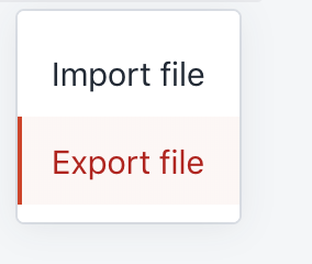
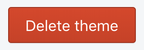
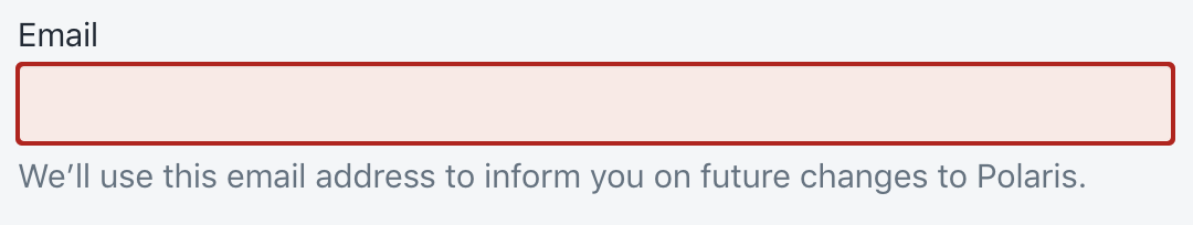
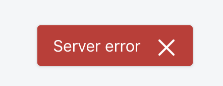
Negative - #DE3618
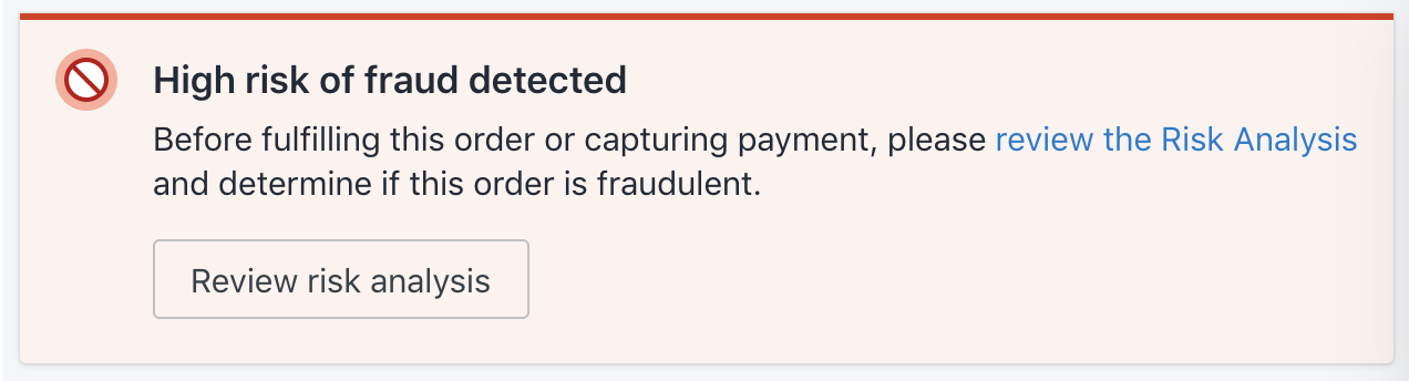
The color semantically tied to negativity in the system will be red. It will also feature variants for lightness at two stops, variants for darkness at two stops, and a text variant with accessible levels of contrast. It needs to also support transparency, so it will feature opacity variants based on the base beginning at .05, then .1, and extending up to .9.
Components
|Banner critical|Action List Item destructive|Button destructive|Text field error|Checkbox error|Exception list critical|Range slider error|Select error|Text style negative|Toast error|Icon dark|Icon base|Icon lighter|
|-|-|-|-|-|-|-|-|-|-|-|-|-|
| |
| |
| |
| |
| |
| |
| |
| |
| |
| |
| |
| |
| |
|
Accent - #9C6ADE
While not tied to a specific semantic meaning, the color for accents in the system will be purple. It will also feature variants for lightness at two stops, variants for darkness at two stops, and a text variant with accessible levels of contrast.
Components
|icon|
|-|
| |
|
Surface #F9FAFB
The color system will need to support an expressive range of greys incorporating ranging from white to black. These will be generated when given a base value that should be nearly white, or nearly black. When given a light value, it will generate 29 stops ranging all the way to black. When given a dark value, it will generate 29 stops ranging all the way to white. This approach will allow us to support dark mode, as the value opposite of the base will be used for a text color where the base value is the background color. Both the base value and the opposite value will generate opacity stops beginning at .05, then .1, and extending up to .9. A specific text color will not be generated as the base opposing value is intended for this case. Surface will also need to generate a value for shadows, with opacity stops, that will be pulled from whichever value is dark (either the base or the opposing value).
For dark mode, #212B36 would be used as the base.
Components
Base surface values ranging up to the middle of the spectrum are used as page background, the background for interactive elements like form elements and buttons, and for some text.
Opposing surface values ranging down to the middle are used in interactive elements like form elements and buttons, as text, and as a border color.
 danrosenthal
All 10 comments
I really like this, it’s headed in the right direction. Color roles, YAS 👍
One section that isn’t quite there for me is the one on greys—other than the page background, these aren’t expressed as roles like the others.
I also love that this is summarized in one place. It reminds me about something you said offline, wondering about which color roles should be themable. The Timeliness role is a good one to think about here. What happens if my brand color is teal?
What do you think about stress-testing this proposal with some real-world scenarios? You could consider:
- Theming for an existing 3rd-party app
- A non-Shopify brand (maybe Arrive?) or imagine if Shopify re-branded
- Dark mode
It might also be interesting to do another kind of test, by taking some other color systems and seeing how they would support the current Polaris look and feel. I’m thinking of Material and IBM’s design language. What do you like/dislike about these other color systems? How much would these systems need to bend to support Polaris today?
 ry5n
on 31 May 2019
ry5n
on 31 May 2019
This is awesome feedback @ry5n, thank you! I'd love the chance to chat more about Grey 1:1 if you have some time next week
danrosenthal
on 31 May 2019
I’ll definitely have some time next week. Feel free to book something in my calendar.
In the meantime, Material is an interesting system to look at for greys. They do a thing where they split their color roles, with specific ones for background and foreground. For example:
- Primary, typically a brand color
- Surface, typically neutral (white/grey)
- On Primary, for text/icons placed against a Primary background
- On Surface, for text/icons placed against a Surface background
You can see the full set of roles in the Material color docs.
ry5n
on 31 May 2019
I ran across an issue related to a lack of color range in Polaris today: https://github.com/Shopify/polaris-ux/issues/115
ry5n
on 4 Jun 2019
Passing through with a couple of notes:
In these cases [for dark mode], we may need to intelligently change the lightness stops to darkness stops, and vice versa.
This is functionally how color inversion works in accessibility settings that support it; colors flip to their "opposite" (teal becomes orange, for example). The contrast ratio of the element against its background is maintained. 👍
a text variant with accessible levels of contrast
We'll also need to maintain contrast levels for icons and other non-text indicators like button backgrounds, since they fall under non-text contrast.
 dpersing
on 5 Jun 2019
dpersing
on 5 Jun 2019
Deep color roles
These roles can be used to create depth in the system, so they need more variants, and opacified values
Surface
Surface requires a wide range of stops to support our expressive use of greys in the system. Unlike other values, if given a light value, it uses that value as 0 and generates darkened stops. If given a dark value, it uses that value as 0 and generates darkened stops. This is built this way to support dark mode.
Base
--polaris-surface-0: #FFFFFF;
Generated variants
- 29 stops
- 3% increment
--polaris-surface-1: #f7f7f7;
--polaris-surface-2: #f0f0f0;
--polaris-surface-3: #e8e8e8;
--polaris-surface-4: #e0e0e0;
--polaris-surface-5: #d9d9d9;
--polaris-surface-6: #d1d1d1;
--polaris-surface-7: #c9c9c9;
--polaris-surface-8: #c2c2c2;
--polaris-surface-9: #bababa;
--polaris-surface-10: #b3b3b3;
--polaris-surface-11: #ababab;
--polaris-surface-12: #a3a3a3;
--polaris-surface-13: #9c9c9c;
--polaris-surface-14: #949494;
--polaris-surface-15: #8c8c8c;
--polaris-surface-16: #858585;
--polaris-surface-17: #7d7d7d;
--polaris-surface-18: #757575;
--polaris-surface-19: #6e6e6e;
--polaris-surface-20: #666666;
--polaris-surface-21: #5e5e5e;
--polaris-surface-22: #575757;
--polaris-surface-23: #4f4f4f;
--polaris-surface-24: #474747;
--polaris-surface-25: #404040;
--polaris-surface-26: #383838;
--polaris-surface-27: #303030;
--polaris-surface-28: #292929;
--polaris-surface-29: #212121;
Opacified
Also unlike other values, surface generates a range of opacified values for the base value, and another range of opacified values for the darkest opposing values. This is because we use opaque variants of both "black" and "white" throughout the system. _A middle opaque range may also be called for, but I'd like to avoid it if possible_.
--polaris-surface-baseOpacified05: hsl(0, 0%, 100%, 0.05);
--polaris-surface-baseOpacified1: hsl(0, 0%, 100%, 0.1);
--polaris-surface-baseOpacified2: hsl(0, 0%, 100%, 0.2);
--polaris-surface-baseOpacified3: hsl(0, 0%, 100%, 0.3);
--polaris-surface-baseOpacified4: hsl(0, 0%, 100%, 0.4);
--polaris-surface-baseOpacified5: hsl(0, 0%, 100%, 0.5);
--polaris-surface-baseOpacified6: hsl(0, 0%, 100%, 0.6);
--polaris-surface-baseOpacified7: hsl(0, 0%, 100%, 0.7);
--polaris-surface-baseOpacified8: hsl(0, 0%, 100%, 0.8);
--polaris-surface-baseOpacified9: hsl(0, 0%, 100%, 0.9);
--polaris-surface-opposingOpacified05: hsl(0, 0%, 13%, 0.05);
--polaris-surface-opposingOpacified1: hsl(0, 0%, 13%, 0.1);
--polaris-surface-opposingOpacified2: hsl(0, 0%, 13%, 0.2);
--polaris-surface-opposingOpacified3: hsl(0, 0%, 13%, 0.3);
--polaris-surface-opposingOpacified4: hsl(0, 0%, 13%, 0.4);
--polaris-surface-opposingOpacified5: hsl(0, 0%, 13%, 0.5);
--polaris-surface-opposingOpacified6: hsl(0, 0%, 13%, 0.6);
--polaris-surface-opposingOpacified7: hsl(0, 0%, 13%, 0.7);
--polaris-surface-opposingOpacified8: hsl(0, 0%, 13%, 0.8);
--polaris-surface-opposingOpacified9: hsl(0, 0%, 13%, 0.9);
Brand
Brand generates a wider range of lightened and darkened stops to support its complex usage in building out the primary variant of our button. A flatter aesthetic would require fewer stops.
Base
--polaris-brand: #5C6AC4;
Generated variants
- 9 lighten and darken stops
- 5% increment
--polaris-brand-lightened1: #6d79ca;
--polaris-brand-lightened2: #808ad1;
--polaris-brand-lightened3: #929cd8;
--polaris-brand-lightened4: #a5addf;
--polaris-brand-lightened5: #b8bee5;
--polaris-brand-lightened6: #cbcfec;
--polaris-brand-lightened7: #dde0f3;
--polaris-brand-lightened8: #f0f1fa;
--polaris-brand-lightened9: #ffffff;
--polaris-brand-darkened1: #4757bd;
--polaris-brand-darkened2: #3e4dac;
--polaris-brand-darkened3: #37459a;
--polaris-brand-darkened4: #313c87;
--polaris-brand-darkened5: #2a3474;
--polaris-brand-darkened6: #232b61;
--polaris-brand-darkened7: #1c234f;
--polaris-brand-darkened8: #161b3c;
--polaris-brand-darkened9: #0f1229;
Brand opacified
--polaris-brand-opacified05: hsl(232, 47%, 56%, 0.05);
--polaris-brand-opacified1: hsl(232, 47%, 56%, 0.1);
--polaris-brand-opacified2: hsl(232, 47%, 56%, 0.2);
--polaris-brand-opacified3: hsl(232, 47%, 56%, 0.3);
--polaris-brand-opacified4: hsl(232, 47%, 56%, 0.4);
--polaris-brand-opacified5: hsl(232, 47%, 56%, 0.5);
--polaris-brand-opacified6: hsl(232, 47%, 56%, 0.6);
--polaris-brand-opacified7: hsl(232, 47%, 56%, 0.7);
--polaris-brand-opacified8: hsl(232, 47%, 56%, 0.8);
--polaris-brand-opacified9: hsl(232, 47%, 56%, 0.9);
Text
--polaris-brand-on: #292f58;
Negative
Similar to brand, negative requires an expressive range of color stops to build out the critical button variant. A flatter aesthetic would reduce complexity.
Base
--polaris-negative: #DE3618;
Generated variants
- 9 lighten and darken stops
- 5% increment
--polaris-negative-lightened1: #e74427;
--polaris-negative-lightened2: #ea583e;
--polaris-negative-lightened3: #ec6c55;
--polaris-negative-lightened4: #ef806c;
--polaris-negative-lightened5: #f19483;
--polaris-negative-lightened6: #f4a79a;
--polaris-negative-lightened7: #f6bbb1;
--polaris-negative-lightened8: #f9cfc8;
--polaris-negative-lightened9: #fbe3df;
--polaris-negative-darkened1: #c53016;
--polaris-negative-darkened2: #ae2b13;
--polaris-negative-darkened3: #972511;
--polaris-negative-darkened4: #811f0e;
--polaris-negative-darkened5: #6a1a0c;
--polaris-negative-darkened6: #531409;
--polaris-negative-darkened7: #3c0f07;
--polaris-negative-darkened8: #250904;
--polaris-negative-darkened9: #0e0302;
Negative opacified
--polaris-negative-opacified05: hsl(9, 80%, 48%, 0.05);
--polaris-negative-opacified1: hsl(9, 80%, 48%, 0.1);
--polaris-negative-opacified2: hsl(9, 80%, 48%, 0.2);
--polaris-negative-opacified3: hsl(9, 80%, 48%, 0.3);
--polaris-negative-opacified4: hsl(9, 80%, 48%, 0.4);
--polaris-negative-opacified5: hsl(9, 80%, 48%, 0.5);
--polaris-negative-opacified6: hsl(9, 80%, 48%, 0.6);
--polaris-negative-opacified7: hsl(9, 80%, 48%, 0.7);
--polaris-negative-opacified8: hsl(9, 80%, 48%, 0.8);
--polaris-negative-opacified9: hsl(9, 80%, 48%, 0.9);
Text
--polaris-negative-on: #63180b;
Interactive
Interactive is the only other color role which generates opacified values, as they can be used for UI focus states.
Base
--polaris-interactive: #007ACE;
Generated variants
- 2 lighten and darken stops
- 22% increment
--polaris-interactive-lightened1: #3db1ff;
--polaris-interactive-lightened2: #addeff;
--polaris-interactive-darkened1: #00375c;
--polaris-interactive-darkened2: #000000;
Interactive opacified
--polaris-interactive-opacified05: hsl(204, 100%, 40%, 0.05);
--polaris-interactive-opacified1: hsl(204, 100%, 40%, 0.1);
--polaris-interactive-opacified2: hsl(204, 100%, 40%, 0.2);
--polaris-interactive-opacified3: hsl(204, 100%, 40%, 0.3);
--polaris-interactive-opacified4: hsl(204, 100%, 40%, 0.4);
--polaris-interactive-opacified5: hsl(204, 100%, 40%, 0.5);
--polaris-interactive-opacified6: hsl(204, 100%, 40%, 0.6);
--polaris-interactive-opacified7: hsl(204, 100%, 40%, 0.7);
--polaris-interactive-opacified8: hsl(204, 100%, 40%, 0.8);
--polaris-interactive-opacified9: hsl(204, 100%, 40%, 0.9);
Text
--polaris-interactive-on: #00375c;
Flat color roles
These roles have flat usage in our system, so they fewer more variants, and no opacified values
Each has generated variants with:
- 2 lighten and darken stops
- 22% increment
Timely
Base
--polaris-timely: #47C1BF;
Generated variants
--polaris-timely-lightened1: #9cdedd;
--polaris-timely-lightened2: #f0fafa;
--polaris-timely-darkened1: #267371;
--polaris-timely-darkened2: #0a1f1e;
Text
--polaris-timely-on: #205756;
Positive
Base
--polaris-positive: #50B83C;
Generated variants
--polaris-positive-lightened1: #98da8b;
--polaris-positive-lightened2: #e4f5e0;
--polaris-positive-darkened1: #2c6420;
--polaris-positive-darkened2: #070f05;
Text
--polaris-positive-on: #24531b;
Attention
Base
--polaris-attention: #EEC200;
Generated variants
--polaris-attention-lightened1: #ffe261;
--polaris-attention-lightened2: #fff7d1;
--polaris-attention-darkened1: #806800;
--polaris-attention-darkened2: #0f0c00;
Text
--polaris-attention-on: #6c5800;
Warning
Base
--polaris-warning: #F49342;
Generated variants
--polaris-warning-lightened1: #fad0ad;
--polaris-warning-lightened2: #ffffff;
--polaris-warning-darkened1: #bc5b0b;
--polaris-warning-darkened2: #522705;
Text
--polaris-warning-on: #6e421e;
Accent
Base
--polaris-accent: #9C6ADE;
Generated variants
--polaris-accent-lightened1: #d8c4f2;
--polaris-accent-lightened2: #ffffff;
--polaris-accent-darkened1: #6227b0;
--polaris-accent-darkened2: #2f1254;
Text
--polaris-accent-on: #462f64;
danrosenthal
on 24 Jun 2019
Technical design document
https://docs.google.com/document/d/1AcBF7aRxBUSvpNhnzjsQCJDEZixAOgsWAb8bIOHZ_MU/edit#heading=h.ivvns6rnzv1d
danrosenthal
on 25 Jun 2019
Of the types of colors listed, I wanted to flag the positive to negative spectrum colors as ones we might want to consider for i18n (able to be customized) so they can later be localized (l10n):
- Brand (our opinion)
- Interactive (our opinion)
- Timeliness (our opinion)
- Positive ⚠️ (possible preconceptions)
- Attention ⚠️ (possible preconceptions)
- Warning ⚠️ (possible preconceptions)
- Negative ⚠️ (possible preconceptions)
- Accent (our opinion)
- Page (our opinion)
- Ink (our opinion)
I think the best example to use is that red and green are reversed when talking about up and down (stock market) in at least China and Japan. I am by no means an expert on this and know little details beyond a few Google searches, but aware it is a thing. https://graphicdesign.stackexchange.com/questions/6982/except-china-which-country-will-use-red-for-up-and-green-for-down
But maybe the internet has widely adopted this positive to negative color spectrum?
 tmlayton
on 2 Jul 2019
tmlayton
on 2 Jul 2019
@tmlayton, this feels like a wait and see kind of decision. I think we should start with a minimally permissive API, and expand that based on what we learn moving forward. As our strategy for localization matures, we may well want to expose the values you mentioned for theming, but I think we should not do it at the outset.
danrosenthal
on 3 Jul 2019
Closing this issue, as it no longer accurately summarizes the work of this project. We have changed tacks to now implement the master brand.
Work in its current state can be seen here: https://www.figma.com/file/nL2OnfyGegWJAKJauvsUJF/Color-System-Sprint?node-id=202%3A190
danrosenthal
on 27 Aug 2019
Related issues
 vilav
·
3Comments
vilav
·
3Comments
 janklimo
·
3Comments
janklimo
·
3Comments
 andrewpye
·
3Comments
andrewpye
·
3Comments
 grandelc
·
3Comments
grandelc
·
3Comments
 greghesp
·
3Comments
greghesp
·
3Comments
Most helpful comment
I really like this, it’s headed in the right direction. Color roles, YAS 👍
One section that isn’t quite there for me is the one on greys—other than the page background, these aren’t expressed as roles like the others.
I also love that this is summarized in one place. It reminds me about something you said offline, wondering about which color roles should be themable. The
Timelinessrole is a good one to think about here. What happens if my brand color is teal?What do you think about stress-testing this proposal with some real-world scenarios? You could consider:
It might also be interesting to do another kind of test, by taking some other color systems and seeing how they would support the current Polaris look and feel. I’m thinking of Material and IBM’s design language. What do you like/dislike about these other color systems? How much would these systems need to bend to support Polaris today?