Polaris-react: [Color system][Badge][Banner] inconsistent color usage and variant options
Currently the use of colors to convey variants with the same meaning is inconsistent across the Badge and Banner components. In some cases, a different color us used to convey the same variant across these components. In other cases, the same variants are not available in both components.
We should make this consistent across components so merchants can reliably associate color with the severity of badges and banners.
Default
Default is consistent in its use of sky across both components, and should be left as-is.
|Badge|Banner|
|-|-|
| |
| |
|
Information
|Badge|Banner|
|-|-|
| |
| |
|
Badge uses blue as its base color, while banner uses teal. Using teal for badge as well as banner would create more consistency while improving color contrast in the information variant of the badge component.
Attention
|Badge|Banner|
|-|-|
| |No such variant|
The badge component uses yellow to communicate the attention variation, while the banner component has no such variant. The banner component uses yellow to communicate a warning state.
Warning
|Badge|Banner|
|-|-|
| |
|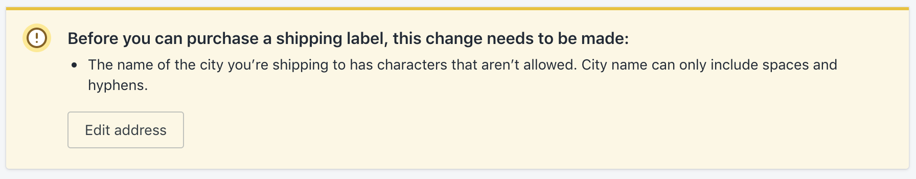 |
|
The badge component uses orange as a base color to communicate a warning state, while the banner component uses yellow to communicate a warning state. For the badge component, yellow communicates the attention state as shown above.
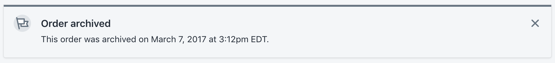
Critical
|Badge|Banner|
|-|-|
|No such variant|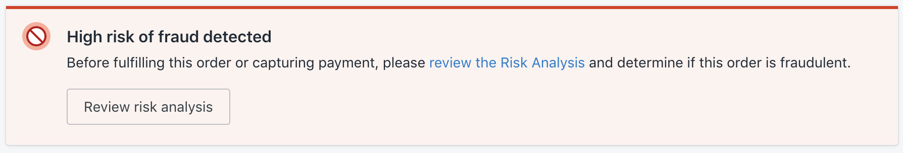 |
|
While the badge component does not have a critical variant, the banner component uses red to communicate a critical variant.
NB The rails implementation does have a critical variant for badge which uses red as its base color.
Success
Success is consistent in its use of green across both components, and should be left as-is.
|Badge|Banner|
|-|-|
| |
| |
|
Overall recommendation
Unify the use of color and variants across these components.
|Variant|Color|Badge|Banner|
|-|-|-|-|
|Default|Sky| ☑️| ☑️|
|Information|Teal| ☑️| ☑️|
|Attention|Yellow| ☑️| ☑️|
|Warning|Orange| 🔥| 🔥|
|Critical|Red| ☑️| ☑️|
|Success|Green| ☑️| ☑️|
Consider eliminating warning
- its use-case is unclear
- removing it would simplify decision making for designers, and make meaning clearer for merchants
Eliminating the warning variant would also allow us to remove orange from the color palette, as orange is only used for the warning badge, and for variants of icon and avatar.
 danrosenthal
All 8 comments
cc: @ry5n @jessebc @allylane @sarahill
danrosenthal
on 8 May 2019
In general this makes sense. In particular, making each color mean the same thing across components is really important. (There’s at least one existing issue about the color discrepancies).
Don’t forget that teal has come to mean “new” (even though it’s a bit broken with the change of the new badge to grey), and we have a grey base color for badges and banners.
Finally, I don’t think it’s necessary to offer each component with every status. For example, maybe a “new” banner doesn’t make sense because banners are inherently for higher-importance communication, and we never want “new” hints to hit that hard. I think this is why some statuses are absent from some components today. If this idea holds, it could be really helpful to document, since it helps reinforce the purpose of each component.
 ry5n
on 8 May 2019
ry5n
on 8 May 2019
Good call @ry5n, I've updated this to reflect the default variant of both of these components and how it consistently uses sky.
I've left the new variant of badge out of this discussion as it feels a bit set apart from the rest of these variants. I agree that there doesn't need to be a new variant for banner.
danrosenthal
on 8 May 2019
https://github.com/Shopify/polaris-ux/issues/110 is interesting, as it advocates using blue for information. I disagree with that, as unifying around teal for information would result in an overall simpler color system. Blue feels inappropriate for this as it is used for text links currently.
Thinking of teal in the context of timely information feels right to me.
danrosenthal
on 8 May 2019
cc: @alex-page @AndrewMusgrave
danrosenthal
on 8 May 2019
@danrosenthal this is great i've been watching the colour system issues all day!
I sit somewhere in the middle. I feel like blue is the colour for information however teal is pretty much blue :). Bootstrap uses teal for information and they use blue for there primary colour. This is because they use the one palette across multiple components:
https://getbootstrap.com/docs/4.3/components/alerts/#link-color
This might be worth exploring across a few components as we use alert colours throughout Polaris. Some additional examples include button destructive and error toast etc.
 alex-page
on 8 May 2019
alex-page
on 8 May 2019
Remember that currently we make a distinction between “info” which really means advice or tip, and “new” which is used for new features. If we want to merge the 2 that’s maybe a larger UX question
ry5n
on 8 May 2019
No immediate action needs to be taken here. Closing.
danrosenthal
on 23 Sep 2019
Related issues
 wmceff
·
3Comments
wmceff
·
3Comments
 grandelc
·
3Comments
grandelc
·
3Comments
 janklimo
·
3Comments
janklimo
·
3Comments
 andrewpye
·
3Comments
andrewpye
·
3Comments
andrewpye
·
3Comments
andrewpye
·
3Comments
Most helpful comment
In general this makes sense. In particular, making each color mean the same thing across components is really important. (There’s at least one existing issue about the color discrepancies).
Don’t forget that teal has come to mean “new” (even though it’s a bit broken with the change of the new badge to grey), and we have a grey base color for badges and banners.
Finally, I don’t think it’s necessary to offer each component with every status. For example, maybe a “new” banner doesn’t make sense because banners are inherently for higher-importance communication, and we never want “new” hints to hit that hard. I think this is why some statuses are absent from some components today. If this idea holds, it could be really helpful to document, since it helps reinforce the purpose of each component.