Polaris-react: Header of resource-list
Issue summary
why I can't add a header in resource-list
Expected behavior
Add a header in resource-list
Actual behavior
Hello,
I am working on Polaris to build my website. And I get a question of resource-list, why I can't add a header in resource-list. Because I saw there is a header when Shopify use resource-list.
Do you have some plan to add a header in resource-list?
Steps to reproduce the problem
Specifications
- Are you using the React components? (Y/N):
- Polaris version number:
- Browser:
- Device:
- Operating System:
⚓️ We’re not accepting pull requests at this time
🗒 We _are_ accepting issue reports and feature requests
🌟 Feature requests that we can’t get to right away will be closed. However, we track all requests and will use it to set priorities. See the contribution guidelines for more information.
 zheren2018
All 12 comments
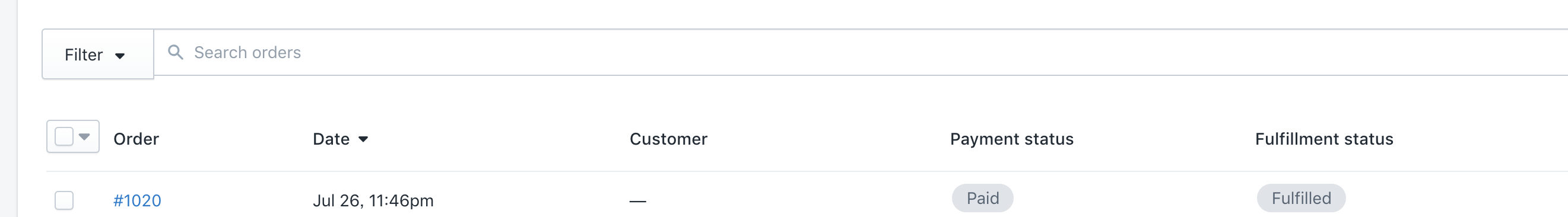
Hi @zheren2018, great question. The screenshot you included is from the orders index which is not yet using our resource list component and we have no plans to add a header to the resource list component. Instead, that information should be moved within each resource list item. See https://polaris.shopify.com/components/lists-and-tables/resource-list#section-case-study for examples.
The center contents of resource list items (besides the checkbox, media, and actions) is meant to be rather freeform and you should not feel restricted to a table-like layout.
I’ll close this issue for now, but we encourage everyone who wants this feature to add a 👍 to the original issue report. We’ll take your collective interest into account when we look at what to work on next.
💜
 tmlayton
on 2 Aug 2018
tmlayton
on 2 Aug 2018
This would be an amazing addition! That Orders table would be incredibly useful.
Since it's been a year, I was wondering if the feedback was enough to see if we can bring this in to a future version of Polaris? 😄
 kyleboss
on 29 Dec 2019
kyleboss
on 29 Dec 2019
Hi @tmlayton and @chloerice (or anyone on the Shopify team, really),
Does Shopify plan on adding something like the Shopify admin's orders list to Polaris?
Without header functionality on the resource list, at times I feel as if I'm forced to choose between UI that's too noisy or potentially unclear. If the Shopify admin orders list didn't have headers, the UI would not be nearly as user friendly as it stands today.
 eugene-kim
on 15 Jul 2020
eugene-kim
on 15 Jul 2020
Hey @eugene-kim, I agree this is useful and an established pattern in the Shopify admin although there is no plan to add this at the moment.
/cc @dfmcphee
tmlayton
on 15 Jul 2020
Hey @tmlayton , understood. Thanks for the quick response!
eugene-kim
on 15 Jul 2020
I'm waiting this useful feature too 😃
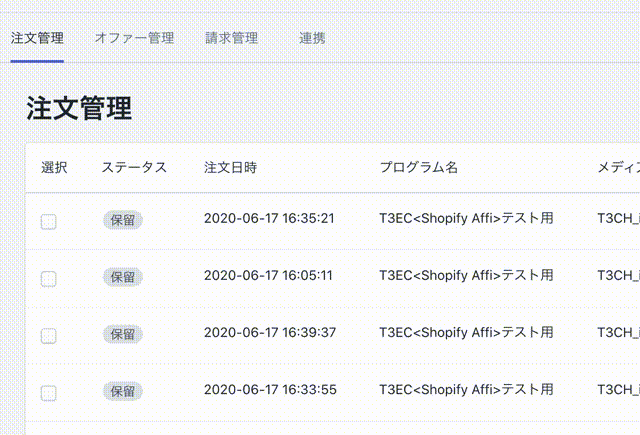
For now, We built UI using React Hooks and DataTable component like below.
 camelmasa
on 21 Jul 2020
camelmasa
on 21 Jul 2020
@camelmasa could you post example of how you implemented the example you show? I am trying to workaround no column headers in ResourceList as well and I like what you did.
 jamieroyce
on 1 Aug 2020
jamieroyce
on 1 Aug 2020
@jamieroyce Our code like this.
    <Card>
      {checkedOrders.length !== 0 ? (
        <div
          style={{
            paddingTop: '8px',
            paddingBottom: '8px',
            paddingLeft: '14px',
            borderBottom: '0.1rem solid var(--p-border, #c4cdd5)',
          }}
        >
          <ButtonGroup segmented>
            <Button onClick={reject}>Reject</Button>
            <Button onClick={approve} primary>
              Approve
            </Button>
          </ButtonGroup>
        </div>
      ) : (
        <></>
      )}
      <DataTable
        truncate={true}
        columnContentTypes={['text']}
        headings={checkedOrders.length === 0 ? ['TEXT'] : []}
        rows={rows}
      />
    </Card>
checkedOrders is checked ids array. Checkboxes have onChange events.
I hope this example helps you.
camelmasa
on 1 Aug 2020
After much exploration and experimentation we have decided we won't be adding this feature to the ResourceList as semantically the markup and structure does not make sense with headers.
Instead, we have been experimenting with a new IndexTable component. It is still in the early stages and is unstable and subject to change so proceed with caution for now.
This new component works much better with headers because it uses an actual HTML table under the hood, which is more semantic and much better for accessibility.
 dfmcphee
on 6 Aug 2020
dfmcphee
on 6 Aug 2020
After much exploration and experimentation we have decided we won't be adding this feature to the
ResourceListas semantically the markup and structure does not make sense with headers.Instead, we have been experimenting with a new
IndexTablecomponent. It is still in the early stages and is unstable and subject to change so proceed with caution for now.This new component works much better with headers because it uses an actual HTML table under the hood, which is more semantic and much better for accessibility.
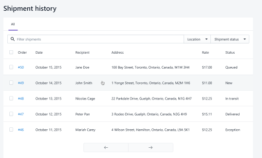
I need to make a History table like this, it is just the same as order page. How to make a table like this? With Datatable & Resourelist. Please Help.
 prats8m2
on 18 Aug 2020
prats8m2
on 18 Aug 2020
Hello, this is my current way to implement a Header on ResourceList Component:
ResourceList Component:
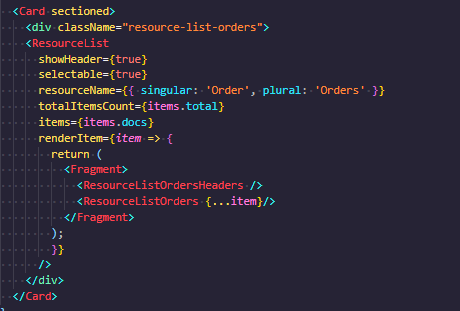
ResourceList Header Component:
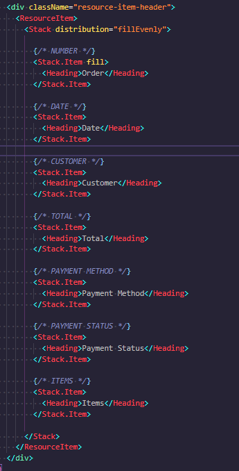
Custom CSS:
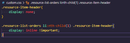
Result:

It works !
: )
 roblesh-mms
on 13 Nov 2020
roblesh-mms
on 13 Nov 2020
@camelmasa Hi!
How do you add a checkbox to the table?
 Alexzanderk
on 29 Dec 2020
Alexzanderk
on 29 Dec 2020
Related issues
 alex-page
·
3Comments
alex-page
·
3Comments
 MateusJabour
·
3Comments
MateusJabour
·
3Comments
 pbojinov
·
3Comments
pbojinov
·
3Comments
 nemoeric
·
3Comments
nemoeric
·
3Comments
 janklimo
·
3Comments
janklimo
·
3Comments
Most helpful comment
After much exploration and experimentation we have decided we won't be adding this feature to the
ResourceListas semantically the markup and structure does not make sense with headers.Instead, we have been experimenting with a new
IndexTablecomponent. It is still in the early stages and is unstable and subject to change so proceed with caution for now.This new component works much better with headers because it uses an actual HTML table under the hood, which is more semantic and much better for accessibility.