Polaris-react: Modal component shows warning if no src is passed in even though it's optional
Issue summary
When using the Overlays/Modal and trying to pass in children without setting a src the component throws a warning and won't render the children.
Expected behavior
The Overlays/Modal should render children passed in and should not consider src a required property.
Actual behavior
The Overlay/Modal does not render passed in children and considers src a required property
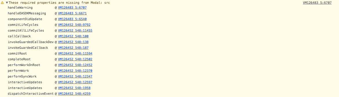
If you follow this stack tract it looks like handleEASDKMessaging is getting called by componentDidUpdate when the open prop changes, which hardcodes the type to 'easdk' even when it isn't.
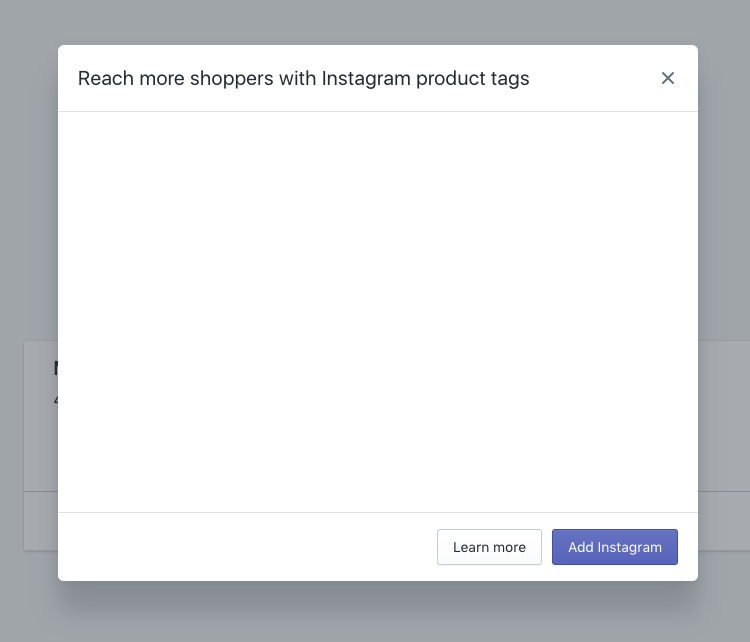
Here is the rendered component
Steps to reproduce the problem
- Import Modal from "@shopify/polaris"
- Create JSX component without setting the src prop and passing in children
- Attempt to open the Modal in the webpage
- Open the console and see the warning
Specifications
- Polaris version: 2.0.0
- React version: 16.3.2
- Browser: Chrome 66.0.3359.181
- Operating System: Mac
Code Example
Here is what my component looks like, for the most part just copied and pasted from the documentation.
import React, { Component } from 'react';
import { Button, Icon, TextStyle, TextContainer, Modal } from '@shopify/polaris';

class ModalExample extends React.Component {
    constructor(props, context) {
        super(props, context);
        this.state = {
          active: false,
        };

        this.handleChange = this.handleChange.bind(this);
    }

    handleChange() {
      this.setState(({active}) => ({active: !active}));
    };

    render() {
      const {active} = this.state;

      return (
        <div style={{height: '500px'}}>
          <Button onClick={this.handleChange}>Open</Button>
          <Modal
            open={active}
            onClose={this.handleChange}
            title="Reach more shoppers with Instagram product tags"
            primaryAction={{
              content: 'Add Instagram',
              onAction: this.handleChange,
            }}
            secondaryActions={[
              {
                content: 'Learn more',
                onAction: this.handleChange,
              },
            ]}
          >
            <Modal.Section>
              <TextContainer>
                <p>
                  Use Instagram posts to share your products with millions of
                  people. Let shoppers buy from your store without leaving
                  Instagram.
                </p>
              </TextContainer>
            </Modal.Section>
          </Modal>
        </div>
      );
    }

  }

export default ModalExample;
⚓️ We’re not accepting pull requests at this time
🗒 This repo is for reporting issues and feature requests only
 timcmiller
All 8 comments
Hi @timcmiller thanks for bringing this to our attention. Are you using the modal inside an embedded app?
 AndrewMusgrave
on 23 May 2018
AndrewMusgrave
on 23 May 2018
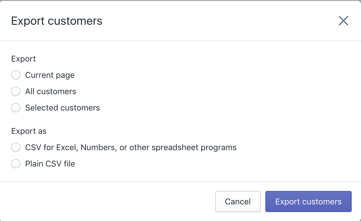
Hi @AndrewMusgrave, yes I am using this inside of an embedded app. But I would like to use the Overlay/Modal inside of it to replicate the Export modal you see on the Admin/Customers page on Shopify.
timcmiller
on 23 May 2018
Currently the embedded modal does not accept children. It's content is set from the src prop which accepts an iframe url of type string.
AndrewMusgrave
on 24 May 2018
And can I not use the Overlay Modal in an Embedded app?
timcmiller
on 24 May 2018
@AndrewMusgrave
I see two different modals in the component docs.
This is the one I'm wanting to us(Which maybe I can't use it in an Embedded App):
https://polaris.shopify.com/components/overlays/modal#navigation
And this one(Which seems like is the one that is loading):
https://polaris.shopify.com/components/embedded/embedded-modal#navigation
timcmiller
on 24 May 2018
I apologize our documentation regarding the modal is a little confusing at the moment. We current export one modal component that will behave different if it's in an embedded app. The props it accepts are also slightly different. Props that have the comment "Modal use only" will only work outside of an embedded app, "EASDK use only" will only work inside an embedded app and if there is no comment the prop will work in either. Let me know if you have any more questions!
AndrewMusgrave
on 24 May 2018
Thanks for clearing that up. I'm sad it won't work for my use case. ┌(˵༎ຶ ل͟ ༎ຶ˵)┐
Are you planning on adding support for children in the EASDK modal?
timcmiller
on 24 May 2018
@timcmiller We're experimenting with generating the content for the modal's iframe from the props and children provided so that the modal is easier to work with for embedded apps. We will update the community via comments in relevant issues with our progress.
 chloerice
on 25 May 2018
chloerice
on 25 May 2018
Related issues
 greghesp
·
3Comments
greghesp
·
3Comments
 mbaumbach
·
3Comments
mbaumbach
·
3Comments
 andrewpye
·
3Comments
andrewpye
·
3Comments
 MateusJabour
·
3Comments
andrewpye
·
3Comments
MateusJabour
·
3Comments
andrewpye
·
3Comments
Most helpful comment
@timcmiller We're experimenting with generating the content for the modal's iframe from the props and children provided so that the modal is easier to work with for embedded apps. We will update the community via comments in relevant issues with our progress.