Pluto.jl: Header font for 0123456789 is too artsy
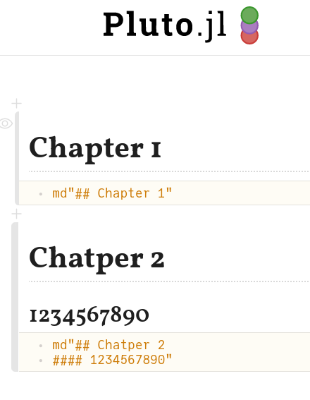
I personally have 2 "complaints":
- the
1is confusing - the "baseline" is weird for this font. <--- less of an issue
 Moelf
Moelf
All 8 comments
The 2 complaints are both just about the 10 digits, right?
 fonsp
on 28 Oct 2020
fonsp
on 28 Oct 2020
I am going to assume that it is, and otherwise refer to #2
fonsp
on 28 Oct 2020
The typeface contains variants that solve these problems:
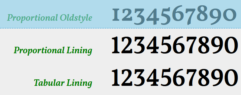
but these are not included in the google-fonts-compiled version
https://fonts.google.com/specimen/Vollkorn
(which we get from
https://github.com/fontsource/fontsource/tree/master/packages/vollkorn
to avoid CDN issues)
The solution could be to use the original fonts:
https://github.com/FAlthausen/Vollkorn-Typeface
but these still need to be compiled to WOFF2:
https://github.com/google/woff2
We can then host them on our own fork of the Vollkorn repo, tag a release, and get them from jsdelivr
fonsp
on 28 Oct 2020
The fork is here:
https://github.com/fonsp/Vollkorn-Typeface
if anyone wants to contribute
fonsp
on 28 Oct 2020
@fonsp opened a PR to your fork
 pankgeorg
on 5 Nov 2020
pankgeorg
on 5 Nov 2020
Thanks to @pankgeorg for compiling!
Available at:
https://cdn.jsdelivr.net/gh/fonsp/Vollkorn-Typeface@1/fonts/woff2/Vollkorn-Regular.woff2
demo:
https://fonsp.com/Vollkorn-Typeface/fonts/woff2/index.html
fonsp
on 11 Nov 2020
I'm fine with anything but the first. personally like the second one
Moelf
on 11 Nov 2020
Opened a PR that uses the second one. I think the third is for tables (kind-of-fixed witdth?)
I love the slashed zero, but it fits in tables/codeblocks (the JuliaMono dotted zero triggers my trypophobia I think)
pankgeorg
on 13 Nov 2020
Related issues
 FelixBenning
·
3Comments
FelixBenning
·
3Comments
 mossr
·
6Comments
mossr
·
6Comments
 karlwessel
·
4Comments
karlwessel
·
4Comments
 mlg556
·
4Comments
mlg556
·
4Comments
 MikaelSlevinsky
·
6Comments
MikaelSlevinsky
·
6Comments