Plots.jl: Variable spacing of markers for 2D line plot
I have been searching for a way to make a 2D line plot where the lines have markers, but the markers are not placed on every single data point but are placed at some user-defined interval.
If anyone has ever used the program Dplot www.dplot.com you'll know this is a very useful feature when plotting large data sets with thousands of points. The need for markers arises often as many journals still require that plots be understandable when printed in black & white. When you have a lot of curves the dash linestyles are often not enough and markers are needed, but if they get plotted on every point it makes the plot garbage.
As an example, I'm wanting a way to make something that looks similar to the figure below. The way I created it is really clunky though, and the legend is not really correct because only the marker is shown and the line is missing. I made this plot by sequentially plotting the sin(x) function as a line over a 101 x points and then plotting the markers over only 11 x points. I set the linewidth=0 for the line so that I wouldn't have duplicate entries in the legend. But again, the legend is not the way we would want it as it's missing the line.

If someone knows a way to do this I'd be very happy to hear it - even if it's a hack for the time being. But hopefully everyone will see the merit of this and make it a basic feature.
FYI, my preferred backend is plotlyjs.
 jman87
All 7 comments
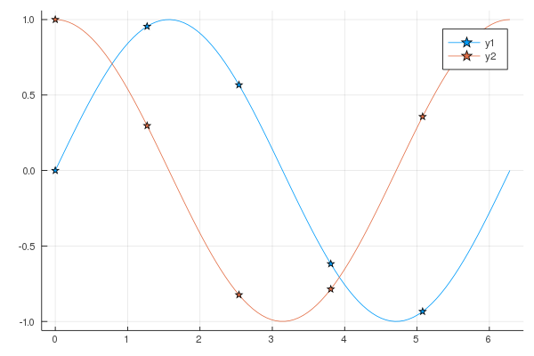
Is something like this enough or do you need more spacing?
plot(sin, markershape = :circle)
 mkborregaard
on 1 Apr 2020
mkborregaard
on 1 Apr 2020
You can hack your own recipe for stuff like that:
@recipe function f(::Type{Val{:samplemarkers}}, x, y, z; step = 10)
    n = length(y)
    sx, sy = x[1:step:n], y[1:step:n]
    # add an empty series with the correct type for legend markers
    @series begin
        seriestype := :path
        markershape --> :auto
        x := []
        y := []
    end
    # add a series for the line
    @series begin
        primary := false # no legend entry
        markershape := :none # ensure no markers
        seriestype := :path
        seriescolor := get(plotattributes, :seriescolor, :auto)
        x := x
        y := y
    end
    # return  a series for the sampled markers
    primary := false
    seriestype := :scatter
    markershape --> :auto
    x := sx
    y := sy
end
Then you can use it with e.g.
plot(range(0, 2π, length = 100), [sin, cos], seriestype = :samplemarkers)

or
plot(range(0, 2π, length = 100), [sin, cos], st = :samplemarkers, step = 20, shape = :star)
 daschw
on 1 Apr 2020
daschw
on 1 Apr 2020
daschw, it looks like that's exactly what I needed. I haven't seen an example like that anywhere else and I would never have figured that out on my own, so if you can could you please see if that could be added to the JuliaPlots documentation site? I'm sure others would benefit. Thank you so much!
jman87
on 1 Apr 2020
Great, for more info on Recipes check out http://docs.juliaplots.org/latest/recipes/ and http://juliaplots.org/RecipesBase.jl/dev/ or https://daschw.github.io/recipes/.
If you have an idea, how the Plots docs could highlight the capabilities of Recipes better, feel free to open a PR on https://github.com/JuliaPlots/PlotDocs.jl. Contributions are very welcome!
daschw
on 1 Apr 2020
daschw, I have a follow-up question as I can't seem to get the legend to display using this method.
Using the following codes produces the image below.
using Plots
@recipe function f(::Type{Val{:samplemarkers}}, x, y, z; step = 10)
    n = length(y)
    sx, sy = x[1:step:n], y[1:step:n]
    # add an empty series with the correct type for legend markers
    @series begin
        seriestype := :path
        markershape --> :auto
        x := []
        y := []
    end
    # add a series for the line
    @series begin
        primary := false # no legend entry
        markershape := :none # ensure no markers
        seriestype := :path
        seriescolor := get(plotattributes, :seriescolor, :auto)
        x := x
        y := y
    end
    # return  a series for the sampled markers
    primary := false
    seriestype := :scatter
    markershape --> :auto
    x := sx
    y := sy
end
plotlyjs()
labels = ["sin(x)" "cos(x)"]
plot(range(0, stop=2π, length=100), [sin, cos],
label=labels, seriestype=:samplemarkers)

If I don't load any backend I get what you showed above. But I've got a lot of stuff set up using plotlyjs and really don't want to have to change. Plus I like that it puts the legend outside of the plot so that it's not potentially covering up any of the data.
Can you give it a try with plotlyjs and see if you get the same behavior? Or is there some other setting I need to add to make plotlyjs work with this recipe?
Also, I'm running the long-term stable version of Julia 1.0.5, as I had some other plotting issues when I tried to upgrade.
jman87
on 1 Apr 2020
Huh, apparently Plotly does not add empty series to legends.
Replacing
x := []
y := []
with
x := [Inf]
y := [Inf]
in the recipe above works for me on GR, Plotly and PyPlot.
daschw
on 1 Apr 2020
Awesome! That got it!
jman87
on 1 Apr 2020
Related issues
 nebuta
·
3Comments
nebuta
·
3Comments
 crstnbr
·
3Comments
crstnbr
·
3Comments
 kleinschmidt
·
3Comments
kleinschmidt
·
3Comments
 jebej
·
4Comments
jebej
·
4Comments
 PallHaraldsson
·
4Comments
PallHaraldsson
·
4Comments
Most helpful comment
You can hack your own recipe for stuff like that:
Then you can use it with e.g.
or