Plotly.js: Violin plot hover labels lose formatting
Hi there,
I don't have experience writing Javascript, so I can't offer a solution. However, I want to report some issues with the violin plot hover labels losing their formatting when certain criteria are met.
Expected result: Violin plot hover text has a background color and text color matching/determined by the color of the violin plot.
Actual result: Hover text has a transparent background and white text (hardly visible against white background)
Steps to reproduce
- Create new violin plot with the following settings:
trace = {
    "type": "violin",
    "x": ["x", "x", "x", "x", "x"],
    "y": [1, 2, 3.0000001, 4, 5],
    "meanline": {"visible": True},
    "hoverinfo": "y",
    "hoveron": "violins+points+kde"
}
layout = {"plot_bgcolor": "black"}
figure = go.Figure(data=[trace], layout=layout)
The plot background set to black is only to see the white text due to the lost formatting.
Observe the following:

The hover labels are incorrectly formatted. Ifpoints: 'all'is enabled, the point hover labels also have incorrect formatting.Change one of the following to restore correct behavior:
y: [1, 2, 3.0000001, 4, 5]toy: [1, 2, 3, 4, 5]meanline: {"visible": True}tomeanline: {"visible": False}hoveron: "violins+points+kde"to any other option forhoveron, including just"kde"
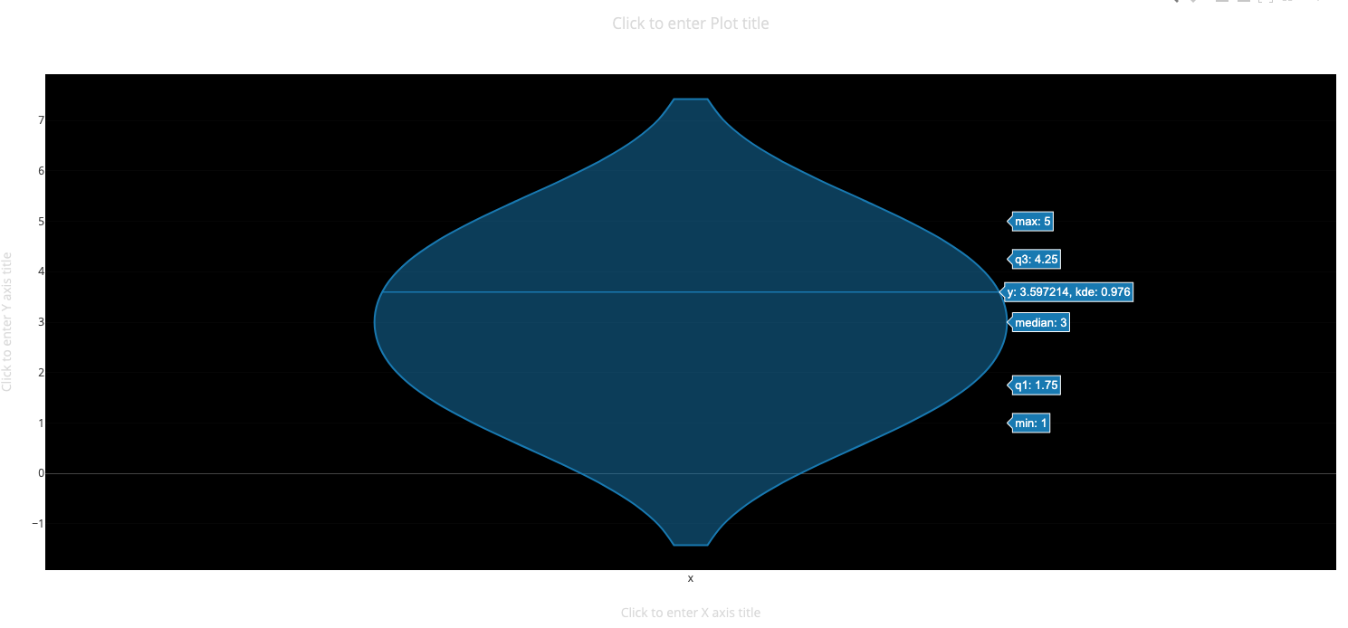
Example above is with mean line hidden.
Notes: This occurs using the Python API and in the online editor, so I think this is an underlying issue with the plotly.js. In addition, the formatting disappears depending on the axes limits of the plot, set by zooming or manually in code. If the zoom level is not set such that you can see the entire box and whisker plot (I think), then the hover labels lose their formatting. But when set to a large enough range to span the box, the labels are ok again. If you go to the plotly example page for the violin plot and zoom in on the plots, you can observe that the label formatting disappears.

Default zoom

Zoom in a little, but the whole box-and-whisker plot is visible.

Top of box-and-whisker is cut off, hover labels lose formatting.
Update: It also appears that when the hover labels lose their formatting, click events don't get fired. I am using a violin plot in a dash app and the click callback does not fire when the labels are not displayed correctly.
 clegaspi
All 2 comments
In a codepen: https://codepen.io/etpinard/pen/wberrP?editors=1010
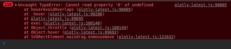
something looks off in hoverAvoirOverlaps in Fx.hover.
Thanks very much for the report @clegaspi !
 etpinard
on 17 May 2019
etpinard
on 23 May 2019
etpinard
on 17 May 2019
etpinard
on 23 May 2019
Related issues
 WG-
·
3Comments
WG-
·
3Comments
 pynklu
·
3Comments
pynklu
·
3Comments
 maxwell8888
·
3Comments
etpinard
·
3Comments
maxwell8888
·
3Comments
etpinard
·
3Comments
 bryaan
·
3Comments
bryaan
·
3Comments
Most helpful comment
In a codepen: https://codepen.io/etpinard/pen/wberrP?editors=1010
something looks off in
hoverAvoirOverlapsinFx.hover.Thanks very much for the report @clegaspi !