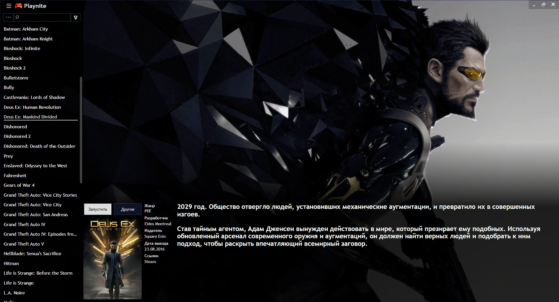
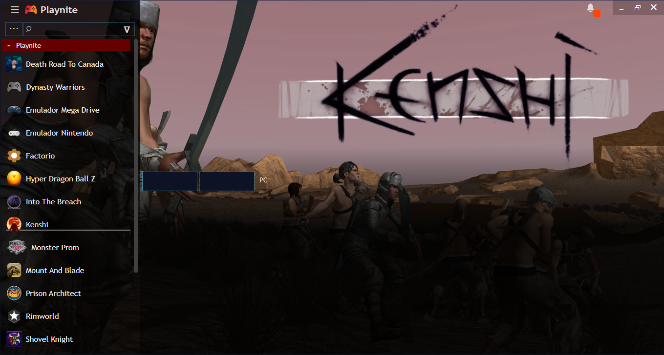
This is rework of modern theme of 3.2. version, with more compact elements.
-Сover and game information has been moved to the bottom since most images focus on the top / center.
-Removed top border
-Reduced list block
-7 colors for theme (Blue/White/Red/Yellow/Purple/Green/Orange)
-updated 06.01 ver.1.4
CompactModern1.4.zip
examples at different resolutions:
720р - https://imgur.com/a/QXfSR
900р - https://imgur.com/a/0Ufq6
1080р - https://imgur.com/a/2UeNc
 Evene174
All 18 comments
This is honestly the best skin and the way i wanted playnite to look.
Only issue i have is that you seemed to have made the cover image a square? or but it too low. You should have just made the it a bit smaller and still keeping it like a rectangle like before. Other than that its awesome
 ArtexJay
on 4 Jan 2018
ArtexJay
on 4 Jan 2018
I've added this to reddit theme list for people to find easily. Also new update will link to that thread from application itself.
 JosefNemec
on 4 Jan 2018
JosefNemec
on 4 Jan 2018
Alright I'll be giving it a try and yes its 1080p but the scaling is by default on my laptop 125%, since and having it at 100% makes everything much too small.
Update: I've updated and still the issue persist :/
I'll patiently wait for v1.3 of this theme :)
ArtexJay
on 4 Jan 2018
@Evene174 Don't use margins to offset the whole layout like you do. It will break in case of different DPI scaling, exactly like ArtexJay posted. If you need to offset the panel more to bottom just change the row scaling of parent grid. For example this specifies that two rows in grid will scale dynamically to fit 40% and 60% percent of the space respectively:
<Grid.RowDefinitions>
   <RowDefinition Height="4*"/>
   <RowDefinition Height="6*"/>
</Grid.RowDefinitions>
Great theme! The problem i have apart from the scaling problem is that the "install" button is partially under the "more" button. The "play" button however is just fine as shown in the screenshot.
 DSPAUL
on 5 Jan 2018
DSPAUL
on 5 Jan 2018
It is really a great theme, but it doesn't working well as it should be =(
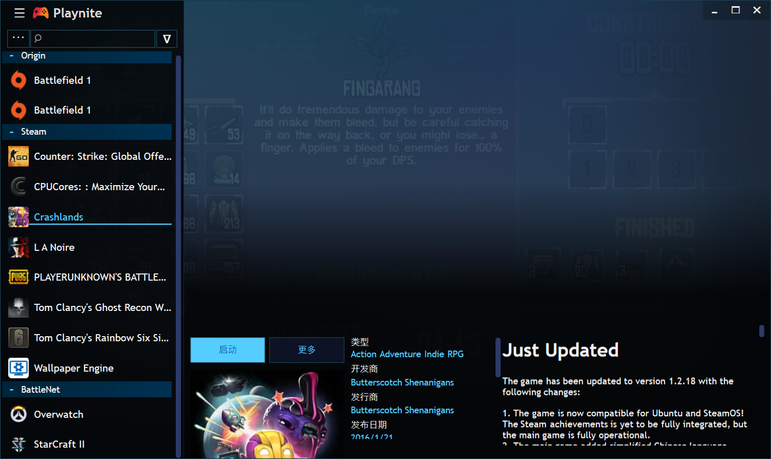
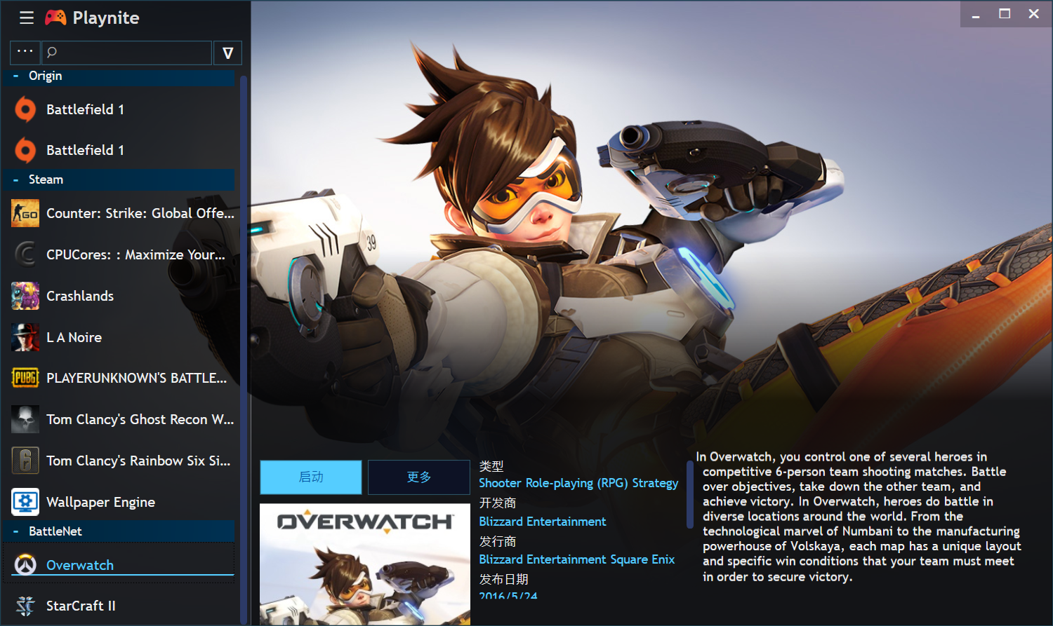
The steam games all look terrible , but battle net is nice ! The background of steam games seem vague unlike the battle net. Maybe it has something to do with the image downloaded from the database, I don't know :p
You will know what I mean .....
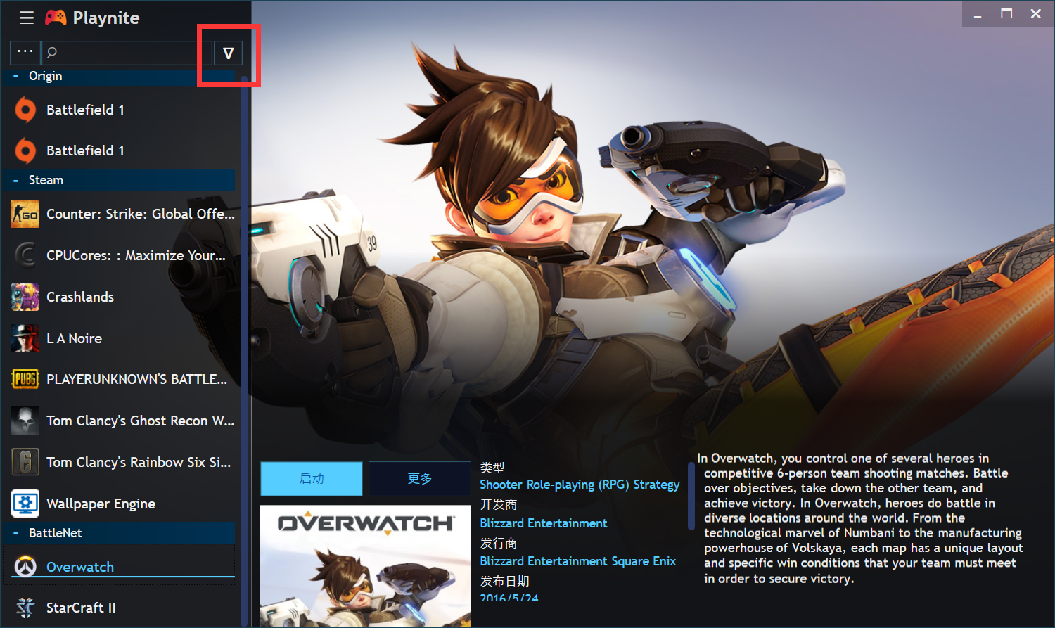
And the button doesn't work on my PC, I clicked it but nothing happened
 L1cardo
on 5 Jan 2018
L1cardo
on 5 Jan 2018
@DSPAUL Fixed in 1.3,thanks for feedback.
@L1cardo It's very strange that the button doesn't work, try to update to latest version.
I tried on several different PCs - did not encounter such a problem, as well as other people.
The theme is aimed at using colorful wallpapers (for example - your Overwatch) and shading at bottom which is used to read the text. I advise you to replace badly-combined images, because for all variants I can't choose a combination of shading and the visibility of the background.
Evene174
on 5 Jan 2018
@ArtexJay @L1cardo
Completely rewrote the code in 1.4, i checked - it works on most resolutions now.
examples in the topic
Evene174
on 5 Jan 2018
Now it's the best Theme! Yay
ArtexJay
on 8 Jan 2018
Love the theme, I get why everything is aligned to the bottom of the screen but the now open space would be perfect for a video window playing the game trailer or a gameplay video
 bocest1986
on 15 Feb 2018
bocest1986
on 15 Feb 2018
YES! This would be an awesome suggestion!
ArtexJay
on 23 Apr 2018
Forgot to mention this before 4.0 release, but custom themes will be broken in Playnite 4. There has been some changes to localization strings and other stuff that will break your theme. It's one of the reasons why themming is being completely rewritten in #510. I'm sorry for the issues and not notifying you earlier.
JosefNemec
on 27 Apr 2018
Yep, i can confirm that theme don't work with 4.1. If your program does not work correctly after upgrading to 4.1. - delete this theme.
In the near future, I have no plans to rewrite it under 4.1, I want to wait for Joseph and his edits to full-screen mode/normal themes, after which I adapt it to the future actual version.
Evene174
on 27 Apr 2018
I will patiently wait, for your theme to support the upcoming version!
ArtexJay
on 28 Apr 2018
The theme doesn't work to me ;-; plz help
 Pikelot
on 28 Feb 2019
Pikelot
on 28 Feb 2019
@Pikelot As I said in my previous post. Existing themes are broken with 4.0 release and new proper theming is coming with #510 If you need to revert back then you can use F4 hotkey to get back to settings.
JosefNemec
on 28 Feb 2019
@JosefNemec Oh, thank you
Pikelot
on 28 Feb 2019
I'm closing this since it won't be compatible with 5.0 theming changes, plus we should use different place to manage 3rd party themes (probably new forums in near future).
JosefNemec
on 6 Jun 2019
Related issues
JosefNemec
·
5Comments
 SEGA99
·
4Comments
SEGA99
·
4Comments
 iiviigames
·
3Comments
iiviigames
·
3Comments
 plasticarmyman
·
5Comments
plasticarmyman
·
5Comments
 xchaolingx
·
6Comments
xchaolingx
·
6Comments
Most helpful comment
Love the theme, I get why everything is aligned to the bottom of the screen but the now open space would be perfect for a video window playing the game trailer or a gameplay video