Planner: Should the Upcoming view use the entire window length?
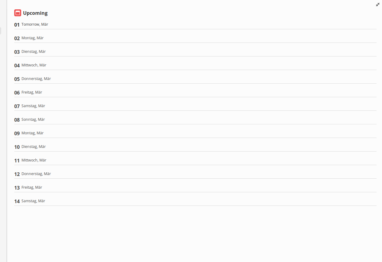
Right now there is about a quarter of white space in the two weeks overview. If the entire window length could be used in full screen, the individual days would not look so clinched.
What do you others think?
 4jNsY6fCVqZv
All 10 comments
I usually just want to see the next 3 days... So I guess no
 Hedronmx
on 3 Mar 2020
Hedronmx
on 3 Mar 2020
I totally agree with you. We need a new design for this.
 alainm23
on 3 Mar 2020
alainm23
on 3 Mar 2020
EDIT I have noticed that the white space is only there when there are no tasks scheduled. If at least several tasks are scheduled, the entire window length is used.
Perhaps it is possible to balance the view in such a way that in both cases no larger white spaces are created?
4jNsY6fCVqZv
on 17 Mar 2020
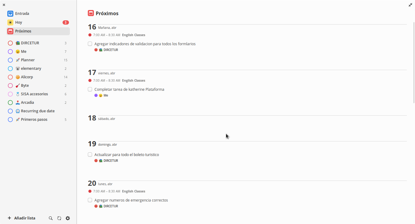
I've improved the space between each day, I think it looks better now.
alainm23
on 15 Apr 2020
Do you have a screenshot or screencast that you would like to share?
4jNsY6fCVqZv
on 15 Apr 2020
Yes.
alainm23
on 15 Apr 2020
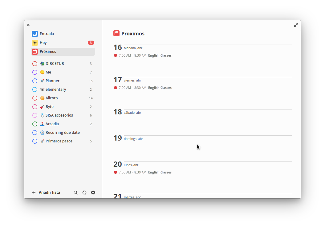
Thank you, what does the view look like when there are no tasks pending?
4jNsY6fCVqZv
on 15 Apr 2020
alainm23
on 15 Apr 2020
Oh, to be more precise:
With no tasks and no active calendar.
4jNsY6fCVqZv
on 16 Apr 2020
I think this has been solved.
alainm23
on 19 Apr 2020
Related issues
 roymckenzie
·
3Comments
roymckenzie
·
3Comments
 Philip-Scott
·
4Comments
Philip-Scott
·
4Comments
 joe733
·
7Comments
joe733
·
7Comments
 zkmrgirish
·
5Comments
zkmrgirish
·
5Comments
 gavr123456789
·
3Comments
gavr123456789
·
3Comments