Phpinsights: [art] Add a logo/banner
If you are a designer and want to contribute to open source would be cool add a logo/banner to this website.
 nunomaduro
All 35 comments
Any ideas for how a logo could look like would be a big help for somebody who want's to tackle this.
 olivernybroe
on 4 Jun 2019
olivernybroe
on 4 Jun 2019
@caneco 🥺
nunomaduro
on 4 Jun 2019
Wut? A bit confused about the topic. What's needed?
 caneco
on 4 Jun 2019
caneco
on 4 Jun 2019
Basically just a general idea of what we would like as a logo if we have any idea :)
This is just a quick sample (spend like 5 min) on a logo (not really a fan of it myself lol)

olivernybroe
on 7 Jun 2019
@caneco 👆🏻🙏
nunomaduro
on 7 Jun 2019
LoL, come up with the same idea using a magnifying glass.

 krisnaw
on 8 Jun 2019
krisnaw
on 8 Jun 2019
Well… I've just played around a bit during my lunch and so far come up with this

@nunomaduro already know me, and I always like to use something subliminar regarding the project in the logo. Can you spot the reason behind the "traffic light" (ahah)
I let the discussion begin! 👊
caneco
on 11 Jun 2019
@caneco I like the idea of the traffic light :D
The logo does remind me a lot of an old tv station logo (the one with text over the squares), however it is also the one I like the most at the same time 🥇
olivernybroe
on 11 Jun 2019
@olivernybroe going to try different combinations and/or a custom shape using squares.
If you spot any combination of shapes that could work "ping it" here. Let's make the logo as a community 💪
caneco
on 11 Jun 2019
@caneco Buddy I love you, but you have news on this? I am fine using the one you proposed at first.
nunomaduro
on 24 Jun 2019
👋
Got a few more inspirations today playing around with the squares and a new typo.


caneco
on 26 Jun 2019
Oh that's nice.
I think we should use this one as our logo

And then this one as the banner logo

I know that it's not the same logo, but because they are just "rearranging" the squares I actually think it could work out quite nice.
The reason I chose that one as the banner logo is because it could be cool to create a animation with the 3 squares, something like this.

What do you guys think?
olivernybroe
on 26 Jun 2019
I love them all.
nunomaduro
on 26 Jun 2019
Great idea for the loading 😄
If we're setup with the main the idea I'm going to refine the logo + extras and I will share with you the final result.
caneco
on 26 Jun 2019
Sound awesome! You are our saviour! 🎉
olivernybroe
on 26 Jun 2019
Wondering if we can make that loader on the console. 😘
nunomaduro
on 26 Jun 2019
Was wondering the same thing.
We might actually be able to do it with custom style on a progress bar 🥇
But it will have to be for ASCII enabled consoles only.
olivernybroe
on 26 Jun 2019
Wondering if we can make that loader on the console. 😘
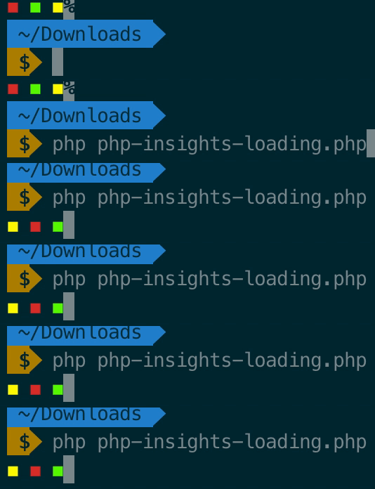
Oh well… run this Gist in your terminal and let me know if it's good 😄
https://gist.github.com/caneco/1f99346ff0c19b86af2b824449f84ad1
caneco
on 27 Jun 2019
@caneco
Haha that is brilliant!
I made some small changes in it. Shifted to using 256 colors instead as terminals normally don't override those colors also and moved cursor to end of line :)
https://gist.github.com/olivernybroe/faa6483cace88473beb7c8940118bc1b
And a gif for lazy guys!
olivernybroe
on 27 Jun 2019
O.M.G! Can you make that bigger and a little bit more centered? That is huge!
nunomaduro
on 27 Jun 2019
@nunomaduro We should be able to do that. However for that we need to basically display the progress bar in multiple lines and then run the delete line command on each line we use. So we have to use cursor navigation up and down prob. also 👍
olivernybroe
on 27 Jun 2019
@olivernybroe thanks! 😄
@nunomaduro
- Bigger it's a matter of choosing the right character… Any suggestion here?
- centered it's also possible using some math calculation
caneco
on 27 Jun 2019
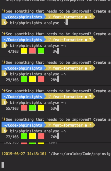
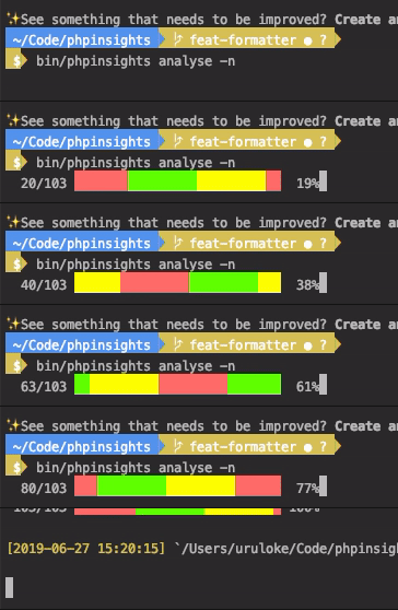
https://gist.github.com/olivernybroe/2cee5ccc104937a0572f2fc8801b97a4
Here is an example with bigger output, but still only using one line. (done with no characters, but changing the background color)
Is this big enough or do we want it even bigger?

olivernybroe
on 27 Jun 2019
@olivernybroe genius! 😃
caneco
on 27 Jun 2019
Haha this is perfect! 😎
So which one of these do you guys prefer?
olivernybroe
on 27 Jun 2019
You should ask that on twitter. 🤗 Make a pool.
nunomaduro
on 27 Jun 2019
@nunomaduro Could you make the pool? Think we would get more responses if you do it ;)
olivernybroe
on 27 Jun 2019
@olivernybroe Can I have access to that POC locally? Link?
nunomaduro
on 27 Jun 2019
@nunomaduro Yeah sure :)
It's in my repo https://github.com/olivernybroe/phpinsights/tree/feat-new-style
To change style just change loadingBar to loadingBar1 here
https://github.com/olivernybroe/phpinsights/blob/feat-new-style/src/Application/Console/Commands/AnalyseCommand.php#L86-L88
olivernybroe
on 27 Jun 2019
Seems like users find the first one to fast. We can easily change the speed by editing https://github.com/olivernybroe/phpinsights/blob/8772ece75171f84a52bbc5df1f10e6d427350cca/src/Application/Console/Style.php#L123, which defines when the pointer should change per iteration. Maybe try out $bar->getProgress() % 5 === 0 and see if that makes it a little less epileptic to look at 😅
olivernybroe
on 27 Jun 2019
Oh that's nice.
I think we should use this one as our logo
And then this one as the banner logo
I know that it's not the same logo, but because they are just "rearranging" the squares I actually think it could work out quite nice.
The reason I chose that one as the banner logo is because it could be cool to create a animation with the 3 squares, something like this.
What do you guys think?
Hello, regarding the logo we're close to this design? Can I make the official artwork && extras?
Speaking of extras, what do you want? Wallpapers, avatars… what else?
caneco
on 10 Jul 2019
You can create a folder called art, and add all that stuff on it.
nunomaduro
on 10 Jul 2019
Stickers, hats, socks, t-shirts. I want the logo on everything! 😻
olivernybroe
on 11 Jul 2019
@caneco Thanks for creating this!
olivernybroe
on 25 Jul 2019
@olivernybroe it was fun doing this…
Still need to make your socks 😅
caneco
on 25 Jul 2019
Related issues
 szepeviktor
·
3Comments
nunomaduro
·
5Comments
szepeviktor
·
3Comments
nunomaduro
·
5Comments
 deleugpn
·
3Comments
deleugpn
·
3Comments
 erwinw
·
6Comments
erwinw
·
6Comments
 dmitryuk
·
5Comments
dmitryuk
·
5Comments
Most helpful comment
I love them all.