Patternfly-react: Turn off close icon on expanded ListViewItem
I'd like to be able to disable the close icon when a ListViewItem is expanded to show it's children.
In our use case the close icon pushes the first child out of alignment. See below
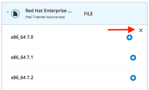
I would also assume that most people would collapse the children by clicking on the dropdown header instead of looking for the x in the corner. Are there use cases when the ListViewGroupItemContainer does not have a parent dropdown capable of collapsing it? If not maybe we could remove the close x entirely.
At a minimum I'd like to be able to pass a prop to the ListViewItem here that would essentially turn off the onClose prop passed to ListViewGroupItemContainer.
 danseethaler
All 8 comments
Ideally, the close button should have no impact on the contents.
 jeff-phillips-18
on 8 Jan 2018
jeff-phillips-18
on 8 Jan 2018
Anyone know if this issue is evident in patternfly itself?
danseethaler
on 10 Jan 2018
I believe it is. Looking at http://www.patternfly.org/pattern-library/content-views/list-view/#/code you can see the close button is overlaid on top of the expanded content.
jeff-phillips-18
on 12 Jan 2018
The close button is floated right, so any block content will stack under it (as visible at [1]), any floated content will get pushed by it. We can allow to not include it in react component unless it is always required from the UX point of view / patternfly guidelines.
[1] http://www.patternfly.org/pattern-library/content-views/list-view/#/code
 jtomasek
on 19 Jan 2018
jtomasek
on 19 Jan 2018
@mcarrano Can you weigh in on this issue?
These are the only possible options I can think of for addressing the use case where the expanded contents occupy the full width:
- Make the X optional
- Include extra margin/padding on the right to prevent overlap or pushing of contents
- Include extra margin/padding on the top to prevent overlap or pushing of contents
And for options 2 and 3, would this margin be optional based on the contents? I would think some contents are totally fine wrapping.
 jgiardino
on 19 Jan 2018
jgiardino
on 19 Jan 2018
Yes, I do see the problem. In our earlier mockups, the expansion was more intended as a way to show details of an object in the list, but agree that the Close button does not really work if we are embedding something like a list that takes up the full width of the container.
My recommendation is that we consider the Close (X) button optional. I can send a PR to update the design documentation to this effect with a note that this not be used if content will span the full width of the expansion panel. What do you think @jgiardino ?
 mcarrano
on 19 Jan 2018
mcarrano
on 19 Jan 2018
Thanks, @mcarrano! I agree with making the Close button optional.
jgiardino
on 22 Jan 2018
Great thanks everyone! I'll submit a PR to make this happen.
danseethaler
on 22 Jan 2018
Related issues
 seanforyou23
·
6Comments
seanforyou23
·
6Comments
 mohd-akram
·
3Comments
mohd-akram
·
3Comments
 priley86
·
3Comments
priley86
·
3Comments
 dlabaj
·
4Comments
priley86
·
3Comments
dlabaj
·
4Comments
priley86
·
3Comments
Most helpful comment
Ideally, the close button should have no impact on the contents.