Parity-ethereum: Theme issue: Hard to read text (almost invisible)

Is it just me or is "0 outgoing transactions" hard to read?
 madnight
All 5 comments
Which Parity version? Which operating system? And which browser do you use?
 5chdn
on 14 Aug 2017
5chdn
on 14 Aug 2017
All parity versions (at least for this year). Arch Linux (up to date). Chromium / Firefox.
madnight
on 14 Aug 2017
Yeah, that's a very dark gray on a very opaque black. rgb(18, 18, 18)
5chdn
on 15 Aug 2017
👍1
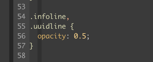
Think the simplest solution is actually upping the opacity from 0.25 to 0.5. PR coming.
js/src/views/Account/Header/header.css
before

after

 jonchoi
on 23 Aug 2017
jonchoi
on 23 Aug 2017
👍1
yes, that should fix the issue, the "after" screenshot is also perfectly readable on my screen
madnight
on 23 Aug 2017
👍1
Was this page helpful?
0 / 5 - 0 ratings
Related issues
 stone212
·
3Comments
stone212
·
3Comments
 barakman
·
3Comments
barakman
·
3Comments
 jordipainan
·
3Comments
jordipainan
·
3Comments
 jurijbajzelj
·
3Comments
jurijbajzelj
·
3Comments
 gaoxiangxyz
·
3Comments
gaoxiangxyz
·
3Comments