Papirus-icon-theme: SUGGESTION: Roll back to the previous Gimp Icon
Hi!
I just updated my Papirus theme installation and now, Gimp icon has changed.
Why did you change Gimp icon?
The previous Gimp icon was wonderful. Not only was an extremely beautiful representation of Wilber (the mascot that is also the Gimp Icon), furthermore it was a very intelligent brush representation.
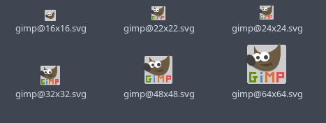
The current Gimp icon is more similar to the original official one (no complaint about that), but has a strange and full colorized text that, IMHO, breaks Papirus guidelines (Not other icons have text if the text is not part of the original icon itself).
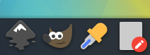
The official icon:
https://commons.wikimedia.org/wiki/File:The_GIMP_icon_-_gnome.svg
So, please, consider to revert the icon change to the previous version or, at least, keep the current one, but without text, like that:

Thank you! ;)
 jEsuSdA
All 48 comments
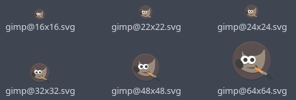
We have a problem with the icon without text, it looks very small, so if you have an idea how to fix it - welcome.

 SmartFinn
on 28 Aug 2017
SmartFinn
on 28 Aug 2017
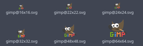
Intialy original gimp logo very wide. I add colorize label for right size, because height very small.
first one or, at leas, keep the current one, but without text, like that:
Nope, height size very small
 varlesh
on 28 Aug 2017
varlesh
on 28 Aug 2017
Also colorize label - a suitable style for this application.
varlesh
on 28 Aug 2017
Why not insert Wilber into a box, like Faenza did?

jEsuSdA
on 28 Aug 2017
Why not insert Wilber into a box, like Faenza did?
Because Gimp not have yet.
I try this, but don't like me:
varlesh
on 28 Aug 2017
Really, I like this icon:
https://github.com/PapirusDevelopmentTeam/papirus-icon-theme/blob/bc9a0e05503573a6a140131dd712acc9d073b76d/Papirus/64x64/apps/gimp.svg
But on gorizontal dock it's loooking very small :(
varlesh
on 28 Aug 2017
Because Gimp not have yet.
It also have not text. XD
Some ideas:


What do you think?
jEsuSdA
on 28 Aug 2017
We not draw only square or circle icons, i talked about this before. Original Gimp not use square....
Also see shadow Wilber on light background - it's blurred contour, remember thunderbird issue:
https://github.com/PapirusDevelopmentTeam/papirus-icon-theme/issues/583
varlesh
on 28 Aug 2017
It also have not text. XD
Yes, it's variation. But Is suitable on style application...
varlesh
on 28 Aug 2017
So, we have these possibilities:
1) Go back to the first version

I think, these version is wonderful. It has no size problems, looks great and it has a Papirus style.
2) Keep the current wilbert without text

I like it, and it is an official wilbert, but has the height problem...
3) Keep the current wilbert but doing something to increase height:
3a) Add a text
The colorized text is really ugly.
And this does not fits very well with the Papirus gidelines.
In case to persist in this version, at least, the text should be like the official one:

3b) Add a square
It does not fits with the Papirus guidelines?
Well, ZIM icon has a square (and its official one has not), and a lot of other icons has a square.
It is an elegant way to solve heigh problem, but keeping the Wilber icon as it is. I think it could be. I mean: technically is a solution that breaks the guidelines, like 3a, but, at least, looks like much better.

3c) Reduce brush size and wilbert height
This is a test where I reduced the brush size and I increased the wilbert height a bit. Maybe these changes makes the icon works again.

What do you think?
jEsuSdA
on 28 Aug 2017
I don't like this:
varlesh
on 28 Aug 2017
I don't like too.
But look at this:
(original wilbert size)

(wilbert with size changed)

If you increase the wilber size (and decrease the brush size), it looks like much better.
I choose the background color using "colorblender", to find a color that armonizes with the wilbert brown.
;)
jEsuSdA
on 28 Aug 2017
1) Go back to the first version
It's icon from another icon theme (i'm add this icon on 2016 year for temporary usage) and not looking as original.
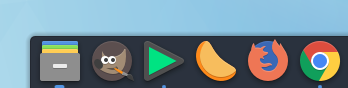
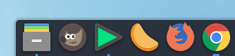
2) Keep the current wilbert without text
Yes, problem with size. But icon looking good
The colorized text is really ugly.
White text on white dock and how it's looking? For example on elementary OS - use plank dock with light background. Or KDE with Breeze colors.
3b) Add a square
Square or circle - it's not solve
varlesh
on 28 Aug 2017
@varlesh
Square or circle - it's not solve
Why not, it's maybe not the best way, but it really solves the problem :)
SmartFinn
on 28 Aug 2017
@SmartFinn Because icon darked. We use layring style dark color on down layer to light color to up layer. We must disable all shadows and light stroke.
varlesh
on 28 Aug 2017
Delete brush not solved problem too, anyway icon very wide - 38px/31px
varlesh
on 28 Aug 2017
@varlesh I don't understand you. Please, write in English. ;)
jEsuSdA
on 28 Aug 2017
@jEsuSdA Remember thunderbird issue - dark logo on light background - it,s problem. We need disable all shadows and white stroke
varlesh
on 28 Aug 2017
@varlesh Ok, I understand.
How it should look without shadows?
By the way, here another possibility I made:

jEsuSdA
on 28 Aug 2017
@jEsuSdA You really can draw this text with pixel align for all sizes?
varlesh
on 28 Aug 2017
it's imposible for 24px(22) and 16px
varlesh
on 28 Aug 2017
See 16px - it's very small ))
varlesh
on 28 Aug 2017
It could be difficult but I didn't try.
But, finally... cause I have no ideas... hehehe: What's the problem about keeping the old icon? it was from other icon theme... ok, but, if the license allow it to be included in Papirus... Why not use it?
I know it will be fine to have all the icon originally made, but, if this implies to have some problems, like these and having a worse solution... what the hell! let's keeping the older one! ;)
jEsuSdA
on 28 Aug 2017
So, guys, maybe we'll turn this problem into a voting poll? I propose the 3 options:
:+1: - Roll back to the previous Gimp icon
:heart: - Delete the text from the current icon
:-1: - Leave as is
SmartFinn
on 28 Aug 2017
But, finally... cause I have no ideas... hehehe: What's the problem about keeping the old icon? it was from other icon theme... ok, but, if the license allow to include in Papirus... Why not use it?
Because i don't like this icon and Paper too. I like original Gimp style logo... but i don't know how adapt this for Papirus...
varlesh
on 28 Aug 2017
@SmartFinn Ok, i create new issue with some styles for Gimp and users can vote and we decide
varlesh
on 28 Aug 2017
A last idea:
You consider it will be possible to do something like that?
http://findicons.com/files/icons/2166/oxygen/128/gimp.png
It brings the new wilbert, had solves the height problem...
jEsuSdA
on 28 Aug 2017
No... more objects, it's not good for little sizes
varlesh
on 28 Aug 2017
@varlesh hahahaha. I surrender! My brain is totally empty! XD
Let's go to the poll!
jEsuSdA
on 28 Aug 2017
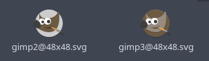
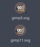
I voted on gimp5 and gimp11, because gimp have mostly circled objects and it's suitable with circle background.
Design rules - circle on circle, square on square.
Also if delete brush - we can centerd Wilber and i like that:
varlesh
on 29 Aug 2017
Yes, logo big (compare with other icons), but i don't have ideas anymore...
varlesh
on 29 Aug 2017
@SmartFinn What you think?
varlesh
on 29 Aug 2017
on dock:

varlesh
on 29 Aug 2017
Or maybe add more color to #5c4f4f ?
varlesh
on 29 Aug 2017
SRC:
apps.tar.gz
varlesh
on 29 Aug 2017
@varlesh looks better than what we have now.
SmartFinn
on 29 Aug 2017
with little fixes colors:
varlesh
on 29 Aug 2017
without brush:
varlesh
on 29 Aug 2017
It's similar as Numix style :rofl:
varlesh
on 29 Aug 2017
I didn't expect that square icon would be on top, the circle looks much better.
@varlesh если так пойдет и дальше - предлагаю забить на результаты :) Пусть опрос пока повисит до 1 сентября.
SmartFinn
on 29 Aug 2017
@varlesh если так пойдет и дальше - предлагаю забить на результаты :) Пусть опрос пока повисит до 1 сентября.
Квадрат лидирует, к сожалению.
Собственно, мы не обязаны же следовать большинству мнений и можем передумать )))
varlesh
on 29 Aug 2017
@SmartFinn Привет Сереж... я кароче удалил кисть и увеличил размер. Получилось 42x34 (без тени). В принципе визуально терпимо:
ЗЫ: Не хочу круги и квадраты, вот не в тему они вообще. Numix какойт получается
apps.tar.gz
varlesh
on 30 Aug 2017
@varlesh Привет!
Все равно есть чувство чего те не родного. Но проблему с высотой это почти решило. Для размеров 48px, 32px и может для 16px лучше поднять Wilber’а на 1px, тогда и центр у всех будет чуть ниже центра глаз, и высота визуально больше.
SmartFinn
on 30 Aug 2017
@jEsuSdA Seems the icon above solves the problem. What do you think?
SmartFinn
on 30 Aug 2017
Все равно есть чувство чего те не родного.
Почему? Полно подобных же значков В круге или квадрате смотрится как нюмикс, вообще не айс.
Для размеров 48px, 32px и может для 16px лучше поднять Wilber’а на 1px, тогда и центр у всех будет чуть ниже центра глаз, и высота визуально больше.
Соглашусь, так как уши уменьшают визуально пространство
varlesh
on 30 Aug 2017
И собственно, большинство людей юзают либо док снизу, либо сбоку. Вверху редко ставит.
varlesh
on 30 Aug 2017
@SmartFinn Залил, поднял на 1px везде, кроме 64px (там уже было поднято).
varlesh
on 30 Aug 2017
@SmartFinn @varlesh
I think It looks like great!
It is a better and more "Papirus-ish" solution than previous. ;)
Good job, guys! Congratulations! ;)
jEsuSdA
on 30 Aug 2017
Related issues
 Chamrosh
·
6Comments
jEsuSdA
·
5Comments
jEsuSdA
·
8Comments
Chamrosh
·
6Comments
jEsuSdA
·
5Comments
jEsuSdA
·
8Comments
 rauldipeas
·
5Comments
rauldipeas
·
5Comments
 thirtysat
·
4Comments
thirtysat
·
4Comments
Most helpful comment
It's similar as Numix style :rofl: