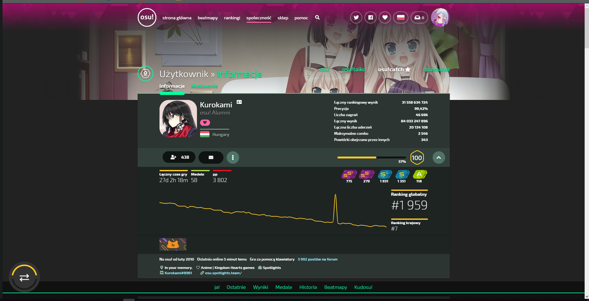
please change header design, and profile background design, that gradiednds looks very bad

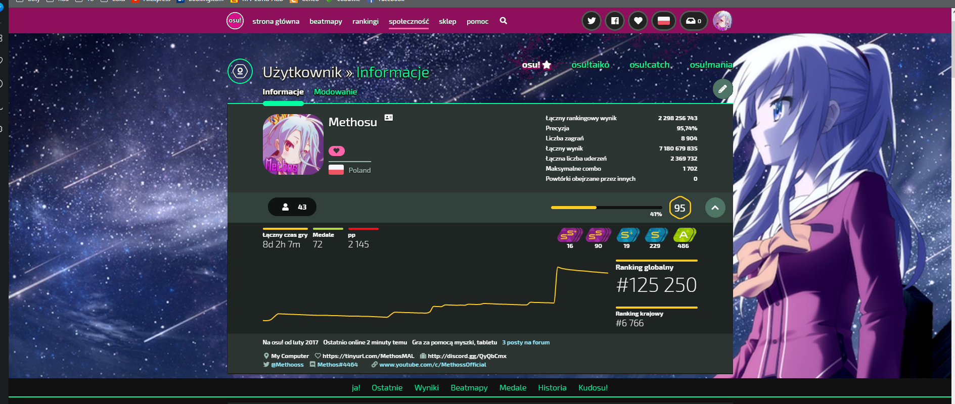
please make more space for BG and make it equal width to the rest of the page

or make to BG will fill first part of the page like this:

 Methosss
All 10 comments
i dont like that part too.. Stefan improvised: https://osu.ppy.sh/users/626907
 Lyawi
on 21 Feb 2019
Lyawi
on 21 Feb 2019
there's header gradient, left & right gradient and shadow gradient on pic i tired too to improvise with that, but i have not enough space for picture, and this shadow gradient making it looking bad
Methosss
on 21 Feb 2019
Mine looks different from those 👀

 Shadowthegod
on 21 Feb 2019
Shadowthegod
on 21 Feb 2019
you have a smaller monitor and / or resolution
@edit that's how i see that: (1920x1080)
Methosss
on 21 Feb 2019
1920x1080 17"
I'm not using firefox in full screen but even if I do, it does not look like that. It just pulls the whole page into the middle
Shadowthegod
on 21 Feb 2019
try LCrtl + scroll and set zoom to 100% 🤔
i think that will be the best way to make it's look better:
Methosss
on 21 Feb 2019
Ah, nvm. I found the "issue", it was not the zoom but a custom script which overwrote the default one. I thought I disabled those 🤔 Anyway, yeah, it looks horrible with that gradient and overextended length.
Shadowthegod
on 21 Feb 2019
I've improvised a gradient overlay with the dark theme i'm maintaining

Replacing background-image linear-gradient on .header-v3__overlay:before with this image
https://flan.s-ul.eu/bZOcj0ZQ.png
 Flanster
on 22 Feb 2019
Flanster
on 22 Feb 2019
that actually looks really good. @arflyte comments?
 peppy
on 25 Feb 2019
peppy
on 25 Feb 2019
Oh interesting. But need to test with various type of background; especially busy and simple bright, and busy and simple dark.
 arflyte
on 26 Feb 2019
arflyte
on 26 Feb 2019
Related issues
 downpour-osu
·
4Comments
downpour-osu
·
4Comments
 gagahpangeran
·
4Comments
gagahpangeran
·
4Comments
 Xinnoh
·
4Comments
Xinnoh
·
4Comments
 shortthu
·
5Comments
shortthu
·
5Comments
 TicClick
·
5Comments
TicClick
·
5Comments
Most helpful comment
I've improvised a gradient overlay with the dark theme i'm maintaining

Replacing
background-imagelinear-gradient on.header-v3__overlay:beforewith this imagehttps://flan.s-ul.eu/bZOcj0ZQ.png