Openstreetmap-website: Replace "share" icon
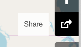
I think the current "share" icon is sub-optimal. Maybe it's to do with routeing, because it looks like it means that boxy vehicles must turn right, or something like that. It's not immediately obvious what it means, nor is it widely used (maybe not even used at all) elsewhere.
I suggest it should be changed to something widely used elsewhere. The meaning of that one isn't immediately obvious, either, but it has the benefit of being far more widely known because it is far more widely used.
Currently, when I give written instructions on how to share the map, I end up saying something like "It's the third button up from the bottom, the one that looks like it means cardboard boxes must turn right." It would make life easier if I could tell people to click the share icon and have most people know exactly which one I mean without further explanation.
 eehpcm
All 8 comments
I can't say that I would recognise the "share this" icon particularly, but I'm willing to be convinced otherwise. But the show-stopping problem with the three-dots-on-a-line icon is that it's very similar to many icons used in OpenStreetMap to represent ways. I don't think we could use it for another meaning in this project.
 gravitystorm
on 21 Jan 2020
gravitystorm
on 21 Jan 2020
@gravitystorm
I can't say that I would recognise the "share this" icon particularly, but I'm willing to be convinced otherwise.
The first time I saw it, it meant nothing to me. The next few times I saw it, I cursed it for not being intuitively obvious. OTOH, it's used by Android and just about every Android app, as well as many places on the web, so it's common. It's just a symbol with an assigned meaning, like the letters of the Roman alphabet (even though many of them can be traced back to stylized representations of some object whose name started with that letter). Arbitrary, but well known. As opposed to the current symbol, which is arbitrary and not well known.
But the show-stopping problem with the three-dots-on-a-line icon is that it's very similar to many icons used in OpenStreetMap to represent ways.
It is? I'm probably having a senior blond moment, but right now I can't think of anything remotely resembling that symbol appearing on the map. Or even in iD, come to that. I can't remember ever looking at the map, or anything in iD and thinking "that looks a lot like the share icon."
eehpcm
on 21 Jan 2020
This is the icon. It says "share" when you hover over it.
 bhousel
on 21 Jan 2020
bhousel
on 21 Jan 2020
This is a good thing to read for background:
https://www.fastcompany.com/3031872/why-isnt-there-a-standard-share-button

The icon on osm.org just looks like an older version of the Apple iOS share icon.
bhousel
on 21 Jan 2020
@eehpcm see e.g. https://wiki.openstreetmap.org/wiki/Way

gravitystorm
on 21 Jan 2020
For completeness, there's also still a bit of confusion between "export" and "share" (some of the functions behind "share" are really "export" functions). See also https://github.com/openstreetmap/openstreetmap-website/issues/651 . The tricky bit I suspect is getting people into a position to be able to contribute (and then having the time and the inclination to do so).
 SomeoneElseOSM
on 21 Jan 2020
SomeoneElseOSM
on 21 Jan 2020
@gravitystorm
Ah, that. :) However, most ordinary consumers are unlikely to ever encounter it, and most who do encounter it may be savvy enough to realize it has two different meanings in two different environments. Not ideal, though.
Thanks to @bhousel for suggesting https://www.fastcompany.com/3031872/why-isnt-there-a-standard-share-button - maybe a variant of the Y icon would be better than what we have. Very little recognition, but maybe a little more obvious what it means.
I'll probably just have to live with the existing icon and having to describe it to people.
eehpcm
on 21 Jan 2020
I think based on the lack of universal share icon, and the conflict with the "way" iconography, we'll have to just keep what we have already. Maybe in a few years the situation can be reconsidered.
gravitystorm
on 19 Feb 2020
Related issues
eehpcm
·
4Comments
 dog1993
·
8Comments
dog1993
·
8Comments
 HarelM
·
7Comments
HarelM
·
7Comments
 jidanni
·
3Comments
jidanni
·
3Comments
 jjiglesiasg
·
8Comments
jjiglesiasg
·
8Comments
Most helpful comment
This is a good thing to read for background:
https://www.fastcompany.com/3031872/why-isnt-there-a-standard-share-button
The icon on osm.org just looks like an older version of the Apple iOS share icon.