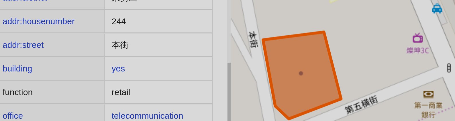
Openstreetmap-carto: Telecom offices are with a dot instead of a specific icon
We observe telecom offices are rendered with just a dot of mystery.
Blowing it up larger and larger just reveals it is indeed just a dot.
Hmmm, maybe one of
$ unicode --max 88 telephone|grep -P '^U+|^.$'
U+2121 TELEPHONE SIGN
℡
U+2315 TELEPHONE RECORDER
⌕
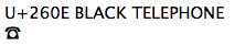
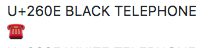
U+260E BLACK TELEPHONE
☎
U+260F WHITE TELEPHONE
☏
U+2706 TELEPHONE LOCATION SIGN
✆
U+1F4DE TELEPHONE RECEIVER
📞
U+1F57B LEFT HAND TELEPHONE RECEIVER
🕻
U+1F57C TELEPHONE RECEIVER WITH PAGE
🕼
U+1F57D RIGHT HAND TELEPHONE RECEIVER
🕽
U+1F57E WHITE TOUCHTONE TELEPHONE
🕾
U+1F57F BLACK TOUCHTONE TELEPHONE
🕿
U+1F580 TELEPHONE ON TOP OF MODEM
🖀
that doesn't conflict with a pay phone, would be better.
 jidanni
All 12 comments
That's because offices are rendered as a dot. There is no mystery.
Listing Unicodes does not help, as they are rendered differently with different fonts:
 polarbearing
on 24 Jul 2019
polarbearing
on 24 Jul 2019
Is this a request to have an icon for telecom offices or a request to remove all generic dots?
 HolgerJeromin
on 24 Jul 2019
HolgerJeromin
on 24 Jul 2019
Offices are rendered with a dot?!
A cartographic first?!
Why not use some more familiar https://www.google.com/search?q=office+icon&tbm=isch
Does any of the general public know a dot means office?
The Unicodes are just suggestions.
I think other maps often just use the icon of the national telephone company as there is usually only one landline supplier per country.
jidanni
on 25 Jul 2019
The dot is being used here to generically mark the location of an entity, it is also used for shops, e.g. on lower zoom levels.
Unicodes do not work as suggestions when I see something different than you see, or I see different renderings in different applications using different font renderings.
If you want to propose a new office icon, feel free to design one that fits the requirements in this style.
polarbearing
on 25 Jul 2019
I think other maps often just use the icon of the national telephone company as there is usually only one landline supplier per country.
If the icon was just a telephone, how would people know it was a telecom office versus just a usable phone or something similar? (I guess the office icon color would help, but it still seems to generic of an icon on it's own).
 Adamant36
on 26 Jul 2019
Adamant36
on 26 Jul 2019
Thus using the AT&T (or whatever local telco) logo would indicate that is is a phone shop / telco office, and not simply a phone booth (picture of a phone).
jidanni
on 28 Jul 2019
If the icon was just a telephone, how would people know it was a telecom office versus just a usable phone or something similar? (I guess the office icon color would help, but it still seems to generic of an icon on it's own).
We already distinguish library and bookstore by having one be a single book and the other a stack of books (besides having amenity-brown vs. shop-purple). So I don't see any problem if the icon is sufficiently different from what we use for amenity=telephone.
 Prince-Kassad
on 28 Jul 2019
Prince-Kassad
on 28 Jul 2019
If the office had a name=, the blue dot would not be so mysterious any more ;)
Maybe brand= might be rendered in the future, too.
BTW, what exactly is a "retail telecom office"? Is there a place like that which is not at the same time a "shop=mobile_phone"?
 daganzdaanda
on 28 Jul 2019
daganzdaanda
on 28 Jul 2019
Some places at least used to have public-facing business offices for land-line telephone service, where subscribers could make service requests, and pay their bills over the counter.
 kennykb
on 29 Jul 2019
kennykb
on 29 Jul 2019
BTW, what exactly is a "retail telecom office"? Is there a place like that which is not at the same time a "shop=mobile_phone"?
This really is a tagging question, but shop=mobile_phone has a too broad definition in my opinion. It is not at all obvious that a shop=mobile_phone will also offer landline and cable services. It also leaves the few companies that do not offer phones or phone contracts very isolated, which makes very little sense.
Prince-Kassad
on 12 Aug 2019
My phone company has two types of shops.
- Full service centers open Monday To Friday:8:30~17:30
- Mini service centers / mobile phone shops open Monday To Sunday 11:00~21:00
https://www.cht.com.tw/en/home/cht/about-cht/business-group/store-locator
jidanni
on 12 Aug 2019
using the AT&T (or whatever local telco) logo would indicate that is is a phone shop / telco office, and not simply a phone booth (picture of a phone).
This is not technically feasable for this style.
So far there are no icon suggestions which would work. A telephone symbol could easily be confused with a phone booth, a police phone or an emergency phone. Also we do not show specific icons for most office= features, and if we were to add them it is not clear that this would be one that is in the top tier for a specific icon.
Therefore I am closing this issue as declined for now.
 jeisenbe
on 9 Jan 2020
jeisenbe
on 9 Jan 2020
Related issues
 kocio-pl
·
4Comments
HolgerJeromin
·
3Comments
kocio-pl
·
4Comments
HolgerJeromin
·
3Comments
 Vort
·
3Comments
Vort
·
3Comments
 d1g
·
4Comments
d1g
·
4Comments
 Tomasz-W
·
4Comments
Tomasz-W
·
4Comments
Most helpful comment
We already distinguish library and bookstore by having one be a single book and the other a stack of books (besides having amenity-brown vs. shop-purple). So I don't see any problem if the icon is sufficiently different from what we use for amenity=telephone.