Openstreetmap-carto: Remake natural=spring as dot+icon
Follow up to #3189, #3253 and #3274.
Proof of concept code is here (based on v4.10.0): https://github.com/gravitystorm/openstreetmap-carto/compare/master...kocio-pl:spring-dot
I'm not satisfied with our new spring rendering. It was based on a clever idea, but in practice it's not too good. My proposition is to get back to the original "s"-based design and follow the way we're rendering fountains. Here's why:
- it's best not to use letters and stay with geometric shapes ("s" may be misleading in other languages than English)
- on medium zoom levels we need just something to spot, and since we already have blue dot as a symbol of a fountain, it should be easier to get the meaning (man made or natural water source)
- on higher levels there's enough space to show real icon depicting object, so it's clear that this is not a fountain
- it fixes the problem of rendering on water areas
- dot is smaller than ring
I also tried to make both dots and labels more visible, so I used the same darker blue color as fountain and made bigger halo.
Examples:
Named spring is better visible than currently
Before

After

Spring in the middle of a water area


Lot of springs on the grass (even better than "s")
Long before

After


Lots of springs on bare ground

real icon on z18+ does not make clutter even on crowded places


 kocio-pl
All 25 comments
I'm a bit confused if you are proposing the 's' again or the fountain symbol, and which are the before/after examples?
Will that fix #1482 also?
Is there a test with a spring being a node on waterway=river (not only stream)?
 polarbearing
on 20 Oct 2018
polarbearing
on 20 Oct 2018
My remarks:
- proposed white outline is definetely too wide
- proposed icon looks more like a fountain icon
I would go with a blue dot with thiner outline on all zoom levels.
 Tomasz-W
on 20 Oct 2018
Tomasz-W
on 20 Oct 2018
Thanks for reactions. It looks like this solution makes sense in general, so we can look more into details.
@polarbearing Sorry for a confusion, I was sure that everyone knows how it looks today and I wanted to sketch a solution before anything more detailed. I have now added before/after when needed, all the other images are planned "after".
My proposition is to redesign it close to the initial "s" idea, but replace the letter with dot instead for medium zoom and show spring icon at high zoom.
I thought that it will be clear that it's not a fountain icon (because it's simple, not symmetrical and lacks the plate at the bottom). However if there is a problem with recognizing, we could use also another icon from Osmic (https://github.com/gmgeo/osmic/blob/master/nature/spring-14.svg):  I like it less, but it's still perfectly acceptable for me - and maybe @Tomasz-W could make some other design.
@Tomasz-W I was worried that thinner outline will make it harder to spot - similar to the way "s" on the grass looks like with smaller outline. I just made the outline to be a bit blue instead of pure white to make it less aggressive. This is natural feature, which is typically in the outdoor, so I assume that visibility is important and should be highlighted.
Further comments and ideas?
kocio-pl
on 20 Oct 2018
It's worth to notice that @imagico in his fork has lately gone further with ring design:
http://blog.imagico.de/the-way-of-the-water/
In general what I like there is systematic approach and consistency on drawing board, but the downsides for me are very weak visibility in practice (I was surprised that all the example images were hardly visible, even as demo!) and trying to push everything into one universal shape, so it's mediocre at medium levels and mediocre at high levels (instead of small icon in medium levels + big icon in high levels).
I see more problems with that, but these are essential. Yet maybe there are some interesting ideas we could use or be inspired by.
kocio-pl
on 20 Oct 2018
Making the outline 1,5 px instead of 2 px works worse for me in the forest and much worse on the grass:


kocio-pl
on 20 Oct 2018
Using different icon on z18+:

kocio-pl
on 20 Oct 2018
I don’t think either of these fountain-like icons will work.
The current blue circle works fine for me at z18
I really liked the examples that @Imagico showed on his blog, and I
actually had been meaning to make a PR for them. His solution also looks
good on springs that become rivers rather than streams.
But blue dot at low zoom and circle at high zoom could work, if Imagico’s
spring code is too complex. I’d suggest using a small circle at z17 and the
full-size circle at z18 and up.
On Sun, Oct 21, 2018 at 6:18 AM kocio-pl notifications@github.com wrote:
Using different icon on z18+:
[image: q5c81be]
https://user-images.githubusercontent.com/5439713/47260568-5f25fd00-d4be-11e8-808b-f3d763eff28d.png—
You are receiving this because you are subscribed to this thread.
Reply to this email directly, view it on GitHub
https://github.com/gravitystorm/openstreetmap-carto/issues/3461#issuecomment-431618813,
or mute the thread
https://github.com/notifications/unsubscribe-auth/AoxshFMB_4X3FwwEqH5tfAkzUzdiMXd9ks5um5MRgaJpZM4XxmN1
.
 jeisenbe
on 21 Oct 2018
jeisenbe
on 21 Oct 2018
@Imagico has addressed the issue of water features having poor contrast on scrub and forest/wood backgrounds by darkening the color of streams and rivers, and his new spring icons match this color. I think this is a great idea, and it would also encourage mappers to correctly tag river water polygons with water=river (or natural=riverbank), not just natural=water alone.
I like how the spring icons are aligned to the waterway, and fit the size of the line. Hopefully this code would not be too difficult to implement?
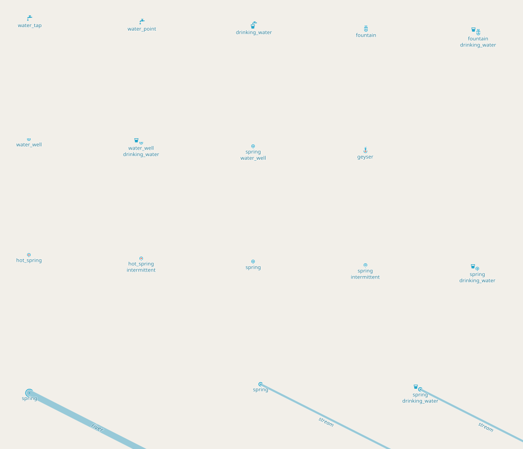
The images also show similar stylized icons for water wells, water taps, hot springs, fountains and geysers:
z15 spring with stream

z16 spring only

z18 spring with stream

z14-z16

z18
jeisenbe
on 21 Oct 2018
Changing water colors means solid changes in the style and AFAIK was important reason for making this fork in the first place. The idea was using 3 colors for different type of water, which I find not solving any problem we have with visibility, while creating big one with technical requirements. We have a ticket for this which is still not resolved.
I'm very surprised that you feel rendering from the forest are readable - for me they don't work at all in this respect. I can see the springs only because this is small image and I'm looking for them, yet it's not easy. Looking at full map I wouldn't be aware that there is any spring. And this is the easy case where the spring is properly attached to a stream, so I can follow the water to find if it begins with a spring. Alone spring node would be even harder to find, I guess.
kocio-pl
on 21 Oct 2018
The issue was the different color for ocean water, right?
Could we change the color of rivers only, to make them more visible on
darker backgrounds, and to match better with a darker spring color?
On Sun, Oct 21, 2018 at 1:39 PM kocio-pl notifications@github.com wrote:
Changing water colors means solid changes in the style and AFAIK was
important reason for making this fork in the first place. The idea was
using 3 colors for different type of water, which I find not solving any
problem we have with visibility, while creating big one with technical
requirements. We have a ticket for this which is still not resolved.I'm very surprised that you feel rendering from the forest are readable -
for me they don't work at all in this respect. I can see the springs only
because this is small image and I'm looking for them, yet it's not easy.
Looking at full map I wouldn't be aware that there is any spring. And this
is the easy case where the spring is properly attached to a stream, so I
can follow the water to find if it begins with a spring. Alone spring node
would be even harder to find, I guess.—
You are receiving this because you commented.Reply to this email directly, view it on GitHub
https://github.com/gravitystorm/openstreetmap-carto/issues/3461#issuecomment-431638386,
or mute the thread
https://github.com/notifications/unsubscribe-auth/AoxshPJrfDzLx92llQYgMQ5TunEZWdGMks5um_p8gaJpZM4XxmN1
.
jeisenbe
on 21 Oct 2018
I don't know, but I don't think this would help.
kocio-pl
on 21 Oct 2018
I like version with 1,5 px outline. Second icon is also not good for me and I don't have idea for a better one (anyway I think we should use simple geometrical shapes for natural objects), so I still suggest to use a dot on all zoom levels.
Tomasz-W
on 21 Oct 2018
Don't you have a problem recognizing them, especially on the grass?
kocio-pl
on 21 Oct 2018
@kocio-pl No, it's OK enough for me.
Tomasz-W
on 21 Oct 2018
I would definitely consider how we could render geysers and hot springs, which are both types of springs in a geological sense, but have quite different appearance and utility for people. Geysers and hot springs are often tourist attracts, but can also be dangerous, and they are not sources of drinking water like ordinary springs. Both tags, natural=geyser and natural=hot_spring, are used often enough to deserve an icon, I believe:
https://wiki.openstreetmap.org/wiki/Tag:natural%3Dgeyser
https://taginfo.openstreetmap.org/tags/natural=geyser
https://wiki.openstreetmap.org/wiki/Tag:natural%3Dhot_spring
https://taginfo.openstreetmap.org/tags/natural=hot_spring
Perhaps I should open a different issue for these two, but I think we should keep them in mind while working on the spring icon, especially because it would be nice if hot_spring was similar to the natural=spring icon, but sufficiently distinctive.
jeisenbe
on 21 Oct 2018
That's what I really like in his proposition (bringing up some special types of springs) and I agree that it's good to remember, however their usage is too low now.
They will be more popular for sure, but the possible scenario might be that they will be just a subtag of spring, just like it happened with fjords (natural=fjord is discouraged and natural=bay + bay=fjord should be used instead). However if this is settled down on Tagging, I would be happy to render them too.

kocio-pl
on 21 Oct 2018
How important is it for them to be rendered so early, given that they're small features? Even in rural areas they seem too prominent on the map. They can be found in urban areas too, where the current rendering really is too early: https://www.openstreetmap.org/#map=14/51.2446/-0.1911
 z14
z14
 z15
z15
 lakedistrictOSM
on 27 Oct 2018
lakedistrictOSM
on 27 Oct 2018
they're small features
They are not always small, there is a magnitude scale for them which I digged up in one of the earlier spring threads.
polarbearing
on 27 Oct 2018
I'm not aware of big springs other than being located inside some water area (@polarbearing could you give a link to something like this?). I'm rather thinking of springs as the outdoor object, and we try to exaggerate them, because in the outdoor there is much more free space. Even when they are located in the urban area, they tend to be in some park or other natural environment, as in your example, and they are not disturbing for me.
kocio-pl
on 28 Oct 2018
sent from a phone
On 27. Oct 2018, at 22:15, polarbearing notifications@github.com wrote:
They are not always small, there is a magnitude scale for them which I digged up in one of the earlier spring threads.
If I were cynical I would suggest to simply go by kocio’s typical size rule, they are smaller than atms, typically, ie. z19/20 would be the zoom to make them appear by this rule ;-)
 dieterdreist
on 28 Oct 2018
dieterdreist
on 28 Oct 2018
One thing I was observing is Big Spring Missouri, https://www.openstreetmap.org/node/5442671644, which is mapped as a node a body of water and starting a river way, currently invisible.
When debugging the invisibility I also found cases of springs as middle nodes in rivers.
There are also some springs mapped as area, which overpass will show easily.
polarbearing
on 28 Oct 2018
It would be possible to improve the rendering of springs by simply moving the icon back to the normal amenity-points layer, so that it layers over waterways, paths and other background objects:
Sink and Rise in Wyoming
Current z14

Current z16

New z14

New z16

jeisenbe
on 10 Nov 2018
Temple in Japan
Lots of these Shinto temples seem to have wells and springs
Current z17

New z17

Castle in Japan
Current (plus well pump) z18

New z18

It also might help to use a slightly more saturated color for the spring icon, such as that used for waterfalls; see the next comment.
jeisenbe
on 10 Nov 2018
But I would prefer to use these icons. I believe it is helpful to have a smaller icon at z14 and z15, and larger at z16 to z17. If needed, we could also make a slightly larger icon for z18 and 19, but I find it big enough.
Sink and Rise, Wyoming
z14

z16

z18

Forest temple in Japan
I recall there is concern about rendering on forest / dark backgrounds
z15

z16

z17

Hotsprings in the city
This is a very Japanese thing; I've not found urban hot springs anywhere else. Many of these are attached to public bath houses. (Note: no current rendering for hot springs to compare)
z15

z16

z17

z18

Scotland rural springs and caves
z14

z15

z16

z17

Red Butte, California
z14

z15

z16

z17

Springs, Geysers and Hot Springs Oh my! (Old Faithful, Yellowstone)
z15

z16

z18

Italian hot springs - mapped as ways
z14

z17

Village in Japan - touristy place with named hot springs, lots of hotels and travel icons in blue
z16

z17

(If we want larger spring icons for higher zoom levels, I would suggest making the semicircle slightly larger, and adding very slight S-shaped curve to the line exiting the spring at the bottom. This would be more similar to USA topographic map icons. @Tomasz-W ?)
jeisenbe
on 10 Nov 2018
This is a very Japanese thing; I've not found urban hot springs anywhere else.
Aachen has springs in the city as well:
https://www.openstreetmap.org/#map=18/50.77686/6.08826
 HolgerJeromin
on 10 Nov 2018
HolgerJeromin
on 10 Nov 2018
Related issues
 FTno
·
4Comments
FTno
·
4Comments
 Phyks
·
3Comments
Phyks
·
3Comments
 meased
·
3Comments
meased
·
3Comments
 boothym
·
5Comments
boothym
·
5Comments
 jengelh
·
4Comments
jengelh
·
4Comments
Most helpful comment
My remarks:
I would go with a blue dot with thiner outline on all zoom levels.