Openra: Reorder the Display tab in Settings
I think some of the tabs in the Settings menu are getting a bit overcrowded.
And with issues like #18242 and #18400 the Display tab is definitely going to be one of them (since those two warrant the addition of two new checkboxes in that tab).
So I was thinking we can do something like the Generals settings, where you have a button to open up additional visual settings.
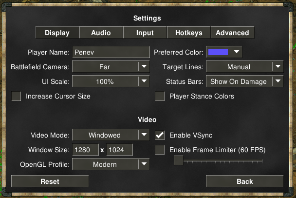
So starting with this (the current TS Settings menu, which is shared across mods):
I made some rough quick mockups:
From this
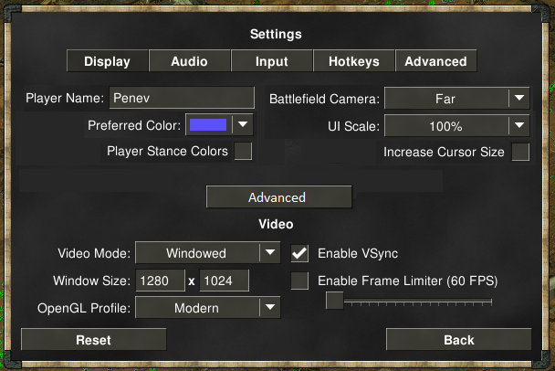
where some things are reordered and more logically grouped spacialy...
to finally this
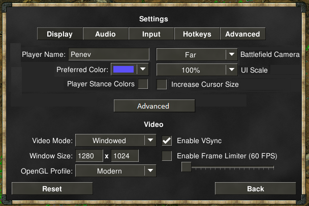
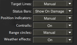
Where the Advanced button either opens a popup with additional settings or replaces the tab entirely and gives you a set of extra toggleables like these:
I want to resolve the two issues/features that this one may or may not be blocking, but I want to gather some opinions before thinking of doing this one.
P.S.: Mine is a rough mockup so I'm open to alternatives.
P.P.S.: @cjshmyr did note "I'd personally move stance colors checkbox in there too", but I personally find that a bit questionable.
 penev92
All 7 comments
Right-handed checkboxes look weird, IMO.
 pchote
on 21 Jul 2020
pchote
on 21 Jul 2020
I figured someone might bring that up.
Going with @cjshmyr's suggestion would actually resolve that issue (but break the symmetry).
penev92
on 21 Jul 2020
How about left-aligning and stacking all the settings in a scroll pane and not worrying about layout or hiding things behind an "Advanced" toggle?
At the same time we can switch to vertical tabs layout which would allow the settings to be broken up into more tabs (also allowing mods to add their own tabs).
And of course any changes to the layout here would be much easier with Yoga. So it's a good time to bounce some ideas around.
 dragunoff
on 21 Jul 2020
dragunoff
on 21 Jul 2020
There are strong parallels between this and #6354, so ping @dragunoff for thoughts and comments. This might provide a route to a clearer UI for #17737?
Edit: beat my ping by literally seconds 😓
pchote
on 21 Jul 2020
The "advanced" options here aren't really advanced, nor are they really "display". A simpler approach that could eventually lead into @dragunoff's more ambitious suggestion could be to simply add a new "Interface" tab that should still just about fit horizontally.
pchote
on 21 Jul 2020
Of all the suggestions I like the new tab the best, so I'm all for that 👍
As much as I'd like to try out Yoga though, I do want to see the two linked issues resolved.
penev92
on 21 Jul 2020
I would be careful about adding tabs that will just about fit if there's any possibility of the interface needing to accommodate more verbose languages than English.
 ghost
on 28 Jul 2020
ghost
on 28 Jul 2020
Related issues
 dnqbob
·
3Comments
dnqbob
·
3Comments
 KOYK
·
4Comments
KOYK
·
4Comments
 TheMightyAltroll
·
3Comments
TheMightyAltroll
·
3Comments
 Maurice84
·
4Comments
Maurice84
·
4Comments
 drunsinn
·
4Comments
drunsinn
·
4Comments
Most helpful comment
The "advanced" options here aren't really advanced, nor are they really "display". A simpler approach that could eventually lead into @dragunoff's more ambitious suggestion could be to simply add a new "Interface" tab that should still just about fit horizontally.