Just some ideas, mock-ups that I have created for a possible TD UI.

Want to back this issue? Post a bounty on it! We accept bounties via Bountysource.
 xan2622
All 67 comments
Pretty :)
 penev92
on 1 Mar 2015
penev92
on 1 Mar 2015
Just my opinion, but I think the metal should be darker kind of like the original TD UI.
 Nelax
on 1 Mar 2015
Nelax
on 1 Mar 2015
Would you be happy yo make a mock up with a darker grey texture like the original, with the green buttons, but buttons with the grey textured background rather than the black ones?
EDIT: Possibly GDI / NOD colours used instead of the green for us to have a Nod / GDI interface.
 DanAE111
on 2 Mar 2015
DanAE111
on 2 Mar 2015
I think that'd be preferable, but I can't really say until I see it. I just would prefer something more like the original.
Nelax
on 2 Mar 2015
Bynnar18 said:
Just my opinion, but I think the metal should be darker kind of like the original TD UI.
Btw, by "original" TD UI, it depends on which game you are talking about:

or

I would really prefer that we choose to go for a lighter UI. I don't think we are obliged to follow the original UI.
dan9550 said:
Would you be happy yo make a mock up with a darker grey texture like the original, with the green buttons, but buttons with the grey textured background rather than the black ones?
Are we obliged to mimic the original UI ? I don't really like how it looks:

xan2622
on 2 Mar 2015
I think the right-hand version of the latest mockup looks great.
 pchote
on 2 Mar 2015
pchote
on 2 Mar 2015
I suppose, you're correct. I'm more fond of the non-DOS UI, but the right hand mockup does look pretty good. We might as well go with it if I'm the only one in opposition.
Nelax
on 2 Mar 2015
This is not my favourite UI but please, let me add some glass effect over these black buttons:

xan2622
on 2 Mar 2015
Black glass looks the best of the three to me.
 RoosterDragon
on 2 Mar 2015
RoosterDragon
on 2 Mar 2015
The right is definitely better. The tiny black outline makes the buttons more defined.
Nelax
on 2 Mar 2015
Do you plan to mimic the power jauge there ?

 ghost
on 3 Mar 2015
ghost
on 3 Mar 2015
Agree with @RoosterDragon here, though I would actually prefer the icons be on a layer above the gloss.
 Phrohdoh
on 3 Mar 2015
Phrohdoh
on 3 Mar 2015
@StexoO said:
Do you plan to mimic the power jauge there ?
Yes, that is more or less my plan. The current TD UI already supports a powerbar and silobar.
xan2622
on 3 Mar 2015
@x-a-n-a-x as reluctant as you are i love the work you've done mimicking the classic UI. I think it looks great.
our differences in opinion make me kind of wish we had selectable skins in a way just to make everyone happy.
DanAE111
on 12 Mar 2015
I have temporarily postponed the TS UI to work on the RA2 UI https://github.com/Phrohdoh/oramod-ra2/issues/11. Btw, some ingame-player.yaml errors (for the TS UI) still block me from having a working and testable UI.
And even if I like the idea to have a "skins switcher" in the options, I doubt it will easily be implemented. How would they managed by OpenRA? And where will the chrome.yaml, ingame-player.yaml, and all the PNG files be stored? Wouldn't it create a mess in the OpenRA sub-folders tree?
xan2622
on 12 Mar 2015
If we could make a texture pack kinda thing we could just put them in folders/zips and throw them in a texture pack directory.
We would need to decide though if the yaml files should be with the pngs, if we have only one static yaml (so all images need to be same size etc) or we introduce a system where the textur packs modify certain parts of the yaml.
I like the first option the best of these.
 MunWolf
on 12 Mar 2015
MunWolf
on 12 Mar 2015
Any Progress on this?
I'm looking forward to the new TD UI
ghost
on 22 Jul 2015
It's more or less postponed until I finish the RA2 UI.
xan2622
on 22 Jul 2015
Really like the latest mockup.
ghost
on 22 Jul 2015
Still nothing new about this UI redesign?
ghost
on 30 Dec 2015
It is still postponed but you have just given me interest in finishing it.
EDIT : I have resumed my work on the graphics but editing the yaml will take some time (because the curent (TD) yaml files are different than RA2 or TS ones).
xan2622
on 30 Dec 2015
Update : I am currently working on the yaml files. I think you can expect a first playable (but still WIP) demo of the interface by the end of the week-end.
xan2622
on 1 Jan 2016
The UI is getting along nicely but I am facing some problems:
- the whole mod UI has been broken (this is a little bit annoying, I admit)
- the horizontal factory switcher (with left and right arrows to select the next factory) is not there yet
- the production icons are not displayed even if you expand the MCV
So.. things are pretty much broken at the moment.
https://github.com/x-a-n-a-x/OpenRA/tree/TDUI2
xan2622
on 2 Jan 2016
I've said it before, on IRC, but I'll add it here for completeness too: I've never liked the wide "concrete" edges around the build palette, and would strongly prefer if we cut the frame off at the tabs row, and left the icons hanging out the bottom (like we do in the current UI).
This UI feature distinguishes TD from our other mods, and evokes the feeling of the C&C3 sidebar: http://vignette4.wikia.nocookie.net/cnc/images/d/db/Command_Conquer_3-Tiberium_Wars.jpg/revision/latest?cb=20111130000812
pchote
on 3 Jan 2016
I don't like them much either. To be honest, I planned to change the bottom part later.
But I didn't know that the idea was to mimick the C&C3 UI (that I like much, BTW).
@pchote: would you accept:
1 - a thin border around the build-palette,
2 - an extra-thin border,
3 - or you'd really prefer keeping the c&c3's ui (no border at all) ?

By uploading an incomplete UI onto this branch, I just wanted to show a first draft of the UI, ingame.
I just wanted to have a working interface first, then the idea was to polish the UI afterward.
But my current problem is : how to make this UI work?
Beause, as you told me on IRC, this UI is broken because I based it (chrome.png, chrome.yaml and ingame.yaml) from TS.
One of the problems is : buttons for example. In the current TD UI, they are made of several parts while RA2, TS and D2K's are made of plain buttons (which is another technique that allows gradiants, reflexion effects and textures). I don't know if I'll be able to port this current UI proposal to the old TD's method.
xan2622
on 3 Jan 2016
3 looks really good, IMO.
pchote
on 3 Jan 2016
2 over 1, 3 looks "modern" i think i would have to see it in game to decide though.
DanAE111
on 4 Jan 2016
Branch https://github.com/x-a-n-a-x/OpenRA/tree/TDUI2 updated:
- new buttons
- glass effect added to buttons (only on the ingame sidebar interface)
TODO/bugs:
- [ ] finish to add the gray texture on all Settings windows
- [ ] map previews should all have their frame similar to a "checkbox" (check the replay browser as an example)
- [ ] the music tab features "panel-texture" as background. I tend to like it but other mods don't have that
- [ ] In Settings > Display: you can notice that a sentense is not readable because of its gray color
- [ ] all windows : the buttons placed at the bottom are overlapping 1px on the main window (it was made on purpose for the current/old TD UI but with this new UI, we can notice this small problem)
- [ ] textfield-focus color looks too vivid
- [ ] the production-queue tabs width should be the same as the production palette icons (below)
- [ ] give the Nod faction its own darker background panel-texture
- [ ] fix the minimap height & width (it should display a 1px black border surrounding the minimap)
- [ ] make button-hover color more vivid
- [ ] fix power & silo vertical bars

xan2622
on 16 Jan 2016
It would be nice if you could also move the map time and add the numeric power display like you did in your old previews... I just find the numeric stuff faster to read and the current map time just looks well, you know.
(This doesn't mean that you should drop the vertical bars, can't we have both?)
ghost
on 16 Jan 2016
If you pushed the production buttons together and to the right (so that there is no grey frame between the individual buttons – like C&C3 does in the image I linked above) there would be enough space to move the three order buttons to the left of them. You would then have plenty of space above the minimap to display the cash, power, timer, and menu button.
pchote
on 16 Jan 2016
I did some tweaks based on how I would like this to look/work (specifically the buttons and the amount of dead space).

pchote
on 16 Jan 2016
Here is my latest version of the UI (based on pchote's suggestions, on IRC):
https://github.com/x-a-n-a-x/OpenRA/tree/TDUI-pchotesidea_blurbg
TODO/Bug:
- [ ] Place a glass effect at the bottom (not shown on this ingame screenshot), over the Production Buttons (Buildings, Defense..) and over the Production Queue Tabs as well.

xan2622
on 19 Jan 2016
I do like the way this is turning out. The icons have been green in those older previews... did you drop that idea or will it be used for the nod version?
ghost
on 19 Jan 2016
There are a couple of places where there is sharper contrast than IMO looks good:
- The sharp grey-black transition between the radar background and the cash line below it (both should be black, so that this is seamless)
- The sharp grey-black transition between the disabled production buttons and enabled ones. These should be made darker.
I also think it looks a bit odd to have the combined radar+cash bin taller than it is wide. Chopping off 20 pixels to make it square looks more balanced.
Mockup with all suggestions:

pchote
on 19 Jan 2016
My latest branch : https://github.com/x-a-n-a-x/OpenRA/tree/TDUI-pchotesidea_6

TODO/Bug:
- [ ] Place a glass effect at the bottom (not shown on this ingame screenshot), over the Production Buttons (Buildings, Defense..) and over the Production Queue Tabs as well.
Check line 433 in ingame.yaml : https://github.com/x-a-n-a-x/OpenRA/blob/TDUI-pchotesidea_6/mods/cnc/chrome/ingame.yaml#L433
xan2622
on 20 Jan 2016
What happend to the green buttons and text? White looks a bit meh imo... I like the rest though.
ghost
on 8 Apr 2016
I'd assume white is GDI, green is Nod.
 GraionDilach
on 8 Apr 2016
GraionDilach
on 8 Apr 2016
That is looking awesome.
DanAE111
on 20 Apr 2016
Here is another alternative branch I have been working on (based on some pchote's comments on IRC): https://github.com/x-a-n-a-x/OpenRA/tree/TDUI-pchotesidea_7

Question : do we really want to also add the timer in the middle of the UI (between the power and silo values)? as shown in this mockup: https://github.com/OpenRA/OpenRA/issues/7572#issuecomment-172232385
xan2622
on 5 Jun 2016
I would prefer it if the map timer moves into the ui like it is the case for all the other mods. This would also open up some space that mappers can use to display mission specific info (See soviet07).
ghost
on 5 Jun 2016
ok, I have just added the timer as well in my github branch.
xan2622
on 5 Jun 2016
Ok, after testing it:
- The old map timer is still active
- I guess the green buttons from earlier designs got dropped?
- Could we display the faction emblem while the radar is not active?
- Regarding my last question, how difficult would it be to support the funpark emblem for said missions?

ghost
on 6 Jun 2016
Something that I've asked a few months back:
Will Nod and GDI share the same design or will there be variations? Like it's the case for all the other mods.
Edit: At least I would like to know from pchote or x-a-n-a-x.
ghost
on 18 Jun 2016
Anything new on this? Or is any sort of development pretty much on hold until the next stable is out?
ghost
on 18 Sep 2016
Here is what I made today:

Todo:
- make the production tabs green (they are currently red)
- find a way to modify the font colors for power/time/cash labels (they are currently white)
- create a darker UI for the nod faction (with red colored labels/buttons)
EDIT: this is just a test. I've been told that the green colors make the UI dull (lack of contrast). I think I'll bring the white colors back and now I wonder if I will make a darker UI for the nod, at least for the moment.

(click for full view)
xan2622
on 30 Sep 2016
I like the green, the white on the UI looks a tad bland. other than that :+1:
DanAE111
on 1 Oct 2016
Hmm.. You're the second person to prefer the green colors and I do prefer them too over the white buttons (also, the original TD UI featured dark buttons with green glyths/icons on them).
I will wait for more feedback but if the consensus goes this way, I'll try to make the green UI more contrasted and make a PR (once this is all finished).
xan2622
on 1 Oct 2016
That specific use of soft green + gradient has poor contrast against the button and surrounding grey frame, which is bad for usability. It also clashes pretty badly with the other greens that we use in the minimap and power bar, IMO.
pchote
on 1 Oct 2016
I think those buttons should be flat, currently they look out of place.
 Sininini
on 1 Oct 2016
Sininini
on 1 Oct 2016
If the buttons around the minimap were green including the power, game time, and cash indicators and values. that should be fine. The red borders around the build palette should be a grey.
In my head that sounds like a good idea. May need to tweak the power and cash bars for that to work.
DanAE111
on 2 Oct 2016
Yeah, that soft green doesn't appear to work so well on the current design of the UI... and I'm not a fan of everything being white either. Looks kinda dull that way.
The UI made overall some great progress though!
ghost
on 9 Oct 2016
Is there any progress on this? I'm surprised that it isn't finished.
ghost
on 17 Sep 2017
Overall I like the WIP displayed here and I think this definitely should be resurrected - the TD mod could use an UI upgrade as currently it is rather bland.
A couple of functional enhancement would also be nice - especially adding the numbered power indicator, as right now you need to hover your mouse over the power bar to see the exact amount of power.
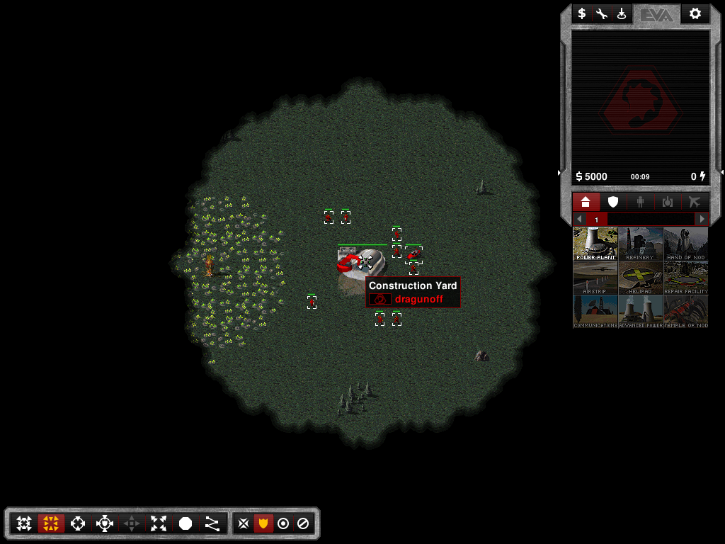
 dragunoff
on 19 Sep 2017
dragunoff
on 19 Sep 2017
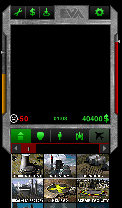
I am resurrecting my work on the TD UI. For now, I have a branch with a single UI with white icons.
https://github.com/xan2622/OpenRA/tree/TDUI-white
I still don't know how to make the Production Queues not red (the frame that surrounds the factories numbers and left and right arrows). If someone knows..
I plan to create another branch to demonstrate how it looks like with a GDI UI (green icons) and a NOD UI (red icons & maybe darker background texture).
EDIT:
Here is another branch for the same UI but with green icons:
https://github.com/xan2622/OpenRA/tree/TDUI-green
xan2622
on 21 Jan 2018
I've tested the UI - great work :-) I realize this is a work in progress but I have a couple of remarks:
1) I was surprised when I saw the sad face emoticon on low power :-) How about simply making that power icon red?
2) Personally I prefer the white icons but I think that there is not enough contrast between currently selected tab and unavailble tabs. Even in the screenshot below the first tab(available, but not selected) pops out because it has more contrast than the rest.
dragunoff
on 1 Feb 2018
Here are the PSD files, for those who want to integrate this sidebar UI into OpenRA.
There are git branches above that you can use to test the current state of the UI.
https://www.dropbox.com/sh/hi67giafc0zqu5e/AACWl4JKRSuHWXHRaTaA9_fIa?dl=0
xan2622
on 28 May 2018
@xan2622 i look forward to seeing the Nod variant you mentioned.
DanAE111
on 28 May 2018
@xan2622 I'm going to integrate it into OpenRA. I'll test the state of the UI and see if it's ready.
 BenChricton78
on 30 May 2018
BenChricton78
on 30 May 2018
How do I integrate it into OpenRA?
BenChricton78
on 30 May 2018
I've tested it. All I need to do now is replace the sad emoji with a red power symbol, and have the factions' symbols in the screen of the UI.
BenChricton78
on 30 May 2018
Updated files with command bar
png: https://drive.google.com/open?id=1Msk-HKR68te3XVZVk4hpYH3ELiSgpxkR
psd: https://drive.google.com/open?id=1API6RUf4JnOyvJmwN8xws8qGO1NcqlRm
Other than the additional command bar it's the same layout as @xan2622 's. So it should be quick to test.
 mabulsoud
on 30 Jul 2018
mabulsoud
on 30 Jul 2018
Adding to the milestone so that we don't forget this.
pchote
on 12 Aug 2018
I've picked this up and I've been working on it. This is largely the the work of @xan2622 and @mabulsoud with some twists from me.
I've decided to go with a distinct UI for the two factions. But I was not able to work around a limitaion in ProductionTabsWidget that prevented me from using green background for GDI buttons (because they would not match to the hard-coded red panel of the production tabs).
I swapped the positions of power and silo usage to be consistent with other mods (it's easy to swap them back if desired).
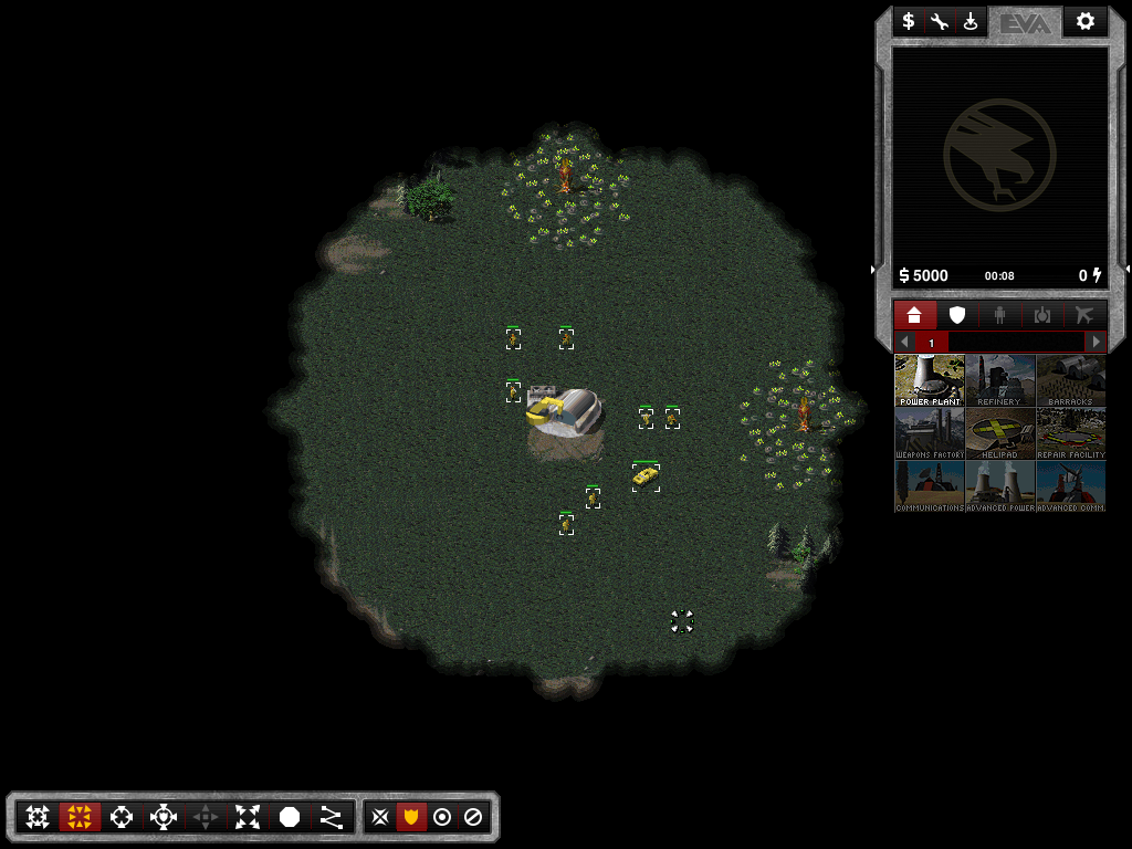
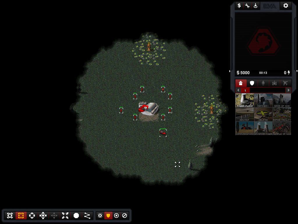
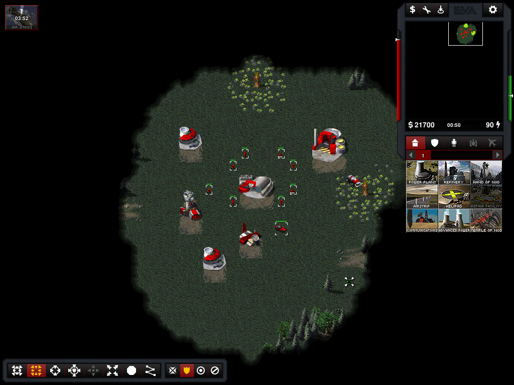
The UI is coded and working in game, these are actual screenshots. If anyone wants to test it, here's my WIP branch: https://github.com/dragunoff/OpenRA/tree/feature/cnc-ui--dragunoff
And so, here's what I came up with:
GDI
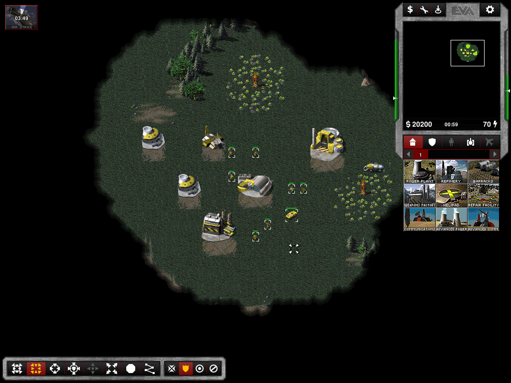
Nod
dragunoff
on 30 Dec 2018
I've managed to make green production tabs and support power background for GDI. However tooltips are still red. I tried sorting that out but it's a whole other mess it seems... And I'm not sure whether I wanna go that way for GDI - perhaps because I'm so used to the red panels in TD :-)
dragunoff
on 2 Jan 2019
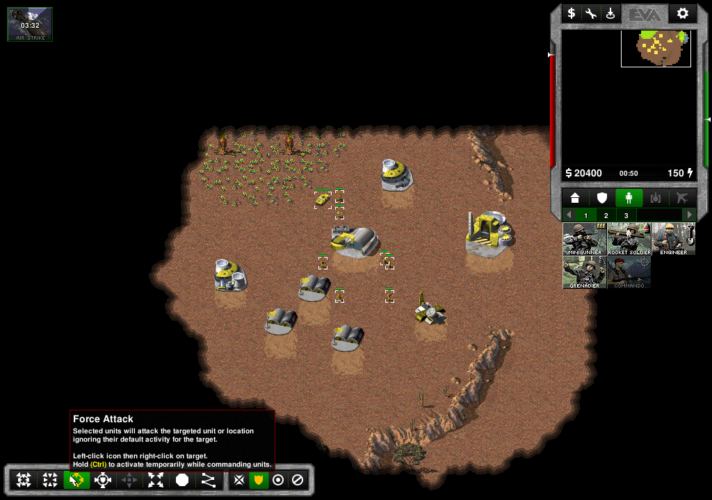
Nod UI with light panels (same as GDI) but with red buttons. I feel like this is the best combo so far: light panels for both factions, with green buttons for GDI and red buttons for Nod.
dragunoff
on 4 Jan 2019
Test builds with the new UI can be downloaded from here:
https://drive.google.com/drive/folders/152J4jvXVkpINDhEQuEK1qgx039nuH3ti?usp=sharing
dragunoff
on 4 Jan 2019
Congratulations @dragunoff for finishing the work that I started a long time ago.
xan2622
on 15 May 2019
Related issues
 Hammerfest
·
4Comments
Hammerfest
·
4Comments
 drunsinn
·
4Comments
drunsinn
·
4Comments
 Punsho
·
4Comments
ghost
·
4Comments
Punsho
·
4Comments
ghost
·
4Comments
 SoScared
·
3Comments
SoScared
·
3Comments
Most helpful comment
Nod UI with light panels (same as GDI) but with red buttons. I feel like this is the best combo so far: light panels for both factions, with green buttons for GDI and red buttons for Nod.