Openfoodnetwork: [mobile ux] 4. Order cycle design update
What is the problem we are solving
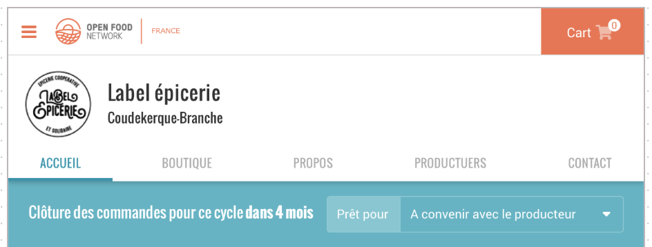
Currently users do not notice the order cycle section as they are not used to ordering in cycles.
Success factors = expected outcome
- [ ] Users start to notice that the order cycle section and therefore there is a decrease in displaying the 'select an order cycle' message
Design overview
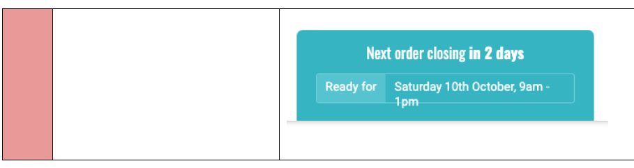
HOW IT LOOKS NOW
_Mobile_
_Tablet_
_Desktop_
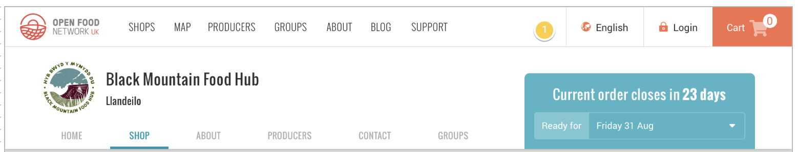
HOW IT WILL LOOK IN FUTURE
_Mobile_
_Tablet_
_Desktop_
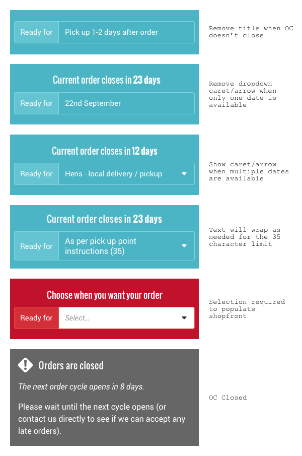
_Design for different states_
Design details are kept in our Zeplin account: https://app.zeplin.io/project/59532764a6c78ff3c534b372/dashboard
 daniellemoorhead
All 16 comments
@RachL is there any way we can see that this design fixes the issue shoppers have in understanding that they have to select an order cycle?
daniellemoorhead
on 13 Dec 2019
@daniellemoorhead
I think so yes.
Automatically:
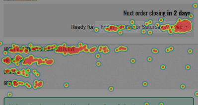
we cannot add events yet with our Matomo set up, but we have heatmaps. I just need to get our limit lifted up because currently I consumed everything by testing it 🙈
With our users:
Each week I have complaints on this. So I have a 5-6 shops I can ask to follow the difference after the new design is in place. I'm sure other instance have it too.
It's almost the only thing I hear complaints about in terms of design...
Also I'm not sure the version with the carret and a blue background is correct.... I think each time you have several OC open you have the red box.
 RachL
on 13 Dec 2019
RachL
on 13 Dec 2019
I think each time you have several OC open you have the red box.
@yukoosawa @mkllnk we'll need to understand the different states that this order cycle section has, so that we cover them all. Seems there's one additional one that @RachL has identified that we haven't included in the list. @mkllnk could you please confirm the full list so that @yukoosawa can make sure she covers all of them? :)
daniellemoorhead
on 17 Jan 2020
When doing this @mkllnk let's look at all the states that the OC can be in and see if a change needs to happen around the use case that @RachL raises.
daniellemoorhead
on 17 Jan 2020
I am planning to tackle the remaining 3 issues in this epic now.
 luisramos0
on 1 May 2020
luisramos0
on 1 May 2020
Time for a design sweep on this epic, to make sure @yukoosawa is happy with the output, that we've achieved the desired outcomes, and that we can officially close this!
daniellemoorhead
on 8 May 2020
DESIGN SWEEP - Sunday May 10, 2020
_Google doc w/images to accompany issues: https://docs.google.com/document/d/1JsplLJJLhRwLUKv7WrgEr6thOylOtJ3JMC5wni42gEE/edit?usp=sharing_
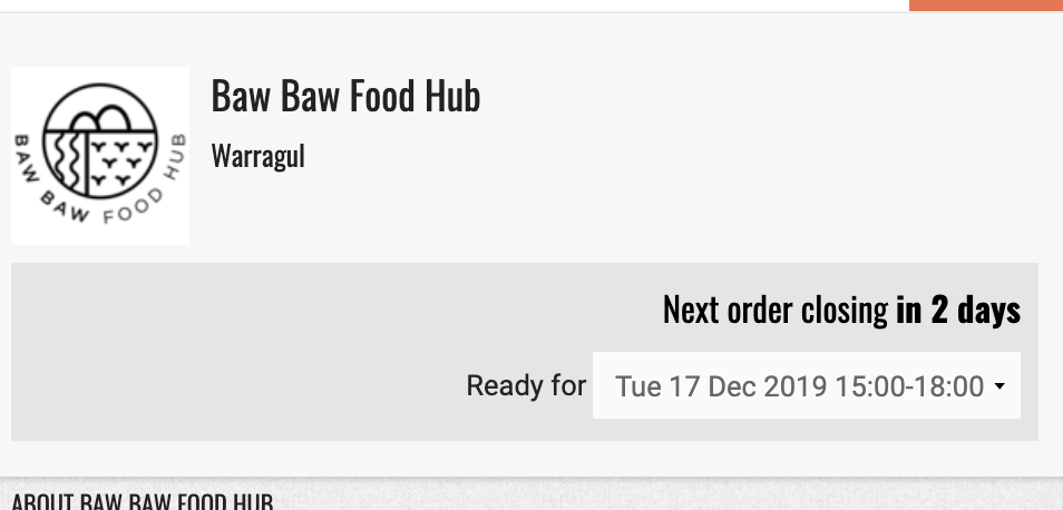
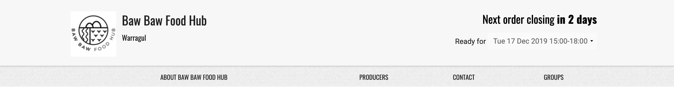
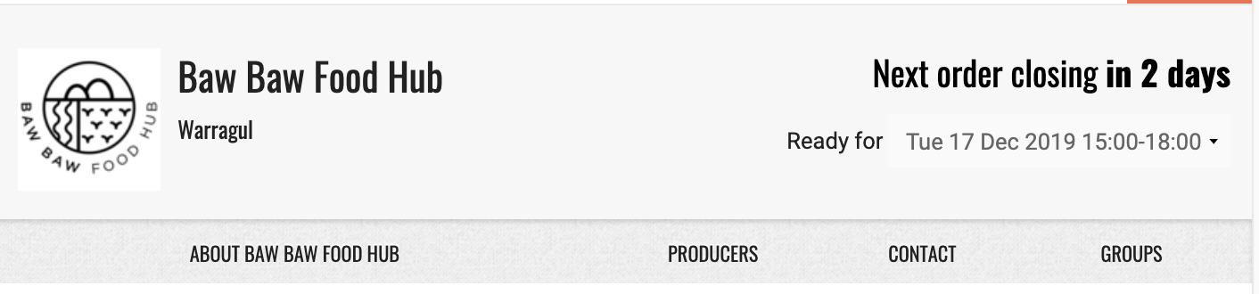
OC Selector
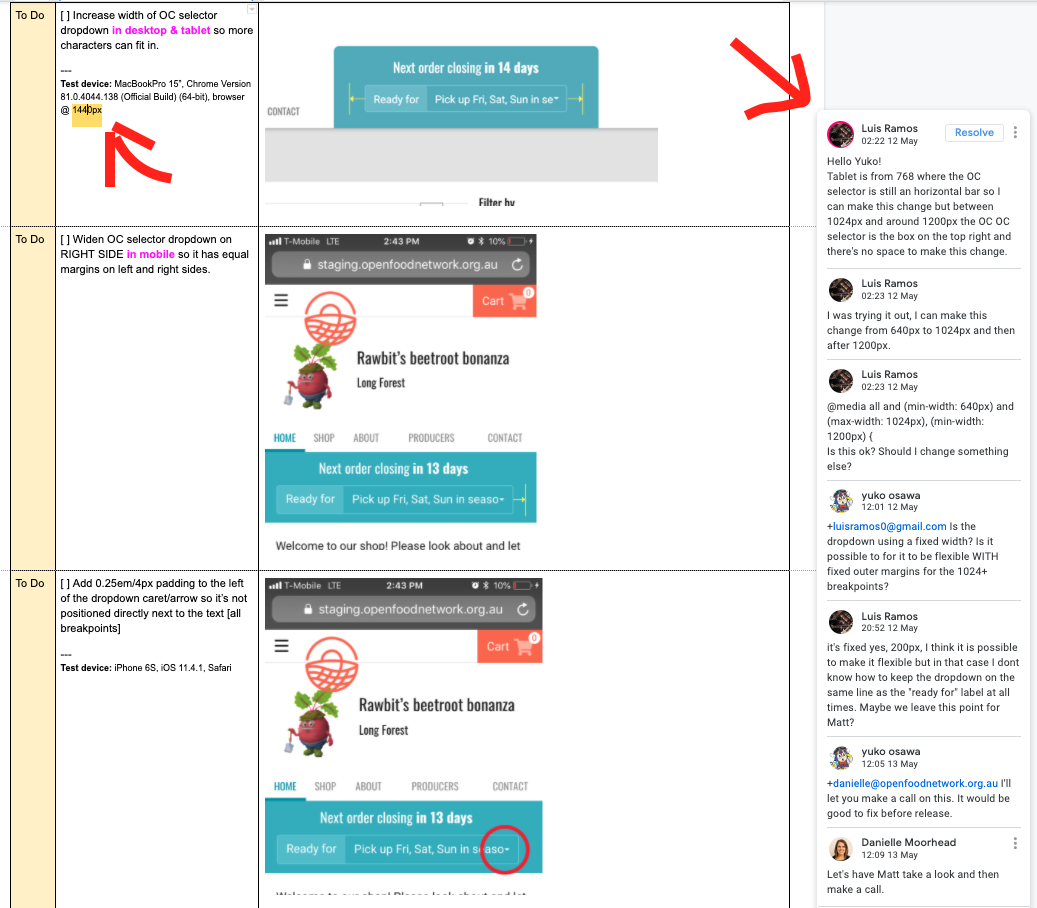
- [x] Increase width of OC selector dropdown so more characters can fit in [desktop & tablet]
- [x] Widen OC selector dropdown on RIGHT SIDE so it has equal margins on left and right sides [mobile]
- [x] Add padding to the left of the dropdown caret/arrow so it’s not positioned directly next to the text [all breakpoints]
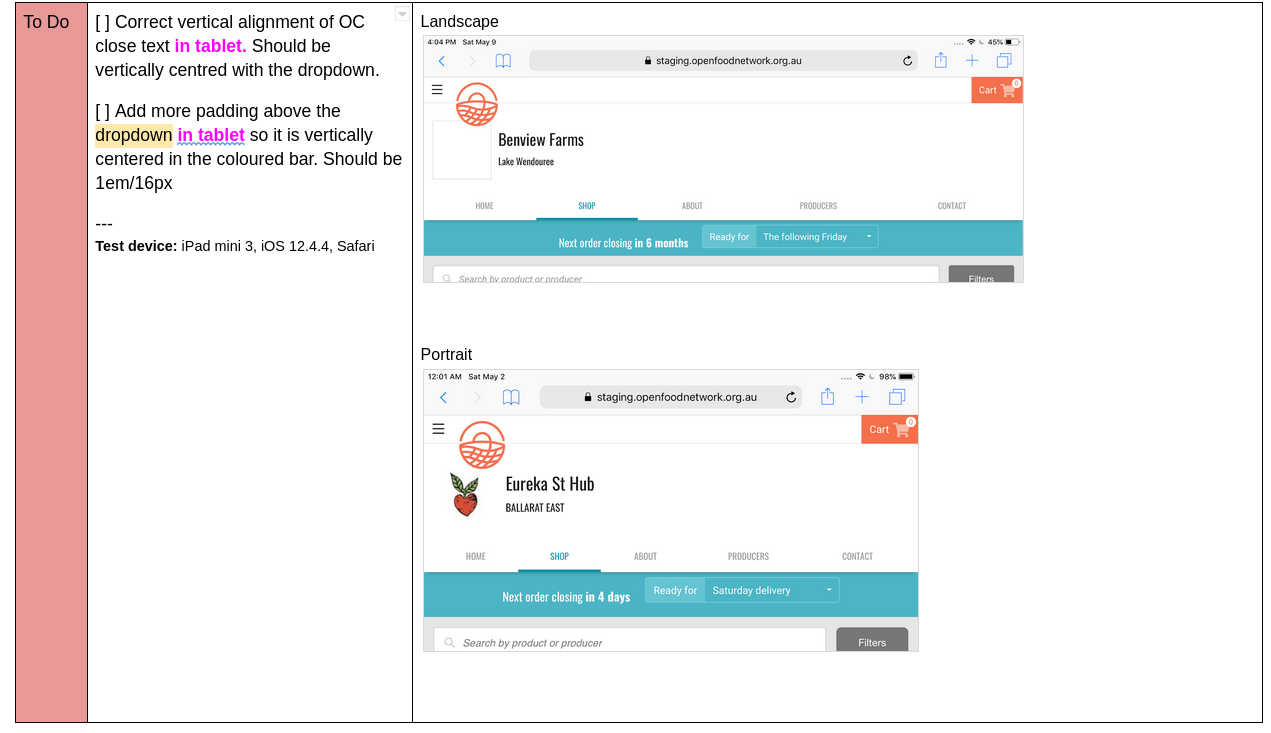
- [ ] OC close text should be vertically centred with dropdown [tablet]
- [ ] Add more padding above the dropdown so it is vertically centered in the coloured bar [tablet]
EDIT - NEW ITEM
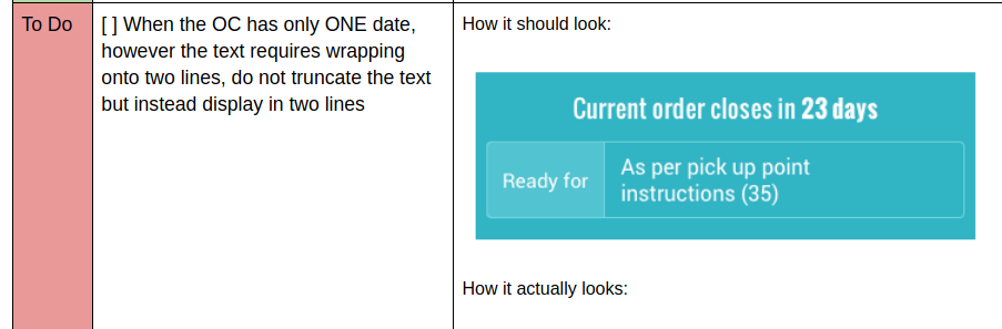
- [ ] When the OC has only ONE date, however the text requires wrapping onto two lines, do not truncate the text but instead display in two lines
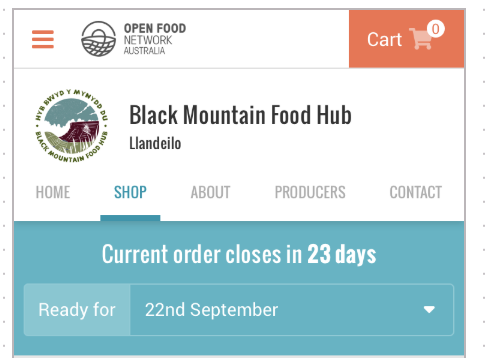
No open OC
- [x] Grey background behind closed message should span the viewport (I believe Matt has solved this with #4604) [desktop]
- [x] Exclamation point ‘!’ and ‘Orders are closed’ text is not vertically centred with the shape [mobile]
 yukoosawa
on 10 May 2020
yukoosawa
on 10 May 2020
great @yukoosawa thanks a lot.
I'll take this one. I'll make a new PR to fix these things :+1:
luisramos0
on 10 May 2020
I have ticked the 4 items addressed in #5407
According to browserstack the two last "OC Selector" items are specific to ipad mini 3, it looks good on ipad and also on ipad mini 2019. I cant fix it because the simulator of ipad mini 3 is not working with my local.
luisramos0
on 12 May 2020
@Matt-Yorkley the first item in @yukoosawa's OC design sweep document needs your attention, not sure if you'd be alerted about this so pinging you in here:
daniellemoorhead
on 15 May 2020
Unassigning myself from this one.
There are 3 pending points after #5407 I believe:
- ipad mini 3 padding issue
- improve what's in #5407 about widening the OC selector (see @daniellemoorhead previous post)
- new item in Yuko's comment above: break text in two lines when OC description is long
luisramos0
on 26 May 2020
Ok, looking at this with Yuko and there are 2 things remaining to be done that can be viewed on the design sweep doc (look for the RED coloured sections)
[ ] Vertical alignment issues on iPads
[ ] Text wrapping in the field when there is a single OC and the text spans more than the field width.
These two things are all that remain to be fixed.
daniellemoorhead
on 6 Oct 2020
Awesome, thanks for clarifying @daniellemoorhead :ok_hand:
See comment below for more details about the issues.
luisramos0
on 6 Oct 2020
I am copying the content to the issue so new contributors dont need to navigate the doc:
Vertical alignment issue:
Text wrapping issue:
luisramos0
on 6 Oct 2020
I tagged good first issue. This is a good first issue if you are an experienced CSSer.
luisramos0
on 6 Oct 2020
Oh my oh my THE LAST ISSUE WAS MERGED

RachL
on 8 Jan 2021
Related issues
 sstead
·
4Comments
sstead
·
4Comments
 shen-sat
·
3Comments
shen-sat
·
3Comments
 HugsDaniel
·
3Comments
HugsDaniel
·
3Comments
 andrewpbrett
·
3Comments
andrewpbrett
·
3Comments
 filipefurtad0
·
3Comments
filipefurtad0
·
3Comments
Most helpful comment
Oh my oh my THE LAST ISSUE WAS MERGED