Openfoodnetwork: [mobile ux] 3. Shop content tabs
What is the problem we are solving
Currently all the shop content is displayed on the single page shopfront above the product list, each behind an expando-collapso text section.
Problems with this:
- It's unclear for users that you can click on the header to close the section.
- It takes up a lot of real estate above the product list.
- There is no way for the shop to direct their users directly to any of this content, especially the about section, as there is only the single shopfront URL.
Success factors = expected outcome
- [ ] The content is moved to its own page, where users can choose to navigate to without impacting on access to the products list.
- [ ] Users can navigate directly to a tab, and shops can share separate URLs for each content section.
Design Overview
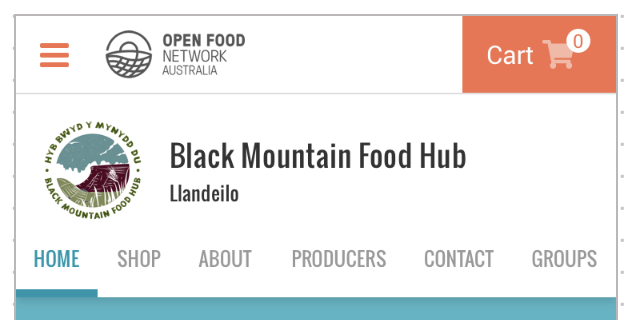
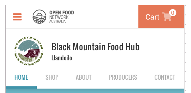
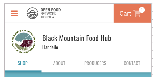
List of content tabs:
- Home: This is the shopfront message that you see displayed in green on the current design, provided by enterprise
- Shop: Product list
- About: About content provided by enterprise
- Producers: List of producers whose products are in the shop (auto populated)
- Contact: contact details provided by enterprise
- Groups: List of groups they are included in (auto populated)
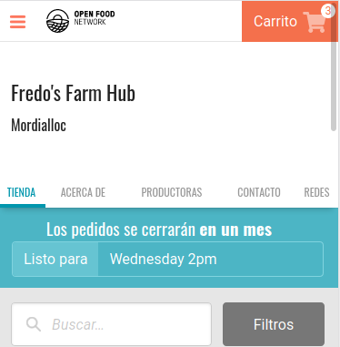
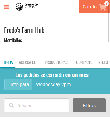
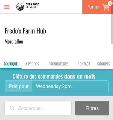
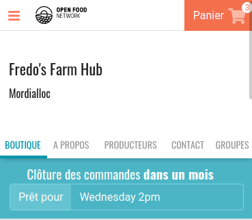
MOBILE: FULL LIST OF CONTENT TABS
MOBILE: GROUPS TAB DOES NOT DISPLAY IF NOT IN A GROUP
MOBILE: HOME TAB DOES NOT DISPLAY IF THERE IS NO SHOPFRONT MESSAGE
TABLET
DESKTOP
Design details are kept in our Zeplin account: https://app.zeplin.io/project/59532764a6c78ff3c534b372/dashboard
 daniellemoorhead
All 37 comments
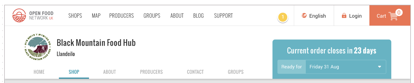
@yukoosawa design input required: have I understood the Home tab correctly - is this the shopfront message that currently displays in a green call out box on the shopfront? I feel like maybe it's a bit more than that, like the 'choose your order cycle' message is there (will this display on the shop tab as well if they haven't?).
daniellemoorhead
on 13 Dec 2019
@daniellemoorhead Yes the OC selection module needs to appear on the 'Home' tab aswell as the 'Shop' one as Customers write instructions for how to use the OC selector in the green box
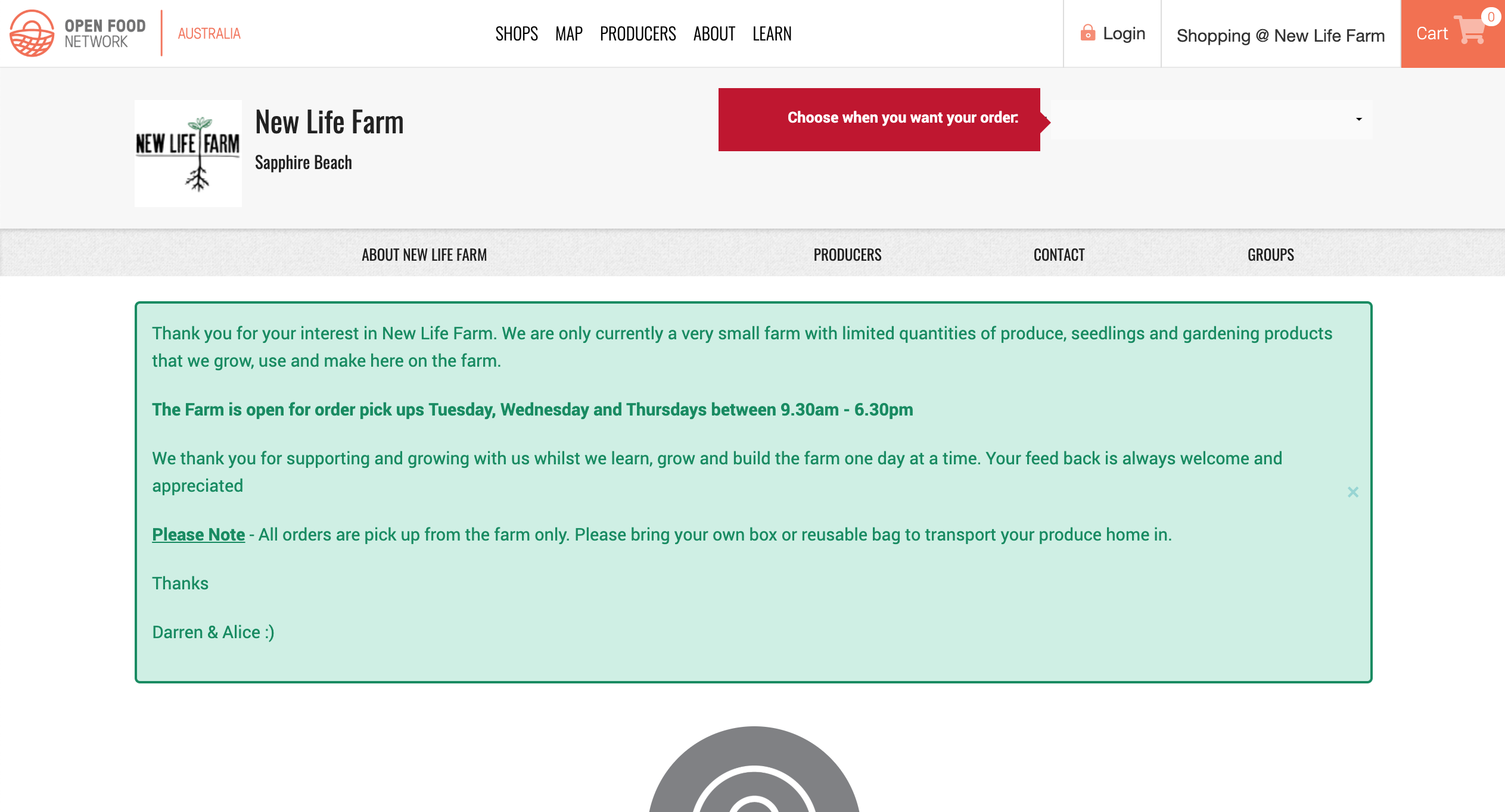
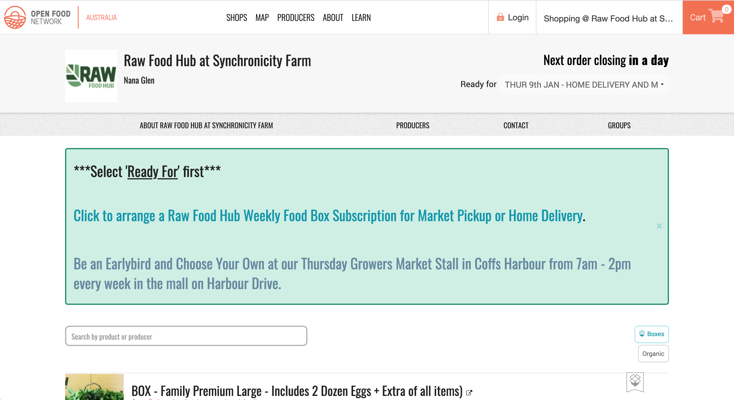
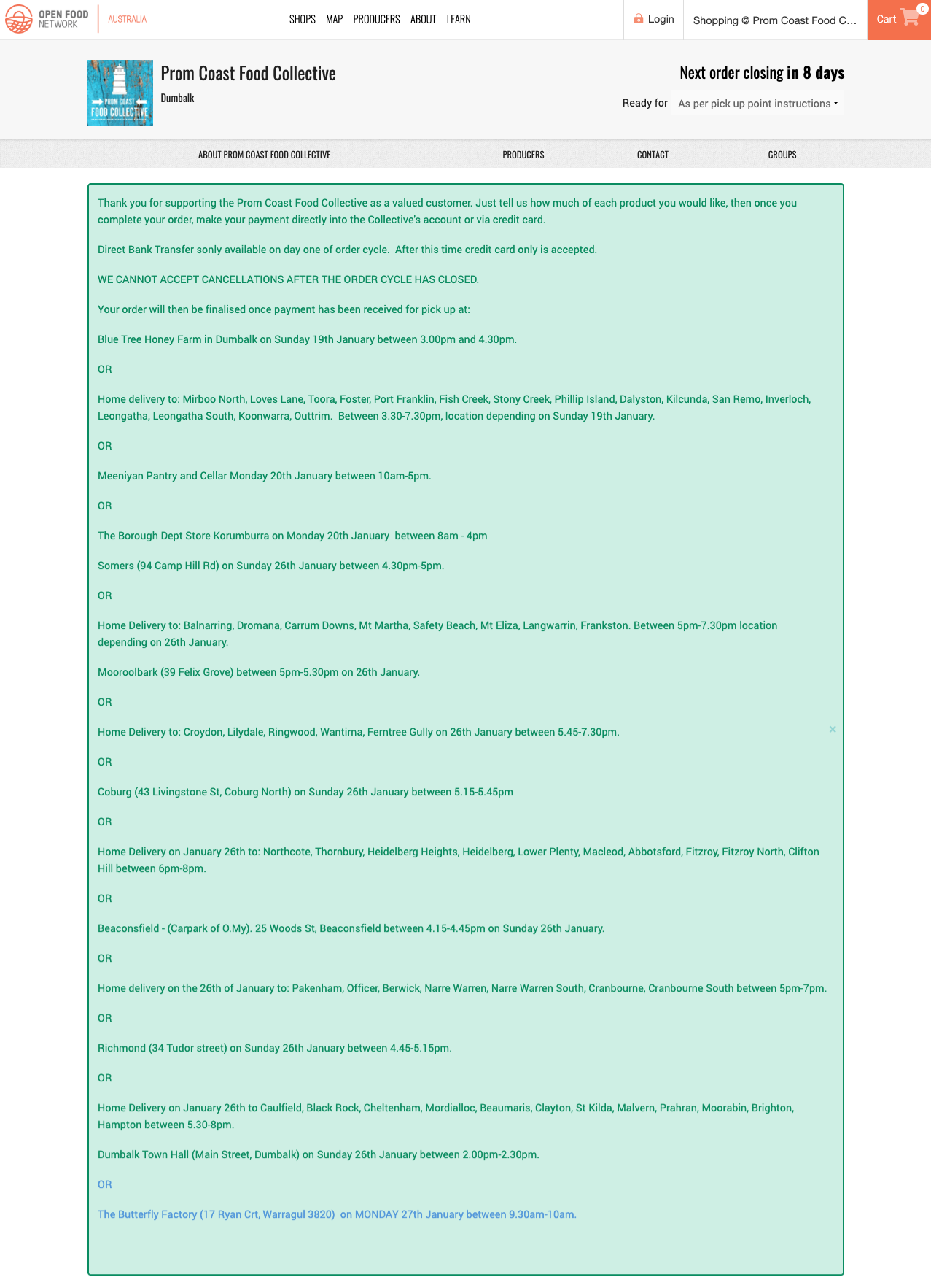
Some examples of 'Home' tab content variability (content, presentation, all-of-the-things) that we will need to contend with and test for:
Typical: https://openfoodnetwork.org.au/new-life-farm/shop
Colours & Font: https://openfoodnetwork.org.au/synchronicity-farm/shop
An essay worth of words: https://openfoodnetwork.org.au/prom-coast-food-co-op/shop
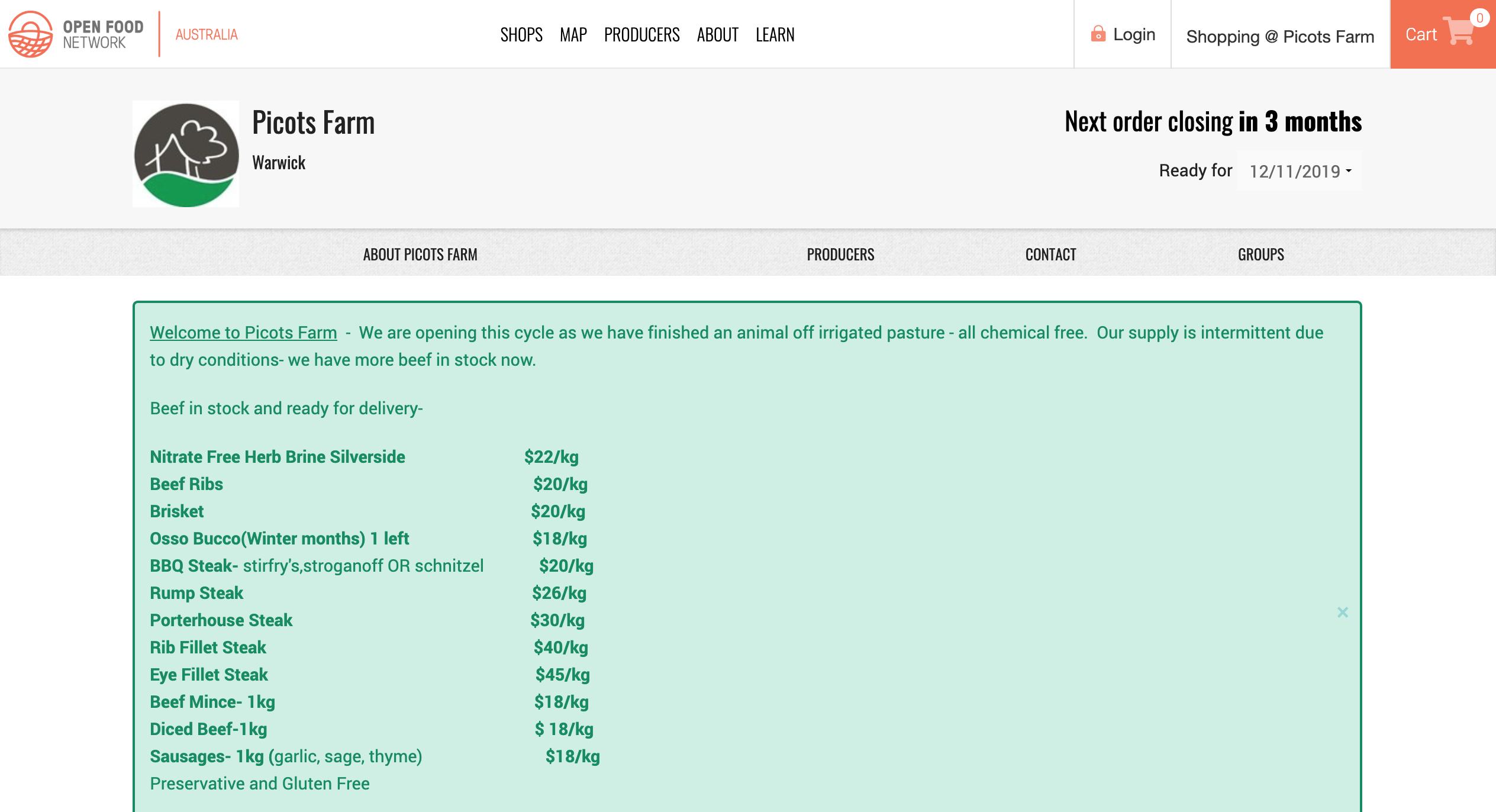
Stock availability: https://openfoodnetwork.org.au/picotsfarm/shop
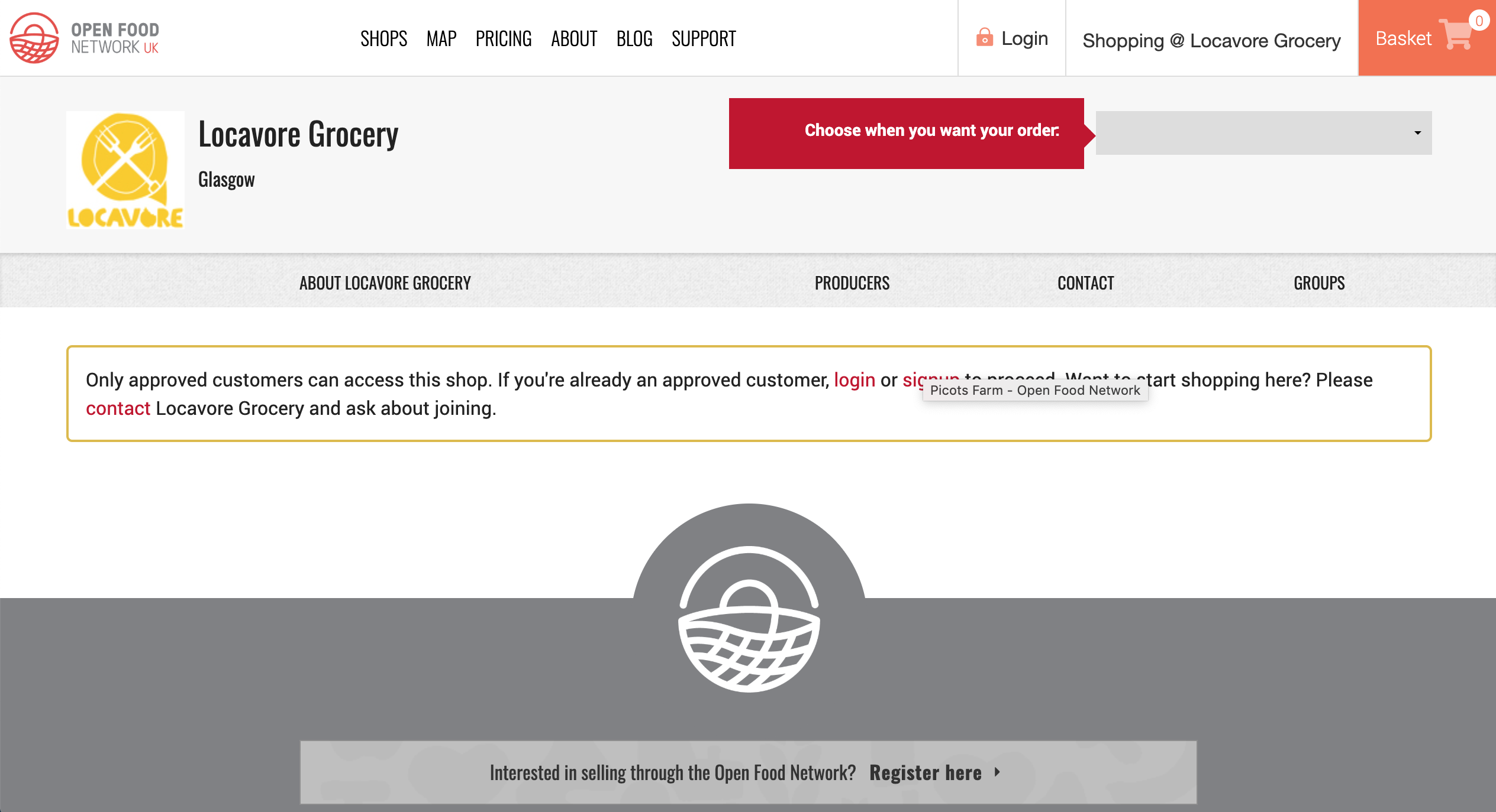
Approved customer message: https://openfoodnetwork.org.uk/locavoregrocery/shop
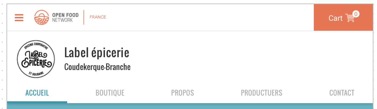
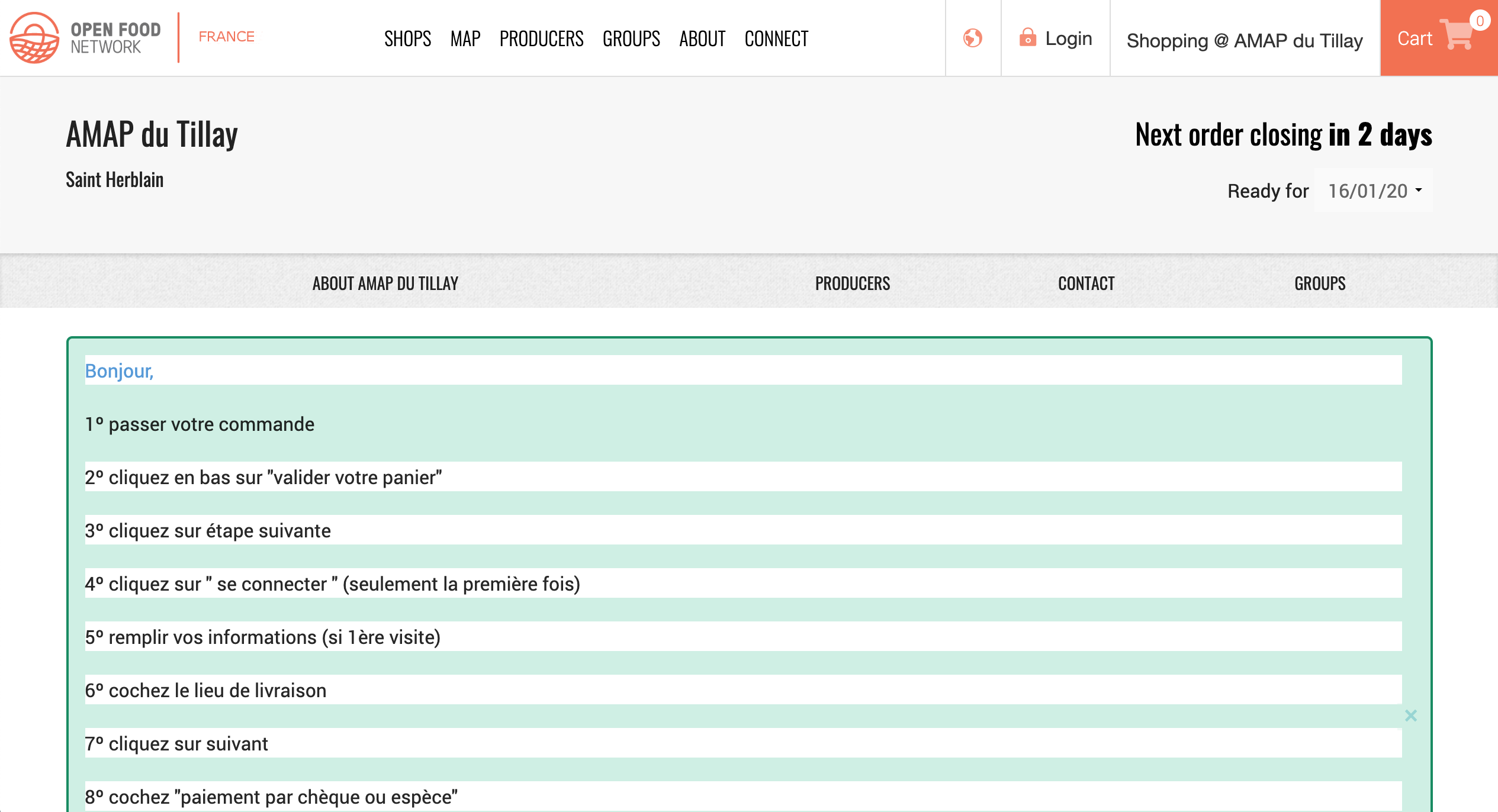
Hmmm... weird white bars: https://www.openfoodfrance.org/amap-du-tillay/shop?locale=en_FR
 yukoosawa
on 6 Jan 2020
yukoosawa
on 6 Jan 2020
FYI the issue for the white bars: https://github.com/openfoodfoundation/openfoodnetwork/issues/1860
 RachL
on 6 Jan 2020
RachL
on 6 Jan 2020
Hey @Matt-Yorkley is there a reason this epic is in the In Dev column and not left in Dev Ready till it's done? I'm not sure on the process, are we supposed to move epics through the pipe as well?
daniellemoorhead
on 26 Feb 2020
I say it should be in Dev Ready since at least one of its issues is in Dev Ready.
Usually I think we can say that closing the last issue closes the epic. In those cases we can move it through the pipe along with the last issue.
 sigmundpetersen
on 26 Feb 2020
sigmundpetersen
on 26 Feb 2020
Ah, I didn't realise those 2 little s4/s5 bugs had been added to the epic...
 Matt-Yorkley
on 26 Feb 2020
Matt-Yorkley
on 26 Feb 2020
There is only 1 story left, the updating of the private shop message style, so I'm shutting this epic and leaving that story in the In Dev column to be done.
daniellemoorhead
on 20 Mar 2020
Re-opening this, as @yukoosawa is doing a design sweep for it.
daniellemoorhead
on 10 May 2020
DESIGN SWEEP - Sunday May 10, 2020
_Google doc w/images to accompany issues: https://docs.google.com/document/d/18NZ9-6L8lSC0pTtuZsPZMfd9jrDP7rBgWQPF6z4L8-k/edit?usp=sharing_
[ ] Improve the spacing of the shop tabs [mobile + tablet]
-- Right now home, shop, and about are too squished to the left.
-- The problem persists if the shop has 4, 5, or 6 tabs.
-- Spacing between the tabs should be equal[ ] Reduce text size in tabs when there are 6 to improve spacing between the tabs in languages other than English [mobile]
[ ] z index for the ‘About’ tab (and likely all the tabs) isn’t right as the box shadow is missing [all breakpoints]
-- Noticeable when the ‘About’ image has a white background.
-- The shadow is used to visually separate the header+tabs from the rest of the content.
yukoosawa
on 10 May 2020
@Matt-Yorkley you ok to sort out these remaining items that came out of @yukoosawa's design sweep?
daniellemoorhead
on 11 May 2020
This is what I mentioned in the delivery train catch up @Matt-Yorkley, not a lot of change required, just tweaks 😄
daniellemoorhead
on 27 May 2020
Unassigning myself temporarily, in case someone else has time to play with this.
Matt-Yorkley
on 7 Jul 2020
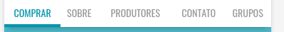
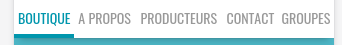
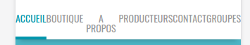
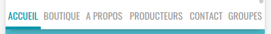
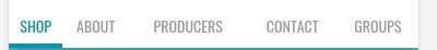
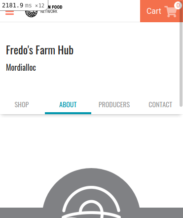
re point 1, improve spacing, the line is very crowded and it completely depends on the translators. If the words are bigger, the tab will take more space. It looks like they are squished to the left just because the words on the left are shorter. For example, in Portuguese from Brasil, it doesnt happen currently:
I am not sure what we can do, I can add some padding to all tabs but that will break more cases where options have more letters and screens are not so large. This is French on iPhone5 were the width is already 100% taken:
and with 6 options:
even on iphone 6:
We could check on the server side if there is empty space available (depending on the translation) and add some padding in those cases, so that the available space gets used.
Another approach would be to see how many options there are /could be 4 5 or 6) and set the width of each to the specific share, like 20% if there are 5, etc.. in English that would look better:
before
after

We will need to check how many tabs there are anyway to reduce the text size, so maybe the solution is:
- check how many tabs there are, reduce text if there are 6 and set the width of each according to the number of tabs.
Thoughts?
 luisramos0
on 13 Jul 2020
luisramos0
on 13 Jul 2020
Have pinged @yukoosawa for thoughts on ☝️
daniellemoorhead
on 15 Jul 2020
Ok, Yuko is super busy doing long hours on her day job so isn't available to respond do this.
@luisramos0 I want to make sure I understand the final solution. Your final point is 1/ check number of tabs and set equal width accordingly, and reduce font if there are 6.
Will this ☝️ remove the issue we see in non-English words? Is there a way to check spacing/padding even for 5 tabs and reduce size, just in case there are some languages where it doesn't fit beyond 4 (like maybe turkish)?
daniellemoorhead
on 11 Aug 2020
yes, that's it.
reduce font size if there are 6 tabs is one easy thing.
reduce font size if "it wont fit" is very different because it depends on 1. the font used and 2. screen size.
maybe we can just reduce font size for both 5 and 6?
luisramos0
on 16 Aug 2020
I'm still worried about legibility - it's pretty small as it is.
How about we try the reduction for 5 and 6 and I get my visually challenged (due to getting older) friends to look at the size on staging and judge how easy it is to read?
daniellemoorhead
on 18 Aug 2020
ok, let''s do that :+1:
I'll let you know when I have a PR.
luisramos0
on 18 Aug 2020
this:
instead of:
and this:
instead of:
luisramos0
on 3 Sep 2020
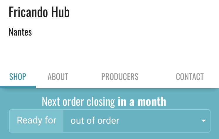
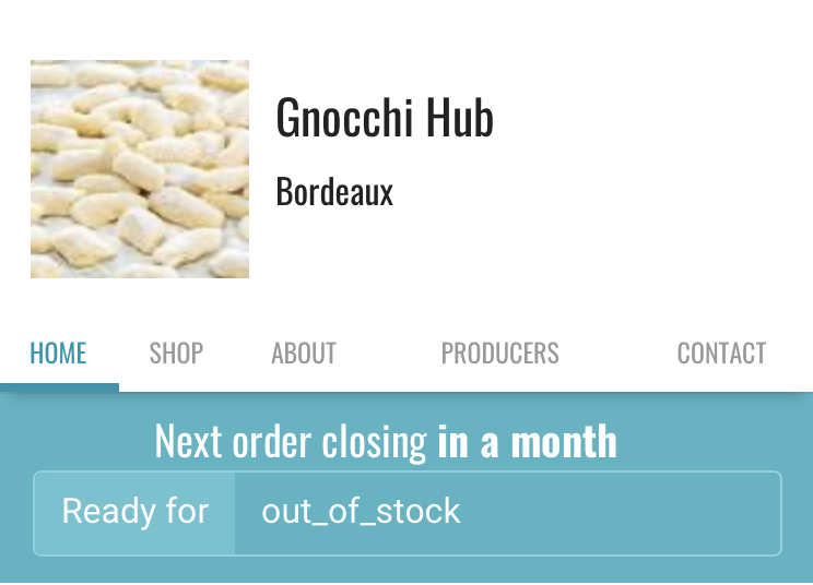
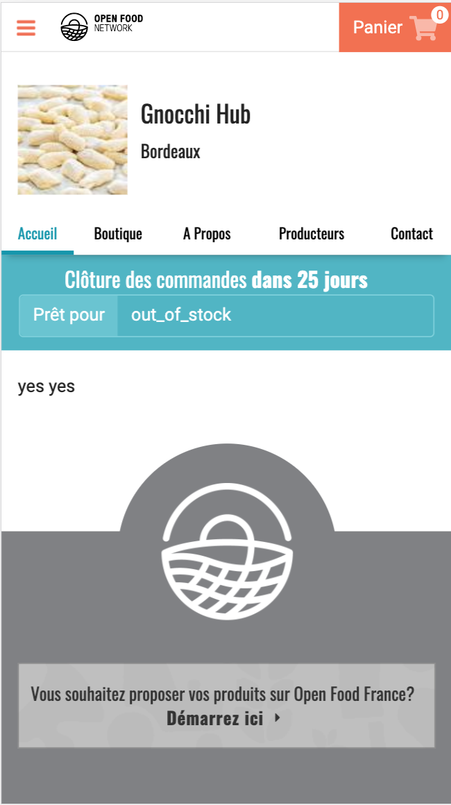
as part of 5985 staged in staging FR, this can be seen here.
4 tabs: https://staging.openfoodfrance.org/fricando-hub/shop
5 tabs: https://staging.openfoodfrance.org/gnocchi-hub/shop?locale=fr
luisramos0
on 3 Sep 2020
@Erioldoesdesign it'd be great if you could provide a view on this from a usability perspective. Horizontal tabs on mobile are fraught, especially when there's too many. My worry is the text is too small (even before the change @luisramos0 has implemented) and we're breaking the accessibility rule of allowing people to set the font size on their phones. A lot of my friends who are starting to have their eyesight change have chosen larger phones and set the font to be bigger on their screens.
I'm going to ask them to test whether they have difficulty reading the tab labels. But it feels like this is a good point in the process where we get you to consider a "now" decision on font size, and decide whether there's a "next" decision around the future of the horizontal tab design.
EDIT: My friend said she can read it, but it stands out as small in comparison to what's she's used to. She commented on the fact that the grey was difficult to read moreso than the blue. So maybe there's something in making the grey a little darker to make it more legible for now?
daniellemoorhead
on 4 Sep 2020
PS. the gnocchi picture on that page is making me hungry! 🤤
daniellemoorhead
on 4 Sep 2020
@luisramos0 one thing - the tabs aren't evenly aligned across the screen for the english versions. I'm pretty sure @Matt-Yorkley fixed this previously in a different PR...any thoughts on why the centring has disappeared?
EDIT: by centred I mean each tab is the same size across.
daniellemoorhead
on 4 Sep 2020
I'm pretty sure @Matt-Yorkley fixed this previously in a different PR
I think you remember the fact I mentioned it above in this issue.
I gave it a try in this PR but I am not sure it looks better:
luisramos0
on 4 Sep 2020
Hmm all my ideas are very 'design tweaks' that could mean a lot of dev work. 🤔 without me knowing what style changes might do what elsewhere in the platform. Also, some of them might be considered a bit radical from a brand perspective but let's see what folks think.
Some ideas:
Easy(?):
- The text default colour is hex colour #999 if we change this to black/#000 this makes text more legible and accessible.
- The nav currently has a text-transform of 'uppercase' I know this is likely a brand choice but if we change that to 'capitalise' then we stop having all caps and have the first letter caps'd. There's research on this around how humans read based on word formations and not individual letters
With these two changes I was able to get the base text em size up to 85em:
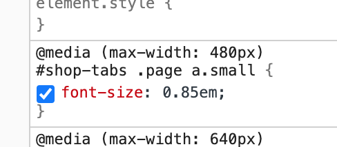
Here's want messing about in the css in inspect looks like:
Not easy (?)
- These above things don't change the fact that some languages have longer words for English words. My proposal would be looking into a 'swipeable nav' or a nav with an arrow. This would mean the folks can increase text size and just have more to swipe.
I'll try to find a live example...
So you can see some swipeable navs here: https://material-ui.com/components/drawers/
But what I'd propose is that we always ensure that the right most nav item/word is 'cut off content' e.g:
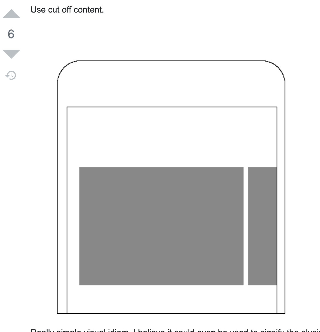
For accessibility, this swipe-y nav would need to be tabbable too.
So that last idea is for sure something that would need testing but I've implemented complex dashboard tools before with this and it's not 0.001 seconds of recognition for users to know how to find more menu items but maybe a few milliseconds more.
Testing would be good to see if people 'get it' swipe actions are so super common now that most people do swipe-y stuff without realising.
The alternative would be making the nav a expand/contract vertical affair which I'm less excited about but likely easier.
I hope that makes sense and isn't too radical.
 Erioldoesdesign
on 4 Sep 2020
Erioldoesdesign
on 4 Sep 2020
Also the closest thing to a gnocchi emoji is 🥔
Erioldoesdesign
on 4 Sep 2020
@Erioldoesdesign given the timezone difference and that I'm not back online till friday do you think you and @luisramos0 could confer on this and come up with a suggestion on next steps? I trust you both to determine the best path forward. 😃
daniellemoorhead
on 8 Sep 2020
@daniellemoorhead Yup! happy to
Erioldoesdesign
on 8 Sep 2020
Hi there, I am a bit confused here, we agreed on an approach, I spent some time to create a PR but now we are talking about doing something else before looking at the result of the PR: https://github.com/openfoodfoundation/openfoodnetwork/pull/5985
The PR is basically reducing the font sizxe if there are more than 4 items in the menu.
Could you please have a look at the PR? I think we could say the PR does make this acceptable and done. This would be the quickest way to fix the issue.
Otherwise I'd have to come back to it and try other things.
Thanks for your input @Erioldoesdesign we can change colour to black and capitalize it :+1: It could be a valid solution. I think I prefer the current uppercase/gray style.
I think we should have a look at the PR and see if it makes things good enough. Otherwise try the black/capitalized style.
As for the swipeable idea, I think we should avoid it if possible, so that the experience is simpler. For example, we could merge about and contact? I think this would be a separate issue though.
luisramos0
on 8 Sep 2020
The uppercase/grey style is lovely. However, it's hard to read for those
who's eyesight isn't so good. We've both looked at the PR and seen how it
looks, and the suggestion of darker font with lowercase is a result of
this. It's nothing to do with the quality of your work so much as the
design not fitting the need in terms of usability. No doubt you know that
this happens. It's not a waste of the work you've done, it's because of
this work that we realise there was an oversight in the design that needs
to be addressed.
There has to be a balance between learning as we go, iterating to allow for
a better UX (which is what this whole piece is about), and this change
feels like it's small enough to try.
So, let's try with the darker font and lowercase and see if this helps the
situation.
Eriol and myself will look at the scrolling tabs as a separate piece of
work, outside of this.
On Tue, 8 Sep 2020 at 20:00, Luis Ramos notifications@github.com wrote:
Hi there, I am a bit confused here, we agreed on an approach, I spent some
time to create a PR but now we are talking about doing something else
before looking at the result of the PR: #5985
https://github.com/openfoodfoundation/openfoodnetwork/pull/5985
The PR is basically reducing the font sizxe if there are more than 4 items
in the menu.
Could you please have a look at the PR? I think we could say the PR does
make this acceptable and done. This would be the quickest way to fix the
issue.
Otherwise I'd have to come back to it and try other things.Thanks for your input @Erioldoesdesign
https://github.com/Erioldoesdesign we can change colour to black and
capitalize it 👍 It could be a valid solution. I think I prefer the
current uppercase/gray style.
I think we should have a look at the PR and see if it makes things good
enough. Otherwise try the black/capitalized style.As for the swipeable idea, I think we should avoid it if possible, so that
the experience is simpler. For example, we could merge about and contact? I
think this would be a separate issue though.—
You are receiving this because you were mentioned.
Reply to this email directly, view it on GitHub
https://github.com/openfoodfoundation/openfoodnetwork/issues/4567#issuecomment-688761777,
or unsubscribe
https://github.com/notifications/unsubscribe-auth/ACTRDPEN64FJGPE6FP7WSGDSEX6DJANCNFSM4J2HRIIA
.
--
Danielle Moorhead
Director
Working hours: Tuesdays and Fridays
[email protected] |
https://about.openfoodnetwork.org.au/open-food-services/0431 961 965
Open Food Network Australia
https://openfoodnetwork.org.au/Our software platform
https://about.openfoodnetwork.org.au/software-platform/ | User Guide
https://openfoodnetwork.org/user-guide/ | Our services
https://about.openfoodnetwork.org.au/open-food-services/ | Sign up to our
newsletter http://eepurl.com/bYYCDj
https://openfoodnetwork.org.au
Open Food Network respectfully acknowledges the traditional custodians of
the unceded lands on which we meet, work and live. We pay our respects to
their Elders, past, present and emerging and acknowledge their deep
spiritual relationship to country.
daniellemoorhead
on 9 Sep 2020
ok @daniellemoorhead thanks for clarifying that the PR was looked at and that this new font style is a step after that, that was not clear before to me :+1:
So, we agree the next step is to make the font color #000, change to capitalise and keep size at 0.875 all the time, correct?
luisramos0
on 9 Sep 2020
Eriol can confirm the font colour, I think it was more of a darker grey
than a full black but I think the correct answer is in their comment
further up.
On Thu, 10 Sep 2020 at 05:52, Luis Ramos notifications@github.com wrote:
ok @daniellemoorhead https://github.com/daniellemoorhead thanks for
clarifying that the PR was looked at and that this new font style is a step
after that, that was not clear before to me 👍
So, we agree the next step is to make the font color #000, change to
capitalise and keep size at 0.875 all the time, correct?—
You are receiving this because you were mentioned.
Reply to this email directly, view it on GitHub
https://github.com/openfoodfoundation/openfoodnetwork/issues/4567#issuecomment-689783750,
or unsubscribe
https://github.com/notifications/unsubscribe-auth/ACTRDPBJFS7MHQ6CNHSADXDSE7MHNANCNFSM4J2HRIIA
.
--
Danielle Moorhead
Director
Working hours: Tuesdays and Fridays
[email protected] |
https://about.openfoodnetwork.org.au/open-food-services/0431 961 965
Open Food Network Australia
https://openfoodnetwork.org.au/Our software platform
https://about.openfoodnetwork.org.au/software-platform/ | User Guide
https://openfoodnetwork.org/user-guide/ | Our services
https://about.openfoodnetwork.org.au/open-food-services/ | Sign up to our
newsletter http://eepurl.com/bYYCDj
https://openfoodnetwork.org.au
Open Food Network respectfully acknowledges the traditional custodians of
the unceded lands on which we meet, work and live. We pay our respects to
their Elders, past, present and emerging and acknowledge their deep
spiritual relationship to country.
daniellemoorhead
on 10 Sep 2020
@luisramos0 is right it's 'font color #000, change to capitalise and keep size at 0.875 all the time' :)
Is the preferred process that that is detailed in another issue and a separate PR or is it ok to edit in the submitted PR? I'm happy with either process.
re. the swipeable nav this was 100% a 'putting this out there for discussion idea' but there was likely a better place to place that than here in the issue or I could have also been clearer that that was 100% not to be considered for this issue/PR. I could have easily created a slack thread/discourse post asking about this and linked this issue as where my thinking came from. I'll keep my design thinking experiments to other places of discussion, which totally makes more sense!
Erioldoesdesign
on 10 Sep 2020
ok, thanks @Erioldoesdesign
it's a good question, I am not sure where is the best place to have these design discussions :+1:
luisramos0
on 10 Sep 2020
ok, I created https://github.com/openfoodfoundation/openfoodnetwork/pull/6083
I decided to use this for mobile and phablet, displays below 640px and I left the previous style grey uppercase for larger screens. Let me know if this is ok or if you think we should do differently.
The PR can be staged and tested now.
Thanks.
luisramos0
on 22 Sep 2020
This last PR is now merged. I linked it to this epic that's why this epic was automatically closed by the PR.
I will leave it closed because I think this is correct, this was the last issue here.
I'll put this on slack so that Eriol and/or Maikel can confirm :+1:
luisramos0
on 7 Oct 2020
Great, thanks Luis!
On Thu, 8 Oct 2020 at 00:42, Luis Ramos notifications@github.com wrote:
This last PR is now merged. I linked it to this epic that's why this epic
was automatically closed by the PR.
I will leave it closed because I think this is correct, this was the last
issue here.
I'll put this on slack so that Eriol and/or Maikel can confirm 👍—
You are receiving this because you were mentioned.
Reply to this email directly, view it on GitHub
https://github.com/openfoodfoundation/openfoodnetwork/issues/4567#issuecomment-704944573,
or unsubscribe
https://github.com/notifications/unsubscribe-auth/ACTRDPG2LGCTVFFOMNGTGVTSJRV5RANCNFSM4J2HRIIA
.
--
Danielle Moorhead
Director
Working hours: Tuesdays and Fridays
[email protected] |
https://about.openfoodnetwork.org.au/open-food-services/0431 961 965
Open Food Network Australia
https://openfoodnetwork.org.au/Our software platform
https://about.openfoodnetwork.org.au/software-platform/ | User Guide
https://openfoodnetwork.org/user-guide/ | Our services
https://about.openfoodnetwork.org.au/open-food-services/ | Sign up to our
newsletter http://eepurl.com/bYYCDj
https://openfoodnetwork.org.au
Open Food Network respectfully acknowledges the traditional custodians of
the unceded lands on which we meet, work and live. We pay our respects to
their Elders, past, present and emerging and acknowledge their deep
spiritual relationship to country.
daniellemoorhead
on 8 Oct 2020
Related issues
 filipefurtad0
·
3Comments
filipefurtad0
·
3Comments
luisramos0
·
3Comments
filipefurtad0
·
3Comments
filipefurtad0
·
3Comments
luisramos0
·
3Comments
 andrewpbrett
·
3Comments
Matt-Yorkley
·
3Comments
andrewpbrett
·
3Comments
Matt-Yorkley
·
3Comments