Openfoodnetwork: Stripe: Mobile Checkout layout unusable
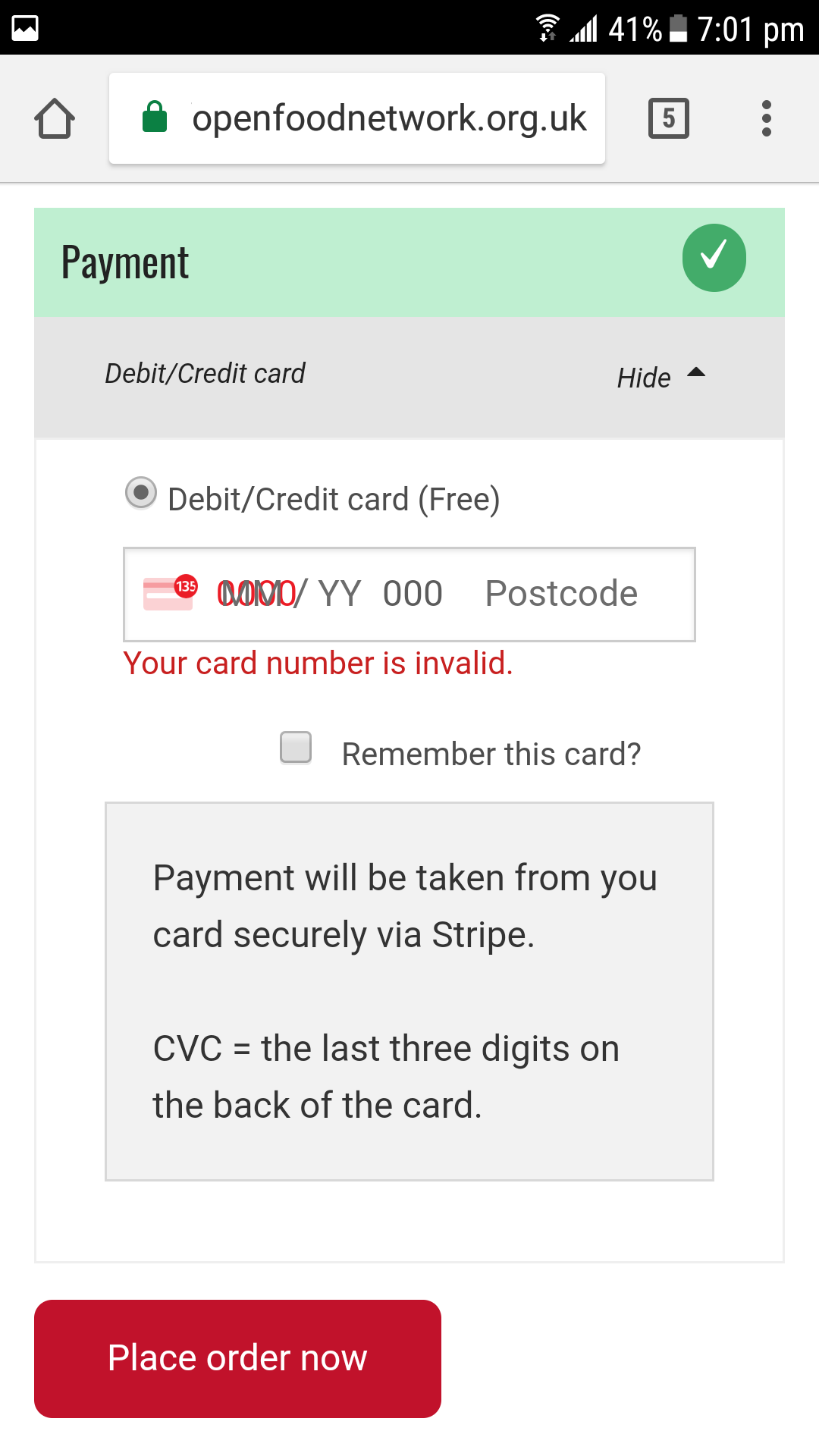
When a user tries to checkout using Stripe on mobile the screen layout is such that they cannot input card details or checkout.
Description
The layout of the checkout screen when paying by card is unusable with fields rendering on top of each other.
While a huge amount of work needs to be done on mobile in general this is a bug affecting existing users that are switching to use Stripe and losing customers. Thus for UK this is a bug.
Expected Behavior
All fields should render in such a way that all can be seen and users can input their details.
Actual Behavior
The layout of the checkout screen when paying by card is unusable with fields rendering on top of each other.
Steps to Reproduce
- Go to cart and select Stripe payment method
- Attempt to enter payment details
Animated Gif/Screenshot
Context
Stopping checkout for users on mobile.
Severity
S3 - Stopping checkouts for existing users on some hubs. Workaround is use a PC, which is not a functional workaround for some users.
Your Environment
- Version used: 1.15.1
- Browser name and version: I was using the Chrome browser (version 66.0.3359.158)
- Operating System and version (desktop or mobile): Samsung Galaxy S7, with Android 7.0.
Possible Fix
 lin-d-hop
All 17 comments
lin-d-hop
on 1 Jun 2018
Thanks for raising this as an issue @lin-d-hop.
I originally posted this on the OFN UK Community - https://community.openfoodnetwork.org.uk/t/ofn-on-the-mobile-phone-an-app-version/183/3
 wmortada
on 1 Jun 2018
wmortada
on 1 Jun 2018
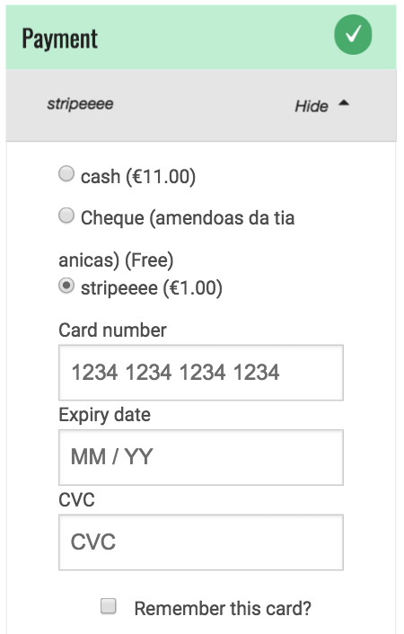
Hi, this PR changes the rendering of the payment form: instead of using the default stripe form, we now have the 3 form fields separated and customisable. The disadvantage is that we lose the fancy icons...
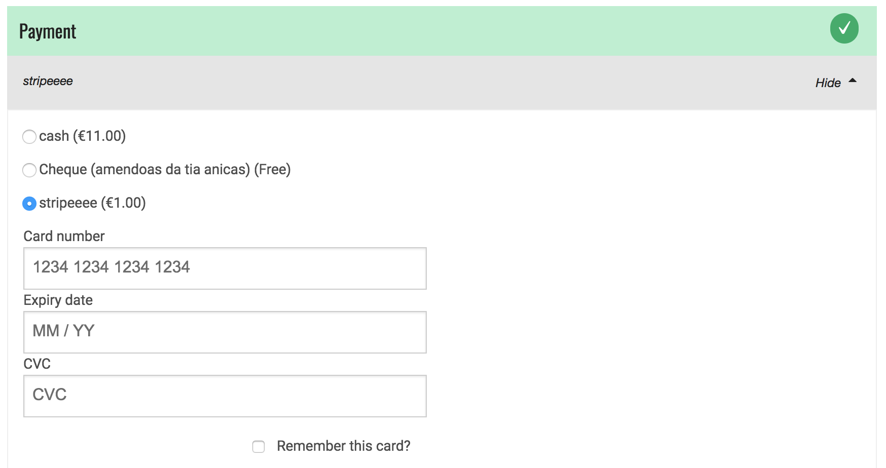
This is how it's looking like now (on desktop and mobile):
A few questions:
- In the current code I don't see the messages shown on the bug report screenshot above "Payment will be taken...". IS that ok/correct?
- Do we collect postal code in this form, the form I get locally doesn't show postal code. We may need to add logic to handle the postcode input...
Looking forward some feedback.
 luisramos0
on 15 Jun 2018
luisramos0
on 15 Jun 2018
tech references:
- stripe elements quickstart: https://stripe.com/docs/stripe-js/elements/quickstart
- stripe elements examples: https://stripe.github.io/elements-examples/ and https://jsfiddle.net/ywain/whj357u9/
luisramos0
on 15 Jun 2018
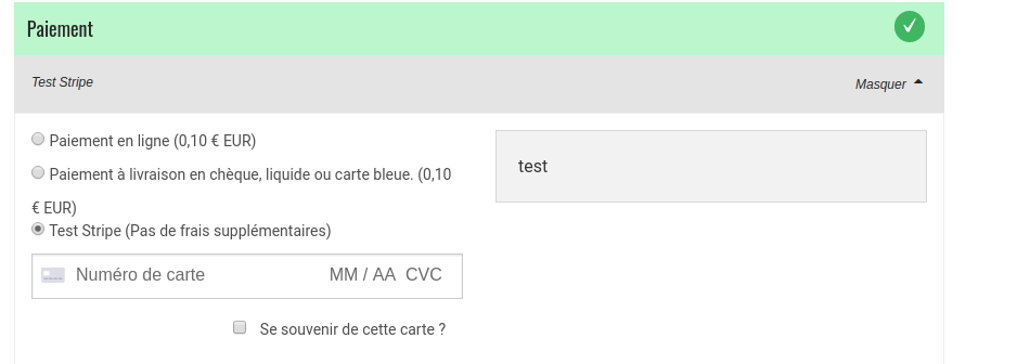
@luisramos0 about the message "payment will be taken" this is something added in the payment method set up as a "description". If you didn't add a comment when setting up the method it's normal you don't see it, but if you did you should see it here, please test the message is displayed if you set up a message to display ;-)

Here "test" should display when you select the stripe method payment for instance.
About your second point I think @oeoeaio or @stveep might be able to answer, I don't know if the postcode is needed here or not in the Stripe payment ... strangly on the French interface I don't see the "postcode zone", maybe it is something that depends on which country your Stripe account is based on? Maybe info asked vary?
 myriamboure
on 18 Jun 2018
myriamboure
on 18 Jun 2018
Thanks @luisramos0 that looks much better.
I think it would be clearer to end users if there is some explanation of what 'CVC' means. I don't think this is obvious to everyone - which is why I added some text in the description field to explain this.
I've been using OFN in the UK and can confirm that a postcode is required here. From a quick internet search it seems as if the postcode isn't required in every country. The form automatically detects which country the card is from and changes accordingly. This means that for the current form you need to enter a card number for the postcode field to appear. Stripe has some test card numbers you can use to test this.
wmortada
on 18 Jun 2018
I've just done some testing and this bug seems to be less of an issue for countries that don't require a postcode (including Australia and France). For these countries the form looks okay on mobile devices.
The issue seems to occur for cards that originate in countries that require a postcode (e.g. UK).
Is the current form a standard form that Stripe offer? If so, should we be escalating this issue to Stripe to fix? Presumably it will be affecting others that use the same form?
wmortada
on 18 Jun 2018
Actually we should probably set hidePostalCode to true (In fact I thought that was the case since I have never seen the postcode field in the frontend until now). I don't think there's any need to collect the postcode in the Stripe.js form, regardless of location, as it is taken from the billing address further up in the form and submitted to Stripe (see makeCardData method in the StripeElements service).
I'm surprised it's an issue though as the Stripe forms are allegedly responsive - they even apparently fixed this issue for small screens: https://github.com/stripe/elements-examples/issues/41
I can't see that we are doing anything that would restrict it though so I agree with splitting the fields to make sure it's usable.
 stveep
on 18 Jun 2018
stveep
on 18 Jun 2018
In fact I think if we just hide the postcode field it should fix the issue (refresh in the middle is after I set it to hide):
https://www.useloom.com/share/538f39d8bd79474ab7e8db4504d84449
I think the issue here is that "postcode" is much longer than ZIP and therefore overlaps (thank god we are not in Hungary yet!) so it is a design flaw for Stripe to fix really.
stveep
on 18 Jun 2018
Hi @stveep I confirm that if we hide postcode field, the original issue is solved.
Stripe shows postcode for US, UK and CA credit cards.
So, if we can remove the postcode field (doesn't look like an illegal thing to do). We don't need to rebuild/format the form as I did on my PR. So that could be an easier solution. I'd go with your change if postcode can be hidden for us, uk and ca cards.
luisramos0
on 18 Jun 2018
Thanks @stveep that sounds like a sensible solution. I did wonder why we were being asked to fill in the postcode on that form so if it isn't needed we should remove it. That would make a much better user experience all round.
I still think that the form should include some explanation of what CVC means - but perhaps this is a separate issue to raise with Stripe?
wmortada
on 19 Jun 2018
I don't know if that should be on Stripe side or if we need to add a tooltip in the checkout form like a small ? in a bubble next to the line. That would be for both mobille and ddesk of course. Don't know if is done/can be done on Stripe side?
myriamboure
on 19 Jun 2018
I doubt this is something Stripe will do anything about - we could add an optional locale-specific tooltip or explanation for CVC but better open a new issue to see if others agree (I don't think it's confusing personally, it's hardly uncommon).
stveep
on 20 Jun 2018
For the record I would prefer the option to just use hidePostalCode: true if that fixes the issue. The form element we are currently using is basically just Stripe's default element with some styling (so it's quite pretty). If we can keep the pretty version that would be ideal. :)
 oeoeaio
on 21 Jun 2018
oeoeaio
on 21 Jun 2018
ok, so looks like we all agree we go forward with PR #2403 that just hides the postcode field. It's ready for code review.
luisramos0
on 24 Jun 2018
Closing for now, #2403 has been merged.
oeoeaio
on 29 Jun 2018
Thanks for resolving this issue. I have posted my suggestion to improve the user experience of the Stripe payment form as a new issue: https://github.com/openfoodfoundation/openfoodnetwork/issues/2418
wmortada
on 29 Jun 2018
Related issues
 filipefurtad0
·
3Comments
filipefurtad0
·
3Comments
filipefurtad0
·
3Comments
filipefurtad0
·
3Comments
 HugsDaniel
·
3Comments
HugsDaniel
·
3Comments
 kirstenalarsen
·
3Comments
kirstenalarsen
·
3Comments
 shen-sat
·
3Comments
shen-sat
·
3Comments
Most helpful comment
Hi, this PR changes the rendering of the payment form: instead of using the default stripe form, we now have the 3 form fields separated and customisable. The disadvantage is that we lose the fancy icons...
This is how it's looking like now (on desktop and mobile):


A few questions:
Looking forward some feedback.