Online-go.com: Darker shade of gold for site supporter names on light backgrounds
Is your feature request related to a problem? Please describe.
The contrast ratio for our yellow (#dfba00) on white (#fff) is only 1.88:1. For off white or other backgrounds, the ratio is even worse. For reference, WGAC recommends 4.5:0 for text, but I think we can follow the guidelines for bold text which is 3:0.
Describe the solution you'd like
I think #a48200 is a nice shade of gold that has a contrast ratio of 3.63:1 on a white background. My proposal is to update the colors of site supporter names to #a48200.
Describe alternatives you've considered
Badges instead of colorful names. I still think badges would be a fun, accessible indicator, but there was little support for removing color (which I can understand).
Additional context
The proposed color scheme:
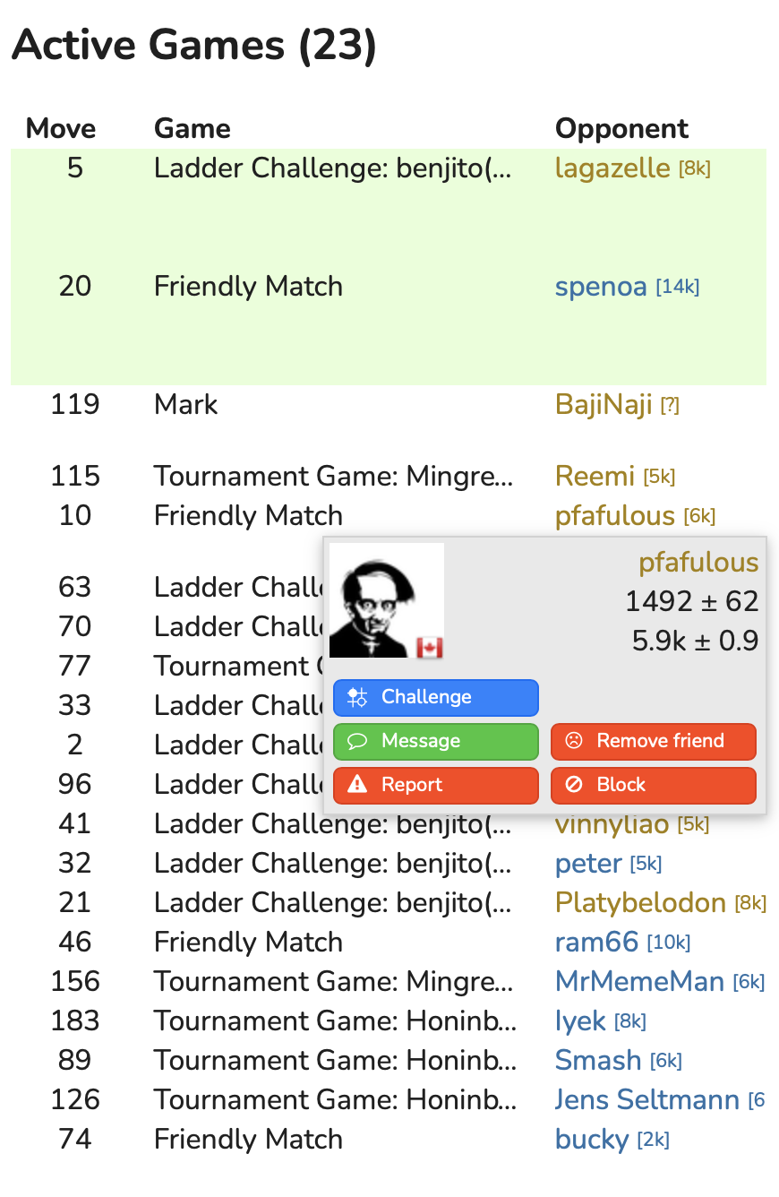
In the player boxes (note gold on dark has not changed)

 benjaminpjones
All 5 comments
Hi @anoek, I'd like to know whether I'd have support to implement this one. The yellow isn't a big deal to me, but there have been complaints in the past that the contrast with light backgrounds is not ideal.
Please let me know, and if you hate it feel free to close!
benjaminpjones
on 20 Feb 2021
Some compare and contrast:
Old:

New:

Old:

New:

Old:

New:
I'm not sure if these side-by-sides make it particularly obvious that there is an improvement, but I think the higher contrast makes for better viewing in suboptimal conditions, like being on a mobile device on a sunny day.
benjaminpjones
on 20 Feb 2021
Relevant ongoing discussion in the forums is here.
 BHydden
on 20 Feb 2021
BHydden
on 20 Feb 2021
Yep that'd be awesome, thanks! Color picking is a challenge for me.
 anoek
on 20 Feb 2021
anoek
on 20 Feb 2021
Sweet! PR incoming. I'm not that confident in color picking myself, but I think I wrote it in such a way that we can fidget with dark.supporter and light.supporter until it's perfect.
benjaminpjones
on 21 Feb 2021
Related issues
 kobakitty
·
3Comments
kobakitty
·
3Comments
 Wizek
·
3Comments
Wizek
·
3Comments
 GreenAsJade
·
3Comments
GreenAsJade
·
3Comments
 roy7
·
5Comments
roy7
·
5Comments
 flovo
·
5Comments
flovo
·
5Comments