Notistack: Add a more detailed custom snackbar example
I see that in the docs, there is an added section for custom snackbars. However, there is no example of one.
Could you put the code of the custom snackbar in the docs?
Thank you!
 cevr
cevr
All 7 comments
Thanks for reporting this @cevr. It'll be added by the end of this week. meanwhile you can access the code here:
To enqueue:
this.props.enqueueSnackbar(null, {
            persist: true,
            anchorOrigin: {
                vertical: 'bottom',
                horizontal: 'right',
            },
            content: key => <SnackMessage id={key} />
        });
import React, { useState } from 'react';
import PropTypes from 'prop-types';
import classnames from 'classnames';
import { withStyles } from '@material-ui/core/styles';
import { useSnackbar } from 'notistack';
import Collapse from '@material-ui/core/Collapse';
import Paper from '@material-ui/core/Paper';
import Typography from '@material-ui/core/Typography';
import Card from '@material-ui/core/Card';
import CardActions from '@material-ui/core/CardActions';
import Button from '@material-ui/core/Button';
import IconButton from '@material-ui/core/IconButton';
import CloseIcon from '@material-ui/icons/Close';
import ExpandMoreIcon from '@material-ui/icons/ExpandMore';
import CheckCircleIcon from '@material-ui/icons/CheckCircle';

const styles = theme => ({
    card: {
        maxWidth: 400,
        minWidth: 344,
    },
    typography: {
        fontWeight: 'bold',
    },
    actionRoot: {
        padding: '8px 8px 8px 16px',
        backgroundColor: '#fddc6c',
    },
    action: {
        margin: 0,
    },
    icons: {
        marginLeft: 'auto',
    },
    expand: {
        padding: '8px 8px',
        transform: 'rotate(0deg)',
        transition: theme.transitions.create('transform', {
            duration: theme.transitions.duration.shortest,
        }),
    },
    expandOpen: {
        transform: 'rotate(180deg)',
    },
    collapse: {
        padding: 16,
    },
    checkIcon: {
        fontSize: 20,
        color: '#b3b3b3',
        paddingRight: 4,
    },
    button: {
        padding: 0,
        textTransform: 'none',
    },
});


const SnackMessage = (props) => {
    const { classes } = props;
    const { closeSnackbar } = useSnackbar();
    const [expanded, setExpanded] = useState(false);

    const handleExpandClick = () => {
        setExpanded(!expanded);
    };

    const handleDismiss = () => {
        closeSnackbar(props.id);
    };

    return (
        <Card className={classes.card}>
            <CardActions classes={{ root: classes.actionRoot, action: classes.action }}>
                <Typography variant="subtitle2" className={classes.typography}>Report Complete</Typography>
                <div className={classes.icons}>
                    <IconButton
                        aria-label="Show more"
                        className={classnames(classes.expand, { [classes.expandOpen]: expanded })}
                        onClick={handleExpandClick}
                    >
                        <ExpandMoreIcon />
                    </IconButton>
                    <IconButton className={classes.expand} onClick={handleDismiss}>
                        <CloseIcon />
                    </IconButton>
                </div>
            </CardActions>
            <Collapse in={expanded} timeout="auto" unmountOnExit>
                <Paper className={classes.collapse}>
                    <Typography gutterBottom>PDF ready</Typography>
                    <Button size="small" className={classes.button}>
                        <CheckCircleIcon className={classes.checkIcon} />
                        Download now
                    </Button>
                </Paper>
            </Collapse>
        </Card>
    );
};


SnackMessage.propTypes = {
    classes: PropTypes.object.isRequired,
    id: PropTypes.number.isRequired,
};

export default withStyles(styles)(SnackMessage);
 iamhosseindhv
on 14 May 2019
iamhosseindhv
on 14 May 2019
For the children option in enqueueSnackBar, how do I pass in other parameters into the custom component?
 hrutvikpatel
on 27 Aug 2019
hrutvikpatel
on 27 Aug 2019
@hrutvikpatel did you find a solution?
 ammoradi
on 21 Jan 2020
ammoradi
on 21 Jan 2020
Someone else also asked this question in https://github.com/iamhosseindhv/notistack/issues/218
I may be able to help if you guys give details if what you're trying to achieve.
iamhosseindhv
on 27 Jan 2020
the example should be in docs tho @iamhosseindhv, let me know if its open-source, I can try to add it myself
 aliahsan07
on 23 Jun 2020
aliahsan07
on 23 Jun 2020
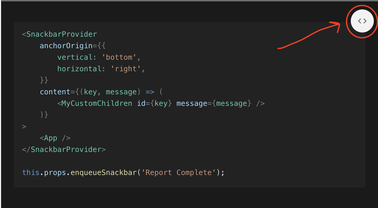
The example is in the doc website @aliahsan07
iamhosseindhv
on 23 Jun 2020
I did not see the symbol of the extension myself
Thank you
Please make it easier to mark more clearly
 YOEL311
on 8 Sep 2020
YOEL311
on 8 Sep 2020
Related issues
 khanhdinovative
·
3Comments
iamhosseindhv
·
8Comments
khanhdinovative
·
3Comments
iamhosseindhv
·
8Comments
 lsansaa
·
7Comments
lsansaa
·
7Comments
 fdemello
·
8Comments
fdemello
·
8Comments
 alexisab
·
5Comments
alexisab
·
5Comments
Most helpful comment
Thanks for reporting this @cevr. It'll be added by the end of this week. meanwhile you can access the code here:
To enqueue: