Tested version: Notepad3 (64-bit) develop v3.18.418.978
As Notepad3 evolves (yay!), sometimes more is asked of the Status Bar, which affects its elements in ways that could be called suboptimal.
This has been brought up before (e.g. here by myself, and more recently, here by hpwamr).
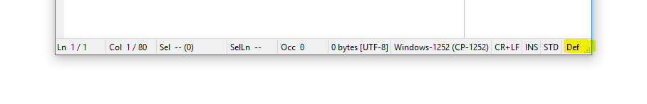
I have a non-new laptop that isn't being replaced anytime soon, with built-in display resolution of 1600x900. (4K/8K is definitely not on my roadmap!) My ideal is to be able to have two instances of Notepad3 side by side, with a little bit of horizontal desktop space still exposed to access frequently-used stuff. This all equates to a workable Notepad3 window width of around 754 pixels. See below:

At these resolutions and sizings, the Scheme indicator on the right of the Status Bar is undersized. There are other shortcomings, e.g. the "Occ" indicator is often truncated.
I'd like to see the Status Bar workable for a specified minimum window width, and I propose that 754 pixels be used (since I seem to be a user that frequently strikes and notices these problems). If anyone would like to propose a smaller minimum width, I would support that.
Someone once said, don't complain about a problem without bringing suggestion to fix it. So...
Suggestions for Discussion:
- Rework the horizontal space allocations for Status Bar elements, e.g.:
- Reduce the content of elements where possible (e.g. remove 000's separators, one em-dash instead of two en-dashes, remove whitespace around text, remove filesize encoding type)
- Determine which elements should have a fixed width, and which elements should have a variable width (e.g. perhaps the style indicator could be a fixed width to accommodate the longest style name)... @RaiKoHoff, can you specify that an element has both a variable width and a minimum width? Can you specify a width from the right? That might be useful for e.g. the style/lexer element consuming as much space as it needs from the right...
- Could the solution be as simple as reducing the Status Bar text font size?
- What about a double-decker Status Bar (2 lines high)? We would need to determine which elements belong on which line...
 craigo-
All 79 comments
Regarding suggestions for discussing:
- the 000's separators are according to your windows settings (
Control Panel: Region and Language -> Formats -> Additional settings...) and I like to keep that. - I don't like the idea of reducing the status bar font size, it should be correlated to menu and other NP3 dialog's font sizes.
- "double-decker" status bar is definitely a no-go :grimacing:
- I don't know currently the dynamics of status-bar section resizing in detail - need to dig deeper...
- I would like to remove the "File Size" field completely
(the value is only valid for saving the file in UTF-8 format - same value can easily be calculated by pressing"Select All" (Ctrl+A)=> selected bytes in UTF-8 encoding. Yes, some people will cry about dropping that ...
 RaiKoHoff
on 20 Apr 2018
RaiKoHoff
on 20 Apr 2018
I agree with you for the points: 1, 2, 3, 5.... :+1:
Point 4, no idea :thinking:
 hpwamr
on 20 Apr 2018
hpwamr
on 20 Apr 2018
@craigo- I vote for keeping the status bar as is. That said, if somebody can come up with a plan, other than decreasing the font size, creating a double-decker bar or removing the File Size field, I'm sure it can be implemented.
@RaiKoHoff Can the status bar be made customizable. For example; a checkbox to enable or disable the File Size field and maybe other fields?
@hpwamr A double-decker status bar is basically, a status bar on tom of a status bar. So there will be two status bars at the bottom. The reason this is not a good idea, is because it will look cluttered and can take up some valuable screen real estate .
 rizonesoft
on 23 Apr 2018
rizonesoft
on 23 Apr 2018
I created an "Optimized Statusbar Version" (_develop_3.18.423.987).
The sections of the status-bar are dynamically adapted to the visual needs. This will result in (visual) jumps on number changes, which might be not optimal.
A solution would be to pre-define a "fixed minimal width" for each section, which reduces the jumps (until the width is exceeded) but wasting some space on small numbers ...
@rizonesoft : yes, we can provide a configuration possibility (suggestion: [Settings2] - no UI, just editable) which sections to be hidden.
RaiKoHoff
on 23 Apr 2018
Development beta "_develop_3.18.423.988" uses a dynamic approach: "relaxed minimal width".
RaiKoHoff
on 23 Apr 2018
@RaiKoHoff I like the No UI [Settings 2] idea. And then we just document it properly. 😉
rizonesoft
on 23 Apr 2018
A double-decker status bar is basically, a status bar on tom of a status bar. So there will be two status bars at the bottom. The reason this is not a good idea, is because it will look cluttered and can take up some valuable screen real estate .
Sorry, I think there is a misunderstanding because I have not correctly named the points where I fully support RaiKoHoff's choice.
But definitely, my choice is to keep a simple status bar !!!
hpwamr
on 23 Apr 2018
Please test development beta "_develop_3.18.424.989"
- new (
[Settings2] StatusBarOptimizedSpace=0/1) to switch between "dynamic optimized" and "relaxed dynamic" status bar display. - new (
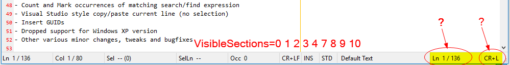
[Settings2] StatusbarVisibleSections=0 1 2 3 4 5 6 7 8 9 10) to define, which fields of the statusbar should be visible. This setting also defines the field ordering, if used.
RaiKoHoff
on 24 Apr 2018
Tested: "_develop_3.18.424.989"
I like the current distribution of the Status Bar with the default settings, much better now than v.988. 😏
Now just dreaming: What about of a Status Bar selectable where the width of the column could be adjusted with the mouse (like the header columns in Explorer) ? 🤔
hpwamr
on 24 Apr 2018
Regarding your dream: Nice idea - a little bit beyond the windows standard :astonished:.
A first question then would be: is user dragged positions fixed (resizing window or increasing line/selection/occurrence count do not change user settings then ...)?
Maybe low priority at the end of the backlog (todo list).
RaiKoHoff
on 24 Apr 2018
@rizonesoft : this statusbar handling is a development beyond the RC feature freeze, and related source code changes are beyond a "bugfix". It is your decision, to put it into upcoming release version.
I still have another PR for Release Candidate, mainly Scintilla upstream changes (included also in this "_develop_3.18.424.989" version [Bugfix RC III]).
RaiKoHoff
on 24 Apr 2018
My idea was a possible resizing in width (increasing / decreasing) of the field: Line, Sel, Occ, etc ...) so that the user can adjust himself the width of a field according to his desires. 🤔
But, you're right It's "a Dream" for "the End" of the "Todo list". 😃
hpwamr
on 24 Apr 2018
Hello @RaiKoHoff ,
Already we have in Settings2:
- new ([Settings2] StatusBarOptimizedSpace=0/1) to switch between "dynamic optimized" and "relaxed dynamic" status bar display.
- new ([Settings2] StatusbarVisibleSections=0 1 2 3 4 5 6 7 8 9 10) to define, which fields of the statusbar should be visible. This setting also defines the field ordering, if used.
Another more realistic idea and NOT beyond the Windows standard! 😏
Why not have a new parameter in Settings2, so that the user can adjust himself the width of the sections according to his desires. 🤔
- new ([Settings2] StatusbarSectionsWidth=0=90 1=90 2=140 3=90 4=90 5=90 6=150 7=50 8=40 9=40 10=140)
PS: Here above, the values (in pixels) are just for example (unrealistic values)
Maybe this "Dream" can become reality "Before the End" of the "To-do list" ❔ 😆
hpwamr
on 25 Apr 2018
Hello @hpwamr ,
Fixed values (in pixels) don't make sense, relative values (section compared to each other) do make sense - it is used internally. In development beta version "_develop_3.18.425.991" I make them configurable by settings file:
- new (
[Settings2] StatusbarSectionRelWidths=2 2 3 2 2 2 2 1 1 1 3) [default].
Meaning:
Sections 7,8,9 (EOL Mode, INS/OVR Mode, STD/2ND Text Mode) have a relative width of 1.
Then e.g. Section 2 (Selection Info) will have 3-times the width of section 7, 8 or 9.
StatusbarSectionRelWidth of 0 will make a section zero width!
Finetuning: increase numbers: StatusbarSectionRelWidths=25 22 35 21 28 18 21 10 11 12 31.
If StatusbarSectionRelWidths is defined in .ini file, the meaning of setting StatusBarOptimizedSpace changes:
StatusBarOptimizedSpace=0: the algorithm tries to keep full section string visible as long as possible.StatusBarOptimizedSpace=1: the algorithm keeps the user defined rel. section widths fixed - cutting off section string ends to enforce this.
Just play around with the settings and get a feeling for it.
Spiderman: With great "_configurability_" comes great responsibility. :smirk:
RaiKoHoff
on 25 Apr 2018
... and the short name prefixes of the status-bar sections should be configurable too :sweat_smile:
RaiKoHoff
on 25 Apr 2018
Please test development beta "_develop_3.18.425.992".
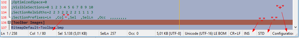
The settings for the statusbar now got an own section within the .ini file:
[Statusbar Settings]
;OptimizedSpace=0
;VisibleSections=0 1 2 3 4 5 6 7 8 9 10
;SectionRelWidths=2 2 3 2 2 2 2 1 1 1 3
;SectionPrefixes=Ln  ,Col  ,Sel  ,SelLn  ,Occ  ,,,,,,,,
New setting for the displayed prefixes SectionPrefixes - a comma separated list. Spaces are not ignored.
RaiKoHoff
on 25 Apr 2018
Hello @craigo- , hello @hpwamr ,
@rizonesoft likes to have this little enhancement pulled into an upcoming 2nd Release Candidate.
It would be fine, if you can test it before I can create a Pull Request for that.
Please provide suggestions for better default values for the [Stausbar Settings] settings too :smiley:
RaiKoHoff
on 26 Apr 2018
@RaiKoHoff I will give it a test. You can create the PR so long. Thanks.
rizonesoft
on 26 Apr 2018
The settings for the statusbar now got an own section within the .ini file:
[Settings2] _This section offers some advanced Notepad3 program settings, and can only be edited manually._
Hello @RaiKoHoff ,
My personal opinion: I don't like to start a new section [Statusbar Settings] because I like to keep only ONE place "[Settings2]" to offer some advanced settings of the Notepad3 program. 🤔
hpwamr
on 26 Apr 2018
@hpwamr : I like to have things more structured - can't do this for old settings because of backward compatibility, but for new stuff, we should not miss the option to structure things.
@rizonesoft : ... creating PR for "Configurable Statusbar"
RaiKoHoff
on 26 Apr 2018
SectionRelWidths=2 2 3 2 2 2 2 1 1 1 3
Other suggestion: can the relative values to be "x10"
E.g.: SectionRelWidths=20 20 28 20 20 20 20 7 7 36
hpwamr
on 26 Apr 2018
@hpwamr : I like to have things more structured - can't do this for old settings because of backward compatibility, but for new stuff, we should not miss the option to structure things.
OK, I understand your point of view. Me too, I like things well structured. 😏
hpwamr
on 26 Apr 2018
@hpwamr : There has been a bug regarding relative width definitions to be x10.
Please check development beta "_develop_3.18.426.993" - new suggested defaults(?) [20 20 28 20 20 20 20 7 7 7 36] implemented.
RaiKoHoff
on 26 Apr 2018
Had a quick look at RC build 992 this evening but ran out of time to comment properly. Particularly interested in getting the “out of box experience” right, and I think 992 had a way to go.
Will have a look at 993 and any subsequent builds over the next 24 hours.
craigo-
on 26 Apr 2018
There has been a bug regarding relative width definitions to be x10.
Please check development beta "_develop_3.18.426.993" - new suggested defaults(?) [20 20 28 20 20 20 20 7 7 7 36] implemented.
Hello @RaiKoHoff,
Good job, it's great how the relative width of the fields adjusts to match as possible the data! 👍 ❤️
hpwamr
on 26 Apr 2018
Hello @RaiKoHoff,
[Statusbar Settings]
;OptimizedSpace=0
;VisibleSections=0 1 2 3 4 5 6 7 8 9 10
VisibleSections=0 1 2 3 4 7 8 9 10
;SectionRelWidths=20 20 28 20 20 20 20 7 7 7 36
;SectionPrefixes=Ln  ,Col  ,Sel  ,SelLn  ,Occ  ,,,,,,,,
For testing purpose I've suppressed the columns 5 and 6.
I obtain 2 wild columns on the right side ! 🤔
hpwamr
on 27 Apr 2018
Thanks for your patience. Here are my thoughts regarding where we are currently at with the status bar.
(Tested version: x64 develop 3.18.427.995)
First thought: I really like @RaiKoHoff's work giving us the ability to tailor the status bar to our individual needs. Thank you.
The out-of-box experience has to be good on a reasonably wide variety of display resolutions. At 1600x900 (not that small!), it's not bad, but the style element is significantly truncated (Notepad3 window width 814 pixels):
When I resize to my standard width of 754 pixels, it looks like this:
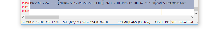
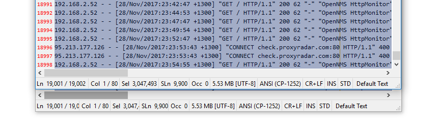
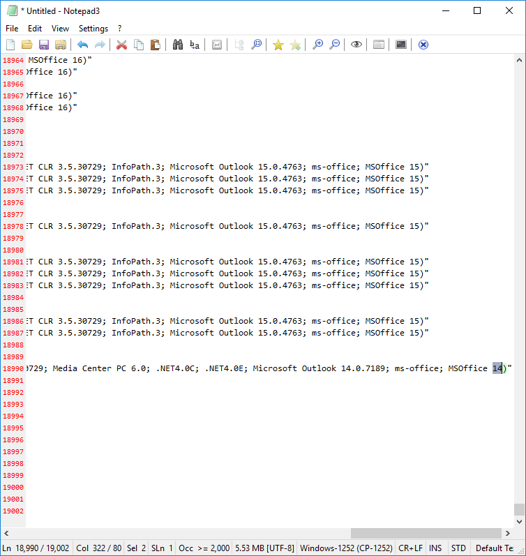
I then spent a fair amount of time customising the status bar, using the following Apache log file as a test:
- 10,000+ lines
- Columns with 300+ characters
- Occurrences for some characters over 30,000
With the following settings:
OptimizedSpace=1(to enforce the proportional widths)SectionRelWidths=140 100 110 104 105 79 138 59 38 38 89(custom widths adding up to 1000)
...I can get to this:
Not bad. But still some room for improvement.
Suggestions:
- Reduce Element Lengths
Get rid of (or make optional):
- Sel: # bytes in brackets
- Size: encoding
I think if this were implemented, I could make the above scenario work (and I'd supply my customised widths for consideration for the defaults). Making the above data optional would be the least intrusive option, I think. To be honest, I wouldn't mind if they disappeared completely.
We might also consider making some of the scheme names shorter, e.g.:
Configuration files(the longest, I believe) ->Config file- Any name that has the plural
files, change tofile
- Fixed-Width elements
I think that it makes sense for some of the status bar elements to remain a fixed width, e.g.:
- Line Endings
- Insert / Overwrite
- Default Text / 2nd Default Text
I see no reason for these elements to ever grow beyond the space required to show their text. That's how they used to behave. In fact, it looks weird if they grow proportionally. (I might even include the Style element, in order that the three rightmost clickable items do not move around too much..?)
Therefore, could we have a "px" suffix that reinterprets the preceding number as a fixed-width number of pixels? e.g.:
SectionRelWidths=20 20 28 20 20 20 20 43px 30px 30px 36
(Take the window width, subtract 103 pixels [43 + 30 + 30], distribute the remainder amongst the other elements according to their respective ratios compared to the total)
- Style Element Truncated First?
I much prefer the behaviour of the OptimizedSpace setting set to 0... It tries to not reduce the width of elements if it would make them less than their contents... BUT it seems not all the elements are equal. The style element seems to get truncated first (only?), when other elements (encoding, line endings) might also be truncated. To test, increase the width of a Notepad3 window to e.g. around 1500 pixels, then start reducing the width and watch what happens.
Could the algorithm start truncating all fields that no longer fit at the same time, spreading the magnitude of the problem across more than one element so that the effect on each element is reduced?
- Rename
OptimizedSpace
Enabling the setting changes the algorithm to enforce the status bar ratios. I suggest that the setting be named something that better represents this, e.g. "StrictRatios".
craigo-
on 28 Apr 2018
😃 What a detailed and thorough testing 👍 Plus a detailed suggestion list 👍 👍. I will consider it ...
RaiKoHoff
on 28 Apr 2018
Hello @craigo-,
Notepad3 (64-bit) Xperimental v3.18.427.996
[Statusbar Settings]
;OptimizedSpace=0
;VisibleSections=0 1 2 3 4 5 6 7 8 9 10
;VisibleSections=0 1 2 3 4 7 8 9 10
;SectionRelWidths=20 20 28 20 20 20 20 7 7 7 36
;SectionPrefixes=Ln ,Col ,Sel ,SelLn ,Occ ,,,,,,,,
[Window]
1920x1080 HighDpiToolBar=-1
1920x1080 PosX=896
1920x1080 PosY=16
1920x1080 SizeX=1008
1920x1080 SizeY=1008
1920x1080 Maximized=0
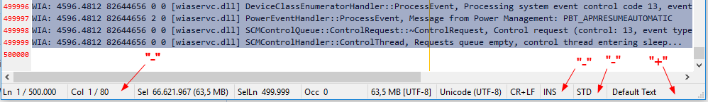
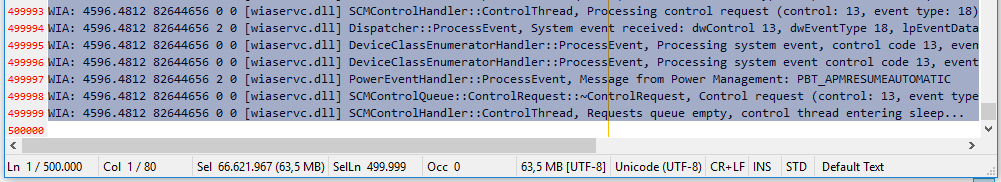
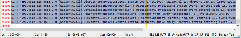
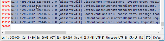
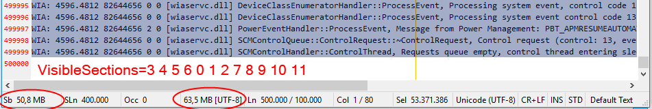
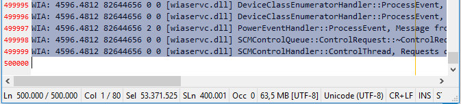
Test Log file of: 500.000 lines
From my test, it looks like the status bar is optimized for: 1920x1080 🤔
Correction: After "re-reading" your reporting, I deleted some of my inappropriate comments ! 😏
hpwamr
on 28 Apr 2018
@hpwamr, I'd say you're right. The status bar looks like it works very well out of the box at 1920x1080, with files with numbers of lines and selections of 100,000+. I'd be happy at an order of magnitude less than that :smile:
...And as per your first post, I have corrected the setting name in my above post. Thanks for pointing that out.
craigo-
on 28 Apr 2018
Please test reworked development version "_develop_3.18.429.997":
Changed:
[Statusbar Settings]
SectionPrefixes=Ln  ,Col  ,Sel  ,Sb  ,SLn  ,Occ  ,,,,,,,,
VisibleSections=0 1 2 4 5 6 7 8 9 10 11
SectionWidthSpecs=30 30 20 20 20 20 0 0 0 0 0 0
SectionPrefixes: Configurable statusbar section prefixes (incl. spaces)VisibleSections: Statusbar sections to be displayed (defining order of section too)_New_:
SectionWidthSpecs:- Value 0: Minimal section width (dynamically adapted)
- Negative Values (e.g.
-120): defining fixed width (pixels) of sections (text maybe truncated) - Positive Values defining relative width of remaining width (total width - fixed sections - optimal (0) sections).
Section text is truncated only if:
- Section is defined to use fixed pixel width (negative spec numbers)
- Not all visible sections fit into statusbar: sections are truncated from right to left order.
- Section 3 (Selected Bytes) is invisible by default, but can be shown, by defining
VisibleSections. - File size encoding indicator (
[UTF-8]) remains to avoid questions about differences between displayed size and encoding dependent resulting file sizes.
If applicable, please make better default suggestions for SectionWidthSpecs=30 30 20 20 20 20 0 0 0 0 0 0.
RaiKoHoff
on 29 Apr 2018
;VisibleSections=0 1 2 3 4 5 6 7 8 9 10
VisibleSections: Statusbar sections to be displayed (defining order of section too)
Hello @RaiKoHoff,
Questions:
- can
VisibleSectionsuse to hide sections too? Or the 12 numbers must always be present ?
E.g. : Display only 6 sectionsVisibleSections=0 1 2 3 10 11🤔 - Before there were 11 sections. Now 12 sections, is this correct? What is the extra section?
hpwamr
on 29 Apr 2018
Yes only VisibleSections is used to hide (or reorder) sections.
Missing sections in SectionWidthSpecs are defaulted to zero (0) meaning minimal width dynamically adapted.
So SectionWidthSpecs=30 30 20 20 20 20 0 0 0 0 0 should be equivalent to SectionWidthSpecs=30 30 20 20 20 20.
RaiKoHoff
on 29 Apr 2018
Missing sections in SectionWidthSpecs are defaulted to zero (0) meaning minimal width dynamically adapted.
Ok, this is why there are 12 numbers ? ❔
Or, is it a missing one, because there is no section "# 3" VisibleSections=0 1 2 4 5 6 7 8 9 10 11
Before ;VisibleSections=0 1 2 3 4 5 6 7 8 9 10
hpwamr
on 29 Apr 2018
@hpwamr : in my comment (https://github.com/rizonesoft/Notepad3/issues/451#issuecomment-385267841) it is noted:
Section 3 (Selected Bytes) is invisible by default, but can be shown, by defining VisibleSections.
Now there a 12 sections (Selected Size has been split into Selected Chars and Bytes : 11 -> 12)
Selected Bytes (Section 3) are hidden now as @craigo- requested (https://github.com/rizonesoft/Notepad3/issues/451#issuecomment-385140080) ...
RaiKoHoff
on 29 Apr 2018
@hpwamr : Sorry there has been a very nasty bug occurring in Release Build only (most of the time I am testing Debug Build). (It has been in reading Number String into internal integer vector - reading SectionWidthSpecsand VisibleSections)
So please test new development beta: "_develop_3.18.429.999"
RaiKoHoff
on 29 Apr 2018
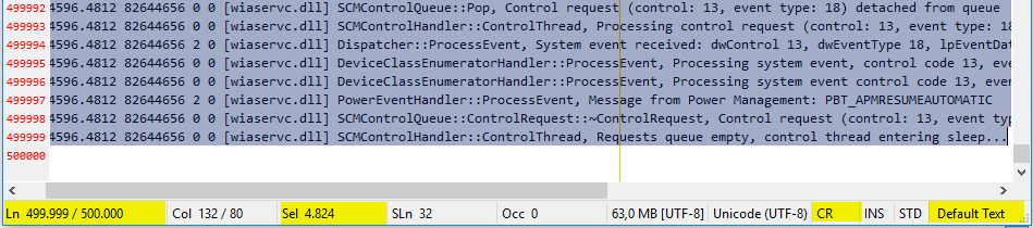
Is this maybe a bug ? 🤔
Reproductible with All versions:
- Open e.g. : readme.txt -, Ctrl+A (Select All) - INS/OVR does toggle correctly (keyboard of double clicks on status bar)
- Now with the same file, Ctrl+End (go to EOF), Ctrl+A (Select All) - INS/OVR does NOT toggle anymore (keyboard of double clicks on status bar)
hpwamr
on 29 Apr 2018
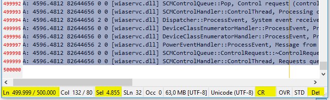
@hpwamr, I too was having intermittent problems when double-clicking on the INS/OVR status bar element when testing with develop build 995. It seemed to be triggered by either resizing the window horizontally, double-clicking on another status bar element (e.g. style, STD/2ND), or making a multi-line selection. But it is a bit tricksy... Every time I tried to document steps to reliably reproduce the problem, it wouldn't always occur.
craigo-
on 30 Apr 2018
UpdateStatusbar() has not been performed in all necessary places and conditions.
I filled some more places, but I like to keep the count of those places as small as possible (expensive operations executing UpdateStatusbar())
Please test Millennium development build "_develop_3.18.430.1000".
RaiKoHoff
on 30 Apr 2018
We got to 1000! 🎆
craigo-
on 30 Apr 2018
... and beyond, cause Scintilla developers don't sleep either 😀
RaiKoHoff
on 30 Apr 2018
New:
SectionWidthSpecs:
- Value 0: Minimal section width (dynamically adapted)
- Negative Values (e.g. -120): defining fixed width (pixels) of sections (text maybe truncated)
- Positive Values defining relative width of remaining width (total width - fixed sections - optimal (0) sections).
Section text is truncated only if:
- Section is defined to use fixed pixel width (negative spec numbers)
- Not all visible sections fit into statusbar: sections are truncated from right to left order.
I'm really excited that we have an option to specify a fixed width (negative numbers). Thanks! I also like the SectionWidthSpecs 0 value (dynamically adapted). This will be very useful.
Refer the screenshot below (Notepad window width 754 pixels, settings at their defaults, and a 19,000 line Apache log file loaded and half-selected):
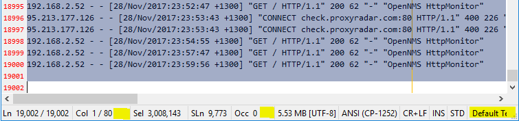
Horizontal space is getting tight and the status bar is getting truncated: the Style element is not completely visible. But both the Col and the Occ elements have space to spare. (I could play around with their respective proportions, but the Occ element probably deserves the space.)
I played around with setting the rightmost four elements to fixed widths, but noticed (exactly as you describe above) that fixed-width elements were being truncated to grant space to other elements.
I am finding that in the situations where elements need to be truncated, I would prefer that the fixed-width elements remain fixed. Trust that the user really wanted the element width set to this figure. (This can also be used to mimic the previous No it can't; it is more a return to the original way fixed-width elements behaved.)OptimizedSpace=1 setting.
I am also thinking that in the same scenario, any element with a specified width of 0 be treated as "fixed width" also (for truncation purposes).
Therefore, when truncation needs to happen, I would prefer that the candidates be, in order:
- Any and all proportional elements that still have some space to "donate". Ideally, this would happen in parallel (at the same time).
- If there are no further gains to be made by truncating proportional elements (because they are all as small as they can be whilst still displaying their contents), then we start truncating elements from right to left.
How does that sound?
craigo-
on 30 Apr 2018
@craigo- : The intention has been exactly as you described it above.
Saying so means that the visible screenshot provided, shows a bug somewhere in the algorithm 😲 .
Starting to hunting that down ...
Ed.:
Yes, the "bug" is: The algorithm tries to keep the user defined proportional relation ship within the remaining space (left from fixed and optimized elements), while ensuring to not truncating text in the proportional area. The last condition enlarges the "remaining proportional" area, which causes the truncation of "fixed" elements from right to left.
Searching for a solution ....
RaiKoHoff
on 30 Apr 2018
@craigo- : Please try development beta "_develop_3.18.430.1002".
I think, we are coming closer, but still some occasional "rounding" problems (and a small danger of being caught in an infinite loop while optimizing section widths ... 😬).
RaiKoHoff
on 30 Apr 2018
I agree, we are getting closer 👍
There is some odd behaviour though. Below is a screenshot of two instances of Notepad3 x64 develop version 3.18.430.1002 with the same file open and the same amount of text highlighted. The top window is 719 pixels wide, the bottom window has been widened to 720 pixels wide:
That's rather a weird jump. I would expect the truncation to get better when giving it more space, not worse!
craigo-
on 30 Apr 2018
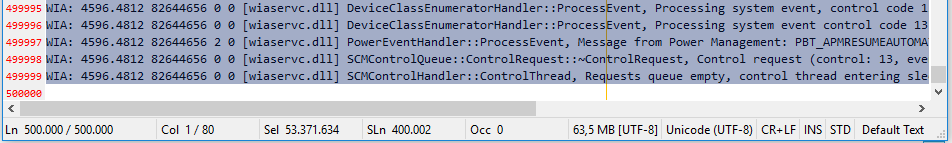
Hello @RaiKoHoff,
Here, I want to share my positive experience with Notepad3 (64-bit) develop v3.18.430.1002 and a test Log file of: 500.000 lines ! 👍 ❤️
Desktop : 1920x1080
1920x1080 HighDpiToolBar=-1
1920x1080 PosX=896
1920x1080 PosY=16
1920x1080 SizeX=1008
1920x1080 SizeY=1008
1920x1080 Maximized=0
Laptop : 1366x768
1366x768 HighDpiToolBar=-1
1366x768 PosX=654
1366x768 PosY=16
1366x768 SizeX=696
1366x768 SizeY=696
1366x768 Maximized=0
hpwamr
on 30 Apr 2018
@hpwamr : Thank you.
I found the bug (hopefully the last one regarding statusbar section width calculation).
Please test development version "_develop_3.18.501.1003".
RaiKoHoff
on 1 May 2018
Any suggestion for a default set of settings of statusbar parameter?
Or shall we try to define the default parameter set to get as close as possible to old visual appearance?
Current default settings are:
[Statusbar Settings]
SectionPrefixes=Ln  ,Col  ,Sel  ,Sb  ,SLn  ,Occ  ,,,,,,,,
VisibleSections=0 1 2 4 5 6 7 8 9 10 11
SectionWidthSpecs=30 30 20 20 20 20 0 0 0 0 0 0
I’ll have a play over the next 12-15 hours and see what works.
craigo-
on 1 May 2018
I am super happy right now.
(Tested version: x64 develop 3.18.501.1006)
I'm playing with the current values:
SectionPrefixes=Ln  ,Col  ,Sel  ,Sb  ,SLn  ,Occ  ,,,,,,,,
VisibleSections=0 1 2 4 5 6 7 8 9 10 11
SectionWidthSpecs=30 20 20 20 20 20 0 0 -44 -32 -32 0
i.e.:
- Reduced the column counter to 20 (in practice I don't find it needs the additional space)
- Fixed Width for Line Endings, INS/OVR, STD/2ND (so they remain stationary when double-clicked)
It works really, really well. The truncation algorithm does a very good job of keeping things visible when space gets progressively tighter. Here is a fairly extreme example, using my aforementioned window width of 754 pixels:
...it is handled very well. That is a very busy status bar; I don't think I can ask for more!
I also tested a few edge cases...
- All elements fixed-width? Works as expected
- All elements proportional with the same value? Works as expected
- All elements dynamically adapted (0)? Works as expected
Well done, @RaiKoHoff 👍
I don't have access to high-DPI displays for testing, so I don't know how well the fixed widths will work in that scenario... Can anyone with high-DPI displays test? If it works well then I put forward my settings above as candidates for the defaults (just for the simple fact to reduce element movement when the text changes). If not, I would replace the fixed-widths with dynamic widths, i.e.:
;SectionPrefixes=Ln  ,Col  ,Sel  ,Sb  ,SLn  ,Occ  ,,,,,,,,
;VisibleSections=0 1 2 4 5 6 7 8 9 10 11
;SectionWidthSpecs=30 20 20 20 20 20 0 0 0 0 0 0
Hello @RaiKoHoff,
Tested: Notepad3 (64-bit) develop v3.18.502.1007 "out of the box" 😏
Problem:
- Double click on "STD" toggle correctly the field to "2ND",
- Toggle correctly the text "readme;txt" to the "Scheme "2nd Default Text"".
- BUT in the
Statusbarthe last field remains "Default Text" instead of "2nd Default Text" !
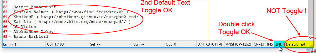
Close and Reopen NotepadP3 restores the correct Scheme (2nd Default Text) the Statusbar ! 🤔
Here Resizing the NP3 window has NO effect !
hpwamr
on 2 May 2018
How did I not notice that??? Happens in 3.18.501.1006 as well...
craigo-
on 2 May 2018
Please test development beta "_develop_3.18.502.1008".
RaiKoHoff
on 2 May 2018
BUT in the Statusbar the last field remains "Default Text" instead of "2nd Default Text" !
Hello @RaiKoHoff
Tested with: "_develop_3.18.502.1009".
It's corrected ! 😃
hpwamr
on 2 May 2018
It works really, really well. The truncation algorithm does a very good job of keeping things visible when space gets progressively tighter. Here is a fairly extreme example, using my aforementioned window width of 754 pixels: https://github.com/rizonesoft/Notepad3/issues/451#issuecomment-385859658
Hello @craigo-, You got it ! 🥇
It works really, _really_ well ! 👍 😃 ❤️
@RaiKoHoff,
I suggest the parameters of "craigo-" for the default Statusbar columns. 😃
SectionWidthSpecs=30 20 20 20 20 20 0 0 -44 -32 -32 0
Desktop : 1920x1080
Laptop : 1366x768
hpwamr
on 2 May 2018
Oh, you really want the "fixed" width for default ?
It would be perfect if @icstyle could verify that this is fine for HighDPI screen settings too?
Maybe I have to adjust the "fixed" values by HighDPI correction too as done for https://github.com/rizonesoft/Notepad3/issues/463#issuecomment-385274032 ?
RaiKoHoff
on 2 May 2018
Looks good to me (tested on .1010), both without and with fixed values from craigo-.
Default:

Fixed values:

 icstyle
on 2 May 2018
icstyle
on 2 May 2018
SectionWidthSpecs=30 20 20 20 20 20 0 0 -44 -32 -32 0
Dear @icstyle If you want, could you, please, check with the displayed values in the line above (values (positive and negative) proposed by "craigo and also tested by me (3 posts above). 🤔
hpwamr
on 2 May 2018
@icstyle, the fixed-width value I supplied for the Line Endings element was supposed to be wide enough to accommodate the string CR+LF (the default), which it clearly does not from your screenshot.
It looks like your line endings are set to CR... If you double-click the status bar element it will change the setting. When you use my fixed width status bar values, I bet you will not be able to see when the line ending setting is CR+LF - it is being truncated.
So, right now, it looks like the fixed width values are not going to work with high-DPI displays.
Is it that Windows is scaling up the font sizes on high-DPI displays (e.g. 200%), and we need to take that into account? I imagine that would work... But the values would cease to always represent a fixed number of pixels...
We could just just not use fixed-width values for the defaults... But for those user who want to use them (me!), particularly across a variety of display pixel densities, this should work across them all. So perhaps we do need to consider scaling in any case.
(EDIT: thinking about it, back when Notepad3 used a fixed width for elements such as line endings and INS/OVR, it must have taken into account font scaling for it to display nicely on high-DPI displays.)
craigo-
on 2 May 2018
It looks like your line endings are set to CR... If you double-click the status bar element it will change the setting. When you use my fixed width status bar values, I bet you will not be able to see when the line ending setting is CR+LF - it is being truncated.
Hello @craigo-,
It could be that "@icstyle" did not use all your negative values (= 30 20 20 20 20 20 20 0 0 - 44 -32 -32 0), because IF "CR" is truncated THEN it seems logical that "INS" and "STD" should be slightly truncated too! ❔ 🤔
hpwamr
on 2 May 2018
@hpwamr, that might be true... But when @icstyle had Notepad3's widths at default settings (the top image), which should size the last 6 elements at the minimum width to display their contents, it still only displayed the line endings as "CR".
craigo-
on 3 May 2018
To be on the safe side regarding default settings (users with HighDPI 200% or DialogFont changers), I decided for:
SectionWidthSpecs=30 20 20 20 20 20 0 0 0 0 0 0.
Please test development beta "_develop_3.18.503.1011".
RaiKoHoff
on 3 May 2018
@RaiKoHoff, @rizonesoft
Hello RaiKoHoff, I'm proud to share the result of your awesome work about the "Statusbar" on the beta : Notepad3 develop v3.18.503.1012 just "Out-of-the-Box" and a test Log file of: 500.000 lines ! 👍 ❤️
[Statusbar Settings]
;SectionPrefixes=Ln  ,Col  ,Sel  ,Sb  ,SLn  ,Occ  ,,,,,,,,
;VisibleSections=0 1 2 4 5 6 7 8 9 10 11
;SectionWidthSpecs=30 20 20 20 20 20 0 0 0 0 0 0
Desktop : 1920x1080 : VisibleSections=0 1 2 4 5 6 7 8 9 10 11 (11 columns)
Desktop : 1920x1080 : VisibleSections=3 4 5 6 0 1 2 7 8 9 10 11 (12 columns + column's reordering)
Laptop : 1366x768 : VisibleSections=0 1 2 4 5 6 7 8 9 10 11 (11 columns)
Laptop : 1366x768 : VisibleSections=0 1 2 4 5 6 7 8 9 10 11 (11 columns and readme.txt 136 lines)
hpwamr
on 3 May 2018
I was indeed playing with line endings, but it looked alright also on CR+LF.
V.1012 on 200% DPI with default settings, looks good to me, except the syntax scheme gets cutted off:


icstyle
on 3 May 2018
@icstyle : Yes, if no more space to compress in dynamic sections, then statusbar is truncated from right to left ... 👍 . Looks good, thank you for testing...
RaiKoHoff
on 3 May 2018
Closing ...
RaiKoHoff
on 13 May 2018
What about the situation with fixed widths and the possibility of variable scaling (non-highDPI and DPI displays)? I’m trying to get my hands on a highDPI laptop to test, but I foresee problems...
craigo-
on 13 May 2018
Issue can be reopened (or creating new issue) if problems occur ...
RaiKoHoff
on 13 May 2018
I would prefer StatusBar looks like this (from my fork of Notepad2):
The Scheme Name, Encoding, Line Ending, INS/OVR, File Size is fixed at right,
because these information often has fixed width (appropriate unit is used for file size, so it will not vary a lot).
On the other hand, other information will vary a lot, depends on line number in current file, cursor position, line length, selection state, matching count, etc. If some information is not complete visible, just need to resize the window a little.
 zufuliu
on 3 Aug 2018
zufuliu
on 3 Aug 2018
@zufuliu : You can use this configuration, to get close to your preferred visualization:
[Statusbar Settings]
SectionPrefixes=Ln  ,Col  ,Sel  ,Sb  ,SelLn  ,Fnd  ,,,,,,,,
VisibleSections=0 1 2 4 5 11 7 8 9 6
SectionWidthSpecs=20 20 20 20 20 50 0 0 0 0 0 25

RaiKoHoff
on 5 Aug 2018
In my screenshot, the Scheme Name, Encoding, Line Ending, INS/OVR, File Size is FIXED at right, they will keep at right when resizing window. On the other hand, I have more items to display:
Ln: current line number / total line count
Col: current column index / total column in current line
Ch: current character index / total character count in current line
Sel: selected bytes count / characters count
The original proposal is at https://github.com/XhmikosR/notepad2-mod/issues/146.
By the way, from your screenshot (the 80 columns), your fix for https://github.com/XhmikosR/notepad2-mod/issues/164 seems broken.
zufuliu
on 5 Aug 2018
Thanks for the hint with "total column in current line" - that makes more sense.
The selected bytes ("Sb") count (total bytes count) is of less information, cause Notepad3 uses UTF-8 encoding always (internally) - a re-coding according to chosen encoding is only performed on file I/O.
What is the need for "current character index" and when is it different to "current column index" ?
The selected character count has been corrected a couple of month (a year?) ago.
If you really need a hard (fixed) status-bar section width, you can use negative numbers as pixel-sizes in SectionWidthSpecs:
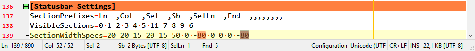
SectionPrefixes=Ln  ,Col  ,Sel  ,Sb  ,SelLn  ,Fnd  ,,,,,,,,
VisibleSections=0 1 2 3 4 5 11 7 8 9 6
SectionWidthSpecs=20 20 15 20 15 50 0 -80 0 0 0 -80
Column index different form character index is because use of the tab char (\t). The column width for tab char is configurable, such as 4 or 8. No matter what value, it's only one character.
Some tools report errors/warnings in line + column index combination, others use line + character index combination, Visual Studio displays both.
zufuliu
on 6 Aug 2018
@zufuliu : naturally - forgot about "tab" - 😁 - thank you for explanation.
RaiKoHoff
on 6 Aug 2018
Please test development beta _X_MUI_4.18.807.1044:
- Add char counting (# chars left of caret / # chars of current line)
- Fix: Column info
RaiKoHoff
on 7 Aug 2018
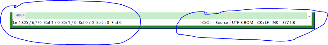
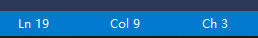
Looking at @zufuliu's screenshot, the column and character number in his build seem to be the same ("Col 1/0 Ch 1/0").
Here is what it looks like in Notepad3 beta build 1044:
("Col 35 / 48 Ch 34 / 47")
Should the column and character count (and max) be the same? i.e. is the character count low by 1?
craigo-
on 7 Aug 2018
I think they should, since no tab (\t) is used, each character is one column width.
zufuliu
on 7 Aug 2018
Please test development beta _X_MUI_4.18.807.1045.
I think the Character-Counter is a counter like Selection-Char-Count and not a line or column index.
So it should be zero based. So I feel better to see the "right count" on left-hand-side of the caret.
But, to don't start a discussion here, i made it configurable:
[Statusbar Settings] ZeroBasedCharacterCount=0/1 (default settings: 0=false, which is your proposal).
Another discussion could be: displaying "1 / 0" (common meaning "_one out-of zero_").
I think it is confusing, so, for Notepad3 the latter number has the same counting base as corresponding index/counter in front.
RaiKoHoff
on 7 Aug 2018
Originally, I use 0 to indicate an empty line. In Col x / y and Ch z / w, x and z is used to indicate next column and character index (or one-based index). when putting cursor at line ends, x=y+1 and z=w+1, so we got 1 / 0 for empty lines.
zufuliu
on 7 Aug 2018
Related issues
hpwamr
·
3Comments
 vvyoko
·
3Comments
hpwamr
·
4Comments
vvyoko
·
3Comments
hpwamr
·
4Comments
 wmsrww
·
3Comments
craigo-
·
3Comments
wmsrww
·
3Comments
craigo-
·
3Comments
Most helpful comment
We got to 1000! 🎆