Nivo: Misaligned ticks for week-based time scale
Hi,
I'm trying to plot weeks in a year to a line chart (see this codesandbox)
My input data point looks like:
[
  {
     x: "2019-W33",
     y: 618940
  },...
]
The xAxis:
xScale={{
  type: "time",
  format: "%Y-W%V"
}}
axisBottom={{
  format: "%Y-W%V",
  tickValues: "every week"
}}
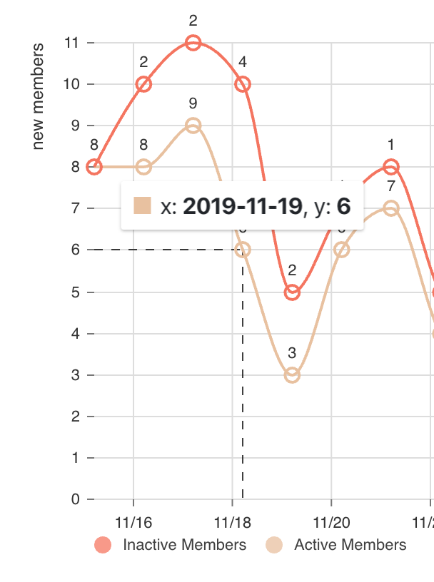
But the axis ticks are not aligned with the line's points and the grid columns are not equally spaced. I'm filling this as a bug but please let me know if I'm doing something wrong...
Thank you
 schlesingermatthias
All 7 comments
I have this same issue but with daily ticks. I have a feeling it affects any chart with a time-based x-axis.
 meltingice
on 17 Dec 2019
meltingice
on 17 Dec 2019
I set useUTC: false on the xScale property.
 wyze
on 17 Dec 2019
wyze
on 17 Dec 2019
@wyze you are a lifesaver, thank you! I had no idea that option even existed.
meltingice
on 17 Dec 2019
Please note that useUTC: false seems to address a different issue and does not seem to apply to the issue of the original poster.
I think I may be partly having the same issue as the original poster, however, I don't have the inconsistent grid line spacing, and my grid remains lined up with the ticks, at least.
In any case, I'm also experiencing "misaligned" ticks on a week-based time scale. For some reason, the ticks that are automatically generated get offset by a seemingly random (to me) amount of days relative to the actual data points.
Please see the following example:
https://codesandbox.io/s/pedantic-tereshkova-69oig?file=/src/index.js
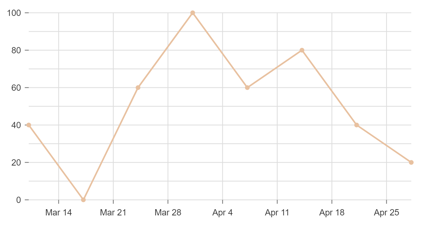
This can be "fixed" by a manual process, by explicitly providing the tickValues as an array from the data set. Also note that you have to do the same for gridXValues, or else the grid lines remain misaligned:
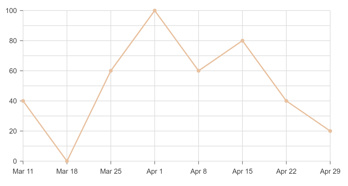
https://codesandbox.io/s/ecstatic-drake-nfvgz?file=/src/index.js
This also occurs when you have tickValues set to multiple months, for example 3 months. Where my data has the months already grouped into 3 month chunks, that gets ignored and different months are used for the ticks. For example:
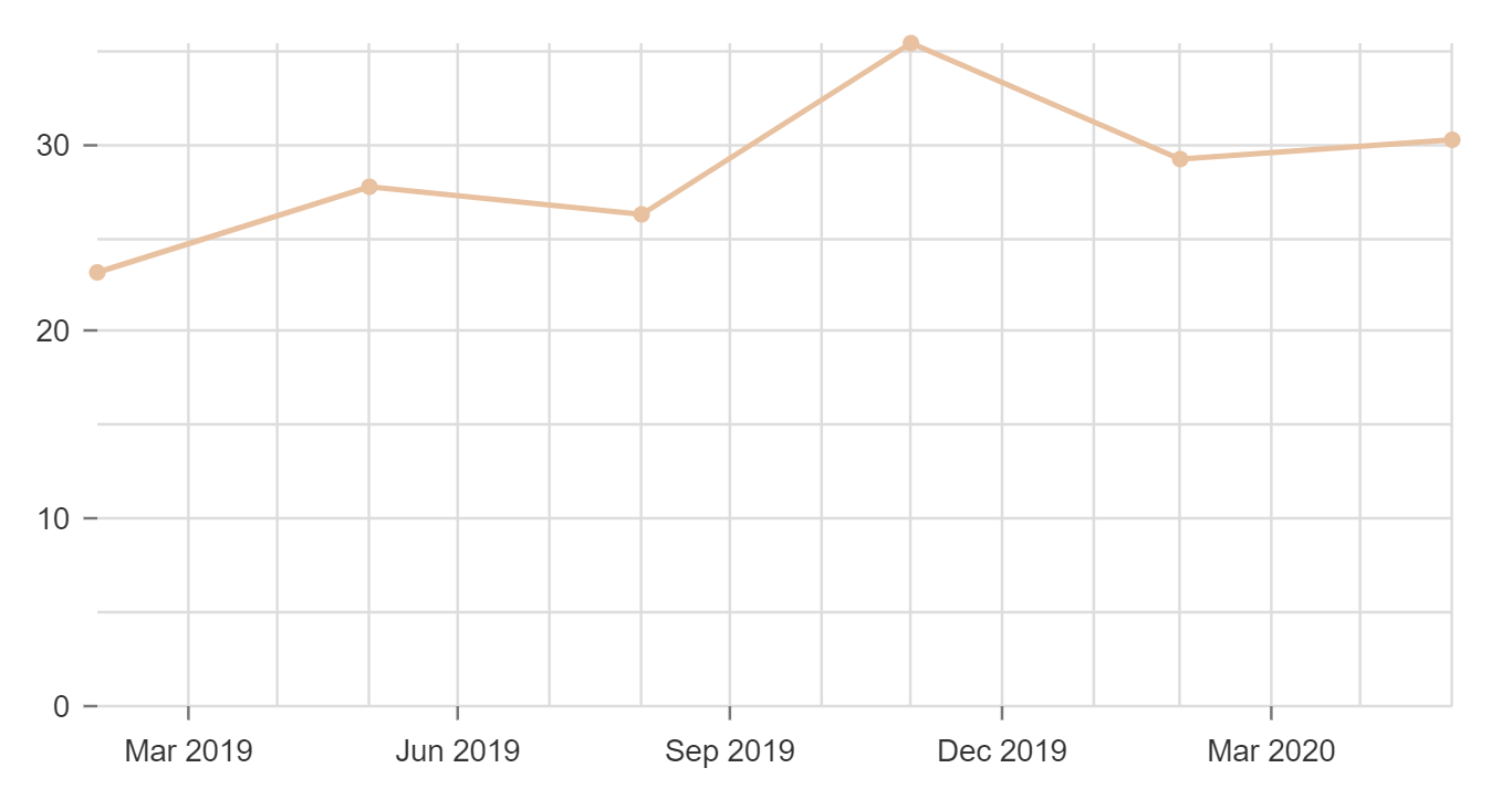
https://codesandbox.io/s/zealous-mahavira-1reo8?file=/src/index.js
It would be great if the automatically generated tick marks would reflect the data points that are being passed in, as in my "fixed" demo above.
 swiharta
on 3 May 2020
swiharta
on 3 May 2020
If it helps anyone, I currently addressed my issue with a function that produces the tick values explicitly. In my case, point.x values are Date objects, which are specific to a given time interval. See a CodeSandbox above for an example. start and end are the min and max dates included in the chart data, intervalType is 'week', 'month, 'day, or 'year', and intervalNum is the number of intervals (ex. 3 months) per data point.
getIntervalTicks = (data, maxTicks=12) => {
  if (!(data && data.length)) {
    console.log('not able to explicitly generate ticks')
      return 8 // fallback to automatically generated ticks of this number
  }
  const {start, end, intervalNum, intervalType} = this.state
  const intervalCount = Math.floor(moment(end).diff(start, intervalType) / intervalNum)
  return data[0].data.reduce((accum, point, index) => {
      const divisor = Math.ceil(intervalCount / maxTicks)
      if (index % divisor === 0)
          accum.push(point.x)
      return accum
  }, [])
}
Then I call this function from the chart parameters as below:
axisBottom: {
  // blah, blah, blah...
  tickValues: this.getIntervalTicks(data),
},
gridXValues: this.getIntervalTicks(data),
This results in limiting the number of ticks to the maxTicks value. So if you have maxTicks=12, and 12 months of data you get 12 ticks, but if you have 13 data points, you'll drop your number of ticks down to 6, then with 14 data points, it goes to 7 ticks, etc...
swiharta
on 4 May 2020
This issue has been automatically marked as stale. If this issue is still affecting you, please leave any comment (for example, "bump"), and we'll keep it open. We are sorry that we haven't been able to prioritize it yet. If you have any new additional information, please include it with your comment!
![stale[bot] picture](https://avatars3.githubusercontent.com/in/1724?v=4&s=40) stale[bot]
on 29 Oct 2020
stale[bot]
on 29 Oct 2020
Closing this issue after a prolonged period of inactivity. If this issue is still present in the latest release, please create a new issue with up-to-date information. Thank you!
stale[bot]
on 5 Nov 2020
Related issues
 p45mark
·
3Comments
p45mark
·
3Comments
 pratikguru
·
3Comments
pratikguru
·
3Comments
 serendipity1004
·
3Comments
serendipity1004
·
3Comments
 KENNYSOFT
·
3Comments
KENNYSOFT
·
3Comments
 dubzzz
·
3Comments
dubzzz
·
3Comments
Most helpful comment
I set
useUTC: falseon thexScaleproperty.