Nextcloud-notes: Hardcoded list for special category images
The server part might come soon with some predefined categories (like "Personal" and "Work").
We could define a list for some of them (like "Music", "Personal", "Movies" and so on) and display them as category icon.
cc @camilasan
 stefan-niedermann
All 13 comments
We now have a hard coded list for
- Music
- Movies / Movie
- Work
Any suggestions for more are welcome, i have no idea what categories people are using :man_shrugging:
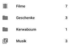
cc @korelstar and @jancborchardt for further ideas
stefan-niedermann
on 4 Oct 2019
Hmmm. Maybe Shopping, Photography, Financial, Private?
But please be aware of subcategories! Currently, the icon switches to a folder with a plus sign, if the category has subcategories. This change may break this behavior.
 korelstar
on 8 Oct 2019
korelstar
on 8 Oct 2019
Yeah, that’s kinda cool to show people the categories.
The first 2 should definitely be:
And then we can have some categories as already mentioned. Let’s not go above 7 total though (Personal, Work and max 5 more) as then it’s a bit excessive. :)
Maybe
- Finances: attach_money
- Movies: what you have in the screenshot above
- Music: what you have in the screenshot above
- Shopping: shopping_basket
- Vacation: wb_sunny (yeah I wanted a palm or smth :D)
 jancborchardt
on 8 Oct 2019
jancborchardt
on 8 Oct 2019
Yes, sounds good, but which icons to use? Ideally just use material icons...
stefan-niedermann
on 8 Oct 2019
Updated my post above with suggestions for the icons. :)
jancborchardt
on 8 Oct 2019
@jancborchardt: @korelstar is right.

We are currently displaying a folder with a +-sign, when there are subcategories which can be expanded. Of course the entries still expand on icon click when there are subcategories.
How could we resolve this style-wise with many different icons? Just assume, the user "knows" there are subcategories?
stefan-niedermann
on 11 Oct 2019
Ah sorry, missed @korelstar’s point above.
Is there a common Android pattern for how to do these subcategories in the navigation? Changing the icon and requiring click on it to expand the subcategories seems a bit difficult to discover.
jancborchardt
on 11 Oct 2019
I think, usually subcategories are always expanded and only separated via a subheader...
Current behavior:
- Clicking on the title
- Parent category gets selcted
- Drawer gets closed
- Notes list shows all items from the parent categories and separated from them all items from the subcategories
- Clicking on the icon
- Parent category gets selected
- Drawer stays open
- Categories in drawer get expanded
- Notes list shows all items from the parent categories and separated from them all items from the subcategories
Possible future behavior:
- Clicking on the title
- Expands the categories
- Drawer stays open
- Parent category gets selected
- Notes list shows all items from the parent categories and separated from them all items from the subcategories
- Clicking on the icon
- Behaves exactly the same like clicking on the title
Benefits
- Subcategories are always easy to discover as you can not longer miss this feature when you select the parent category
Drawbacks
- Drawer has to be closed manually when selecting a category that has subcategories. Might be annoying.
Another variant would be to use the possible future behavior but close the drawer. The user would see the expanded subcategories in the time while the drawer closes (animated) and if the user opens the drawer again. Drawback of this solution would be that a user has to open the drawer twice if he wants to directly open a subcategory. Might be annoying, too :man_shrugging: :man_shrugging: :man_shrugging:
stefan-niedermann
on 11 Oct 2019
I think we should not slow down the default use-case. I.e., showing notes of a primary-level category should not require more steps than now.
Btw., the plus icon is a fast-track in order to jump to subcategories. It's not the only way to do this and it does apply to advanced users only.
korelstar
on 13 Oct 2019
Agree with @korelstar here, showing the notes of the primary level category should take precedence. A simple behavior could be:
- Tap on the text / most part of the entry → Go to the notes of that category
- Tap on the icon, which has a sort of triangle indicator overlaid in case there are subcategories → Expand the subcategories.
What do you think?
jancborchardt
on 25 Oct 2019
Sounds good. We would have to change the current plus sign with a triangle then.
korelstar
on 25 Oct 2019
I aggree, but then we have as remaining issue, that the triangle might look good in a folder, but it is hard to discover in a "special category icon" as overlay. How should we solve this?
stefan-niedermann
on 25 Oct 2019
I’d say it’s possible, if we just overlay it correctly, and on the same position for every icon, for example bottom right. The triangle just needs to have a proper distance to the existing icon, that is a border which is cut off from the icon being overlaid.
Just like e.g. icon-menu-sidebar or the notifications icon:


jancborchardt
on 25 Oct 2019
Related issues
 gsantner
·
9Comments
gsantner
·
9Comments
 awolfman
·
6Comments
stefan-niedermann
·
5Comments
awolfman
·
6Comments
stefan-niedermann
·
5Comments
 pejakm
·
9Comments
pejakm
·
9Comments
 mfechner
·
8Comments
mfechner
·
8Comments