Nextcloud-deck: Adjust design to new style of Nextcloud app
I'd like to consider to adjust the design of the Deck app to the new style of the Files, Talk and Notes app.
@jancborchardt i need your input here. Some kind of scribble or maybe a design season at your talk instance.
A few things i already considered:
- Every Android app uses as brand color the color of the current account / instance. For clarity we should continue this.
- Now the header will get bright / dark depending on the light / dark theme. This gives us the option to put some kind of colored circle into the toolbar as an indicator for the current board. (Wasn't possible until the redesign because the board color might look ugly next to the account color)
- I explicitly don't want to use the current board color as branding (for floating action button and stuff), because this would be confusing compared to the other apps, even if it is important
Any ideas are highly appreciated.
Progress
- [x] New account chooser
- [x] Light / Dark action bar
- [x] Use board colors instead of account colors for branding
 stefan-niedermann
All 8 comments
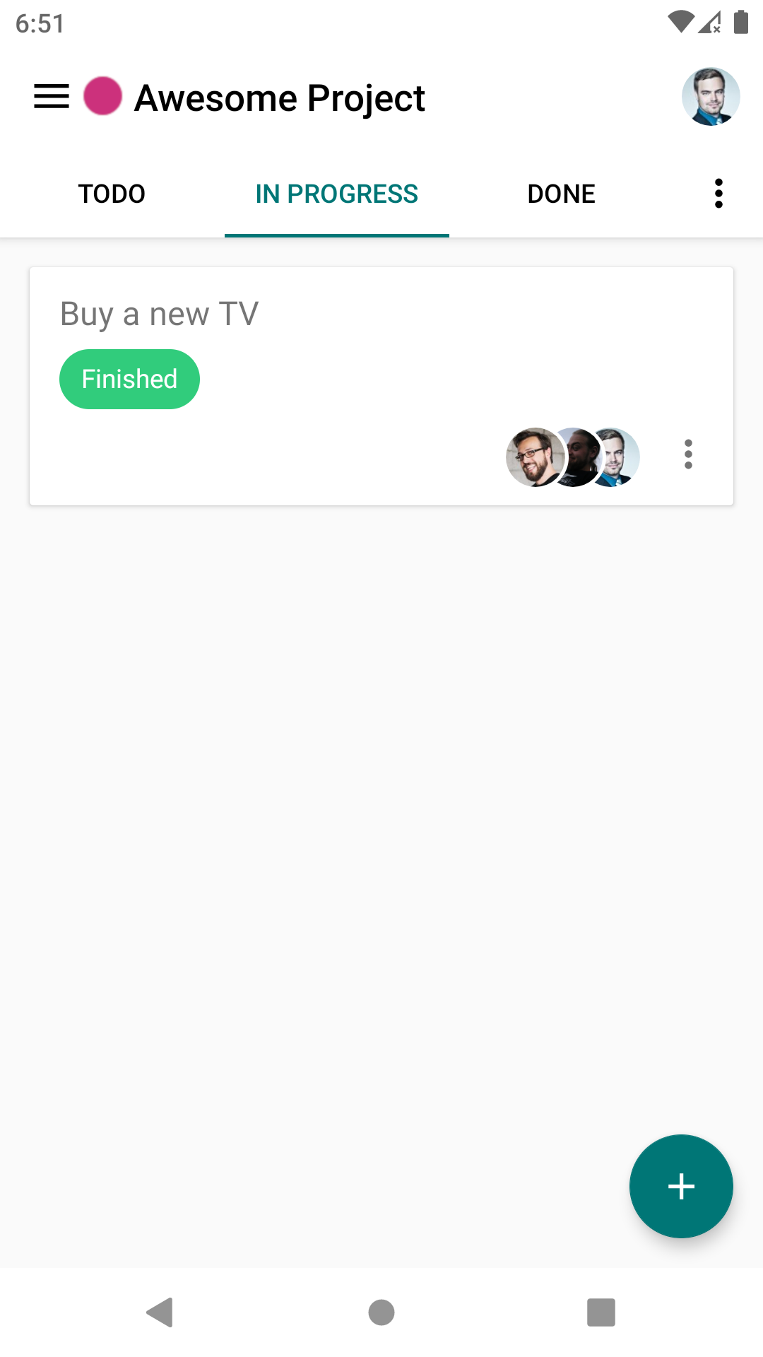
I would actually say that it would be very nice to indeed use the board color as the header and FAB color. Because e.g. for the common case that you only have 1 account, it’s very difficult to distinguish the boards. I would say the theming color only needs to be present in the heading of the sidebar.
That way we really use the colors in the way they relate to things, and we also don’t combine too many at the same time. What do you think? :)
 jancborchardt
on 13 Jun 2020
jancborchardt
on 13 Jun 2020
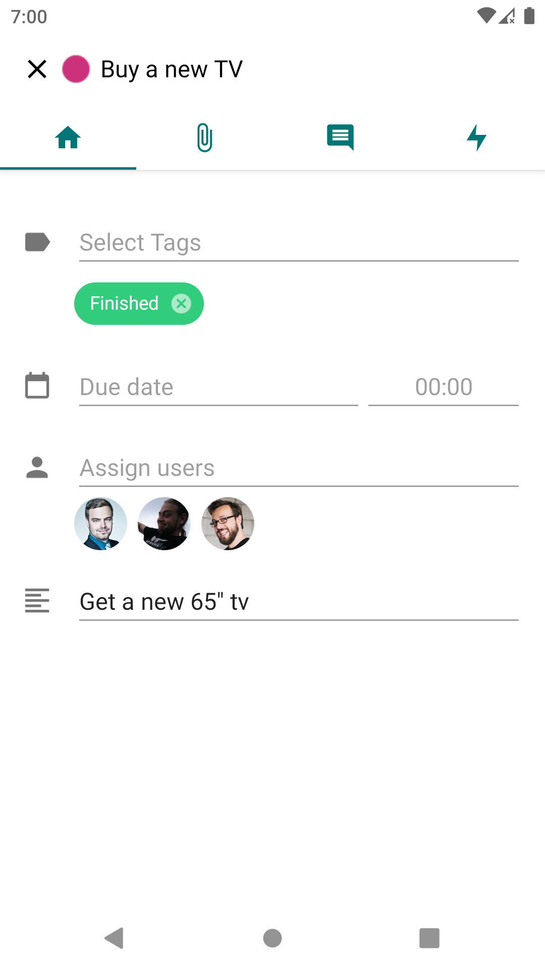
Idea 1
Actually i thought more about a brighter theme, where the account color is used as primary tint and the board color is visualized with a colored circle ( )
)
I prefer this idea because the tint of the primary elements (like FABs) would be the same in every app which will guide the user a bit better and he will not confused whether the tint means Account, Board, Categories or whatever other apps provide but always the same.
| 1 | 2 |
| --- | --- |
|  |
|  |
|
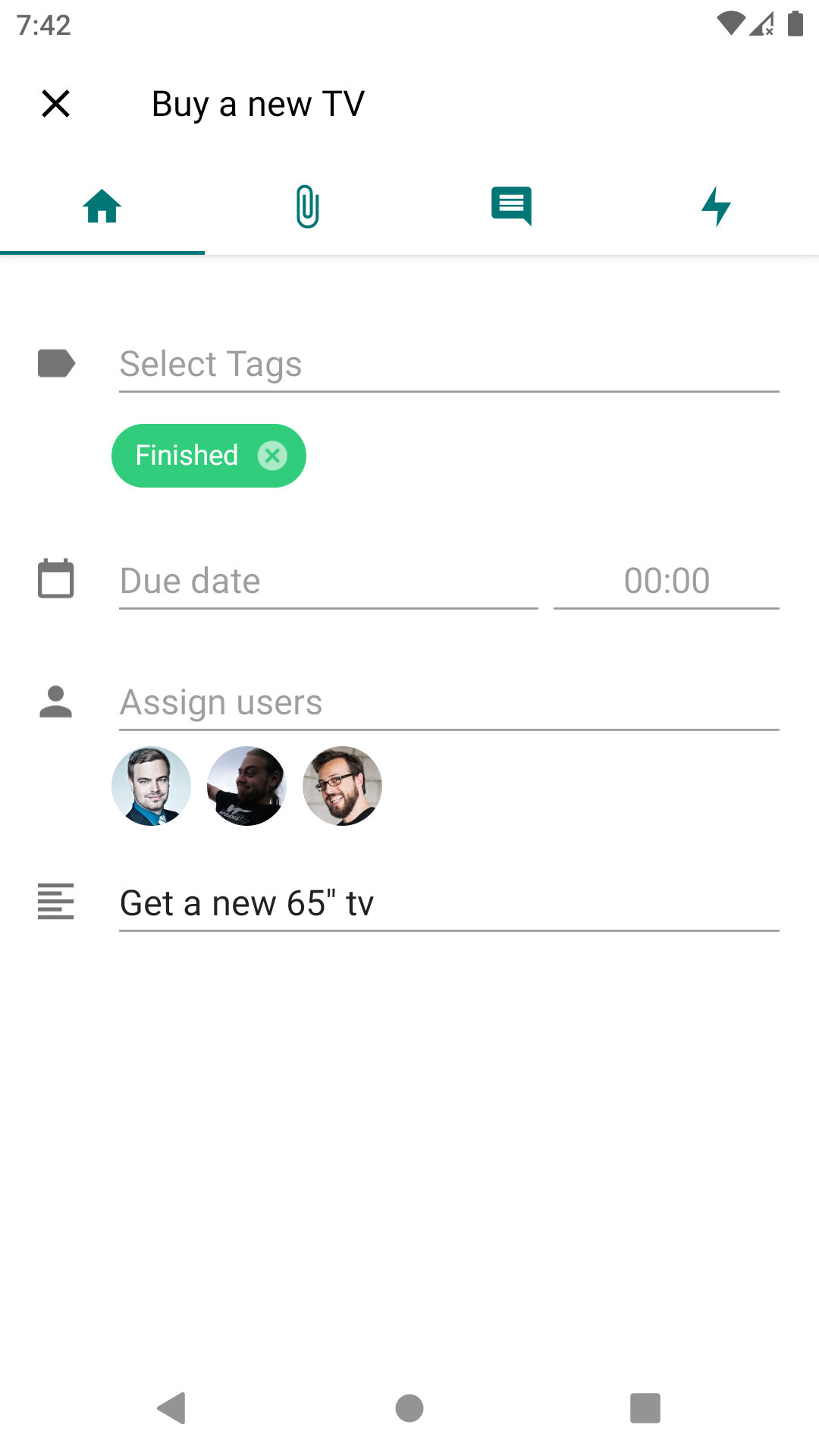
Idea 2
The second idea was to not display a colored circle but use the board color as primary tint (think as if the #007676 was the board color in this case :wink: )
| 1 | 2 |
| --- | --- |
|  |
|  |
|
stefan-niedermann
on 17 Jun 2020
@stefan-niedermann good stuff! :) Idea 2 is nicer as it only shows one "meta" color – that is, a color besides the colors for tags and due date etc.
jancborchardt
on 20 Jun 2020
How would you handle edge case colors in this scenario? Let's say #ffffcc? (or #222200 on a black theme)
I would calculate whether or not the contrast ratio is sufficient, sure, but in this case nearly everything would be black on white - except the FAB maybe.
In Idea 1 we could simply draw 2px black padding around the circle in the toolbar. (Edit: I see, this would of course also affect the theme color of the account...)
(We didn't have this issue yet because in the currently released version the whole header gets the theme color)
stefan-niedermann
on 20 Jun 2020
Don't new boards get an automatic color assigned from a palette which works both on light and dark?
If someone sets a very light/dark color, we can still use that color for the decorative elements of the highlighting (FAB, underline of the column tabs, etc) but the text should then be in the nearest properly contrasting grey. (Just like we handle it for the primary color fallback on the server.)
jancborchardt
on 20 Jun 2020
Yes, new boards have a good color as default. Just when selects manually an edge case color this would be an issue.
Makes sense, that one who sets the color should be aware of the problems and we display a more greyish UI in this case.
Fine for me. Time for implementing 👍
stefan-niedermann
on 20 Jun 2020
Phew :sweat: Done.
@jancborchardt @splitt3r and everyone else who is reading this: We are looking for testers of the new design:
- You can download the APK here
- The linked APK file can safely be installed parallel to the production version
- There are at least 8 different combination of Dark/Light app theme, Dark/Light board colors and enabled/disabled branding (multiplicated by all board colors between white and black of course :wink:)
- If you find bugs, just open them (no need to fill the issue template) and post a screenshot and a hint what's wrong with it
stefan-niedermann
on 30 Jun 2020
Awesome ❤️ i will give it a try
 splitt3r
on 30 Jun 2020
splitt3r
on 30 Jun 2020
Related issues
 D-side
·
5Comments
D-side
·
5Comments
 mithodin
·
7Comments
stefan-niedermann
·
7Comments
jancborchardt
·
7Comments
mithodin
·
7Comments
stefan-niedermann
·
7Comments
jancborchardt
·
7Comments
 thenickname
·
4Comments
thenickname
·
4Comments
Most helpful comment
Awesome ❤️ i will give it a try