Nextcloud-deck: Change scroll behavior of edit mode
When the edit mode does not fit into the screen (e. g. because of a huge description), then currently the scrollable area is only the details tab.
Instead the whole screen including the title and the tabs should be scrollable (ActionBar should stay fixed on top).
 stefan-niedermann
All 7 comments
Maybe useful: https://mobikul.com/viewpager/
stefan-niedermann
on 26 Sep 2019
Sooo, i finally got this working (53-change-scroll-behavior-of-edit-mode), but i am not happy with it.
Have a look at the video:
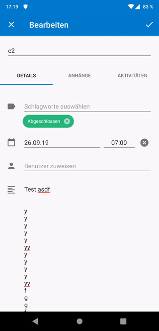
Given you have a large description (or a small screen) and you scroll down, everything looks awesome. But as soon as you swipe to the next tab, we have two possibilities:
- (current, see video): One keeps the position, which is really confusing because one does not know where he is, because the tabs are at the top and not visible
- every tab switch resets the position to the top, which looks buggy and flickering, because everything is so jumpy.
All in all i am not happy with either solution. Maybe something like a bottom nav would be a better pattern?

Or just simply stacking all the contents below each other (no tabs, but simply put the attachments below the details and the activity below the attachments)?
cc @jancborchardt and @jenniferpiperek for your valuable opinion :)
stefan-niedermann
on 27 Sep 2019
Is it possible to have the tabs sticky at the top, that is that they don’t scroll out of view?
 jancborchardt
on 6 Oct 2019
jancborchardt
on 6 Oct 2019
We could move the title into the details for now (and later into the blue toolbar as you suggested on the conf 2019, but that's a later step). It would make the title only editable in the details tab, but it would stay readable in the blue toolbar.
This way the tabs would always stick on the top (like in the About-section). Is this, what you suggested?
stefan-niedermann
on 6 Oct 2019
That’s definitely a good step forward, yes. :) So the tabs would then also be blue, right?
jancborchardt
on 6 Oct 2019
Okay, i implemented what we have discussed about previously:
stefan-niedermann
on 13 Oct 2019
Seems very good! :) Nice one @stefan-niedermann
jancborchardt
on 14 Oct 2019
Related issues
 D-side
·
5Comments
D-side
·
5Comments
 riweckr
·
6Comments
riweckr
·
6Comments
 timkrief
·
3Comments
timkrief
·
3Comments
 mbousq
·
5Comments
mbousq
·
5Comments
 treuss
·
3Comments
treuss
·
3Comments