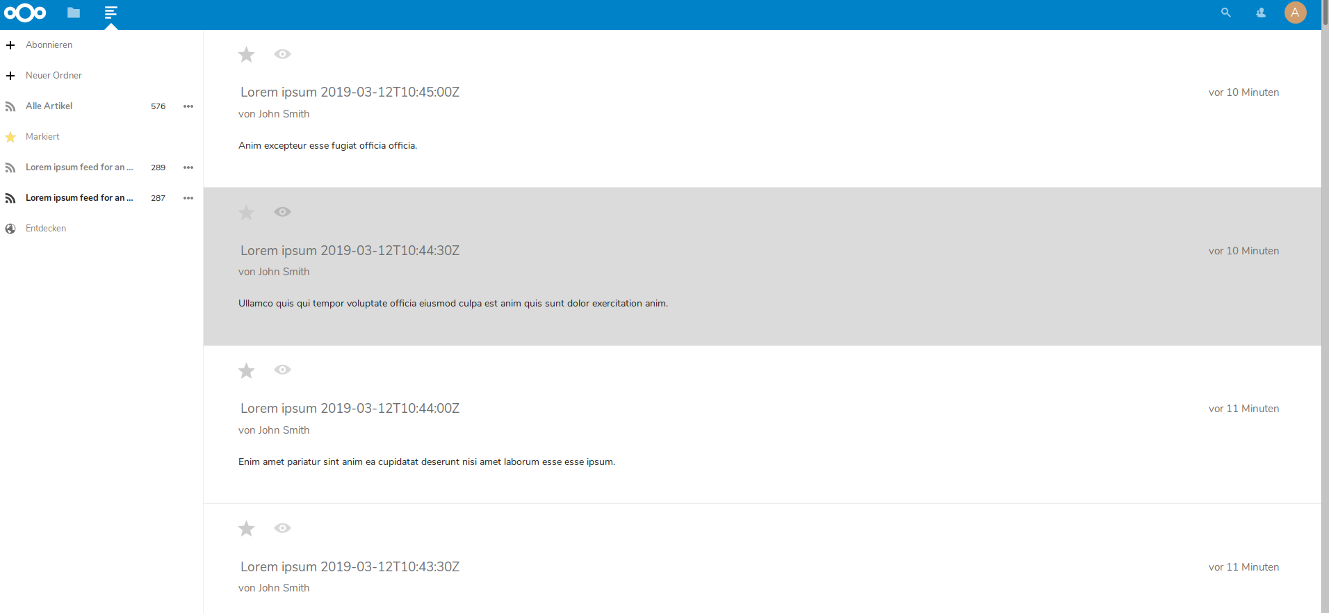
Since News 13.1.0 the active feed entry has a dark gray background and the others have a gray background. That IMHO doesn't look good. I guess you could highlight an active article in a very light gray like #f1f1f1 but the rest should stay white.
And in compact mode the headline always has a white background which creates an optical break between the headline (white background) and the content (gray background) of an article which looks weird and may even be confusing.
 DudleyDursley
All 13 comments
Which theme is that?
 SMillerDev
on 9 Mar 2019
SMillerDev
on 9 Mar 2019
The default theme. I tried the official docker container, installed only the News app and added a feed. All other settings are the default, the result is the same.
Edit: It happens with Firefox and Epiphany.
DudleyDursley
on 9 Mar 2019
@SMillerDev same bug here, no theme at all as commented here https://github.com/nextcloud/news/pull/377#issuecomment-471183323 which seems to be the faulty commit.
 brunob
on 9 Mar 2019
brunob
on 9 Mar 2019
Yeah, the gray looks really ... bad...
 z3ntu
on 11 Mar 2019
z3ntu
on 11 Mar 2019
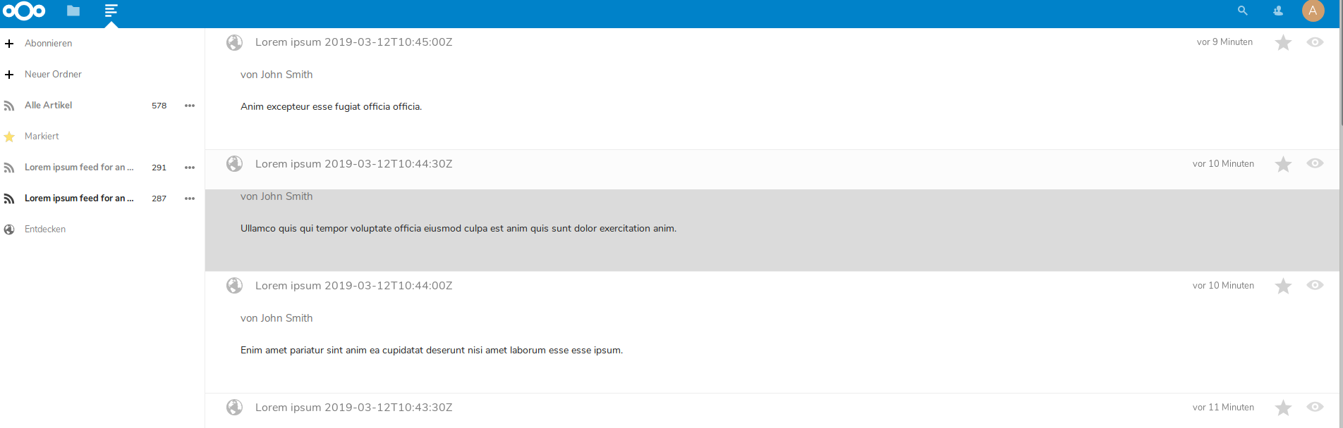
Alright I tested #417 and created some screenshots for you, so you can give feedback before we release.
 Grotax
on 12 Mar 2019
Grotax
on 12 Mar 2019
Thx, comment posted here https://github.com/nextcloud/news/pull/417#issuecomment-471972781
brunob
on 12 Mar 2019
I am not sure if this is how the fix is intended, but for me (without any themes activated) i still got a light grey background on the arcticle.
Article List:

Article:
 koegs
on 14 Mar 2019
koegs
on 14 Mar 2019
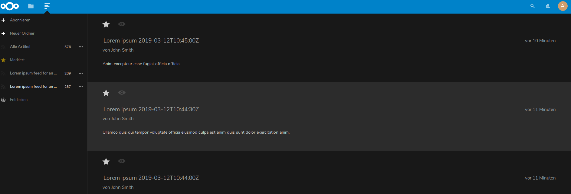
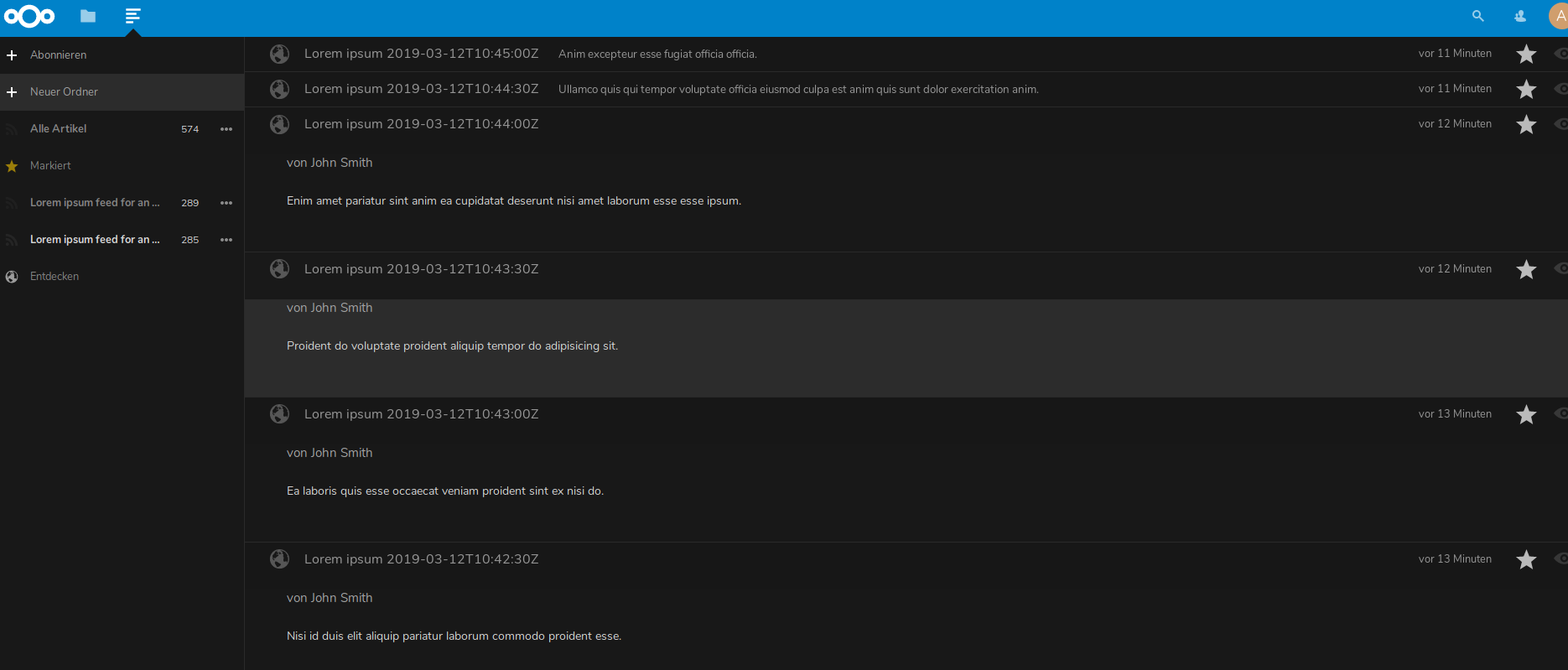
Yes, the active article has a grey background. The rest of the feed will have the same background as other apps. This is in line with the files app.
SMillerDev
on 14 Mar 2019
So, just to be clear. You intentionally moved away from the old design with a white (and nice for the eyes) background for the arcticle to a light-grey background for the article?
I am not in the position to really complain about that, but personally i would prefer the "old" version where you have a white background on the article like since the beginning :+1: and maybe the grey highlight only for the title.
koegs
on 14 Mar 2019
As i said in https://github.com/nextcloud/news/pull/417#issuecomment-471972781 & https://github.com/nextcloud/news/pull/417#issuecomment-471984796 white background should have been better for now. Anyway, the weird thing is that grey background comes form a PR mentioning " accessibility themes" ^^
brunob
on 14 Mar 2019
You can still create a PR with a better approach, we are still searching for contributors especially for design/js tasks.
Grotax
on 14 Mar 2019
There's a dark mode for nextcloud now and I'll tell you, the previous approach was far worse for dark mode then this is for all modes. If people don't like it I'm more than happy to review a pull request.
SMillerDev
on 14 Mar 2019
434 ?
brunob
on 14 Mar 2019
Related issues
 mjanssens
·
8Comments
mjanssens
·
8Comments
 janumix
·
7Comments
janumix
·
7Comments
 Refhi
·
8Comments
Refhi
·
8Comments
 criwe
·
7Comments
criwe
·
7Comments
 HanFox
·
4Comments
HanFox
·
4Comments
Most helpful comment
So, just to be clear. You intentionally moved away from the old design with a white (and nice for the eyes) background for the arcticle to a light-grey background for the article?
I am not in the position to really complain about that, but personally i would prefer the "old" version where you have a white background on the article like since the beginning :+1: and maybe the grey highlight only for the title.