Neos-ui: Make user aware of validation failure in other tabs
Description
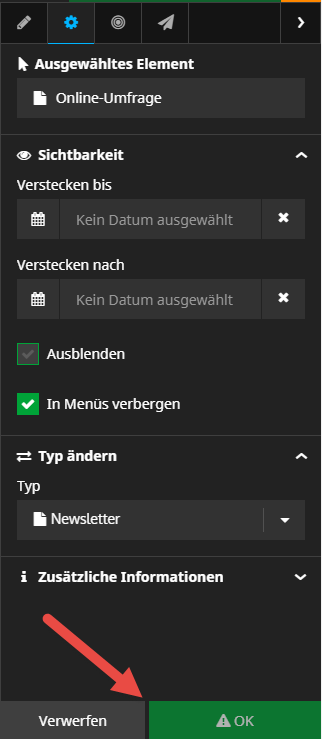
In the inspector, if property validation fails in another tab that you're currently on, you are not aware about this. You just cannot apply the changes and see an OK button with an exclamation mark in front:
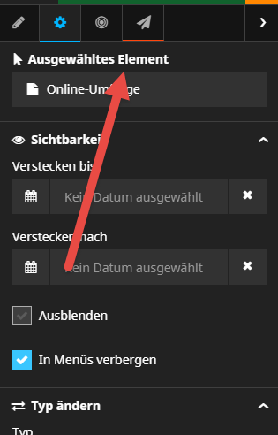
Only by checking all tabs, you will find out that you have a validation error:

Expected behavior
It would be good to somehow mark tabs with validation errors in a way the user knows where the validation error occurs:
Affected Versions
UI: tested only in 1.x
 lorenzulrich
All 9 comments
A very important suggestion! You may also drop it into #guild-ux
 dimaip
on 28 Feb 2019
dimaip
on 28 Feb 2019
If we can make it even more visible, with a red counter of the amout of error in each tag, it can be nice, but the red line is a good start, and way better than nothing.
 dfeyer
on 28 Feb 2019
dfeyer
on 28 Feb 2019
Or maybe the full tab icon can be red when containing error, should be as easy to implement than the slim red bottom border
dfeyer
on 28 Feb 2019
Nice Idea!
I've got a tiny question:
Will the red bar be stacked on-top of the blue (active) bar,
if the error happens in the active tab – or not visible?
If not visible .. this inconsistent could cause some confusion.
If stacked .. this could become an issue for colorblind persons.
.. or it's placed on top of a tab, not as sexy but quite functional.
 wrybit
on 28 Feb 2019
wrybit
on 28 Feb 2019
I‘d make the top border (the blue one if active) red. Or the whole tab nav item.
 danielkestler
on 28 Feb 2019
danielkestler
on 28 Feb 2019
Just to clarify, my screen was not meant as a design suggestion. I think the bottom line generally is the indicator of the selected tab, so I'm not sure it's clever to abuse it for the "validation failed" warning.
lorenzulrich
on 28 Feb 2019
Since this is a very important information i prefer the suggestion of @dfeyer (a red counter beside the tab icon). This cannot be confused with active state and with enough contrast it should also be visible for all audiences.
 mficzel
on 1 Mar 2019
mficzel
on 1 Mar 2019
So it would be something like this?
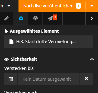
(I just added this using Bootstrap classes in the browser inspector, so it's still not good enough regarding the width of the button, placement.)
lorenzulrich
on 1 Mar 2019
@lorissikora Maybe this would be a good issue to start with
lorenzulrich
on 19 Mar 2019
Related issues
 pduersteler
·
8Comments
pduersteler
·
8Comments
 fheinze
·
3Comments
danielkestler
·
8Comments
fheinze
·
3Comments
danielkestler
·
8Comments
 markusguenther
·
4Comments
dimaip
·
5Comments
markusguenther
·
4Comments
dimaip
·
5Comments
Most helpful comment
So it would be something like this?
(I just added this using Bootstrap classes in the browser inspector, so it's still not good enough regarding the width of the button, placement.)