Neos-ui: Different fonts / mix of fonts in UI
As I understand, only the Content Module is rewritten in ReactJS, right? There seems to be different fonts in use (I know we talked about that topic before on Slack, and definitely, there have been adjustments and improvements regarding font rendering, but I think it is still not the right font in the new UI).
Look for the "g" letters.
Menu in Content Module:
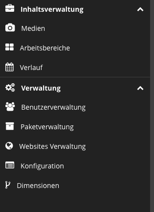
Menu in the rest of the UI:

I like the "old" font a lot more!
 danielkestler
All 8 comments
We are using Open Sans now, in the old UI Noto Sans was used.
I'm not entirely sure why we switched but I remember that there were some disscussion about that.
 mstruebing
on 21 Dec 2017
mstruebing
on 21 Dec 2017
I think Noto Sans has a better readability.
But no matter the font: it should be identical throughout the UI.
danielkestler
on 21 Dec 2017
It is not only the fonts, the UI is not consistent between the different (old and new) modules. Look at the arrow:
Media module:

Content module:

danielkestler
on 21 Dec 2017
@danielkestler Media module is not powered by react ... currently
Aggre the we need to choose a new font ;) But please don't switch now, need some UX consideration.
 dfeyer
on 21 Dec 2017
dfeyer
on 21 Dec 2017
My take on this: the new UI should not have switched the font from the start. Now we have an inconsistent UI for our users. So the easiest way would be to just go back to the look that all users know and is present in all other modules.
In a next step, we could think about introducing a new font or a more polished UI, but throughout the backend.
danielkestler
on 21 Dec 2017
I agree, I think we should revert the new UI font to NotoSans, before the UX guys decide on a new font.
Regarding arrows, I could live with that inconsistency.
 dimaip
on 22 Dec 2017
dimaip
on 22 Dec 2017
This is still an “issue”... and while I am already working on the UI, I could make this change if you agree. What do you think?
danielkestler
on 5 Feb 2019
@danielkestler go for it!
dimaip
on 6 Feb 2019
Related issues
 fheinze
·
3Comments
fheinze
·
3Comments
 kdambekalns
·
4Comments
kdambekalns
·
4Comments
 dennisirmscher
·
7Comments
dennisirmscher
·
7Comments
 pduersteler
·
8Comments
pduersteler
·
8Comments
 samuelhauser
·
10Comments
samuelhauser
·
10Comments
Most helpful comment
This is still an “issue”... and while I am already working on the UI, I could make this change if you agree. What do you think?