Neos-ui: Copy/Cut/Paste buttons should reflect the clipboard state
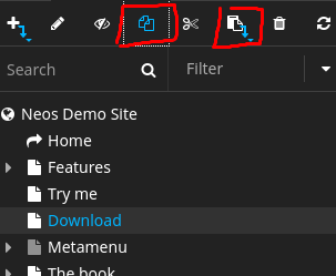
In the old ui, when you copy/cut a node, the respected button becomes highlighted, until you have pasted the node, while the paste button also becomes active. When you click on the copy/cut button again, it should clear the clipboard and unselect it.
That's not what currently happens in the new ui.
 dimaip
All 4 comments
@dimaip Do you suggest that the insert mode should also be visible / selectable in the toolbar?
 akoenig
on 29 Aug 2017
akoenig
on 29 Aug 2017
@akoenig certainly!
dimaip
on 29 Aug 2017
I think this needs a little discussion -- for the insert mode, we do not have these three-strip buttons anymore but we always solve it in a modal (for now).
Do you think that's a must-have for the new UI for now? For me that is rather a small UX change, with not a big impact. That's why I remove the must-have label for now... If you disagree, let's discuss :)
All the best,
Sebastian
 skurfuerst
on 4 Sep 2017
skurfuerst
on 4 Sep 2017
IMO this makes the UI less visually responsive. I'd consider it a mid-minor UX issues and would try to fix it before 1.0 if possible, especially since it's pretty easy to fix.
I'd love if we could prioritize issues for 1.0, i.e. those which we tackle first and those which we can postpone but still good to make, e.g.: "high-pro", "mid-prio", "low-prio", "not-going-to-1.0".
dimaip
on 4 Sep 2017
Related issues
 ComiR
·
5Comments
ComiR
·
5Comments
 danielkestler
·
8Comments
danielkestler
·
8Comments
 johannessteu
·
4Comments
skurfuerst
·
9Comments
johannessteu
·
4Comments
skurfuerst
·
9Comments
 bwaidelich
·
9Comments
bwaidelich
·
9Comments
Most helpful comment
IMO this makes the UI less visually responsive. I'd consider it a mid-minor UX issues and would try to fix it before 1.0 if possible, especially since it's pretty easy to fix.
I'd love if we could prioritize issues for 1.0, i.e. those which we tackle first and those which we can postpone but still good to make, e.g.: "high-pro", "mid-prio", "low-prio", "not-going-to-1.0".