Nemo: please give an option to revert to classic, non compact icon view
nemo 4.0 changed the icon view to something with bigger icons and less white space
while this new look isnt bad the old one looked better IMO
the new view looks very similar to the old compact view which was a option that users could change
what im asking for is an option to have the classic view back
 davidbepo
All 9 comments
This is not going to happen, the changes that have been made don't lend themselves well to being able to just turn them on or off. You're also I think vastly outnumbered by people who have clamoured for a long time to have less spacing between icons.
Perhaps look at it in another manner.. if there are specific issues you find with the new view layout, feel free to bring them up. I'm by no means 100% happy with its current state and am always open to suggestions, but backwards is not an option here.
 mtwebster
on 23 Nov 2018
mtwebster
on 23 Nov 2018
so is nemo going the nautilus route? im not asking to go backwards on anything, im just asking to have an option to customize it, the default can still be like it now
i also have other issues with nemo 4.0 in desktop icons, so for now i will keep my version locked nemo 3.8.6
davidbepo
on 23 Nov 2018
What is the nautilus route? I'm not sure what that means. Zero functionality has been lost other than removal of the compact layout, which is superfluous now. I said in my last post making this optional is not an option.
So you have issues with the desktop also. Feel free to open an issue or issues.
mtwebster
on 23 Nov 2018
What is the nautilus route? I'm not sure what that means
changing things without giving options to have the old behavior, removing important functionality etc
nemo likely wont do all of that but this is certainly going in that direction...
So you have issues with the desktop also. Feel free to open an issue or issues.
one of them is the loss of non-aligned to grid mode, i couldnt find it in the new options
davidbepo
on 24 Nov 2018
@davidbepo If you don't want/like the new feature use older nemo!
 leigh123linux
on 24 Nov 2018
leigh123linux
on 24 Nov 2018
the new icon view is too compact that the "one word" filenames now does not fit horizontally and wraps by letters and that looks bad. I am saying in the same window size the version 3.x has 5 icons. and now it has 10! that is too less space.
@leigh123linux you tell us that compact size is can read filenames with wrapping letters? Yeah the this compact size works if you have 5 letter words. There is no such filemanager works this way.
 howdev
on 26 Dec 2018
howdev
on 26 Dec 2018
@howdev It looks ok here.
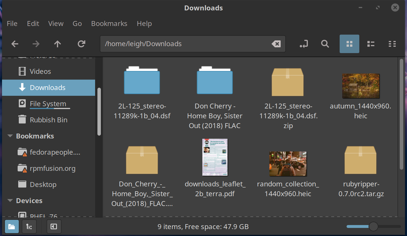
leigh123linux
on 26 Dec 2018
@leigh123linux Ok that looks interesting. I already deleted the dconf for nemo and is still the same. There must be some other settings somewhere else?
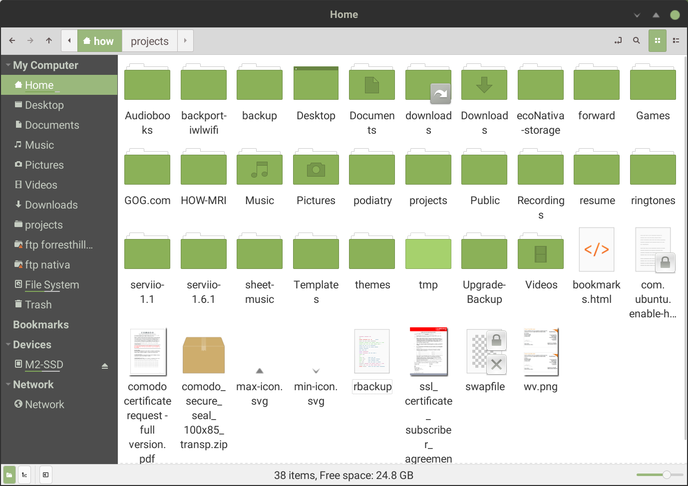
howdev
on 26 Dec 2018
I think is a zoom level problem. when zoom out the spacing is more, the icons is also more. When zoom in, the icons is bigger but does not maintain the spacing, the spacing is less. when at max zoom, the bigger but the spacing is even less.
in version 3.8 the spacing is maintained better. When zoom in or out there is sufficient spacing to allow most names without wrapping.
howdev
on 26 Dec 2018
Related issues
 jmgomezpoveda
·
5Comments
jmgomezpoveda
·
5Comments
 Enkouyami
·
7Comments
Enkouyami
·
7Comments
 teo1978
·
5Comments
teo1978
·
5Comments
 mdogancay
·
3Comments
mdogancay
·
3Comments
 memeplex
·
6Comments
memeplex
·
6Comments
Most helpful comment
This is not going to happen, the changes that have been made don't lend themselves well to being able to just turn them on or off. You're also I think vastly outnumbered by people who have clamoured for a long time to have less spacing between icons.
Perhaps look at it in another manner.. if there are specific issues you find with the new view layout, feel free to bring them up. I'm by no means 100% happy with its current state and am always open to suggestions, but backwards is not an option here.