Mplfinance: Making the height of the candle shorter.
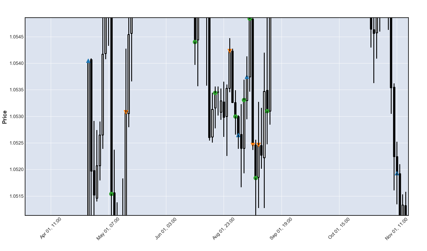
How can you make the candle shorter? Maybe making the distance of the Y axis like 1.045 TO 1.050 shorter? This happened when I magnified it to see details.
Magnified:
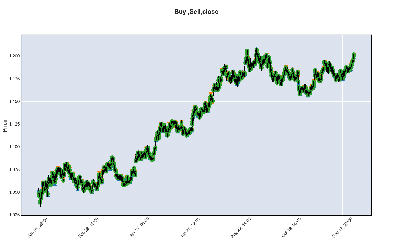
Original plot.:
 toksis
All 8 comments
@toksis
I'm not quite sure what you are asking. The size of the candles depends the Open, Close, and High, Low in your data. Perhaps if you attach your data, and code, that was used to make this plot I may better understand what you are asking. Please also indicate what version of mplfinance you are using:
import mplfinance as mpf
print(mpf.__version__)
Thank you. --Daniel
 DanielGoldfarb
on 7 May 2020
DanielGoldfarb
on 7 May 2020
Version -- 0.12.3a3
On my magnified picture, the candle are so long that it will not fit the screen. On my link , you can adjust the size of the candle. You can do this to make the candle fit. Making the distance of the Y axis shorter like 1.05 to 1.10 is like 1 inch. Make it .5 inch?
Thank you.
Tell me if you will still need the whole code. Thanks.
class Chart:
    def __init__(self, df):
        self.df = df[1:]


    def boughtsoldplot(self,plotvalues):

    # Short = 0
    # Long = 1
    # End = 2
        buy_signal = []
        sell_signal = []
        close_signal = []

        for x in plotvalues:


            if x == None:
                buy_signal.append(np.nan)
                close_signal.append(np.nan)
                sell_signal.append(np.nan)
            elif x[0]==1:
                buy_signal.append(x[1])
                close_signal.append(np.nan)
                sell_signal.append(np.nan)
            elif x[0]==0:
                sell_signal.append(x[1])
                close_signal.append(np.nan)
                buy_signal.append(np.nan)
            elif x[0]== 2:
                close_signal.append(x[1])
                buy_signal.append(np.nan)
                sell_signal.append(np.nan)


        # apds = [mpf.make_addplot(self.df),
        apds = [mpf.make_addplot(buy_signal,scatter=True,markersize=100,marker='^'),
                mpf.make_addplot(sell_signal,scatter=True,markersize=100,marker='v'),
                mpf.make_addplot(close_signal,scatter=True,markersize=100,marker='o')]

        return apds

    def displaychart(self,type,plotvalues):


        # if style == ' ':
        #     style = 'candle'

        # mpf.plot(self.df,type=type)
        apds = self.boughtsoldplot(plotvalues)

        mpf.plot(self.df,addplot=apds,figscale=2,volume=False,type = type,
                 title="Buy ,Sell,close"
                 )
Thanks. I will try to take a closer look at this in the next couple of days. I now see what you mean from the link. It is really compressing the y-axis itself, and the candles just follow along. The code you posted should be enough, along with the data, for me to play with this and see what I can do get the appearance that you want.
DanielGoldfarb
on 7 May 2020
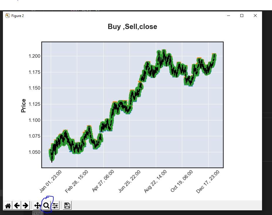
Can you tell me what you used to zoom in?
Also, what backend are you using:
import matplotlib
print(matplotlib.get_backend())
Please do the above import and print in the same file and at the same time (either just before or just after) you generate the mplfinance plot. Thank you. --Daniel
DanielGoldfarb
on 7 May 2020
import matplotlib
print(matplotlib.get_backend())
None
TkAgg
This is the tool that went out after running the program. Thank you Daniel for the fast reply.
toksis
on 7 May 2020
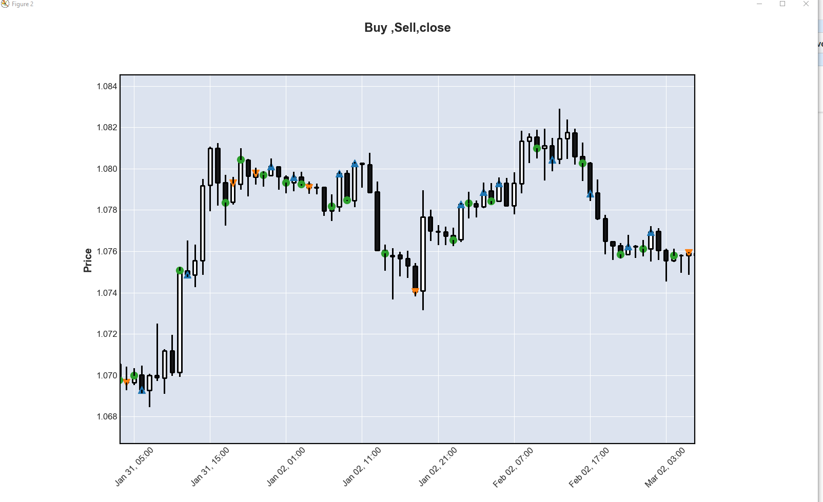
I think this might be a matplotlib question, in which case you can select the Pan tool (the one to the left of the Magnifying Glass that you circled).
Then click and hold the right mouse button while you move the mouse down to vertically scale the y-axis (and candles).
 AndySum
on 7 May 2020
AndySum
on 7 May 2020
Thank you!
toksis
on 7 May 2020
@AndySum Thanks!
DanielGoldfarb
on 7 May 2020
Related issues
 kitt-th
·
5Comments
kitt-th
·
5Comments
 viorell91
·
3Comments
viorell91
·
3Comments
 Full4me
·
3Comments
Full4me
·
3Comments
 smjure
·
4Comments
smjure
·
4Comments
 jainraje
·
4Comments
jainraje
·
4Comments