Mplfinance: How can I adjust the line size of the candles?
Hi there, how can i adjust the candle size a bit smaller? In my sample pic, i loose the lower and upper shadows.
 fxhuhn
All 20 comments
Please provide the code and the data used to make the sample pic, so that i can be sure i understand what i am looking at. Thank you.
 DanielGoldfarb
on 5 Apr 2020
DanielGoldfarb
on 5 Apr 2020
this is my lastest snipet of my tests:
save = dict(fname='ads.png',
            dpi=300,
            figsize=(2920/300, 1280/300)
            #pad_inches=0.5
            )
mpf.plot(stock,
         type='candle',
         volume=True,
         addplot=add_plots,
         title='Adidas',
         ylabel='Kurs in Euro',
         ylabel_lower='Volumen',
         style='charles',
         savefig=save)
@fxhuhn Can you please provide the data in a csv file? Thank you.
DanielGoldfarb
on 5 Apr 2020
why you need the csv file? it is completly independ from the data.
fxhuhn
on 5 Apr 2020
Please note, that the format of the date is german :-)
export.txt
fxhuhn
on 5 Apr 2020
No worries about the date format; and thanks for the data. I know it seems like it shouldn't be necessary. The main reason I ask for the data is to avoid making a fool of myself; it helps me to be more sure about what I am looking at. The secondary reason is that, sometimes, not often but a couple of times already since I became maintainer of mplfinace, I find a single data point that may be affecting the plot in a way that we did not anticipate. I don't think that's the case here, but just want to be sure. Thanks. I will try to take a good look into this within a day or two. I do have some code in there that is supposed be appropriately adjusting candle sizes based on data density and such; it may not be working as expected. Or it may be necessary to give the user the ability to adjust candles themselves. Thank you.
DanielGoldfarb
on 6 Apr 2020
It seems that the code does not adjust the shadows. The volume bars look right.
Some ideas for display and storage:
- I think the candles should be a little smaller in general (same for the lines)
- Also a way to adjust the aspect ratio (a wider image like 16:9)
fxhuhn
on 6 Apr 2020
- will play with and think about candle size adjustments.
- what exactly do you mean by "shadows"
- use kwarg
figratioto adjust aspect ratio.
DanielGoldfarb
on 7 Apr 2020
I've been playing around with this a bit. I think you may be running into some resolution limits here. Making the figure larger seems to help. Either through mpf.plot(figscale=2.75) or modifying
save = dict(fname='ads.png',
        dpi=300,
        figsize=(2920/300, 1280/300))
to
save = dict(fname='ads.png',
        dpi=300,
        figsize=(292, 128))
I'm going to play around with tweaking the candle widths and line-width of the wicks, and see how that looks. The tricky part is the candle and wick widths that will look best, will vary depending on the size/resolution of the plot (and I'm not sure there is a way for the code to know what the resolution will be when the plot is ultimately rendered).
The default candle width is 0.5 times the average distance between data points. So, for example, if you have daily data, the candle will be approximately 1/2 day wide, which for most plots is very reasonable and looks fine. But if you have a lot of data, and that data compressed into a relatively small Figure, you will run into resolution problems because there are not enough pixels to clearly distinguish a half-day on your plot. This is why making the Figure larger, with your exact same plot, looks fine.
Presently the code is allowing matplotlib itself decide the width of the wicks (that width is set to None). I will see what happens if the wick is always set to some fraction of the candle width itself. That may generally impove the appearance of the plot, but I am not convinced there won't be any resolution issues if your Figure size is to small for a lot of data. Will keep you posted as I play with this some more.
DanielGoldfarb
on 7 Apr 2020
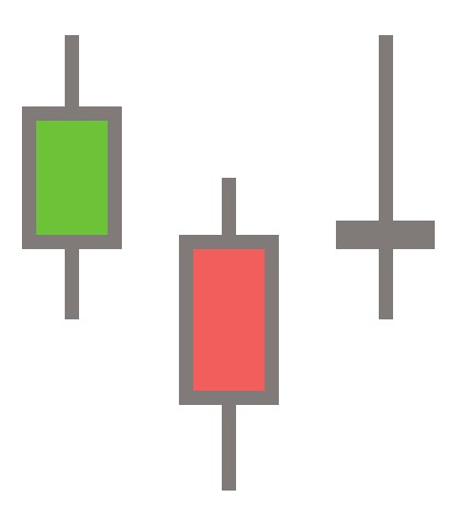
In my definition shadows are the difference beween body and high/low. Also called fuse and wicks ;-)

fxhuhn
on 7 Apr 2020
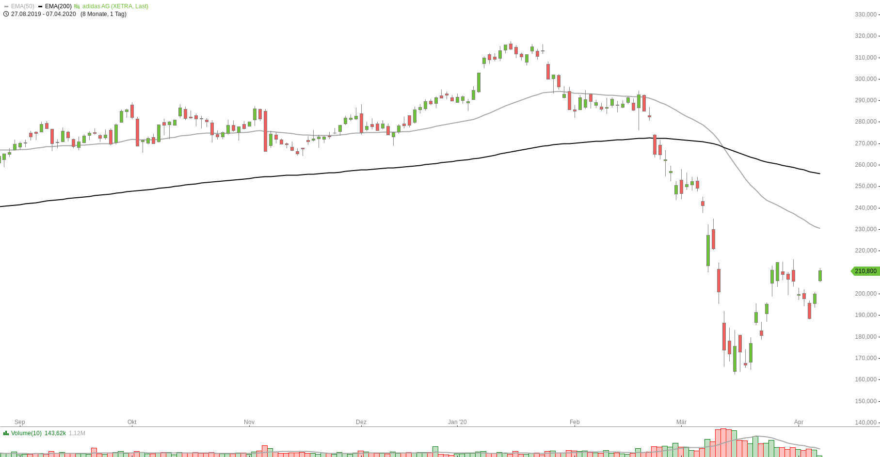
if i would show around 150 candles, what settings do you recommend for me? Could a representation similar to this one be created?
fxhuhn
on 7 Apr 2020
In my example the with of the candle is 7px. And the lines of the fuse and wicks are 1px. I think the values should be used as a guide.
fxhuhn
on 7 Apr 2020
I will try to repspond to https://github.com/matplotlib/mplfinance/issues/81#issuecomment-610233320 in more detail soon, but very swamped with high priority stuff this week, so it may be until next week. In the meantime, as a quick fix, I recommend do BOTH of these:
remove
figsizefrom yoursavedict, so:save = dict(fname='ads.png', dpi=300 )
add
figscale=2.75orfigscale=3.0to your call tompf.plot()
I noticed when doing both of the above, the quality/resolution of the plot was much better.
Regarding pixels, (https://github.com/matplotlib/mplfinance/issues/81#issuecomment-610434370),
Thank you for the other information. I will definitely take that into account when considering possible ways to provide a broader range of resolutions that still look good. However, please be aware it may not be as simple as setting the pixel size. Depending on the size of the plot and density of the data, this pixel settings may be way too small for some plots.
Also, as you may be aware, all plotting packages use multiple coordinate systems (for example: Data, Axes, Figure, and Display) and employ mathematical transformations to go from user data to pixels on the screen. For the most part, to keep mplfinance code easily maintainable, we work primarily in the user's Data coordinate system (occasionally Axes). Solving resolution issues at the pixel level will complicate the code and make it difficult to maintain and enhance in the future. However, as mentioned, I will take those pixel measurements into account when designing a strategy that will hopefully translate to an ideal pixel size when the standard matplotlib transforms are applied under the hood.
All the best. Stay safe and healthy. --Daniel
DanielGoldfarb
on 7 Apr 2020
@DanielGoldfarb thanks for the hint with figscale.
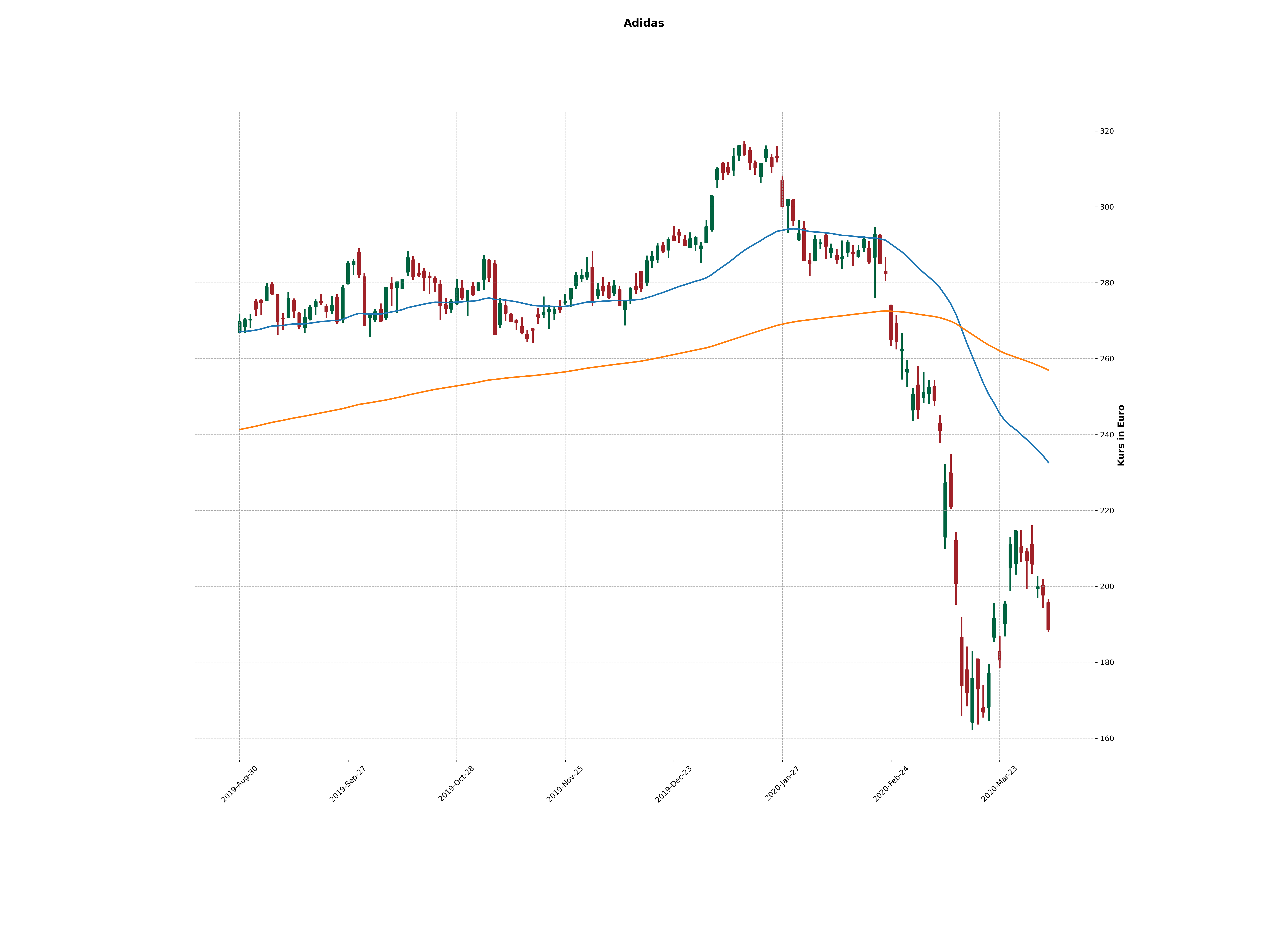
fxhuhn
on 7 Apr 2020
I found this post while looking for a way to reduce the line width of the body and shadows. My chart would look much better if the line width can be set to 1pixel or we can adjust as a parameter.
Thanks!
 goferville
on 12 Apr 2020
goferville
on 12 Apr 2020
I found this post while looking for a way to reduce the line width of the body and shadows. My chart would look much better if the line width can be set to 1pixel or we can adjust as a parameter.
Thanks!
+1, looking for the same. If one plots a longer timeframe, its just black lines overlapping each other. Thanks for any update to target this issue!
 OndraCapek
on 21 Apr 2020
OndraCapek
on 21 Apr 2020
@goferville , @OndraCapek
At some point will provide access to line width; in the meantime increasing figscale should make your plots look better.
DanielGoldfarb
on 21 Apr 2020
Adding some more interest here as I found my minute bars were overlapping horizontally and it was hard to read. I have a screen resolution of 2560x1440.
I've made these two changes:
In _utils.py under _construct_candlestick_collections
Line 470 remove lw = None so that lw = 0.5 is set
and changing
delta = avg_dist_between_points / 4.0
to
delta = avg_dist_between_points / 8.0
I think it would be helpful to have these values accessible from the styles or .plot(). I use the charts interactively, so zooming in and out on different time scales is important.
Before:
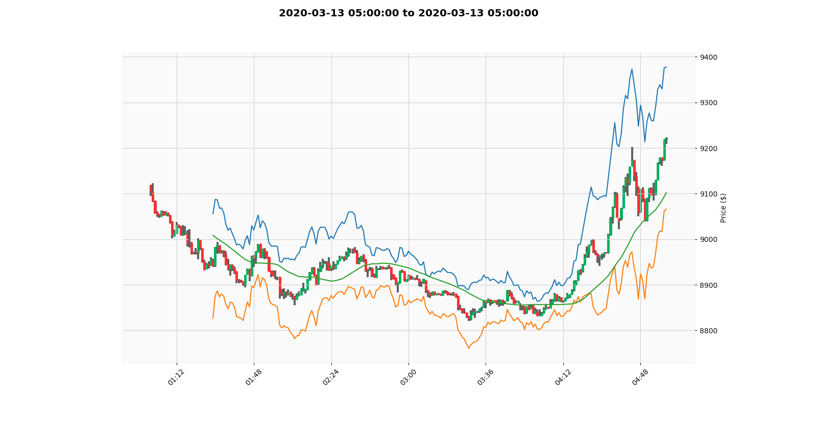
After:
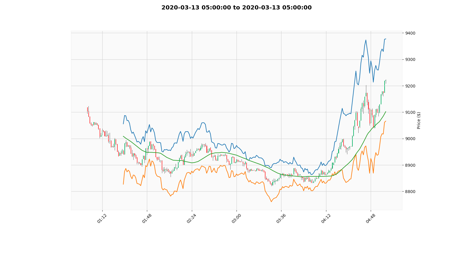
Changing lw to a number less than 0.5 also seems to have strange results so I wasn't confident to polish it up for a pull-request.
 AndySum
on 6 May 2020
AndySum
on 6 May 2020
@AndySum ... Thanks for you input and demonstration that those code changes work well. Much appreciated! I will definitely look into making those values accessible somehow. In the middle of implementing subplots for the next couple of weeks, so not sure how soon.
DanielGoldfarb
on 6 May 2020
new version 0.12.5 just released to Pypi
DanielGoldfarb
on 8 Jun 2020
Related issues
 Full4me
·
3Comments
Full4me
·
3Comments
 ghost355
·
5Comments
ghost355
·
5Comments
 leochan007
·
6Comments
leochan007
·
6Comments
 obahat
·
3Comments
obahat
·
3Comments
 ismailbayram
·
4Comments
ismailbayram
·
4Comments
Most helpful comment
Adding some more interest here as I found my minute bars were overlapping horizontally and it was hard to read. I have a screen resolution of 2560x1440.
I've made these two changes:
In
_utils.pyunder_construct_candlestick_collectionsLine 470 remove
lw = Noneso thatlw = 0.5is setand changing
delta = avg_dist_between_points / 4.0to
delta = avg_dist_between_points / 8.0I think it would be helpful to have these values accessible from the styles or .plot(). I use the charts interactively, so zooming in and out on different time scales is important.
Before:

After:

Changing lw to a number less than 0.5 also seems to have strange results so I wasn't confident to polish it up for a pull-request.