Mplfinance: Feature Request: Remove axes completely - show data only
Hi, I've made a python script to convert a csv file in a candlestick like this using mpl_finance, this is the script:
    import matplotlib.pyplot as plt
    from mpl_finance import candlestick_ohlc
    import pandas as pd
    import matplotlib.dates as mpl_dates

    plt.style.use('ggplot')

    # Extracting Data for plotting
    data = pd.read_csv('CSV.csv')
    ohlc = data.loc[:, ['Date', 'Open', 'High', 'Low', 'Close']]
    ohlc['Date'] = pd.to_datetime(ohlc['Date'])
    ohlc['Date'] = ohlc['Date'].apply(mpl_dates.date2num)
    ohlc = ohlc.astype(float)

    # Creating Subplots
    fig, ax = plt.subplots()
    plt.axis('off')
    fig.patch.set_facecolor('black')

    candlestick_ohlc(ax, ohlc.values, width=0.6, colorup='green', colordown='red', alpha=0.8)

    plt.show()

Now I need to do the same thing but using mplfinance instead of mpl_finance and I've tried like this:
    import mplfinance as mpf
    # Load data file.
    df = pd.read_csv('CSV.csv', index_col=0, parse_dates=True)

    # Plot candlestick.
    # Add volume.
    # Add moving averages: 3,6,9.
    # Save graph to *.png.
    mpf.plot(df, type='candle', style='charles',
            title='',
            ylabel='',
            ylabel_lower='',
            volume=True,
            mav=(3,6,9),
            savefig='test-mplfiance.png')
And I have this result:

So, now I need to change background color from white to black, remove grid and remove axes but I have no idea how to do it.
Thanks for the replies.
 MatteoSid
All 26 comments
@MatteoSid
Matteo,
Please read through the entire Customization and Styles notebook. That should answer your question.
For some of what you want to do, that you will have to use the kwarg rc= when calling mpf.make_mpf_stye(). (where rc= is used to specify a dict of rcParams).
If, after reading through that notebook you are still stuck, just let me know and I will be happy to provide more detailed specifics. (Also, in addition to the above mentioned notebook, there is an example of using mpf.make_mpf_style(...,rc=...) here.)
Thanks. --Daniel
 DanielGoldfarb
on 9 Mar 2020
DanielGoldfarb
on 9 Mar 2020
@DanielGoldfarb
Thank you so much for the fast reply, I've read the documentation but I only found how to remove the grid but I can't find a way to remove all the rest. I think that I must to use the rcParams but I have no idea how it works.
MatteoSid
on 10 Mar 2020
@MatteoSid
Matteo,
The basic idea is you can make some things disappear by setting them to the same color. For example, if the axis labels and the figure are both white (or both black) then you won't see the axis labels.
Regarding rcParams, documentation can be found here. However when working with mplfinance modifying rcParams directly may not work (because, internally, mpf.plot() maintains its own copy of rcParams; so it's best to pass in any changes you want by calling mpf.make_mpf_style()).
I've posted a couple of possible solutions to your issue; just click here.
All the best. --Daniel
DanielGoldfarb
on 10 Mar 2020
@DanielGoldfarb
The problem is that I need to have only the graph, if I hide the axes the image is big but the graph remain small. I solved using _crope_ function from pillow. This is the result I was looking for:
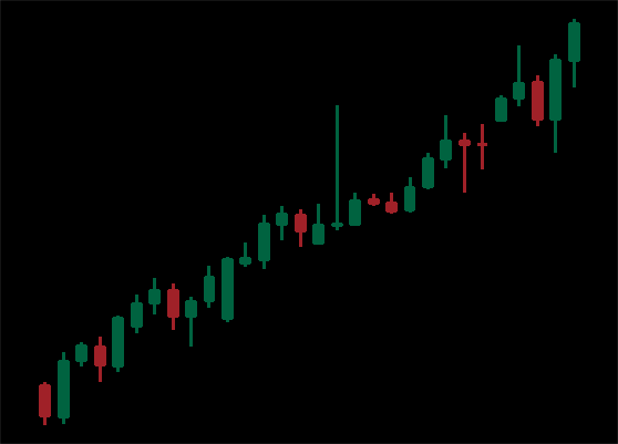
Anyway thank you so much for your time and for your helpfulness.
MatteoSid
on 11 Mar 2020
you're welcome. all the best.
DanielGoldfarb
on 11 Mar 2020
I found a solution by setting the RCparams to the following
rcparams = {'axes.spines.bottom':False,
            'axes.spines.left':False,
            'axes.spines.right':False,
            'axes.spines.top':False,
            'xtick.color':'none',
            'ytick.color':'none',
            'axes.labelcolor':'none'
            }
The only problem is that it still renders data where the labels used to be. So I still need to use pillow to crop the image
 bastulli
on 22 Mar 2020
bastulli
on 22 Mar 2020
I found a solution by setting the RCparams to the following
The only problem is that it still renders data where the labels used to be. So I still need to use pillow to crop the image
Thank you!
I managed to get it even smaller using:
"font.size": 0,
So the final rc= becomes:
rc={
    "axes.labelcolor": "none",
    "axes.spines.bottom": False,
    "axes.spines.left": False,
    "axes.spines.right": False,
    "axes.spines.top": False,
    "font.size": 0,
    "xtick.color": "none",
    "ytick.color": "none",
}
 tavurth
on 9 May 2020
tavurth
on 9 May 2020
Is there any chance of supporting this in the future?
Pulling in an extra package just to crop this means we can't use it so easily on slim runtimes like serverless.
tavurth
on 9 May 2020
Sure. Will look into making this easier. Give me few weeks to finish up some current enhancements, and then will look into this. (Unless you want to look at the code yourself and suggest an approach, and/or contribute, then maybe possibly sooner).
DanielGoldfarb
on 10 May 2020
@DanielGoldfarb thank you!
I'll also try to take a look if I get some free time in the next weeks
tavurth
on 11 May 2020
@tavurth @MatteoSid @bastulli
I've added two kwargs to mpf.plot() currently in the version in my fork if you would like to install and test it, and let me know if it works for you.
The kwargs you can set are axesoff=True or axesoffdark=True.
I'm guessing based on the discussion above that you will prefer axesoffdark=True.
You should be able to get rid of all of your rc={ ... } custom style settings and just use axesoffdark=True to get the appearance you want with any mplfinance style.
If you get a chance to install and test the version from my fork, please let me know if it works for you. It seemed to be working for me. I hope to merge and release that version by the end of this week (as soon as I finish up a few other enhancements and documentation).
DanielGoldfarb
on 11 May 2020
@DanielGoldfarb thank you for taking a look so quickly!
I pulled your branch with the following:
pip install --upgrade https://github.com/DanielGoldfarb/mplfinance/archive/master.zip#egg=mplfinance
And the axis off seems to work!
Here's an example with axisoff=False:

Here's an example with axisoff=True:

However, some styles such as classic start to look a little strange, as the background color of the chart is removed:
tavurth
on 12 May 2020
Here's the result of testing with the axisoffdark=True with the classic style:

Which fixes the above issue where the background causes weird candle coloration.
And here's axisoffdark=True with a custom style:

Looking good, thank you!
tavurth
on 12 May 2020
But I guess with axisoff=True the chart style (background) should be preserved somehow.
Your thoughts?
tavurth
on 12 May 2020
But I guess with
axisoff=Truethe chart style (background) should be preserved somehow.Your thoughts?
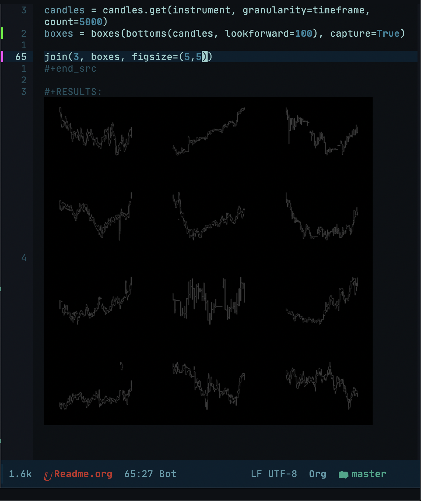
your emacs config looks cool!
 rhoit
on 12 May 2020
rhoit
on 12 May 2020
@tavurth
Will,
I simply did basically what Matteo (@MatteoSid) had suggested in his original post to this issue
You can take a look at the code in src/mplfinance/plotting.py
if config['axesoffdark']: fig.patch.set_facecolor('black')
if config['axesoff']: fig.patch.set_visible(False)
if config['axesoffdark'] or config['axesoff']:
    for ax in axlist:
        ax.set_xlim(xdates[0],xdates[-1])
        ax.set_axis_off()
You are welcome to play with the code and see if you can make it work any better. Presently I don't have much time to look into this.
Maybe inserting this line ( just below if config['axesoffdark']: fig.patch.set_facecolor('black') ) will help?
if config['axesoff']: fig.patch.set_facecolor('white')
By the way, thank you so much for testing this out and providing the great images to show the test results. Much appreciated!!
DanielGoldfarb
on 12 May 2020
By the way, thank you so much for testing this out and providing the great images to show the test results. Much appreciated!!
Thanks for doing this so fast!
I'll have a look into the code in the next few days and see if I can find any suggestions!
your emacs config looks cool!
@rhoit thank you! It's doom-emacs, with the +jupyter layer uncommented in ~/.doom.d/init.el, plus a few tweaks.
tavurth
on 13 May 2020
Hi @DanielGoldfarb I took a look through the code just now and I'd say that we don't really need the axisoffdark config key, as in that way the users passed style responds as expected.
I would suggest removing all code related to axisoffdark and simply leaving:
    if config["axesoff"]:
        for ax in axlist:
            ax.set_xlim(xdates[0], xdates[-1])
            ax.set_axis_off()
In this way I was able to get the following image:
(where every other box was intentionally drawn with axisoff=True)

As you can see, my custom style is transferred in this case.
Let's try the axisoff=True with the classic style:

Looking good here too!
What are your thoughts about this? Would you prefer me to make a PR?
tavurth
on 14 May 2020
Note that I also checked your savefig conditional, adding the clause:
    if config["savefig"] is not None:
        save = config["savefig"]
        if isinstance(save, dict):
            # Expand to fill chart if axisoff
            if config["axesoff"]:
                plt.savefig(**save, bbox_inches="tight")
            else:
                plt.savefig(**save)

        else:
            # Expand to fill chart if axisoff
            if config["axesoff"]:
                plt.savefig(save, bbox_inches="tight")
            else:
                plt.savefig(save)

        if config["closefig"]:  # True or 'auto'
            plt.close(fig)
In this way the chart internals expand to fill the entire chart space, as can be seen from the above image.
tavurth
on 14 May 2020
@tavurth
Will, Thanks so much for spending time on this. I will integrate your suggestions. (No need for a PR, as I am in the midst of a major restructuring of plotting.py and I expect any PR including that file would have to be manually merged anyway.)
I would be very curious to see your custom style. Would you be interested in giving it a name and submitting a PR to add it, here: https://github.com/matplotlib/mplfinance/tree/master/src/mplfinance/_styledata? Or at least please post the code for it here to satisfy my curiousity.
Thanks. All the best. --Daniel
DanielGoldfarb
on 14 May 2020
@DanielGoldfarb thank you!
My custom style is nothing special:
def creates_style_shown_above(**kwargs):
    market_colors = mpf.make_marketcolors(
        base_mpf_style="nightclouds"
    )

    return mpf.make_mpf_style(
        base_mpf_style="nightclouds",
        marketcolors=market_colors,
        gridstyle="",
        **kwargs,
    )

mpf.plot(..., style=creates_styles_shown_above())
Just need something with minimal distraction, I'm not sure it warrants a new named style
tavurth
on 14 May 2020
@tavurth
Will,
Thanks for contributing this code. I modified the dict section slightly to:
if isinstance(save, dict):
    # Expand to fill chart if axisoff
    if config["axisoff"] and 'bbox_inches' not in save:
        plt.savefig(**save, bbox_inches="tight")
    else:
        plt.savefig(**save)
in case the user already include 'bbox_inches' in the savefig dict. Let me know if you see any issue with that. I also decided to change the kwarg to axisoff (not axesoff) since the method that gets called is set_axis_off()
DanielGoldfarb
on 31 May 2020
in case the user already include 'bbox_inches' in the
savefigdict. Let me know if you see any issue with that. I also decided to change the kwarg toaxisoff(not axesoff) since the method that gets called isset_axis_off()
That sounds like a better idea, it's nice to always preserve settings as otherwise they'll just submit another bug report.
Looking good!
tavurth
on 1 Jun 2020
new version 0.12.5 just released to Pypi
set kwarg axisoff=True
DanielGoldfarb
on 8 Jun 2020
When this enhacement was released 11 days ago, the code for axisoff=True was strongly coupled to some code that produced something similar to tight_layout=True. After receiving #180 and re-reading the code, it seems to me more appropriate that the code should be loosely couples, really completely independent, and so I have made it that way: axisoff=True and tight_layout=True are now completely independent.
My appologies to anyone who was relying on this coupling between axisoff and a tight-layout-like behavior. If you are using axisoff=True and you want tight layout also, you will soon have to also add tight_layout=True. I expect to release this change within the next few days.
If axisoff had been released a long time ago, I might have tried to do something that preserves, or at least makes available, a certain amount of backwards compatibility with the coupling. However, since coupling between otherwise independent kwargs is, imho, not good, I have decided to completely remove the coupling and make these two kwargs completely independent of each other.
DanielGoldfarb
on 19 Jun 2020
Related issues
 kitt-th
·
5Comments
kitt-th
·
5Comments
 viorell91
·
3Comments
viorell91
·
3Comments
 smjure
·
4Comments
smjure
·
4Comments
 obahat
·
3Comments
obahat
·
3Comments
 cleitonmoya
·
5Comments
cleitonmoya
·
5Comments
Most helpful comment
@MatteoSid
Matteo,
The basic idea is you can make some things disappear by setting them to the same color. For example, if the axis labels and the figure are both white (or both black) then you won't see the axis labels.
Regarding rcParams, documentation can be found here. However when working with
mplfinancemodifying rcParams directly may not work (because, internally,mpf.plot()maintains its own copy of rcParams; so it's best to pass in any changes you want by callingmpf.make_mpf_style()).I've posted a couple of possible solutions to your issue; just click here.
All the best. --Daniel