Monero-gui: Send to multiple addresses in the gui
The GUI should be able to send to multiple addresses. Is it possible to send with multiple addresses as inputs? If so, that should be added too
 fresheneesz
All 36 comments
sounds like a reasonable request to me. also simply becasue its one of the basic features in the cli wallet.
if its realistic and worth the effort needs to be discussed.
solving this UX wise seems like another task. might have effect on:
- send tab
- confirmation pop up
- transaction history details
opinions welcome
 medusadigital
on 8 Aug 2017
medusadigital
on 8 Aug 2017
any news on this one?
 chpio
on 12 Feb 2018
chpio
on 12 Feb 2018
would like to see this implemented too, please check how its implemented in electrum or other btc gui clients
i send payments daily to 20+ address using btc with single transaction, would switch to xmr if this is implemented
 ankurss
on 21 Feb 2018
ankurss
on 21 Feb 2018
@medusadigital @Jaqueeee can you implement this in coming version ?
ankurss
on 26 Mar 2018
Would be nice to have that by now.
 binaryFate
on 17 Feb 2019
binaryFate
on 17 Feb 2019
It's feasibly possible, but I would like to see some UI mockups before recommending this feature's inclusion. I'm concerned this will clutter the UI.
 SamsungGalaxyPlayer
on 17 Feb 2019
SamsungGalaxyPlayer
on 17 Feb 2019
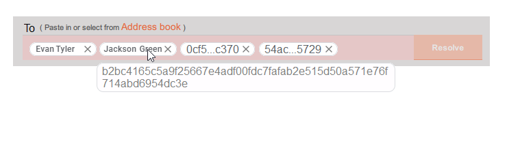
How bout we do it like any email client would? Here's a UI mock for ya:
fresheneesz
on 18 Feb 2019
Looks good but not sufficient: their amounts might be different and should be displayed too. A drop-down type of display could display more.
binaryFate
on 3 Mar 2019
Great point. Here's another try:
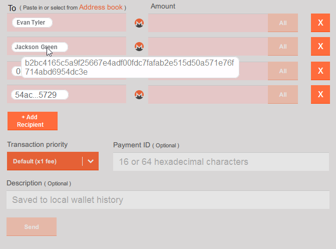
Note that I've left out the advanced options, so use this mock up mindfully as a starting point.
fresheneesz
on 17 Mar 2019
I'd love to see some UI mockups for this in the latest versions. The simple mode should not support this feature imo, but the advanced/expert mode should :)
SamsungGalaxyPlayer
on 23 Apr 2019
This could be helpful for this issue: https://doc.qt.io/qt-5/qtqml-javascript-dynamicobjectcreation.html
 selsta
on 23 Apr 2019
selsta
on 23 Apr 2019
I’m currently working on this: https://streamable.com/bzw7p
@GBKS I’d need your design help on this :)
selsta
on 14 May 2019
I’m currently working on this: https://streamable.com/bzw7p
@GBKS I’d need your design help on this :)
Looks nice, can you we also have a textarea option also ? so someone doesn't need to manually enter each and can copy/paste from exports of other software
like this : https://imgur.com/3Qii6Y1
ankurss
on 14 May 2019
This is a tricky one. Hard to keep things simple for single-recipient transfers (which are probably the majority of transfers) while still making it easy to add/manage multiple recipients. Let me know what you think of the layout below, we'll probably have to iterate a few things.
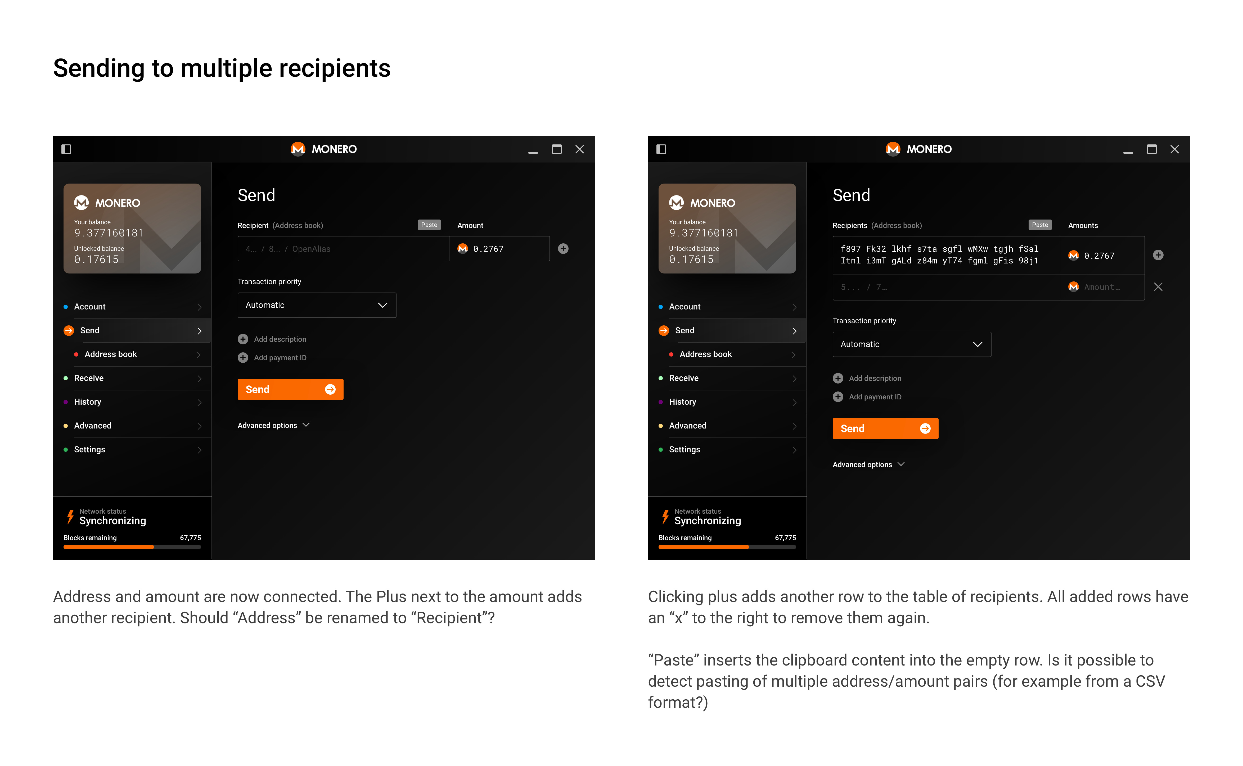
I really like the idea of having an email-like way of handling contacts that prioritizes names over addresses. That might be a separate project/task though, since we'd have to ensure that whenever an address is entered, users have a super easy way to associate it to a name, and I think that touches more than just this screen. Maybe split that into a separate discussion?
 GBKS
on 16 May 2019
GBKS
on 16 May 2019
@GBKS That looks fantastic! (Love the dark mode too). I think it covers the ground very well. Names vs addresses should probably be a separate discussion tho.
fresheneesz
on 16 May 2019
@GBKS Thank you! I really like the design :)
selsta
on 23 May 2019
@selsta awesome. Are there any more interactive states or other details you'd like to see mocked-up? Otherwise, I'll put these designs up on Zeplin.
GBKS
on 23 May 2019
@selsta it's up on Zeplin. There are no new icons in this one, so you should be able to get everything from existing files.
GBKS
on 25 May 2019
Progress update:
- https://github.com/monero-project/monero/pull/5518 was merged.
- GUI integration is still work in progress. Thanks to dsc for helping me :P
- WIP image:
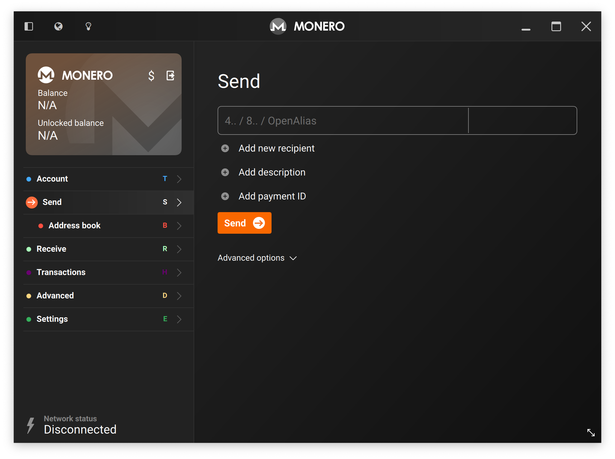
@GBKS The current problem is that the + next to the address/amount row can be confusing. The user could think that clicking the + is required to save the input so we thought it would be better to have a dedicated button underneath. But that’s now looking quite bad in combination with the other 2 buttons :P Any idea how we could solve this?
selsta
on 30 Aug 2019
Is this this as primarily a power-user features, that's why I made the initial suggestion of having it smaller and next to the amount. It also provides a nice space for the 'remove' option, which you don't have in the screenshot above. So I'd suggest going back to the proposed design.
Alternatively, it would help to add the table headers. If you see "Recipients" at the top, the option to "Add recipient" makes more sense.
Does that help?
A small note, the spacing between the icon and text, as well a the vertical distance between each icon button is a bit too big.
GBKS
on 30 Aug 2019
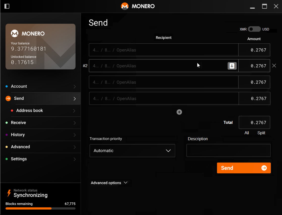
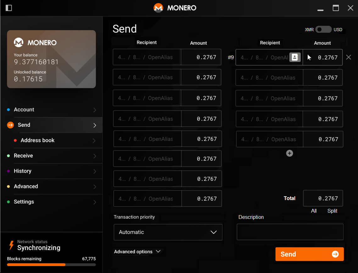
I made some drafts considering that the maximum number of outputs in a transaction is 16 (transaction without change). I'd use a GridView with 8 rows and 2 columns, which will display a single column when there are less than 8 recipients. The last item of the gridview would be a + button (add new recipient), which would be displayed below the last recipient.
When mouse is over a recipient field, recipient # is displayed on the left side, borders are highligthed, address book button is displayed, and delete recipient (X) button is displayed.
Total amount field: it has two functions: 1) All (sweep_all function), which spend all unlocked amount in the account. 2) Split, which splits the inserted total amount equally between the recipients.
Fonts in recipient and amount fields probably will need to be smaller.
Since displaying the fiat conversion in each amount field is too much information, I added a switch XMR <> USD/EUR above Amount fields.
Example of transaction with less than 8 recipient addresses.
Example of transaction with more than 8 recipient addresses.
 rating89us
on 27 Jun 2020
rating89us
on 27 Jun 2020
Looks really good. Do you really need that number indicator ("#9" in front of the address input)?
If you really want the "+" button below to the inputs, I'd add a label "+ Add recipient" and left-align it. Makes it more consistent with some of the other screens. I'd also left-align the "Recipient" label just like about have "Transaction priority" and "Description".
Is the "Total" input purely display or can I enter a number? If so, what's the interplay between entering values for each recipient, and then changing the total?
GBKS
on 3 Jul 2020
Looks like adding a number in "total" and then clicking "split" will divide the total among all participants? Maybe I'm off here. Or does "All" assign the value to all outputs but "Split" divides them equally? That should be more clear.
SamsungGalaxyPlayer
on 4 Jul 2020
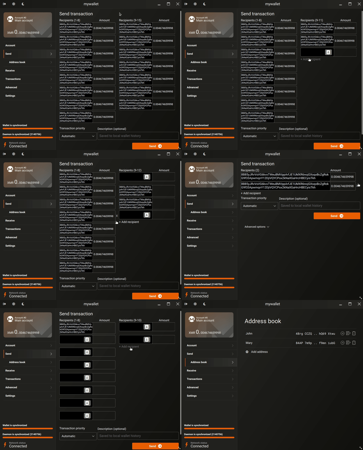
I coded some parts already, see below.
Regarding addresses inputs, what is your opinion about using single line (not displaying the whole address but having a smaller grid height) vs. multiple line input (displaying whole address but having a larger grid height)?
Monero addresses are really large (95 chars) and our window space is really limited. I don't know if we can change the default window size.
rating89us
on 12 Jul 2020
I don't know if we can change the default window size.
A lot of people use small monitors or VMs, AFAIK we already had complaints that the default window height is too large. So I don’t think we should change it.
Regarding addresses inputs, what is your opinion about using single line (not displaying the whole address but having a smaller grid height) vs. multiple line input (displaying whole address but having a larger grid height)?
I we say be default display it in a single line. When someone clicks into the textbox it should expand to display the full address.
selsta
on 12 Jul 2020
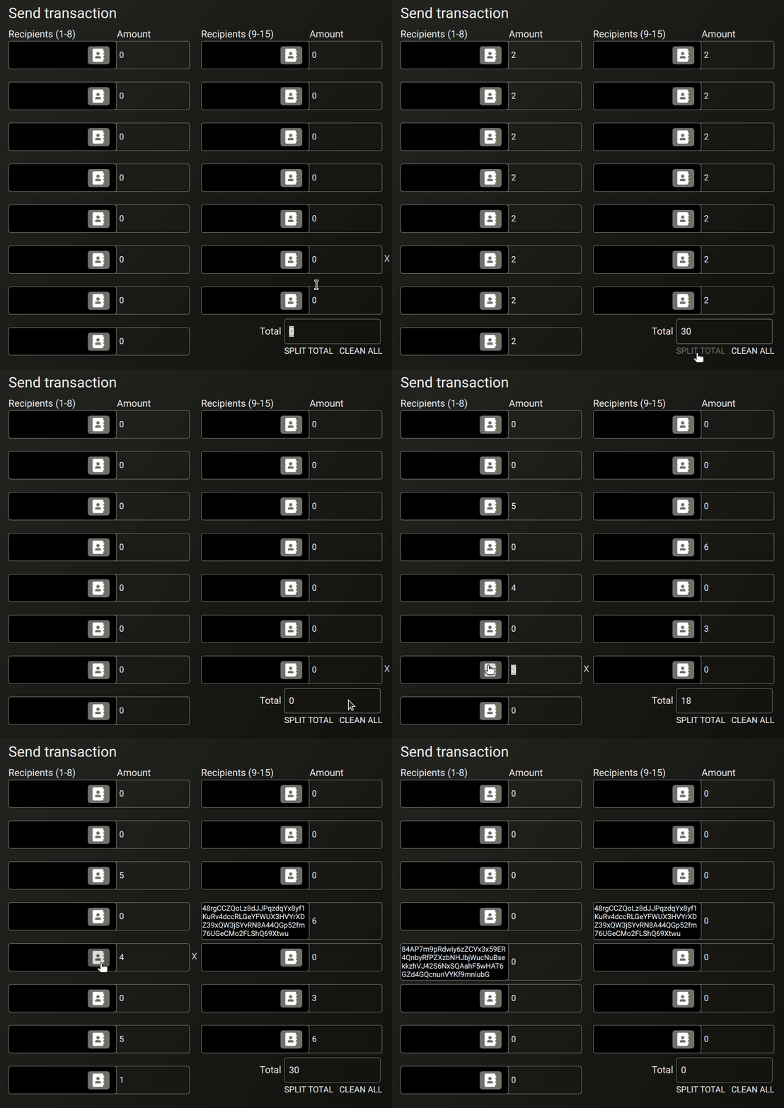
Total field sums all recipients amounts
"SPLIT TOTAL" splits the total amount equally between all recipients
"CLEAN ALL" cleans all recipients amounts
rating89us
on 13 Jul 2020
This looks busy to me with the very prominent address buttons. Can we quiet those down? Maybe make remove the grey and just make the icons selectable. Maybe this will be less busy if the button only appears if hovered over like in your mock-up.
I also don't love the (1-8) and (9-15), but I don't have a better idea.
Good start :)
SamsungGalaxyPlayer
on 13 Jul 2020
I mocked up a layout that tries to calm things down a little visually and make more room for addresses.
- Add recipient now looks like the other "Add buttons"
- Moved split and clear into the labels
- Turned all the rows into a table
- Only show address book button on hover (also only show the "X" on hover?)
- Simpler address book icon (the ragged edge on the current icon is really messy)
- For the 9+ address view, I made the text much smaller and tightened up spacing (is this dense enough now?)
- Made every 5th dividing line brighter as a more subtle indicator to segment recipients (tried to come up with something different than the numerical indicators, not sure how successful the brighter lines are)
And a question - "Clean all" only clears amounts and not recipients, right?
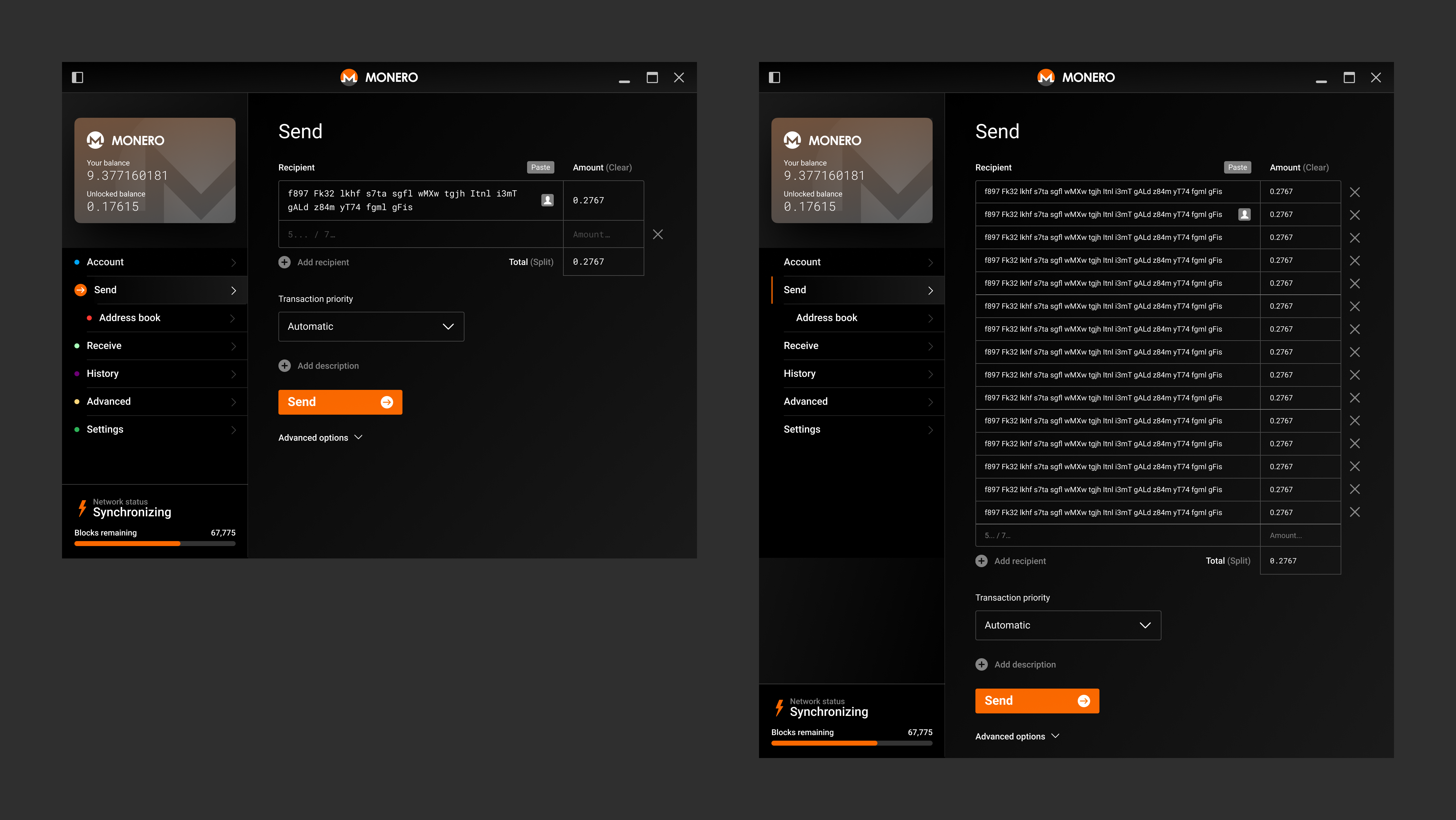
Let me know what you think.
GBKS
on 22 Jul 2020
I really like this :)
SamsungGalaxyPlayer
on 22 Jul 2020
I like it too, but i don't think we should divide addresses in segments. It's not consistent with the CLI and all the other wallets (afaik) and looks a bit confusing to me.
 erciccione
on 24 Jul 2020
erciccione
on 24 Jul 2020
@erciccione segmenting (and the mono font for multiple lines) helps keep track of where you are when comparing addresses. Similar to how phone numbers, credit card numbers, IBANs, etc are segmented.
To me personally, the fact that the CLI doesn't do something is not an argument, because CLI options are so limited. Graphical interfaces can take advantage of very different possibilities.
GBKS
on 27 Jul 2020
I understand why segmenting is useful, my concern is only that could confuse people. It did it with me for a moment and i'm fairly familiar with the technology. If i'm the only one with this opinion, feel free to ignore it :)
the fact that the CLI doesn't do something is not an argument,
As i said, it's not just about the CLI. No other wallets that i know of is segmenting addresses. If "the official" wallet segments and others don't, users may think the format of the address is different in other wallets (thinking about mobile wallets in particular)
erciccione
on 27 Jul 2020
Maybe it's just a matter of finding the right segment width? So it's functional but does not confuse? Here is an overview of a view options. Maybe a few more people can chime with what they think is the right way to go.
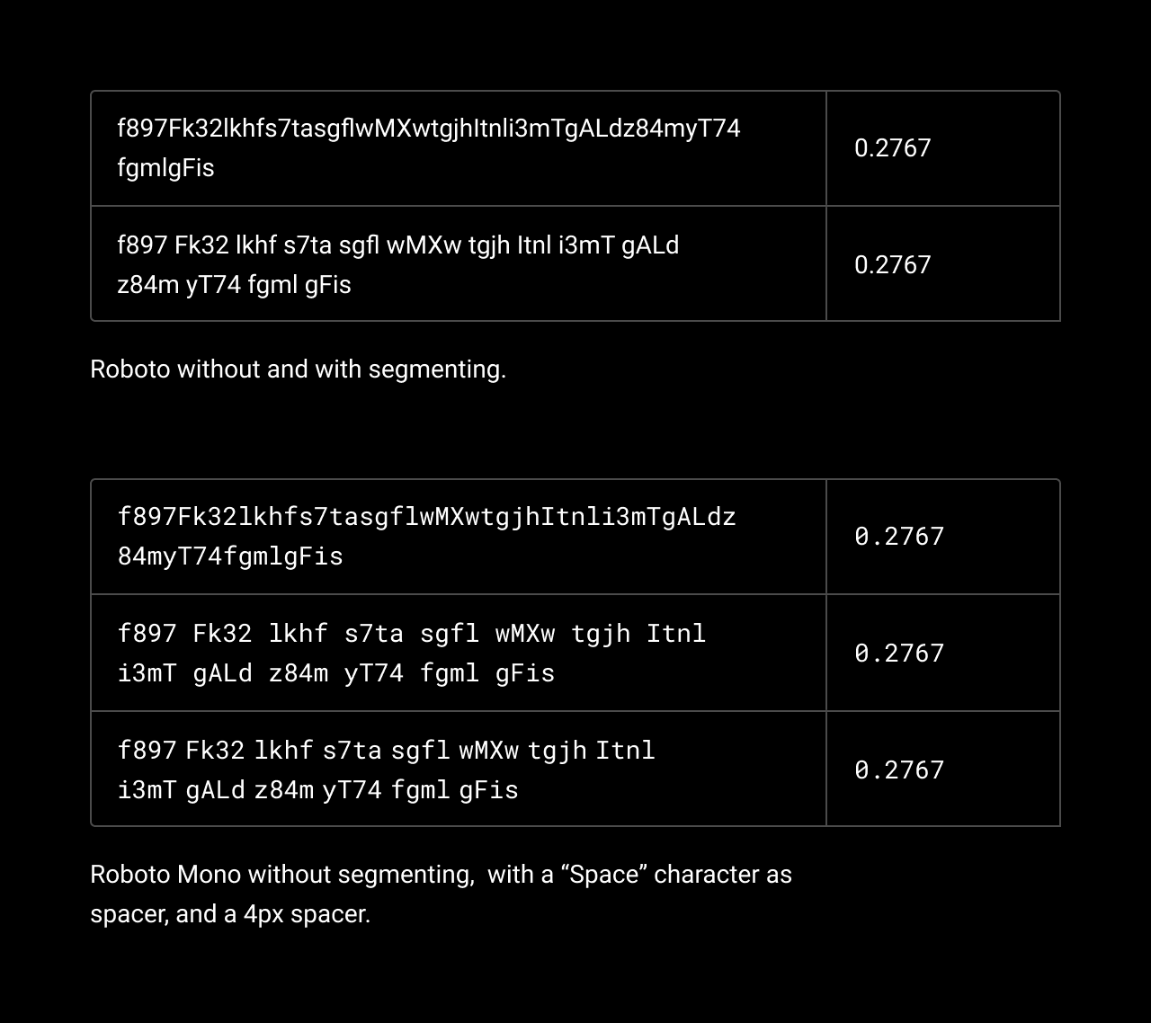
GBKS
on 28 Jul 2020
'Roboto with segmenting' looks like a good solution to me :)
erciccione
on 28 Jul 2020
I prefer without segmenting, because since monero addresses have 95 characters, we always have a single segment with 3 characters (instead of 4).
Monero GUI currently displays addresses in the following format:
- AAAA AAAA AAAA ... AAAA AAAA ABCD
But since we need to display the full address in this field on send page, it would have a 3 characters segment at the end:
- AAAA AAAA AAAA ... AAAA AAAA BCD
Alternatively, we could also change the splitting so that the 3 characters segment stay at the middle of the string, something like this:
- AAAA AAAA AAAA ... AAA ... AAAA AAAA ABCD
rating89us
on 29 Oct 2020
I'm OK with a 3 character segment at the end. The bank account number on my debit card also has a 2 character segment at the end. I think it's pretty standard that way.
GBKS
on 29 Oct 2020
Related issues
 1337tester
·
6Comments
1337tester
·
6Comments
 jmgranner
·
6Comments
jmgranner
·
6Comments
 ddyzhang
·
8Comments
ddyzhang
·
8Comments
 blackvalyrian
·
4Comments
GBKS
·
9Comments
blackvalyrian
·
4Comments
GBKS
·
9Comments
Most helpful comment
This is a tricky one. Hard to keep things simple for single-recipient transfers (which are probably the majority of transfers) while still making it easy to add/manage multiple recipients. Let me know what you think of the layout below, we'll probably have to iterate a few things.
I really like the idea of having an email-like way of handling contacts that prioritizes names over addresses. That might be a separate project/task though, since we'd have to ensure that whenever an address is entered, users have a super easy way to associate it to a name, and I think that touches more than just this screen. Maybe split that into a separate discussion?