Modernflyouts: "Dark-grey" out unavailable options in media flyout
Many a times, features like shuffle, repeat, stop, etc. are not available for an app. In that case, I would request you to please change the color of disabled options to be a different and look more dark-greyish.

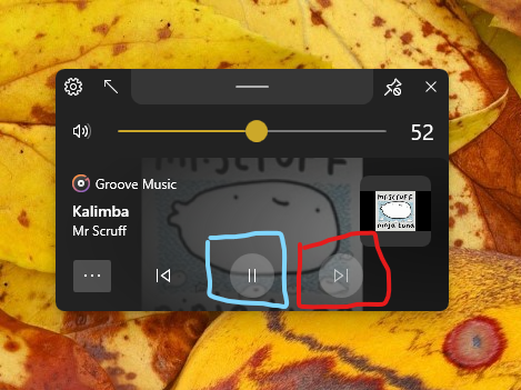
In this, the options for next and previous are not available. But they look almost same to play/pause button.
Please fix this.
 Cyberdroid1
All 22 comments
what do you think of hiding them altogether like you did with the more controls button? https://github.com/ShankarBUS/ModernFlyouts/issues/6#issuecomment-699673253
 Poopooracoocoo
on 28 Sep 2020
Poopooracoocoo
on 28 Sep 2020
IMO, We shouldn't hide those three buttons. Having any one of them hidden will look like a tooth plucked mouth. So changing the color is a easy and viable way.
The other two (i.e. "More Controls" & "Timeline Properties") buttons are on the edge and won't make that much difference when they are hidden.
We can easily realign those buttons when one of them is hidden but it will look inconsistent 😅
I have to reconsider the design and make some more UI changes post v0.7
TBH, I'd like to do this in v0.8
 ShankarBUS
on 28 Sep 2020
ShankarBUS
on 28 Sep 2020
Wait a minute.... If the previous & next buttons are disabled, why only the background changes and not the foreground?
The foreground color of the glyphs must look faded. Is that what you are saying @Cyberdroid1?
ShankarBUS
on 30 Sep 2020
Any modification, but it should look "different". This is what I meant.
Cyberdroid1
on 30 Sep 2020
A disabled button should look like the *Next" button in the following image

You can see that the glyph looks faded unlike the image you posted above. I'm confused why that is like that 🤔🤔🤔
Does the above image I attached meet your requirements?
ShankarBUS
on 30 Sep 2020
Can you make the same image in dark mode? It looks improved in light mode.
Cyberdroid1
on 30 Sep 2020
I didn't make any changes. That's how it should look already. I will see what's wrong
ShankarBUS
on 30 Sep 2020
Hmm, can we make the symbols more grey-ish, so that it blends with button background, and then the visibility is less ?
Cyberdroid1
on 30 Sep 2020
Hey @Cyberdroid1,
This is how it looks on my device in dark mode

There are some visibility issues here.
ShankarBUS
on 30 Sep 2020
Made a repro with WinUI xaml :

_WinUI in a UWP app_
These are our app's buttons :
_ModernWpf in our app_
What do you think?
ShankarBUS
on 30 Sep 2020
None, actually. 😅 Both are looking same, apparently.
Cyberdroid1
on 30 Sep 2020
What should we do then? File a issue on the WinUI repo and hope they would fix it 😑? (the changes will be ported to ModernWpf later for consistency, that's why I said to file a issue there)
That won't happen 😞. We have to override the colours for ourselves to make it more distinguishable 🤦♂️
@Poopooracoocoo, you are the right guy for that 😅😁. I saw you bargain with MS employees mutliple times (on Project Reunion, WinUI, PowerToys & some more repos). Could you file an issue regarding this contrast issue on there?
It's not necessary but would help other devs facing similar issues. As a temporary workaround we can override the required colours only in dark mode.
ShankarBUS
on 30 Sep 2020
lmfao. microsoft never listens. i try but never succeed. you could use the accessibility angle but microsoft still won't care.
Poopooracoocoo
on 30 Sep 2020
Okay let's not care about them, we can carry on with the said workaround
ShankarBUS
on 30 Sep 2020
Are you doing it? Just wanted to ask. 😀
Cyberdroid1
on 5 Oct 2020
Yes I should do it 😑
ShankarBUS
on 5 Oct 2020
@ShankarBUS
What if we remove the backgound circle from Play/Pause button? That can fix this, won't it?
Or, edit the colors?
Cyberdroid1
on 27 Oct 2020
Editing the colors will do the job I guess 🤔
ShankarBUS
on 27 Oct 2020
@ShankarBUS Any status update?
Cyberdroid1
on 1 Dec 2020
@Cyberdroid1,
Forgot it. But there may some noticeable difference in the next version due to the addition of reveal effect.
Thanks for the reminder.
One more thing,
As you said, both normal button background and disabled background are using the same colour. That's why we can't distinguish between them
ShankarBUS
on 1 Dec 2020
As you said, both normal button background and disabled background are using the same colour. That's why we can't distinguish between them
Oh ok. That's why.
You can try a thing. On disabled buttons, there can be a custom cursor of 🛑 or something similar when the cursor is brought upon that button.
Cyberdroid1
on 1 Dec 2020
What about removing the background of the play/pause button but retain the reveal effect?
Cyberdroid1
on 20 Dec 2020
Related issues
 DanRotaru
·
3Comments
DanRotaru
·
3Comments
 Hymian7
·
4Comments
Hymian7
·
4Comments
 luojunyuan
·
3Comments
luojunyuan
·
3Comments
 neubland
·
4Comments
neubland
·
4Comments
 toineenzo
·
4Comments
toineenzo
·
4Comments
Most helpful comment
lmfao. microsoft never listens. i try but never succeed. you could use the accessibility angle but microsoft still won't care.