Mkdocs-material: Table of Contents is blurry
__I checked that...__
- [x] ... the documentation does not mention anything about my problem
- [x] ... the problem doesn't occur with the default MkDocs template
- [x] ... the problem is not in any of my customizations (CSS, JS, template)
- [x] ... there are no open or closed issues that are related to my problem
Description
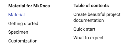
Table of Contents (the right sidebar) is slightly blurry on Chrome and Safari on Mac. Firefox is ok. I did not test on Windows.
It's likely related to the transform rule in css. Disabling it makes the text crisp again (with TOC at wrong place, though)
@media only screen and (min-width: 60em)
.md-sidebar--secondary {
  transform: translate(-100%);
}
Steps to reproduce the bug
- Navigate to: https://squidfunk.github.io/mkdocs-material/
- And resize the windows so that it is at least 1600px wide.
 tuner
tuner
All 8 comments
Thanks for reporting. You're right, it is related to the transform rule which induces a new layer on the GPU. The text is blurry, because width and height are not divisible by 2 (see this link) which cannot be guaranteed with pure CSS.
It might however be solvable by using calc() with margin, effectively making the transform unnecessary. Things to do:
- Try to replicate the TOC behavior with
calc() - If this works, research browser support on
calc()
Support should be good by now, so if it works we can make an informed decision and switch to a calc()-based position strategy. Maybe there is an even simpler approach.
Happy to collaborate! If you (or somebody) feels like submitting a PR, we can tackle this quickly.
 squidfunk
on 7 Oct 2019
squidfunk
on 7 Oct 2019
Yup, I have been using calc for years.
I did some initial experiments with Chrome's dom inspector and looked at the sass sources.
In _sidebars.scss:
width: px2rem(242px);

@include break-from-device(tablet landscape) {
      display: block;
      margin-left: 100%;
      transform: translate(-100%, 0);
      ...
}

@include break-from-device(screen) {
      margin-left: px2rem(1220px);
      ...
}
Couldn't you just have something like:
$width: px2rem(242px);
width: $width;

@include break-from-device(tablet landscape) {
      display: block;
      margin-left: calc(100% - $width);
      ...
}

@include break-from-device(screen) {
      margin-left: px2rem(1220px) - $width;
      ...
}
So, no calc needed except for the tablet landscape hack. I didn't quite understand how the 100% margin works, but replacing the transform with calculated margin appears to work anyway.
tuner
on 7 Oct 2019
LGTM. What about browser support? If we don’t loose anything significant we can go ahead with this fix.
squidfunk
on 8 Oct 2019
Calc has been supported since ie9: https://developer.mozilla.org/en-US/docs/Web/CSS/calc#Browser_compatibility ... so you don't need to be afraid of using it :-)
tuner
on 8 Oct 2019
@tuner looking good. God, I'm doing this far too long, we could really use some more recent CSS features by now :-) Also see #1293 which is pretty interesting.
squidfunk
on 9 Oct 2019
I confirm the problem in Chromium on Linux. My description, screenshots and possible solutions are here: https://github.com/cirruslabs/cirrus-ci-docs/issues/490#issue-506178855
 AlexWayfer
on 13 Oct 2019
AlexWayfer
on 13 Oct 2019
Fixed in c736cd99. Will be part of v5. See #1306 for updates.
squidfunk
on 22 Dec 2019
Material for MkDocs 5.0.0rc1 is out which fixes this issue 😀 Let's test and improve it together!
squidfunk
on 10 Mar 2020
Related issues
 atmarx
·
4Comments
atmarx
·
4Comments
 HerbFargus
·
4Comments
HerbFargus
·
4Comments
 ngtrian
·
3Comments
ngtrian
·
3Comments
 dbdevtop
·
4Comments
dbdevtop
·
4Comments
 michael-nok
·
3Comments
michael-nok
·
3Comments
Most helpful comment
Fixed in c736cd99. Will be part of v5. See #1306 for updates.