Hello, I would like to colaborate with this project by offering a _free_ new logo proposal that suits better with the name of the project. I already have a few ideas. Let me know if this is of your interest. Thank you.
 LuigiBaute
All 21 comments
Hi Luigi,
first thanks for offering your service. We had this discussion before, several times.
Feel free to do some designs but be aware that it might be a death march to get a logo change done :). Some of the people have strong opinions about the logo which is the initial one from the mithril creator @lhorie.
 StephanHoyer
on 17 Apr 2018
StephanHoyer
on 17 Apr 2018
Hi @LuigiBaute, thanks for the offer. There's one big constrain on the logo:
The logo is the borromean rings
— Leo Horie in the last discussion about the Web site design.
He was not flexible on that point, and I'd defer to him for that, even though he's not been around for a while.
 pygy
on 17 Apr 2018
pygy
on 17 Apr 2018
If it's something everyone likes, I won't be opposed to it :)
 lhorie
on 17 Apr 2018
lhorie
on 17 Apr 2018
He's alive... errr.. Hi Leo :-)
pygy
on 17 Apr 2018
Hi! :)
lhorie
on 17 Apr 2018
@LuigiBaute I'd love to see a proposal. We've got enough active maintainers for a quorum so we can at least give you a decision one way or the other 😄
 tivac
on 18 Apr 2018
tivac
on 18 Apr 2018
I'll start working on it, where can I contact you? Could it be Discord? or here at github? as you please.
LuigiBaute
on 18 Apr 2018
Update the PR, or you could put something into gitter for more immediate feedback from folks.
tivac
on 18 Apr 2018
I'll gladly adjust it as many times as necessary, we could play with the colors or anything you like.
LuigiBaute
on 19 Apr 2018
@lhorie @tivac @pygy @StephanHoyer let me know what you guys think! Cheers!
LuigiBaute
on 19 Apr 2018
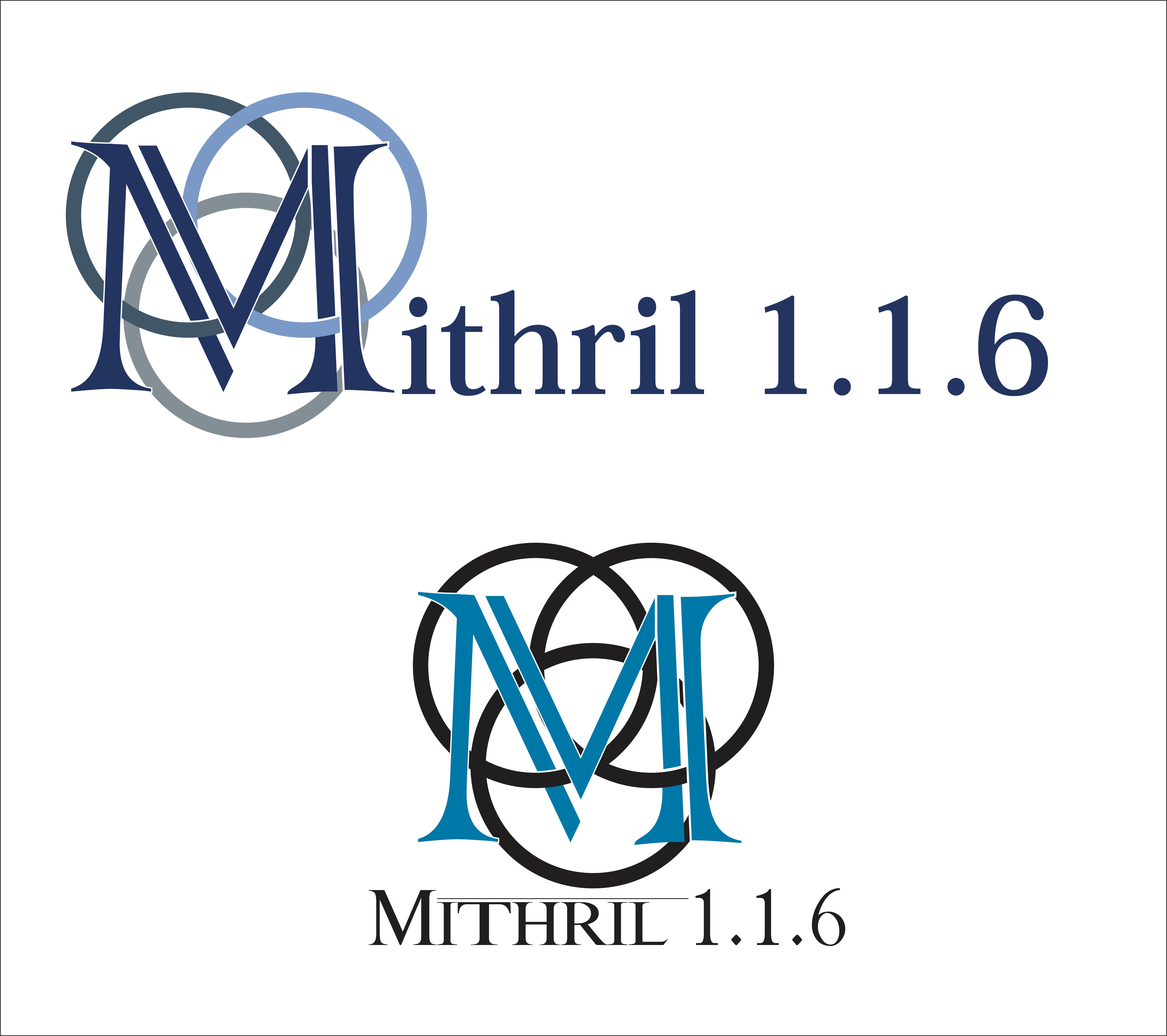
@LuigiBaute hello,
Can i give you a little feedback ?
The actual logo:
![]()
Is very clean; your logo idea is good but is a bit visually polluted.
The first logo colors looks great, but not with the M with the circles and the second (for me) is out of table.
Here is the suggestion:
I liked the colors of circle in the first logo (You got them from the official website, right?), and the color of Mithril + version looks good too.
I suggest you to stay with the circles clean or make a new logo from zero.
See ya; good luck!
 danielbarion
on 20 Apr 2018
danielbarion
on 20 Apr 2018
I like the idea of intertwining the M with the logo, but the result is indeed visually crowded.
If you want to make the rings distinct or non-flat, please look at https://en.wikipedia.org/wiki/Borromean_rings for an overview of how they are supposed to overlap.
pygy
on 20 Apr 2018
just playing with paint .. 😀 Borromean with open rings .. it is connected and overlapping but loose and does not constrain ...
 dnErf
on 22 Apr 2018
dnErf
on 22 Apr 2018
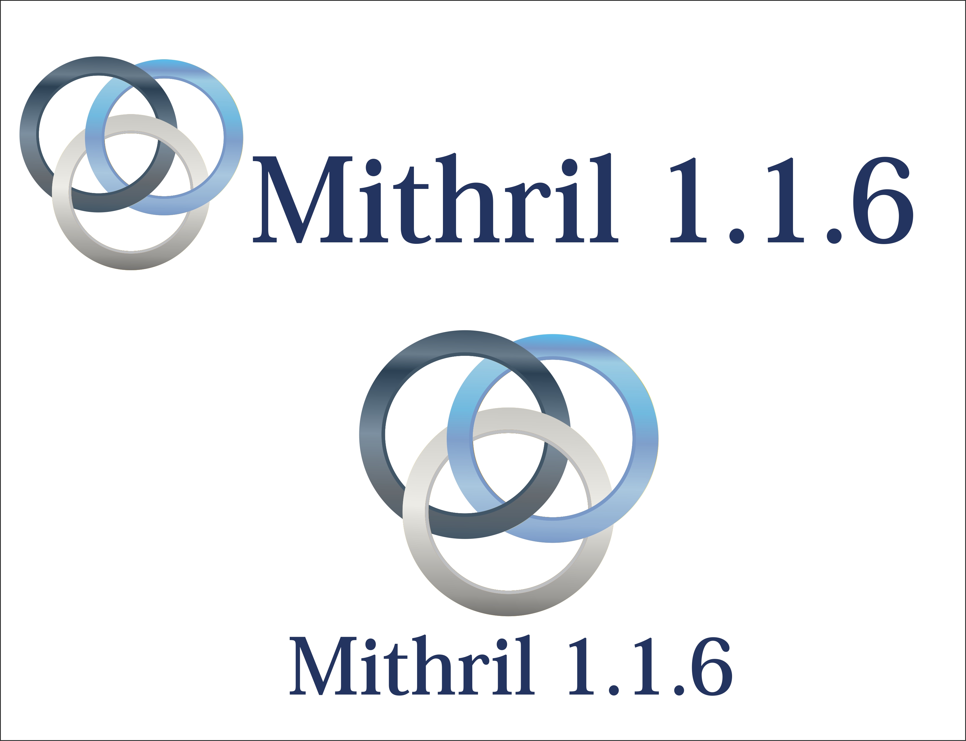
what do you think of these modifications?
LuigiBaute
on 24 Apr 2018
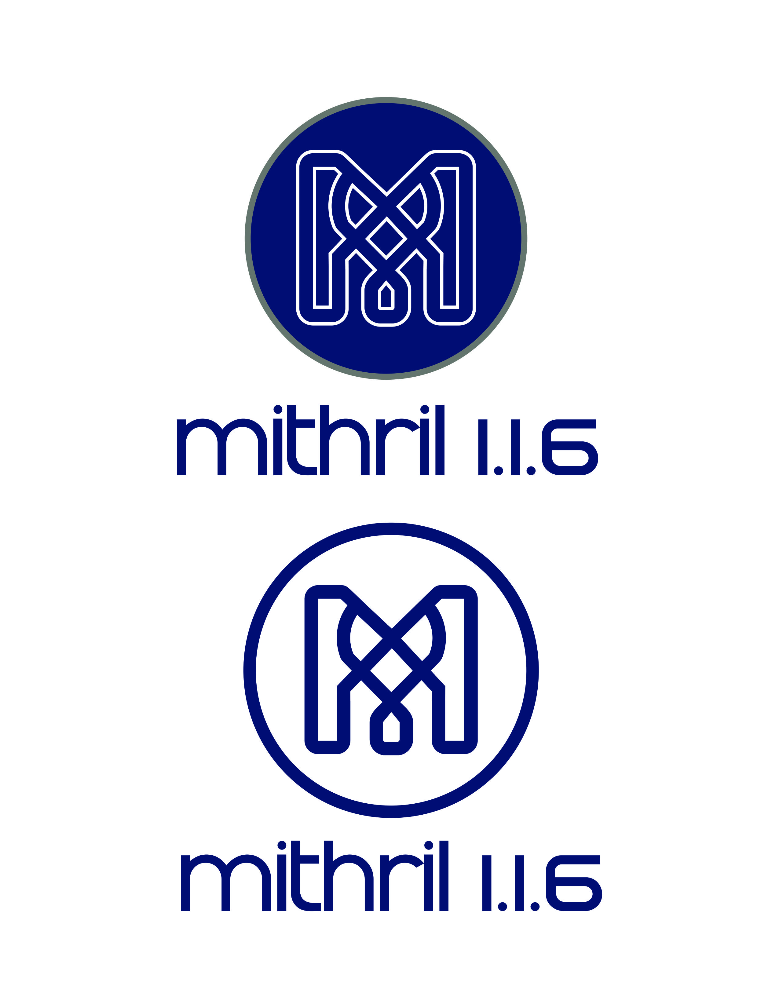
I see you're trying to go for for a fantasy metallic feel, but I'm afraid bevel, gradients and serif fonts are somewhat dated design techniques
Generally, I think design trends right now tend to favor flat designs (see React, Vue, Chrome, Microsoft, Uber, etc)
Within those constraints, there are still different ways to invoke a material feel, e.g. via text shaping or stylized letters. Another excellent example of a timeless flat design is the Coca Cola logo and its smooth flowy feel.
Although I originally used the borromean rings for their texture similarity to chainmail and the trinity connotation (for MVC, get it haha?), a new design doesn't necessarily need to keep them since that symbol is not unique at all in the first place. Please don't feel like you have to keep using it, as I feel that doing so might be hindering your artistic freedom.
lhorie
on 25 Apr 2018
Ok thanks, now I get where the logo idea came from. let me remake everything and start with the same point of view you had at the beggining to see what comes up! Cheers! :smiley:
LuigiBaute
on 26 Apr 2018

What do you think?
LuigiBaute
on 2 May 2018
For me it's still way too much. this by @ludbek is still my favourite one. Clean an simple

StephanHoyer
on 2 May 2018
I do like the addition of color in the simplest item, and the pseudo-perspective added by the inner ring (though you messed up the way the rings overlap, you had it right in the metallic version ;-)).
I like @ludbek's logo, but the link/chain metaphor is AFAICT already more in use in the wild than the three rings thing, which is thus more distinctive (though I only did a quick Google image search, I may have missed some key search term... logo three rings, logo borromean, logo chain, logo link is what I looked for).
pygy
on 3 May 2018
@LuigiBaute I really like these.
Yes, simplicity is good, but it's also difficult not to overlap with countless other "simple" logos.
This particular study is striking in its full-form, and if simplicity is needed it offers some unique shapes within it that can be isolated for print/iconographic needs.
I have seen the linked-chain and 3-circles illustrations many times in the past. They're not ugly, but they're safe and unoriginal.
 shuckster
on 16 May 2018
shuckster
on 16 May 2018
They might as well grow on me, especially the second one.
I see massive support for the link-like logo, but I think it is too generic as well, especially in a Web context. @LuigiBaute do you mind if I re-open this, or are you done with the idea?
pygy
on 16 May 2018
Related issues
pygy
·
4Comments
 millken
·
4Comments
millken
·
4Comments
 mke21
·
3Comments
pygy
·
3Comments
mke21
·
3Comments
pygy
·
3Comments
 designMoreWeb
·
4Comments
designMoreWeb
·
4Comments
Most helpful comment
For me it's still way too much. this by @ludbek is still my favourite one. Clean an simple