Mini-media-player: UX improvement suggestion: artwork and controls in separate containers
Hi there,
first of all - thank you for such a flexible media player.
I'd like to suggest a feature that would help to improve user experience.
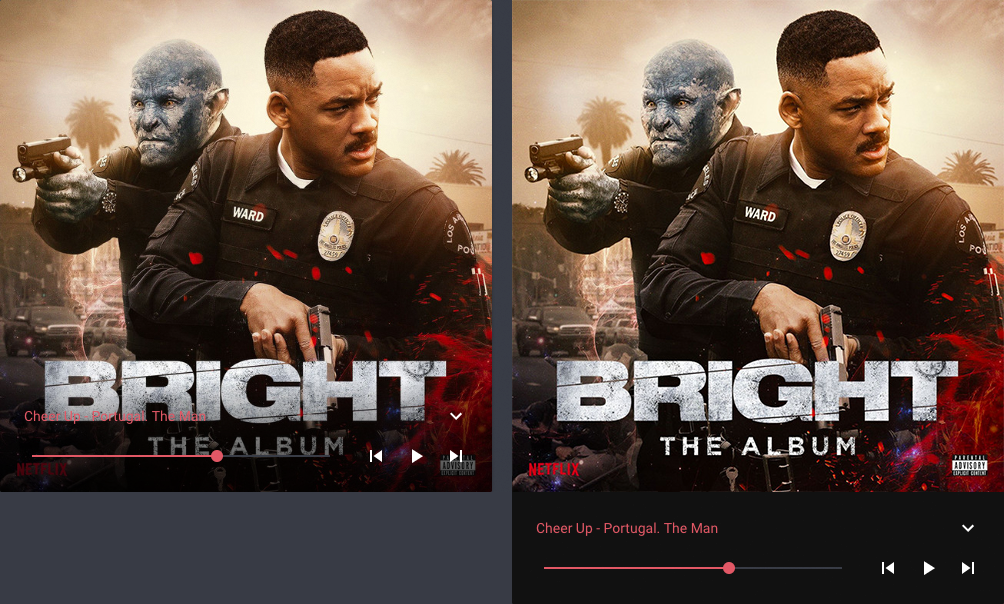
Option to have artwork and controls in separate containers would help to improve accessibility / readability by a huge margin.
This is because when controls are placed in a container with semitransparent gradient background and that container overlaps the artwork - it's very often when you can't see the controls and the artwork is covered, too.
Yes, having done that will make media player container taller, but I think it's worth it.
Please see the picture attached showing situations before / after to better understand my point.
Thanks in advance.
 quantummobile
All 17 comments
Hey, thanks for the suggestion.
You are absolutely correct, the current solution is just bad from a UX perspective.
Probably changing the layout of full-cover and full-cover-fit, your mockup is one possible solution.
 kalkih
on 7 Feb 2019
kalkih
on 7 Feb 2019
Hi, you're welcome. I could do more detailed UX evaluation and come back with suggestions - if you like?
One more idea - maybe background of controls block could use colours from the current theme? Or at least have an option to choose black or white?
quantummobile
on 8 Feb 2019
Sure, let me know what you come up with.
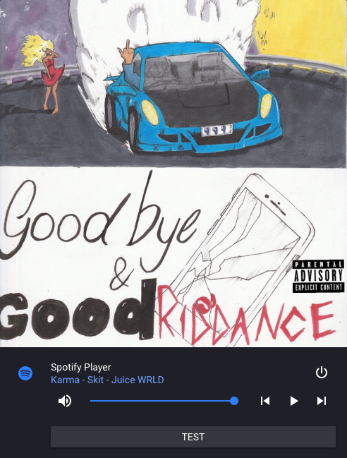
The control block would already be using colors from the current theme, (--paper-card-background-color) to be specific.
I played around with the idea a bit and the card gets ridiculously tall, especially when using additional options such as tts or shortcuts.
kalkih
on 10 Feb 2019
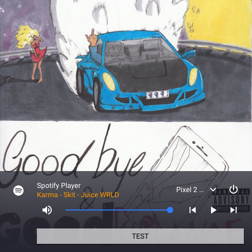
Another solution would be to simply just bring up the opacity, would make the lower part of the artwork difficult to see though.
kalkih
on 10 Feb 2019
Sure, let me know what you come up with.
The control block would already be using colors from the current theme, (--paper-card-background-color) to be specific.I played around with the idea a bit and the card gets ridiculously tall, especially when using additional options such as tts or shortcuts.
Hi there,
please allow me some time to think about it. I'm sure there's a way to get it all together properly :)
It's just that I'm not the only user who wants to see album artwork not covered in any way - it's a whole with the music and we must respect that.
By the way - what's that rectangle with text "Test" inside for?
quantummobile
on 11 Feb 2019
I'm sure some users want to see the complete artwork unobstructed, but let me remind you of the card name "mini-media-player".
If users really want to see the complete artwork and doesn't mind the size there's always the core media-control card.
The rectangle at the bottom is a shortcut button, see the shortcuts option.
Let me know what you come up with, a design that displays the complete artwork while still keeping the card "relatively" small would be optimal.
kalkih
on 11 Feb 2019
Alright, that's exactly what I'm thinking of - card small enough while keeping artwork and controls separately. I think I'll get back to you this weekend.
Cheers!
quantummobile
on 11 Feb 2019
Hi,
This is what I came up with so far:
https://scene.zeplin.io/project/5c694359f910033c23e4dae5
Note, that text case changed from Upper Case to Sentence Case in shortcut button - this is done to improve readability. Sentence Case text also uses less space.
Well, let me know what you think.
I think you should give it a try :)
Cheers!
quantummobile
on 17 Feb 2019
Thanks, I appreciate the time you've put into this.
The problem with this design is that it's vastly different from the "normal" view (without artwork: full-cover enabled), which makes it infeasible to implement in my opinion. It's more or less a new card.
kalkih
on 17 Feb 2019
No problem :)
You could use only the area with artwork and author - track name, while keeping "normal" view with all the controls etc. intact.
That would make for a clean view in case of artwork: full-cover enabled.
quantummobile
on 17 Feb 2019
You could use only the area with artwork and author - track name, while keeping "normal" view with all the controls etc. intact.
Yes, I like the idea of scaling down the size of the artwork, from taking up the full width, to half as in the mockups.
Helps a lot to reduce the overall height.
kalkih
on 17 Feb 2019
Great, looking forward to seeing it in next release.
Cheers
quantummobile
on 17 Feb 2019
Made a quick mockup, maybe something like this:
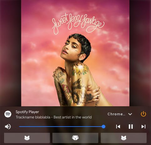
Might be a bit too ambitious with all the gradients and stuff.
kalkih
on 17 Feb 2019
Yea, exactly - "gradients & stuff" :)
I still suggest to separate content from the controls.
Think from users perspective - one wants to clearly see artwork alongside with artist name, track name and then wants to have tools organised in one place to control the content.
Why don't you just move ahead with the layout where artwork takes left half of the screen and artist name, track name - the right side. By doing so you would remove clutter in the control area.
quantummobile
on 18 Feb 2019
Why don't you just move ahead with the layout where artwork takes left half of the screen and artist name, track name - the right side. By doing so you would remove clutter in the control area.
Wasn't able to get that design to look aesthetically pleasing, but will play around more with the idea.
kalkih
on 19 Feb 2019
Would you consider collaborating on this matter? I could do UX/UI for you as the topic is interesting to me.
Let me know.
Cheers
quantummobile
on 19 Feb 2019
Absolutely, as long as I like the design and think it's feasible to implement, I would be happy to implement it.
Keep in mind that the design has to work in all possible configurations (option combinations), as well as dark/light themes, and adjust accordingly.
kalkih
on 19 Feb 2019
Related issues
 bramkragten
·
4Comments
bramkragten
·
4Comments
 hulkhaugen
·
3Comments
hulkhaugen
·
3Comments
 kbrohkahn
·
3Comments
kbrohkahn
·
3Comments
 darkkatarsis
·
4Comments
darkkatarsis
·
4Comments
 GuyKh
·
4Comments
GuyKh
·
4Comments
Most helpful comment
Made a quick mockup, maybe something like this:
Might be a bit too ambitious with all the gradients and stuff.