Mini-media-player: Enabling "group" and "show_progress" together looks bad
Enabling "group" and "show_progress" together leaves no padding/margin between the secondary info and the progress bar, doesn't look good.
 hulkhaugen
All 3 comments
Thanks for reporting this, that does indeed look bad 🤢
This is mostly an issue when the player is displayed in the "collapsed view" if I'm correct.
I'll most likely end up adding some paddings to the top and bottom of the card when group is set to true. It would make the card take up slightly more vertical space, but should look way better.
| Before | After |
| ------- | ------ |
| 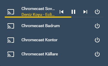 |
| 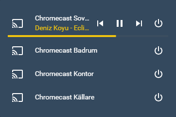 |
|
 kalkih
on 14 Jan 2019
kalkih
on 14 Jan 2019
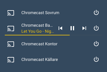
Okay, so I ended up making the progressbar slightly slimmer (only when group: true) so the vertical height of the card wouldn't need to be increased more than necessary.
I'm not 100% satisfied so might change again in the future.
kalkih
on 17 Jan 2019
Fix for this is now available in v1.0.0.
Thanks!
kalkih
on 3 Feb 2019
Related issues
 bramkragten
·
4Comments
bramkragten
·
4Comments
 Krocko
·
4Comments
Krocko
·
4Comments
 TheRealBadRobot
·
3Comments
TheRealBadRobot
·
3Comments
 fleXible
·
5Comments
fleXible
·
5Comments
 porebas
·
5Comments
porebas
·
5Comments
Most helpful comment
Okay, so I ended up making the progressbar slightly slimmer (only when
group: true) so the vertical height of the card wouldn't need to be increased more than necessary.I'm not 100% satisfied so might change again in the future.